Key takeaways:
- Readable and accessible fonts improve user experience across all devices.
- The right font should reflect your brand and connect with your audience.
- Using optimized, flexible fonts helps your website load faster and work better globally.
Your font choice may shape how people see your website. With overflowing content on the internet, the right typography can make a big impact on how people perceive your brand.
In this guide, we’ll walk you through what makes a font effective for the web, how to choose one that fits your brand and audience, and which one are the best font for a website in 2025.
What is the best font to use for your website?
You can choose any cool font you’d like for your website, and it’s totally up to you. However, a recent survey confirms that 76% of designers say readability and accessibility are their top priorities when selecting type. That means simple fonts are often best, as long as they’re easy to read.
Here’s a closer look at the key traits that make a font a great choice for your website:
- Readability. A high x-height, open counters, and proper spacing help users scan content. Avoid fonts that are overly narrow, tightly spaced, or hard to distinguish at small sizes.
- Brand voice. Fonts should align with your brand’s personality. A playful, rounded font like Baloo 2 suits a children’s site, while a sleek sans like Orbitron fits a tech startup.
- Accessibility. Choose fonts with distinct, unambiguous letterforms — particularly important for users with dyslexia or low vision. A good accessible font ensures an “I,” “1,” and “l” are easily differentiated.
- Performance. Fonts can impact page speed. Use optimized formats like WOFF2 or variable fonts, and subset characters to include only the necessary ones.
- Multi-language support. For global audiences, select fonts that support extended Unicode or specific scripts, such as Thai, Devanagari, or Arabic. Families like Noto are built to prevent missing characters.
- Hierarchy and pairing. Use font weights and sizes strategically to create visual hierarchy. Pair a standout headline font with a legible body font to guide users through your content intuitively.
- Cross-device consistency. The best fonts render cleanly across operating systems, browsers, and screen sizes, ensuring a consistent user experience anywhere.
19+ Best fonts for websites in 2025 (curated list by category)
Below are some top font picks for your website in 2025. It’s grouped by style and use case so you can find the right fit for your brand and audience.
- Sans-serif — Best for clean body text, user interface (UI) design, and responsive layouts
- Variable Fonts — Best for performance-first design, scalable systems, and responsive typography
- Serif — Best for editorial websites, formal branding, and content-rich experiences
- Script and Display — Best for hero banners, branding, logos, and expressive typography
- Accessible Fonts — Best for education, public services, healthcare, and inclusive user experience (UX)
- Multilingual Fonts — Best for global websites, international audiences, and multi-script support
1. Sans-serif — Best for clean body text, UI design, and responsive layouts
Sans-serif fonts are one of the leading typographies in 2025 thanks to their modern aesthetic, exceptional legibility, and versatility across devices. These fonts support a user-centric experience by reducing visual noise and enhancing content clarity.
Here are some of the top sans-serif fonts recommended for professional, accessible, and beautiful websites:
- Inter
- Roboto
- Poppins
- Libre Franklin
- Noto Sans
Inter
Inter is a variable sans-serif typeface designed by Rasmus Andersson specifically for user interfaces. It’s optimized for screen rendering and supports dynamic weights and widths. With advanced OpenType features like tabular numbers and contextual alternates, Inter is ideal for modern digital experiences. It’s a favorite for dashboards, SaaS platforms, and accessibility-forward sites.

(Image source: Network Solutions website builder)
Roboto
Roboto is a modern font made by Google for digital use. It mixes straight lines with smooth curves and comes with many styles and sizes, including Condensed and Slab versions. It supports many languages like Latin, Cyrillic, and Greek, which is great for global websites. Roboto is popular for apps, blogs, and online stores.

(Image source: Network Solutions website builder)
Poppins
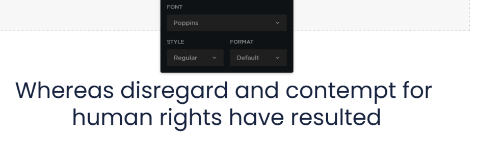
Poppins by Indian Type Foundry brings a geometric sensibility to the sans-serif family. Its monolinear letterforms and rounded curves deliver a modern, minimal look, while maintaining excellent readability in both headings and body text. Its proportional spacing and clean shapes make it ideal for fintech, SaaS, and education websites.
(Image source: Network Solutions website builder)
Libre Franklin
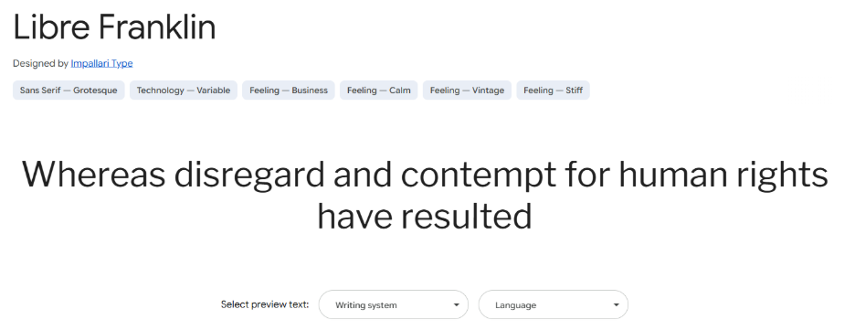
Inspired by classic American gothics, Libre Franklin is a versatile sans-serif font designed for digital performance. With weights ranging from Thin to Black, it supports typographic hierarchy with ease. Libre Franklin includes OpenType features such as fractions and ligatures, making it highly functional.
(Image source: Google Fonts)
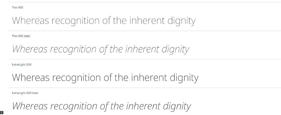
Noto Sans
Noto Sans is a font from Google made to work with all languages. It’s simple, clear, and supports over 1,000 languages, so text shows up the same everywhere. Its clean look makes it great for websites with lots of reading and also a good choice when clarity and accessibility matter.
(Image source: Google Fonts)
2. Variable Fonts — Best for performance-first design, scalable systems, and responsive typography
Variable fonts let you adjust a font’s weight, width, and more—all from one file. This makes websites load faster, perform better, and adapt easily to different screens. In 2025, designers use variable fonts to build flexible, scalable designs. They’re a great choice for brands that care about speed, accessibility, and clean typography.
Example fonts for this category:
- IBM Plex
- Lexend
- Recursive
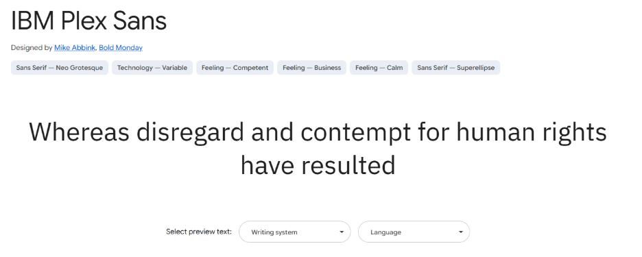
IBM Plex
IBM Plex is a multi-style, open-source typeface designed to reflect IBM’s brand spirit: tech-savvy, human-centered, and globally inclusive. The Plex family includes Sans, Serif, Mono, and Condensed variants, and its variable version gives designers complete control over visual expression. With generous spacing, a tall x-height, and sharp geometry, IBM Plex is ideal for enterprise websites, design systems, and developer-focused platforms.
(Image source: Google Fonts)
Lexend
Lexend is a science-backed font engineered to improve reading performance and reduce visual stress. As a variable font, Lexend allows users to customize font weight and width based on individual reading preferences. Its clean, open shapes are optimized for digital reading environments. Lexend is particularly effective for accessibility-driven platforms, online learning tools, and healthcare websites.

(Image source: Google Fonts)
Recursive
Recursive blends monospace and sans-serif styles in one system. Designed by Stephen Nixon, it includes axes for weight, slant, and casual or formal tone. Recursive supports fluid typography. This makes it perfect for interactive platforms, data visualizations, and modern design systems where expressive branding meets technical function.

(Image source: Google Fonts)
3. Serif — Best for editorial websites, formal branding, and content-rich experiences
Serif fonts offer a sense of tradition, authority, and elegance. Serif typefaces are often paired with sans-serifs to create visual hierarchy and contrast, while still offering high readability on screen.
Examples of the best serif fonts for your website:
- Playfair Display
- Lora
- Libre Baskerville
- EB Garamond
Playfair Display
Playfair Display is a high-contrast serif font with roots in transitional design. Its elegant curves and sharp strokes make it a striking choice for headlines and hero sections. It renders crisply on screens and retains sophistication at large sizes. This font works well when paired with a simple sans-serif for body text, allowing titles to command attention without overwhelming the layout.

(Image source: Google Fonts)
Lora
Lora combines classic calligraphic influences with a modern serif structure that leads into a balanced and inviting typeface. Its moderate contrast and brushed curves make it suitable for both body text and headings.

(Image source: Network Solutions website builder)
Libre Baskerville
Libre Baskerville is a web-optimized revival of the classic Baskerville font. With a tall x-height and open counters, it’s engineered for comfortable reading at smaller sizes. This font is ideal for scholarly articles, journals, and any web project that requires a formal, readable serif. It shines when paired with a sans-serif like Open Sans or Roboto for a clean typographic balance.

(Image source: Google Fonts)
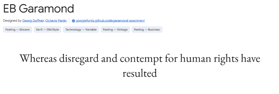
EB Garamond
A digital reimagining of the Garamond legacy, EB Garamond brings Old-Style elegance to the web. It features soft, humanist curves and fine details that provide a refined, literary feel. While often used in headings, EB Garamond also performs well in long-form text thanks to its readability and rhythm.
(Image source: Google Fonts)
4. Script and Display — Best for hero banners, branding, logos, and expressive typography
Script and display fonts bring personality, flair, and creativity to web design. These fonts are best suited for large text, such as headlines, hero sections, branding, and callouts. In 2025, they remain key players in making bold statements and guiding user attention when used thoughtfully.
Top fonts for this category include:
- Rubik
- Lil Grotesk
- Lobster
- Snell Roundhand
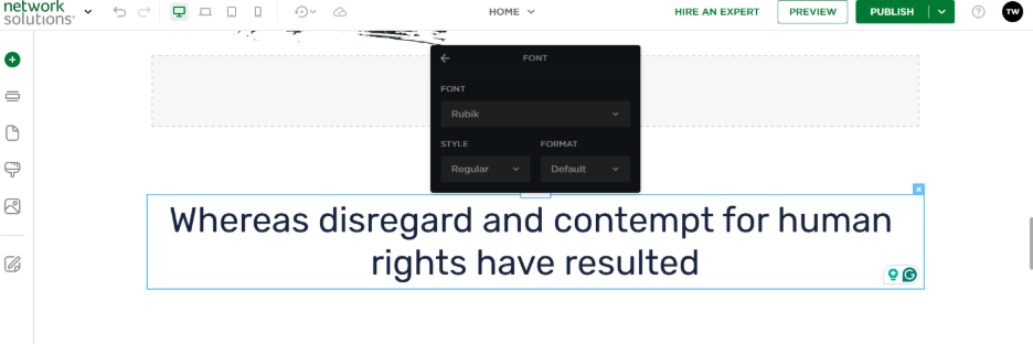
Rubik
Rubik is a slightly rounded font that feels playful yet professional. Designed by Hubert and Fischer, it features a geometric structure softened by its rounded corners. Rubik’s readability at larger sizes and its broad character set make it a strong choice for impactful headlines, branding, and UI elements.
(Image source: Network Solutions AI website builder)
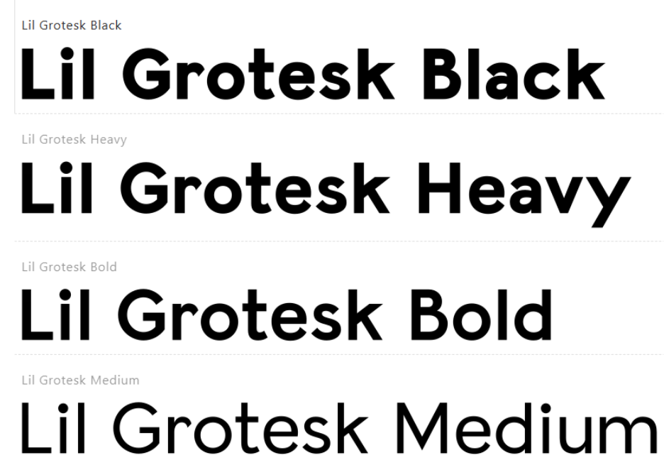
Lil Grotesk
Lil Grotesk is a modern display typeface with bold personality. Its tight spacing, geometric form, and unexpected quirks make it suitable for brands that want to break the mold. Ideal for hero banners and logo treatments with contemporary vibe that grabs attention without compromising legibility.
(Image source: Google Fonts)
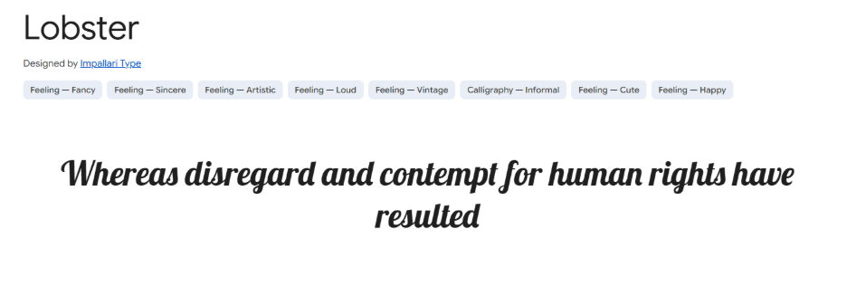
Lobster
Lobster is a bold script typeface known for its vintage-inspired charm. It’s an excellent choice for brands that want a touch of retro flair or personal expression. Commonly used in logos, signage, and social media visuals, Lobster’s swash ligatures and strong presence make it best used in moderation and paired with clean sans-serifs.
(Image source: Google Fonts)
Snell Roundhand
Snell Roundhand is a classic formal script that adds sophistication and elegance to any design. Often found in luxury branding and high-end web presentations, it conveys refinement and tradition. Snell Roundhand should be used sparingly. This font is ideally for invitations, boutique websites, and statement headlines that require an elevated tone.

(Image source: dafont.style)
5. Accessible Fonts — Best for education, public services, healthcare, and inclusive UX
Accessible fonts are thoughtfully designed to improve reading clarity for all users, including those with visual impairments, dyslexia, or cognitive challenges. In 2025, accessibility is no longer optional — inclusive typography is central to digital design. These fonts help ensure your content can be read comfortably and confidently by the widest possible audience.
Examples:
- Atkinson Hyperlegible
- Open Sans
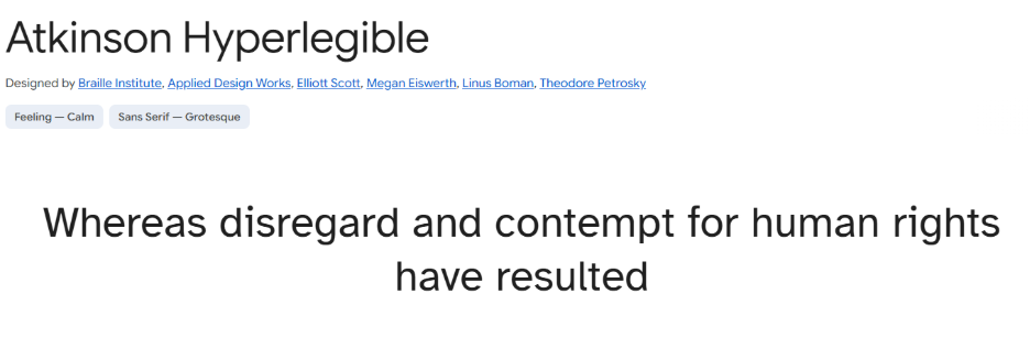
Atkinson Hyperlegible
Developed by the Braille Institute, Atkinson Hyperlegible is designed specifically for people with low vision. Rather than simplifying characters, it exaggerates differences between similar letterforms (like “I” and “l”), improving legibility for those with partial sight. The font strikes a balance between high functionality and visual personality, making it suitable for educational websites, public sector platforms, and socially responsible brands.
(Image source: Google Fonts)
Open Sans
Open Sans is a humanist sans-serif known for its clean, approachable design and wide character support. Its generous spacing and neutral tone make it one of the most widely used fonts for inclusive UX. Open Sans performs exceptionally well across screen sizes, making it a go-to for apps, corporate sites, and content-driven platforms that prioritize accessibility and legibility.

(Image source: Google Fonts)
6. Multilingual Fonts — Best for global websites, international audiences, and multi-script support
Multilingual fonts supports diverse writing systems and ensure consistent presentation across multiple languages. The selections below provide comprehensive language coverage without compromising performance or aesthetic cohesion.
- Sarabun
- Baloo 2
- Tinos
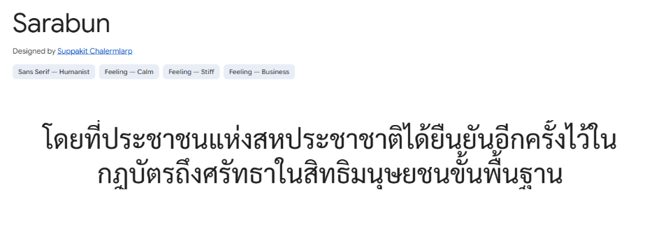
Sarabun
Sarabun is a modern Thai and Latin typeface developed for use in both display and body text. Its neutral tone and precise detailing make it an excellent fit for professional, academic, and governmental websites targeting Southeast Asian audiences. With strong vertical metrics and balanced spacing, Sarabun ensures harmonious text flow across scripts.
(Image source: Google Fonts)
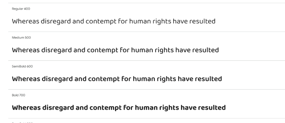
Baloo 2
Baloo 2 supports several Indian scripts, including Devanagari, Bengali, Tamil, and more. Its rounded, friendly style brings approachability to multilingual branding while maintaining readability. Baloo 2 works well in headlines, educational materials, and sites serving diverse cultural audiences.
(Image source: Google Fonts)
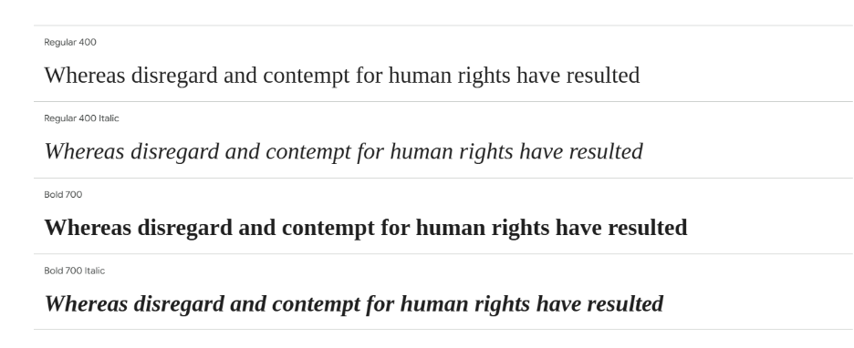
Tinos
Tinos offers a metric-compatible alternative to Times New Roman. It delivers a classic look with enhanced screen performance. Its sturdy forms and professional tone make it ideal for corporate sites, international non-governmental organizations (NGOs), and legal content where clarity and compatibility matter.
(Image source: Google Fonts)
How to pair fonts for maximum impact
Pairing fonts finds a balance between contrast and consistency that guides users through your content. Let’s look for some guidelines to help you create effective font combinations:
- Prioritize contrast, but don’t overdo it
- Match mood and tone
- Stick to two or three fonts max
- Use weight and style for hierarchy
- Test across screen sizes
Read for more details!
1. Prioritize contrast, but don’t overdo it
When pairing fonts, contrast helps define roles on the page. A serif headline paired with a sans-serif body text is a classic move, as it is clean, easy to read, and visually engaging. However, too much contrast (such as combining two wildly decorative fonts) can feel chaotic. Aim for balance.
Example: Playfair Display + Montserrat
Playfair brings traditional elegance, while Montserrat adds a modern, geometric feel. This combo works well for brands that want to mix legacy with innovation.
2. Match mood and tone
Fonts should share a similar energy. If your headline is bold and playful, a minimal, corporate-style body font might feel mismatched. Make sure both fonts align with your brand personality.
Example: Lora + Inter
Lora offers a soft, organic serif look, while Inter maintains a clean and versatile aesthetic. The result is a smart, accessible blend that works beautifully for content-heavy websites.
3. Stick to two or three fonts max
Using more than three fonts can clutter your layout and confuse users. Typically, one font is used for headings, one for body text, and possibly a third for accents or calls to action.
4. Use weight and style for hierarchy
Instead of introducing a whole new font, use different weights or styles within the same family to create variation. For example, using bold for headers and regular for body copy keeps things cohesive.
Example: Libre Baskerville + Poppins
Libre Baskerville’s refined serif presence gives structure to headings, while Poppins brings friendly clarity to body text. It’s a pairing that feels both traditional and contemporary.
5. Test across screen sizes
A pairing that looks great on a desktop might fall apart on mobile. Always test how fonts scale, space out, and interact across devices to ensure readability and consistency.
Best practices to make your fonts meet accessibility standards
While pairing fonts helps create visual hierarchy and reinforce brand tone, it’s equally important to ensure your typography meets accessibility standards. Here’s how to make your fonts accessible, inclusive, and user-friendly:
- Use appropriate font sizes. Readable font sizes are essential for both clarity and usability. Follow these recommended ranges:
- Paragraph text: 16–20px for optimal body readability across devices.
- Subheadings: 22–30px to create visual breaks and guide scanning.
- Main titles or headings: 30–70px, depending on design and emphasis.
- Maintain optimal line height. A good line height improves text flow and reduces eye strain. Set your line height to 1.4–1.6x the font size. This ensures comfortable spacing between lines, especially important for long-form content or mobile reading.
- Adjust letter spacing for uppercase text. Uppercase letters can feel cramped and harder to read. Slightly increase letter spacing when using all caps for headings, buttons, or calls to action to enhances legibility and prevents visual fatigue.
- Prioritize strong color contrast. Ensure there’s sufficient contrast between text and background colors. Tools like WebAIM Contrast Checker or Contrast Ratio can help you with testing your combinations. For accessible design:
- Aim for a contrast ratio of at least 4.5:1 for normal text.
- For larger text (above 18pt or 14pt bold), a minimum of 3:1 is acceptable.
- This ensures your content is readable by users with low vision, color blindness, or glare-prone screens.
- Choose fonts with clear letterforms. Avoid fonts where characters like “l” (lowercase L), “I” (uppercase i), and “1” (one) look similar. Fonts with distinct, open shapes and apparent differences between characters are better for all users, particularly those with dyslexia or visual impairments. Look for fonts specifically designed for accessibility, such as Lexend, or those with strong clarity across weights and styles.
- Test across devices and browsers. Even accessible fonts can behave differently across platforms. Always preview your typography on desktop, tablet, and mobile. Check rendering in multiple browsers and operating systems. Adjust spacing, line height, and size as needed to maintain consistency.
Choose your font and build your site
Fonts decorate your website and shape how people experience it. The best fonts in 2025 strike a balance between function and style. They support readability, express your brand voice, and adapt smoothly across devices.
The best way to find the right font is to try it out in a real design. Start creating a site and see how different typefaces look and feel on your actual pages. You can try our AI Website Builder and start building a site with no design experience needed. It offers a variety of fonts for you to choose from that complement your brand.
Use this guide as a starting point, then experiment, test, and fine-tune your typography. Good font choices can make your content clearer, your design stronger, and your brand more memorable.
Frequently asked questions
There’s no single “best” font for every website — it depends on your brand style, audience, and content type. Popular, versatile choices include Open Sans, Roboto, and Poppins, which are clean, modern, and widely supported across devices.
Sans-serif fonts, such as Arial, Inter, or Roboto, are considered the easiest to read on screens. These fonts feature simple letterforms that remain clear at various sizes and resolutions, enhancing the overall user experience.
Professional web designs often use fonts that strike a balance between readability and a polished aesthetic. Fonts such as Helvetica Neue, Georgia, or Montserrat are commonly used because they convey a modern and sophisticated look and work well for both headings and body text.
Start by identifying your brand’s personality — modern, elegant, playful, or minimalist. Then, select 1–2 fonts that reflect that tone, test them for readability, and ensure they meet accessibility standards (like proper contrast and legibility on all devices). Tools like Google Fonts and Adobe Fonts can help you easily explore and test options.
