Key takeaways:
- Strong brand identity shapes how your audience sees, hears, and remembers your brand across every interaction.
- Great brand identity examples show how design, tone, and values work together. This combination helps a brand become easier to recognize and trust.
- Looking at real brands can help you build your own identity, especially when you want your visuals to reflect a clear story and a strong purpose.
If your brand keeps getting ignored, the issue isn’t the product. It’s the way you present it. Weak visuals. Mixed messages. Cluttered design. All of these can push people away before you even get a shot to speak.
In this article, we’ll show you strong brand identity examples from companies that nailed clarity and earned real recognition. You’ll see how visual elements, brand values, and personality work together to leave a strong mark. These brands stood out, stuck around, and built loyalty that lasts. Use their moves to build a brand that clicks and delivers.
To make better sense of the examples ahead, it’s worth understanding what brand identity really means.
What is brand identity?
Brand identity is how a business chooses to present itself in the world. It’s built from visual elements like your logo, color palette, and typography, combined with tone of voice, storytelling, and design decisions.
When all these pieces work together, you get a strong identity that:
- Communicates your brand’s personality
- Reflects your brand values
- Connects with your target audience
- Becomes instantly recognizable across every touchpoint
Align your visuals and messaging for your brand to feel clear, consistent, and real.
Brand identity vs brand image vs visual identity
Before we go further, let’s clear up a common misconception. People often mistake brand identity, brand image, and visual identity for one another, but they’re not the same thing. Here’s how they differ:
| Concept | What it means |
| Brand identity | How you want people to see your brand—your visuals, tone, and strategy |
| Brand image | How people actually perceive your brand |
| Visual identity | The design side—your color palette, fonts, layout, and imagery |
Now let’s break each one down to see the role each one plays.
Brand identity
Brand identity is the intentional personality of your brand. It’s the complete image you build and share with the world. It brings together different elements to build a consistent and memorable presence. This includes your visuals (logo, colors, typography), your messaging and tone of voice, and the core values that guide your mission. Essentially, brand identity is the sum of all the ways you present yourself to your audience.
Brand image
This is how your audience truly sees your brand. It’s the public’s impression, shaped by their direct experiences with your product or service, what they hear from others (word-of-mouth), and how well your brand’s messaging matches up with reality. Unlike brand identity, which is what you create, brand image is the reputation you earn.
Visual identity
The full visual expression of your brand is the visual identity. It’s the “look and feel” that makes your brand instantly recognizable. This includes your logo, color palette, typography (fonts), and all other design elements used consistently across your website, marketing materials, and products. It’s the key to creating a strong, memorable visual presence.
Together, these three fuel how people see, remember, and trust your brand.
What strong brand identity looks like
Strong branding doesn’t happen by accident. The best brands connect through every visual, word, and feeling. Here’s what sets them apart from the rest:
| Element | What it does |
| Visual elements | Create a brand feel that’s consistent across touchpoints |
| Color palette | Triggers recognition and sets emotional tone |
| Typography | Carries personality and ties everything together |
| Brand’s personality | Helps customers connect with what you stand for |
| Brand values | Make your story feel real and relevant |
| Voice and messaging | Builds trust and loyalty through tone and clarity |
| Packaging | Extends your visual identity into the real world |
| Target audience | Guides design and communication decisions |
| Good design | Keeps your identity sharp, readable, and professional |
| Instantly recognizable | Makes your brand hard to ignore and easy to remember |
Want a brand identity that connects and converts? Our Pro Services team can help you build a look and voice your audience will remember.
15 best brand identity examples
A strong brand identity makes your business memorable, relatable, and trustworthy. It goes beyond a logo or catchy tagline. The way it looks, sounds, and feels is what counts.
To inspire your own brand strategy, here are 15 US-based brands setting the standard. These companies span legacy giants, bold newcomers, and niche disruptors. Each has a clear identity that you instantly recognize.
- Nike
- Apple
- Starbucks
- Coca-cola
- McDonalds
- Airbnb
- Patagonia
- Levi’s
- Warby Parker
- Glossier
- Bumble
- Hydro Flask
- United Sodas of America
- Boy Smells
- Casper
1. Nike: Empowerment through motion
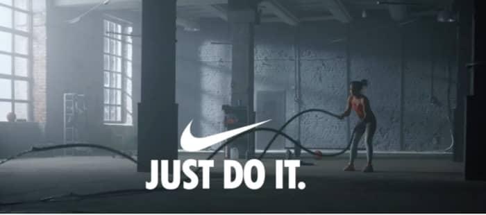
The Nike story began in 1964 under the name Blue Ribbon Sports, selling running shoes trackside and from the back of a car. Seven years later, the brand adopted the name of the Greek goddess of victory and unveiled the now-iconic Swoosh, a symbol of speed and motion. By 1988, “Just Do It” had become its rallying cry that urged the world to stop hesitating and start moving.
This is Nike in action:
- Visual identity. Swoosh, bold typography, and sharp black-and-white color scheme that gives Nike a strong visual identity
- Voice. Motivated, confident, and all about pushing performance
Why it works: Nike stands out as one of the top brand identity examples because its message runs deeper than design. The brand is rooted in empowering individuals, and that idea shows up not only in packaging but also in social media, ads, partnerships, and even product design.
2. Apple: Simplicity that speaks volumes
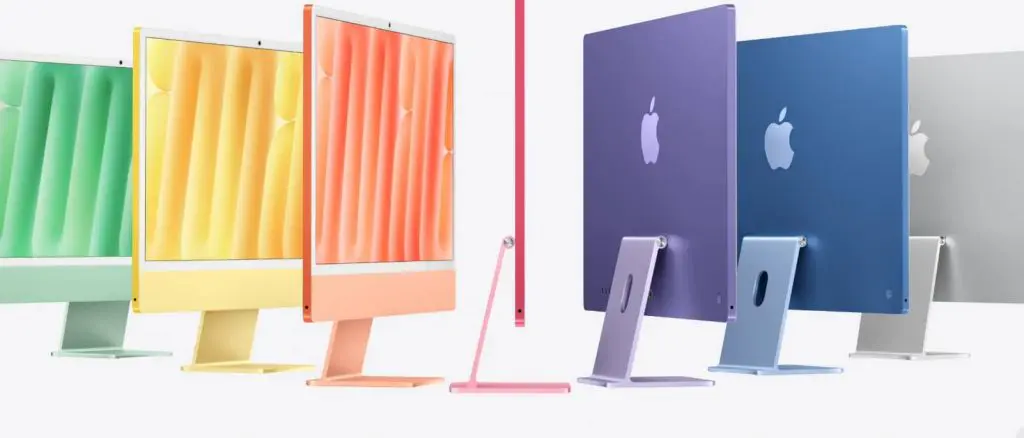
Apple started in 1976 when Steve Jobs, Steve Wozniak, and Ronald Wayne built the first Apple computer in a California garage. Their goal was to make technology small enough and simple enough for people to use at home or work. That vision of simplicity and intuitive design still drives Apple today. You can see it in its clean packaging, smooth interfaces, and seamless device experience.
This is how Apple delivers:
- Visual identity. Sleek lines, a monochrome look, and a minimalist design approach that favors usability over extras
- Voice. Clear, calm, and grounded in purpose
Why it works: Apple places heavy emphasis on making every detail feel intentional. From retail stores to product launches, everything reflects one unified identity built on elegance and restraint.
3. Starbucks: A global brand with local warmth

Starbucks opened in 1971 as a small shop in Seattle’s Pike Place Market, selling fresh coffee beans and brewing gear. The founders named it after a Moby-Dick character, which inspired the siren in its logo. They designed it as a welcoming space between home and work, with details like cup design, store layout, and background music that create an inviting, familiar feel.
This is Starbucks’ identity at work:
- Visual identity. Earthy greens, the siren logo, and photography that highlights community and comfort
- Voice. Warm, approachable, and rooted in connection
Why it works: Starbucks feels familiar across locations because it keeps a consistent color palette and flexible visuals that adapt to local cultures while staying true to the brand.
4. Coca‑Cola: Refreshing the world with connection
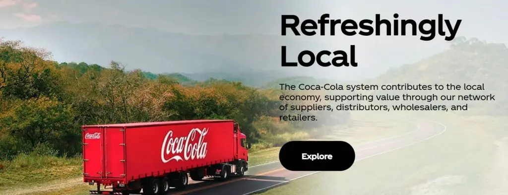
Coca-Cola debuted in 1886 at an Atlanta pharmacy, where its founder, Dr. John Pemberton, sold it for five cents a glass. What began as a small soda fountain drink grew into a global brand tied to joy, celebration, and everyday connection. Its red-and-white colors, Spencerian script logo, and contour bottle remain core to its identity.
This is how Coca‑Cola connects:
- Visual identity. Signature red and white color palette, flowing script logo, and classic bottle silhouette
- Voice: Warm, optimistic, and inclusive
Why it works: Coca‑Cola creates universal connection by reinforcing happiness and community in every ad or soda can. Its strong brand perception is shaped by consistent marketing efforts and a visual identity that’s simple yet iconic.
5. McDonald’s: Convenience with a friendly face
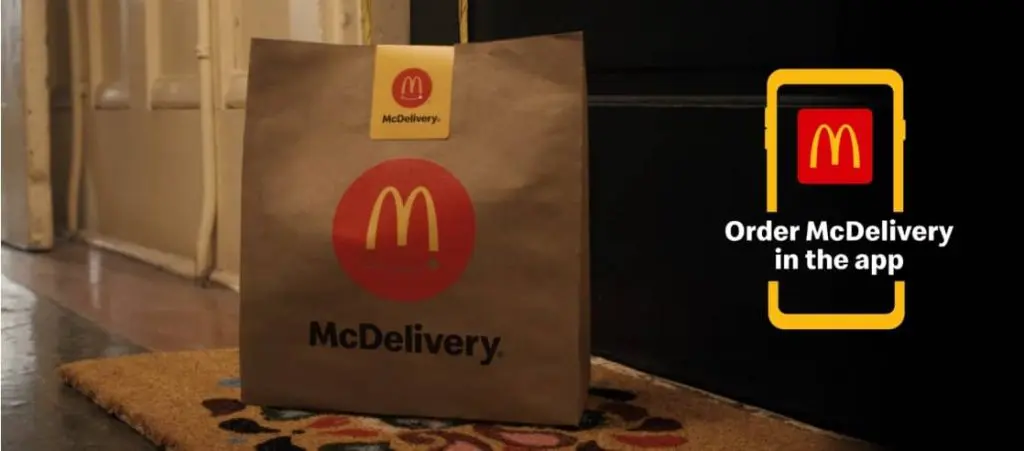
McDonald’s began in 1940 as a small drive-in owned and operated by brothers Richard and Maurice McDonald in San Bernardino, California. In 1955, Ray Kroc launched the first franchised McDonald’s and paved the way for its global growth. Today, its identity is tied to community, nostalgia, and bold, approachable visuals. The Golden Arches and red-and-yellow palette are recognized worldwide.
This is how McDonalds owns its voice:
- Visual identity. Bold red and yellow palette and iconic golden arches logo
- Voice. Friendly, energetic, and playful
Why it works: McDonald’s maintains a strong brand identity through consistent design and messaging that appeal to all ages. From Happy Meal characters to location aesthetics, it speaks directly to its customers and reinforces comfort and familiarity. Even its drive-thru visuals and packaging reflect a joyful, cohesive brand experience.
6. Airbnb: Built around belonging
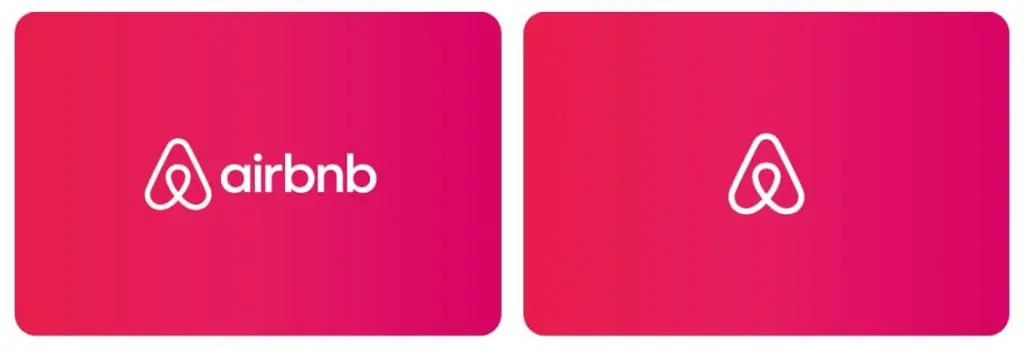
Airbnb began in 2008 when Brian Chesky and Joe Gebbia offered air mattresses in their San Francisco apartment to cover rent. That small idea grew into a global platform connecting millions of hosts and guests. Its brand centers on belonging, community, and trust, values reflected in the Bélo logo and the welcoming tone of every interaction.
This is how Airbnb feels like home:
- Visual identity. Friendly fonts, warm colors, and the unique logo known as the Bélo
- Voice. Honest, welcoming, and people-first
Why it works: Airbnb puts people at the center of the business. Every touchpoint, whether it’s the app or the logo, feels like an invitation. Its branding speaks directly to customers and focuses on shared experiences over transactions.
7. Patagonia: Activism woven into every thread
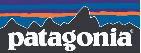
Patagonia’s story began in 1973, when Yvon Chouinard channeled his passion for climbing into a small, purpose-led business. It started out making gear for a close-knit community of climbers, then grew into a worldwide name in premium outdoor wear. At its core, the brand is driven by environmental activism, and that mission shows in every product, campaign, and initiative.
This is how Patagonia leads with purpose:
- Visual identity. Earthy shades, a strong mountain logo, and photography that mirrors the wild
- Voice. Honest, direct, and mission-first
Why it works: Patagonia backs up its values with action. Its visuals, products, and messaging all point to one mission—protecting the planet. That’s what makes the brand feel real and worth supporting.
8. Levi’s: Timeless American heritage
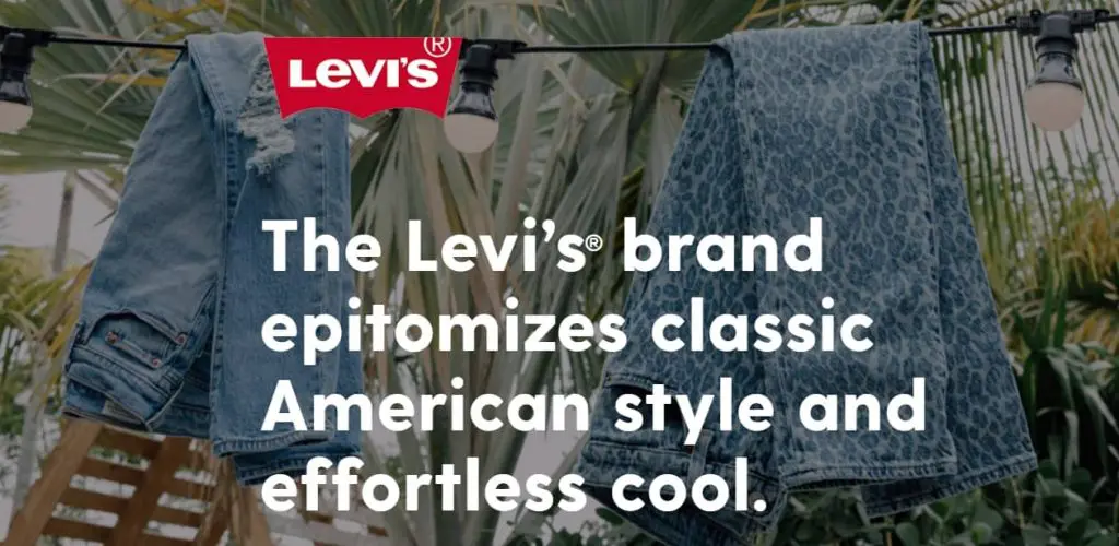
Levi’s began in 1873 when Levi Strauss and tailor Jacob Davis patented the first blue jeans using rivets for strength. Miners and workers wore them for their durability, and over time the rugged denim became a symbol of style and self-expression.
This is how Levi’s keeps its legacy alive:
- Visual identity. Classic typography, a deep red tab, and vintage-inspired visuals to reflect Levi’s long-standing heritage and Americana roots
- Voice. Down-to-earth, rugged, and inclusive that’s always tied to self-expression and everyday wear
Why it works: Levi’s brand identity blends premium quality with a respect for its roots in durable workwear. It adapts to new trends while keeping its heritage intact. This balance of authenticity and cultural relevance keeps its story going through strong, consistent visual storytelling.
9. Warby Parker: Modern style with a mission
Warby Parker began in 2010 with a simple goal: make stylish glasses affordable and easy to get. The business pairs function with fashion to prove that a purpose-driven brand can still look sharp. Its home try-on program and online-first approach disrupted the traditional eyewear market.
This is how Warby Parker makes purpose look stylish:
- Visual identity. Clean lines, calming blues, and plenty of white space create a sleek, minimalist look that matches Warby Parker’s product design
- Voice. Friendly, smart, and socially aware that’s clear with a touch of wit
Why it works: Warby Parker’s brand identity reflects accessibility and purpose. Its direct-to-consumer model and buy-one-give-one mission show that a values-led business can still look sharp. Across touchpoints, the brand uses sleek aesthetics and a straightforward tone that connects with Gen Z.
10. Glossier: Beauty powered by community
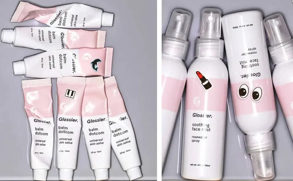
Glossier began in 2014 as a spin-off from Emily Weiss’s beauty blog, Into The Gloss. The brand was built on the idea of celebrating real people and their routines, not celebrity endorsements. Everything starts with the customer. Their feedback guides product development and the overall experience.
This is how Glossier keeps it real and relatable:
- Visual identity. Soft pinks, clean fonts, and user-generated visuals
- Voice. Friendly, casual, and inclusive
Why it works: Glossier’s identity feels approachable and modern. From packaging to product names, every choice reflects its focus on everyday beauty and direct connection with its audience.
11. Bumble: Designed to take the first move
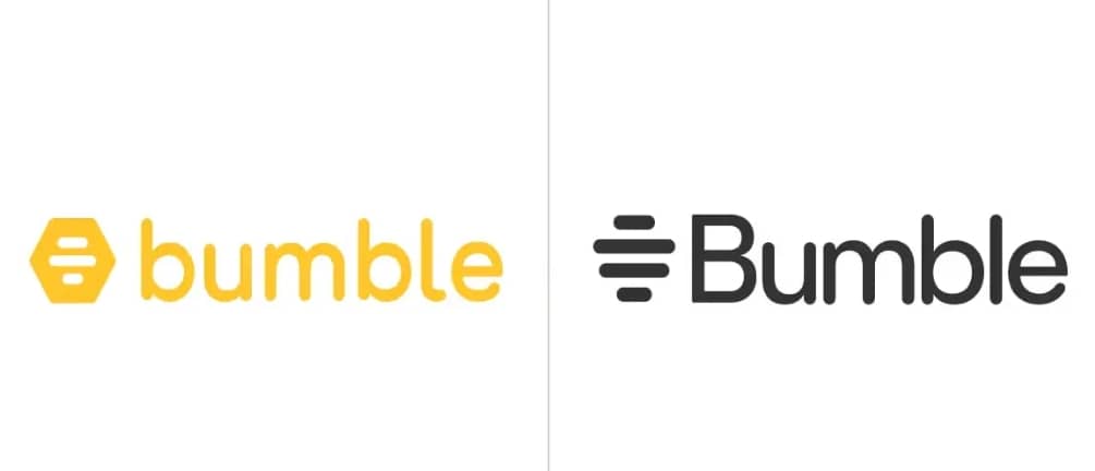
Bumble launched in 2014. It was founded by Whitney Wolfe Herd to create a dating app where women make the first move. The idea was to build a safer, more respectful space for forming connections. Its branding is bold and modern—rooted in confidence, equality, and genuine connection.
This is how Bumble merges tech with intention:
- Visual identity. Bright yellow palette, hexagonal icon, and bold type
- Voice. Empowering, upbeat, and inclusive
Why it works: Everything about Bumble reinforces control and positivity. Its UI design, messaging, and overall tone all work together to make the brand feel intentional. The result is a dating app that feels safe, modern, and easy to trust.
12. Hydro Flask: Color meets utility

Hydro Flask was founded in 2009 in Bend, Oregon, by Travis Rosbach and Cindy Morse. They wanted a reusable bottle that kept drinks hot or cold for hours. That idea grew into a lifestyle brand tied to movement, nature, and bold self-expression.
This is how Hydro Flask brings self-expression to hydration:
- Visual identity: Bright color options, clean logo, and fluid shape
- Voice: Playful, active, and outdoorsy
Why it works: Hydro Flask blends function with personality. Every bottle feels personal that fits not only for hikes, but also in hallways, and everything in between.
13. United Sodas of America: Fun, flat, and future-forward
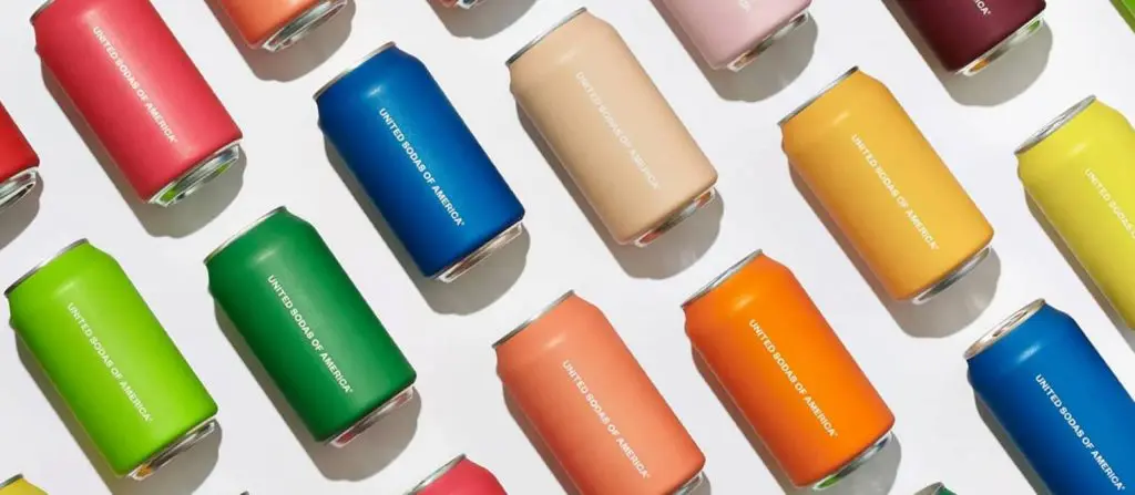
United Sodas launched in 2020 with the goal of reimagining soda for a new generation. The founders set out to create better-for-you drinks with bold, modern design and nostalgic appeal. Its visual identity is bright and playful that’s made to stand out both on shelves and in hand.
This is how United Sodas mixes flavor with flair:
- Visual identity. Matte-finish cans, gradient colors, and clean layout
- Voice. Smart, cheeky, and contemporary
Why it works: The branding feels fresh without being try-hard. It plays with design trends while staying true to its soda-shop-meets-startup concept.
14. Boy Smells: Subtle and subversive

Boy Smells was founded in 2015 in Los Angeles by Matthew Herman and David Kien. They started in their kitchen, mixing scents that blend masculine and feminine notes. Today, the brand challenges fragrance norms with bold packaging and inclusive language that embraces contradictions with confidence.
This is how Boy Smells builds identity through contrast.
- Visual identity. Blush pink labels, serif fonts, and matte black jars
- Voice. Playful, unapologetic, and poetic
Why it works: Boy Smells blurs the line between masculine and feminine. The visual system reflects that fluidity and makes the brand impossible to ignore.
15. Casper: Comfort at first sight
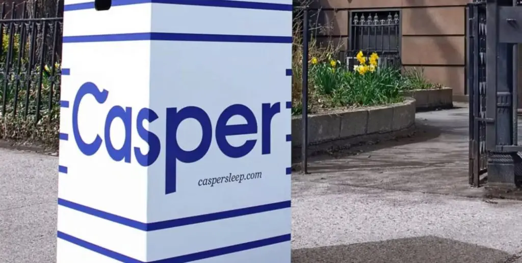
Casper launched in 2014 to change the way people buy mattresses. Instead of showroom visits, it let customers order online and have a mattress arrive at their door. Its branding turned a once-boring product into a modern essential people were excited to share.
This is how Casper brings calm into branding:
- Visual identity. Calming blues, rounded typography, and clean layout
- Voice. Light, helpful, and conversational
Why it works: Casper keeps things simple and serene. The branding delivers on a simple yet powerful promise that aligns with the product: better sleep with zero stress.
How to craft a visual identity that fits your brand story
Design trends fade. Logos change. But a brand identity that fits the message and shows up consistently is what makes people notice and remember. Here’s how to develop one that connects:
- Know what you’re here to do
- Understand who you’re talking to
- Lock in your visual style
- Write like a human
- Stay consistent, everywhere
Know what you’re here to do
Every brand starts with a reason to exist. What do you believe in? What problem are you solving? Before picking colors or writing taglines, anchor everything to your mission, values, and the people you serve.
Pro tip: Write a one-sentence mission, vision, and values set. If it doesn’t feel honest or clear, start over.
Understand who you’re talking to
Good branding sounds and looks like it was made for someone specific. Who is that person? What do they care about? Know your audience like you’ve seen their wish list and their favorite saves.
Lock in your visual style
Your logo, colors, fonts, and imagery should speak the same language. Pick a palette with intention. Stick to 1–2 fonts. Use visuals that reflect your brand’s vibe, whether it’s rugged, refined, or refreshingly weird.
Write like a human
Your brand voice should feel real, not scripted. Speak like you’re talking to a friend in a clear, approachable, and confident tone. Every message, from your homepage to your emails and receipts, should carry the same personality, as if one trusted voice is behind it all.
Stay consistent, everywhere
A standout brand identity goes beyond a bold logo or catchy slogan. When every element—from the design of your packaging to the specific language in your messaging—works together seamlessly, your brand becomes instantly recognizable. As shown in the examples in the list above.
This kind of consistency at every customer touchpoint builds familiarity, which ultimately turns into trust.
Create a brand identity that lives up to your business’ core values
Design gets the first glance. Voice and values earn the second. A clear identity earns loyalty. Whether you’re just starting out or refining your look, it helps to study real examples of branding to tell the story of your brand—and build its own brand identity.
Need help with your brand visuals? Our Pro Services team can help you design your logo, choose the right colors, and create a look that matches your brand’s full potential.
Prefer to do it yourself? Use our Website Builder to launch your brand with visuals, content, and structure all in one place.
Frequently asked questions
A brand identity example is a business that’s instantly recognizable through its cohesive visuals and messaging.
Consider Nike. Their brand identity is a masterclass in consistency. The Swoosh logo, the powerful slogan “Just Do It,” and their confident, action-oriented voice all work together to convey a single message: motivation. This clear identity, reinforced by athlete partnerships and bold marketing, makes the brand instantly recognizable and memorable to its audience
Brand identity defines how people recognize and connect with your business. When your visuals, voice, and values stay consistent, it reinforces credibility, sets you apart in a crowded market, and helps turn first-time buyers into loyal customers.
When brand image and identity align, your business sends a clear and consistent message. It helps customers see what your brand stands for, builds real emotional connection, and makes your marketing more genuine and effective. This alignment also sharpens internal focus and strengthens long-term loyalty.