
Key takeaways:
- Fonts influence your website’s readability, brand perception, and user experience, guiding visitors through your content with ease.
- Typeface, fonts, and font style are different, though they’re often used interchangeably. A typeface is the overall design of characters, a font is a specific variation of that typeface, and font style refers to changes like bold, italic, or underline applied to a font.
- To choose a font for your website, focus on readability and ensure it reflects your brand’s personality. Stick to a maximum of three fonts to maintain a clean, cohesive design.
So, you’re building your website. You’ve nailed your domain name, picked a layout you love, and maybe even added a photo to the About page. But now you’re stuck on one tiny-looking but surprisingly big question:
What font should I use for my website?
It might not seem like a major decision, but just like the rest of your web design, your font choice says a lot. It affects how people feel about your brand before they even read your content. And yes—it absolutely impacts whether they stay or click away.
Let’s walk through how to choose the perfect font for your website.
Why fonts matter to your website
The right font can make your site feel professional, approachable, modern—or all three. The wrong font? Well, it can turn people off faster than a pop-up ad with no close button.
Think of your font as your brand’s voice. It should match your tone. A law firm probably won’t use bubble letters. A wedding photographer’s site might feel stiff with a font that looks like a government form.
Even Steve Jobs thought typography was powerful when he audited a calligraphy class and later credited it for the Mac’s design. Fonts matter more than most people realize.
Font vs. font style vs. typeface: What’s the difference
Before you pick a font, it helps you to know the difference between a font, font style and a typeface.
| Feature | Typeface | Font | Font style |
| Definition | A family of fonts with shared design | A specific version of a typeface, including weight, size, and style | A variation in appearance, like bold or italic |
| Example | Roboto, Times New Roman, Georgia | Roboto Regular 12px, Arial Bold 14px | Roboto Bold, Arial Italic, Georgia Regular |
| Purpose | Sets the overall tone and design | Defines the specific look (weight, size, style) | Adds emphasis or hierarchy |
| Used for | Branding, tone, and style | Applying a specific weight, size, or style to the typeface | Structuring content (headings, body text, etc.) |
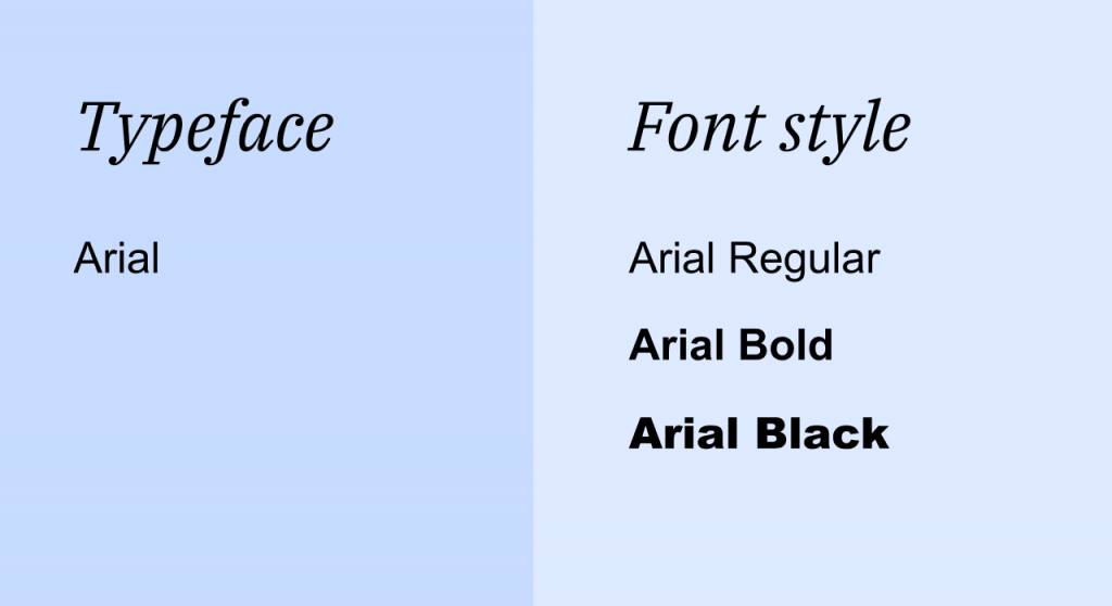
What is a typeface
A typeface is the overall design of letters, numbers, and symbols that share similar features. It represents the general look and feel of the text, and it includes various fonts that fall under the same category.
For example, “Arial” is a typeface. It includes fonts like Arial Regular, Arial Bold, and Arial Italic. Each of these is a specific version of the Arial typeface with different attributes.
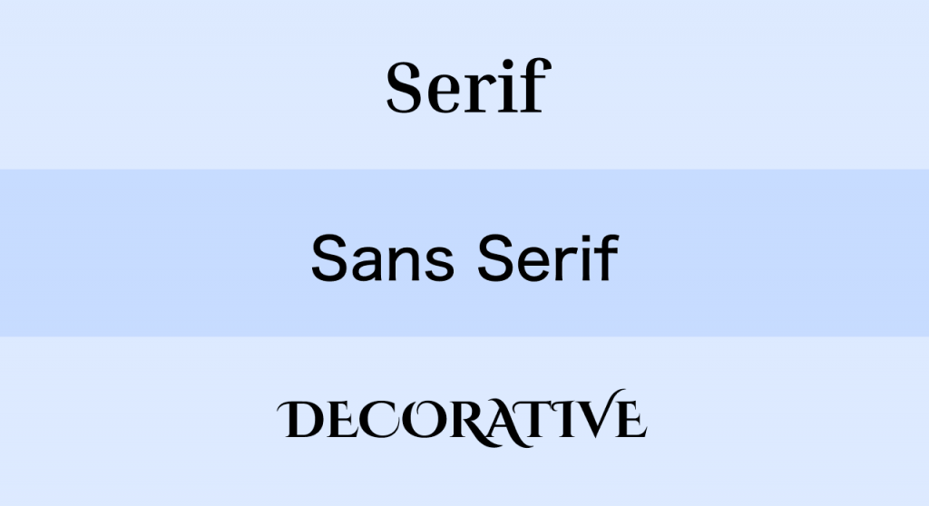
Here are the major typeface categories you’ll come across:
- Serif fonts. These have little “tails” or “serifs” that are decorative strokes at the ends of letters. They feel classic, trustworthy, and a little more formal. Great for blogs, editorial-style websites, or professional services.
- Sans-serif fonts. No tails here—just clean lines and a modern feel. After all “sans” means without so “sans-serif” means no tails. Great for tech companies, startups, portfolios—anything that needs a clean, minimal look.
- Script or decorative fonts. These are usually cursive fonts that mimic handwriting or add flair. They’re fun—but best used sparingly. Great for logos, headers, or small accent areas. Not ideal for long paragraphs.
What is a font
A font refers to a specific variation of a typeface, including the weight, size, and style of the text. It’s the actual instance of a typeface that you use in your design.
So, if Arial is a typeface, then Arial Bold 14px or Arial Regular 12px are fonts. The difference between them lies in the weight (bold vs regular), size (14px vs 12px), and other variations.
What is a font style
A font style is a modification of a font to change its appearance. This includes variations like bold, italic, underline, and other changes that help create emphasis or hierarchy in your text.
Back to our previous samples, if you start with Arial Regular, you can make it Arial Bold or Arial Italic to highlight text or make it stand out. The font style doesn’t change the base typeface but alters the visual weight or slant of the text.
Why this matters: Although they’re subtle, understanding the difference between typeface, font, and font style helps you make more informed decisions about your website’s design. It allows you to pick fonts that match your brand’s personality, ensure readability across devices, and maintain a consistent design that enhances the user experience.
How do I choose a font for my website?
Here’s your step-by-step guide to picking a font that won’t just look good, but will actually help your site perform better:
- Keep it readable
- Match your brand’s vibe
- Choose no more than 2-3 fonts
- Stick with web-safe or Google fonts
- Test it on mobile
Keep it readable
If people can’t read your content, they won’t stick around. A readable font improves user experience, keeps visitors engaged, and encourages them to explore your website more. Here’s some helpful tips to keep in mind:
- Prioritize legibility. Avoid overly intricate fonts like scripts or handwritten styles for body text. They might look cool, but they’re harder to read in longer paragraphs. Save them for small headings or accents.
- Focus on size. Make sure your body text is large enough to read easily—at least 16px for most websites. Smaller text may seem stylish but can frustrate readers, especially on mobile devices.
- Line spacing is key. Ensure your line height is set to around 1.4 to 1.6x the font size. This gives text enough breathing room, improving readability.
- Consider your letter spacing (kerning). For fonts like sans-serifs, make sure the letters are spaced well. Too tight, and words may appear like a jumbled mess. Too wide, and they lose their flow.
Match your brand’s vibe
Different font styles convey different moods, so matching the right font to your brand personality can elevate your overall design. Are you bold and modern? Calm and cozy? Traditional and polished? Your font should reflect that. For example, is your web design:
- Minimalist? Try Lato or Montserrat.
- Creative? Try Raleway with a bit of personality.
- Formal? Go classic with Merriweather or Playfair Display.
Be sure to use the same font throughout your website to maintain consistency. This avoids a cluttered, chaotic look. Plus, your branding is consistent.
Then, consider your audience. Think about who will be reading your content. If your audience is older or less tech-savvy, choose fonts that are easy to read. A younger, more design-conscious audience might appreciate a more artistic typeface.
Choose no more than 2–3 fonts
One main font for headings, one body font for content, and an optional accent font. Too many fonts can feel chaotic and unprofessional.
Also, choose fonts that complement each other. For example, pair a serif font for headings, which are more structured, with a sans-serif font for body text, which tends to feel more neutral and cleaner.
Stick with web-safe or Google Fonts
Web-safe fonts are readable across devices, designed to be compatible with all devices regardless of the browser or operating system. Google Fonts and Adobe Fonts are both modern, usually free (in the case of Google Fonts) and optimized for the web, so they’re great choices for both style and functionality.
Just a few helpful tips:
- Web-safe fonts (like Arial and Verdana) are universally supported and won’t break your design, but they can sometimes look a little plain or outdated.
- On the other hand, custom fonts can make your site look unique, but they may slow down your page load time and cause display issues on different devices. If you use custom fonts, ensure they’re optimized for the web.
Test it on mobile
Your font might look great on a laptop and awkward on a phone. And with a forecasted 1.8 billion mobile internet users by 2029 globally, it’s best to always test across devices before locking it in.
To help test your font’s mobile-responsiveness, here’s a few points you might want to keep in mind:
- Look for responsive designs. Ensure your font resizes appropriately on mobile devices. Mobile-friendly fonts should maintain readability without being too small or too large.
- Test across devices. Always preview your website on different screen sizes (mobile, tablet, desktop) to make sure your fonts are legible.
- Use Cascading Style Sheets (CSS) media queries. For advanced users, use media queries to adjust font sizes or styles depending on the screen size, ensuring a seamless experience for all users.
15 fonts to choose for your website
Explore some of the best fonts you can use for your website. These 15 fonts were handpicked from popular typefaces and font families that cater to different styles, from sleek and modern to traditional and elegant.
- Roboto
- Lora
- Open Sans
- Montserrat
- Merriweather
- Playfair Display
- Poppins
- Georgia
- Source Sans Pro
- Raleway
- Cinzel
- Futura
- Quicksand
- Avenir Next
- Pacifico
1. Roboto (Sans-serif)
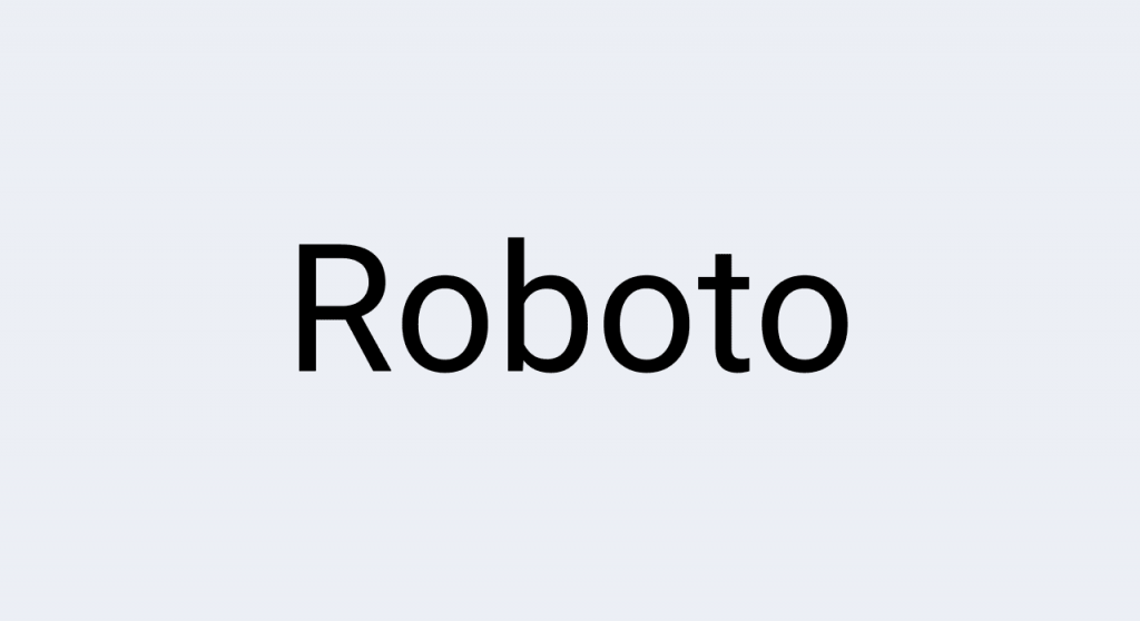
One of the most popular sans-serif fonts, Roboto is clean, modern, and extremely versatile. Its balanced design works well for both headings and body text.
Best for: Startups, portfolios, blogs, tech sites
2. Lora (Serif)
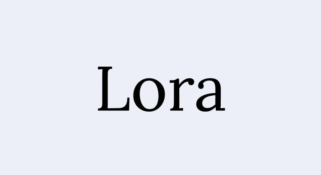
A classic serif font that feels refined yet approachable. Lora has a timeless appeal with excellent readability, making it perfect for editorial content or professional sites.
Best for: Blogs, news sites, and literary websites
3. Open Sans (Sans-serif)

Another incredibly popular font, Open Sans offers exceptional legibility. It’s friendly and neutral, making it a safe and easy choice for almost any website.
Best for: Blogs, eCommerce, and service-based sites
4. Montserrat (Sans-serif)
A bold, contemporary sans-serif font that brings a modern, city-like feel to your site. Montserrat has geometric styling and makes an impactful statement in headings.
Best for: Startups, portfolios, creative agencies
5. Merriweather (Serif)

This serif font is modern but with a traditional feel, making it perfect for websites that need to exude professionalism while staying readable.
Best for: News websites, articles, and professional services
6. Playfair Display (Serif)
Elegant and sophisticated, Playfair Display is ideal for websites that require a touch of class. This font pairs well with more neutral body fonts for a high-end aesthetic.
Best for: Fashion, photography sites, and luxury brands
7. Poppins (Sans-serif)
Poppins is a geometric sans-serif font with rounded edges, giving it a friendly, modern feel. It’s well-suited for a clean and youthful design.
Best for: Tech startups, creative agencies, and design portfolios
8. Georgia (Serif)

Georgia is a classic web-safe serif typeface that’s known for its readability on screens. It’s a great font for people who need a professional look with a touch of personality.
Best for: Blogs, news sites, and professional websites
9. Source Sans Pro (Sans-serif)

This font is clean and easy to read, and it’s designed specifically for user interfaces, which makes it perfect for websites that require easy navigation and clarity.
Best for: eCommerce, tech sites, and SaaS platforms
10. Raleway (Sans-serif)
A clean and elegant sans-serif typeface, Raleway is a bit more sophisticated and works beautifully for headings or logo design. It offers both a modern and timeless appeal.
Best for: Corporate websites, creative portfolios, high-end brands
11. Cinzel (Serif)
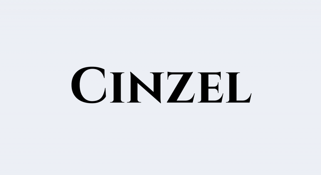
A bold, serif font that evokes a sense of grandeur and history. Cinzel is excellent for making statements with large headings or creating a strong brand identity.
Best for: Luxury products, restaurants, and event websites
12. Futura (Sans-serif)

A geometric sans-serif that has a modern, almost futuristic vibe. Futura works well for companies or brands that want to appear forward-thinking.
Best for: Tech brands, product-based sites, and modern startups
13. Quicksand (Sans-serif)

A rounded sans-serif font that’s soft and approachable. Quicksand is great for websites that want to maintain a friendly, welcoming vibe.
Best for: Children’s websites, personal blogs, or non-profits
14. Avenir Next (Sans-serif)
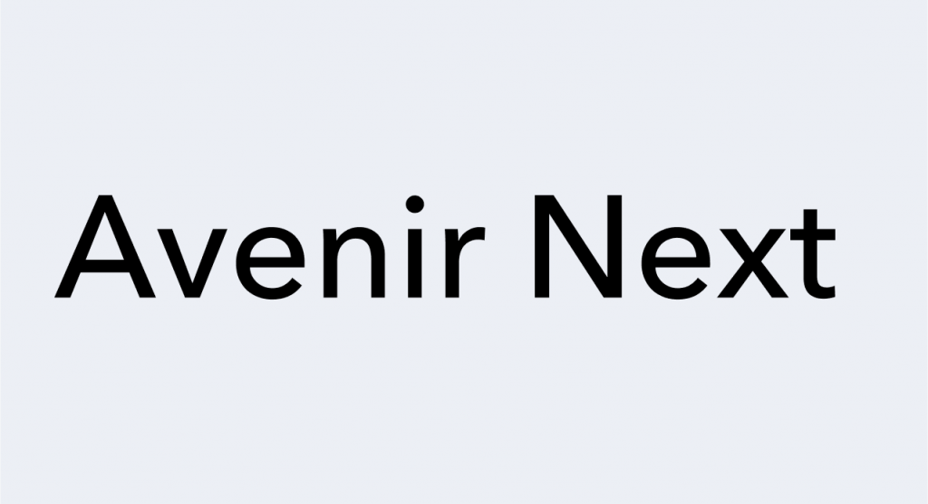
A modern and sleek sans-serif font that balances style with legibility, perfect for tech, corporate, and design-focused websites looking for a contemporary feel.
Best for: Blogs, tech websites and design portfolios
15. Pacifico (Script)
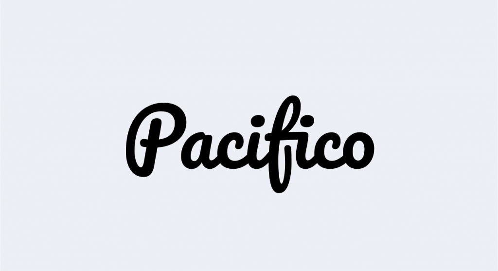
If you’re looking for a script font, Pacifico is a friendly, flowing option. It adds a personal, handwritten touch to your design.
Best for: Branding, creative portfolios, and personal blogs
How to pair fonts and create visual hierarchy
When fonts work well together, they create a visual hierarchy—this means readers can easily understand what to focus on first, what’s important, and how the content flows.
For example, larger fonts or bold text are often used for headings to grab attention, while smaller text is used for body content so it doesn’t compete for focus. By using different font sizes, weights, and spacing, you can show users what they should look at first, second, and so on.
In this web page, the important information is in bold and larger sizes. Meanwhile, supplementary information is smaller and thinner. Your eyes are drawn to the bigger letters before noticing the smaller ones.
Font pairing also helps create clear distinctions between different types of content, guiding the reader’s eye and making the information easier to digest. On the sample website template, the buttons’ font is different from the headers and the body for visual emphasis.
Here are some best practices to remember when pairing fonts:
- Don’t let fonts clash. If your heading font is bold or unique, pair it with a clean and neutral font for the body text. You don’t want your readers to get distracted by too many competing styles.
- Maintain consistency. Stick to no more than three fonts: a primary font (headings), secondary font (body text), and tertiary font (emphasis). Using more than that can make your website feel chaotic and disorganized.
- Complement, don’t compete. Make sure your fonts complement each other. Serif fonts often pair well with sans-serif fonts, as they balance formality with modernity. For example, Playfair Display (serif) pairs well with Open Sans (sans-serif), combining elegance and readability.
- Consider font pairing tools. Use online tools like Google Font Pairings to help you find fonts that work well together.
Fonts, accessibility, and mobile readability
Fonts don’t just need to look nice—they need to be accessible. That means they should be readable for everyone, including people with low vision or reading difficulties.
Make sure your font:
- Is at least 16px for body text
- Has high contrast
- Uses enough spacing between lines and letters
- Looks good on phones, tablets, and desktops
Accessible fonts are easier to read for everyone, and better readability means more time spent on your site. It also helps to pair your font with a good web interface and the right color scheme. Having accessible fonts while using the wrong palette may still end up with a website that’s difficult to read.
Common font mistakes to avoid
Let’s go over some common font-related missteps that can hurt your design and your user experience.
- Using too many fonts
- Choosing style over readability
- Picking a thin or light font that’s hard to see
- Forgetting to test on mobile
- Using decorative fonts for body text
- Loading custom fonts that slow down your website
If in doubt, go simple and modern. It’s hard to go wrong with fonts like Open Sans, Roboto, Lato, or Georgia.
Quick checklist: Pick the right font for your website
Here’s a quick recap to make font selection easier:
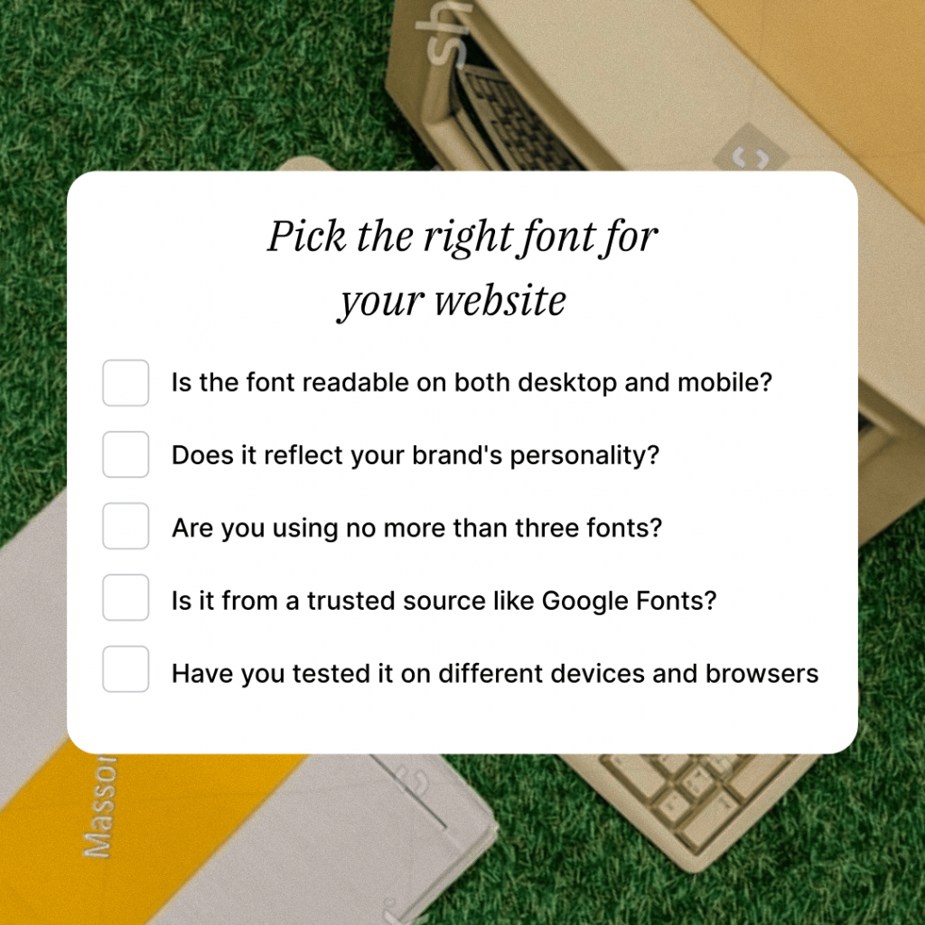
- Is the font readable on both desktop and mobile?
- Does it reflect your brand’s personality?
- Are you using no more than three fonts?
- Is it from a trusted source like Google Fonts?
- Have you tested it on different devices and browsers?
If you’re confident in your answers, you’re likely on the right track. You’re soon ready to publish your website.
Choose the perfect font for your site
Fonts might feel like a small detail when you’re building a website, but they shape the way people experience your content. The right font can help you connect with your visitors, build trust, and make your site feel like it was built with care.
So take a few minutes to choose fonts that work well together, reflect your style, and make reading easy. And if you’d rather not do it alone, use a reliable website builder like Network Solutions that lets you preview fonts, pair them easily, and make changes as you go.
Frequently asked questions
Pick something that’s easy to read and fits your brand style. Fonts like Open Sans, Roboto, and Lato are popular because they look good on almost any site.
A strong heading font paired with a simple body font works best. Try Montserrat for headers and Source Sans Pro or Arial for the body.
Think about your brand personality—friendly, formal, creative, minimal—and find fonts that align with it. Tools like Google Fonts allow you to browse by mood or category.
Web-safe and Google Fonts are safer because they load fast and display well on all browsers. Custom fonts can add style, but they require more setup and can slow things down.
Stick to three fonts: one for headings, one for body text, and one for accents. This keeps your design balanced and readable.