Key takeaways:
- Choosing the right fonts improves both the design and readability of your content.
- Proper implementation of Cascading Style Sheets (CSS) and web fonts ensures consistent display across devices and browsers.
- Following best practices for accessibility and responsiveness prevents font rendering issues and enhances user experience.
HTML fonts play an important role in how content is presented and perceived by visitors. Aside from being an aesthetic decision, they also make your content readable, accessible to all users, and aligned with your brand.
This article will delve into the different ways to use and manage fonts in HTML, including methods of styling text and the impact of these choices on user experience.
What are HTML fonts?
An HTML font refers to the style, weight, and size of a webpage’s text. It’s how characters and text elements like headings, paragraphs, and links appear on your screen. This is made possible by using CSS, where you can set the font family, size, weight, and style for text elements.
System fonts vs web fonts
System fonts are the pre-installed fonts on your device and include basic fonts like Arial, Times New Roman, and Courier. These fonts are universally available but may limit your design options. One advantage is that they load quickly because they’re already on your computer.
Web fonts, on the other hand, are fonts that aren’t installed on your device but are loaded from external servers. With web fonts, you have plenty of design possibilities, which means they do not restrict you to basic system fonts.
These are the types of fonts to familiarize with when it comes to HTML:
- Web-safe fonts. These are fonts commonly installed in all major operating systems like Microsoft Windows and macOS, and devices. Web-safe fonts include Arial, Verdana, and Georgia. Since they’re on most systems, your text displays consistently across different platforms.
- Google Fonts. Google Fonts is a popular, free-to-use collection of web fonts that you can easily integrate into your website. It provides a vast selection of fonts optimized for web usage to ensure fast load times. It has over 1,000 fonts available.
- Custom fonts. Custom fonts allow you to use unique typefaces that reflect your brand identity. These fonts can be loaded from your own server or from a third-party service like Adobe Fonts. While custom fonts can enhance your site’s aesthetic, they may impact load times, so it’s important to choose them wisely and optimize them for the web.
Popular HTML font families
There are different HTML font families available, each offering distinct advantages depending on your design needs. Below is an overview of popular font families that can help you achieve the most suitable font for your site.
Common web-safe fonts
Web-safe fonts are those that are commonly available across most devices and operating systems. These fonts are reliable because they ensure a consistent appearance on different browsers and platforms without any extra loading time.
- Arial (sans-serif)
- Verdana (sans-serif)
- Tahoma (sans-serif)
- Trebuchet MS (sans-serif)
- Times New Roman (serif)
- Georgia (serif)
- Garamond (serif)
- Courier New (monospace)
- Brush Script MT (cursive)
Let’s describe them below with previews of how they look on screen.
1. Arial (sans-serif): A widely used sans-serif font that’s clean and easy to read. Best for body text and general website content.

2. Verdana (sans-serif): Known for its large x-height, Verdana is great for readability on screens. It’s ideal for body text, especially in smaller sizes.

3. Tahoma (sans-serif): Similar to Verdana but with narrower letter spacing. Often used for navigation menus and headlines.

4. Trebuchet MS (sans-serif): This font is a bit more stylized and is perfect for headings and special sections.

5. Times New Roman (serif): A classic serif font that adds a more formal, traditional feel to your text. Typically used for long-form content or print-style websites.
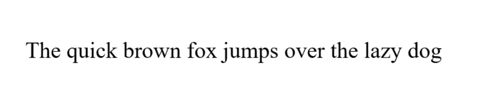
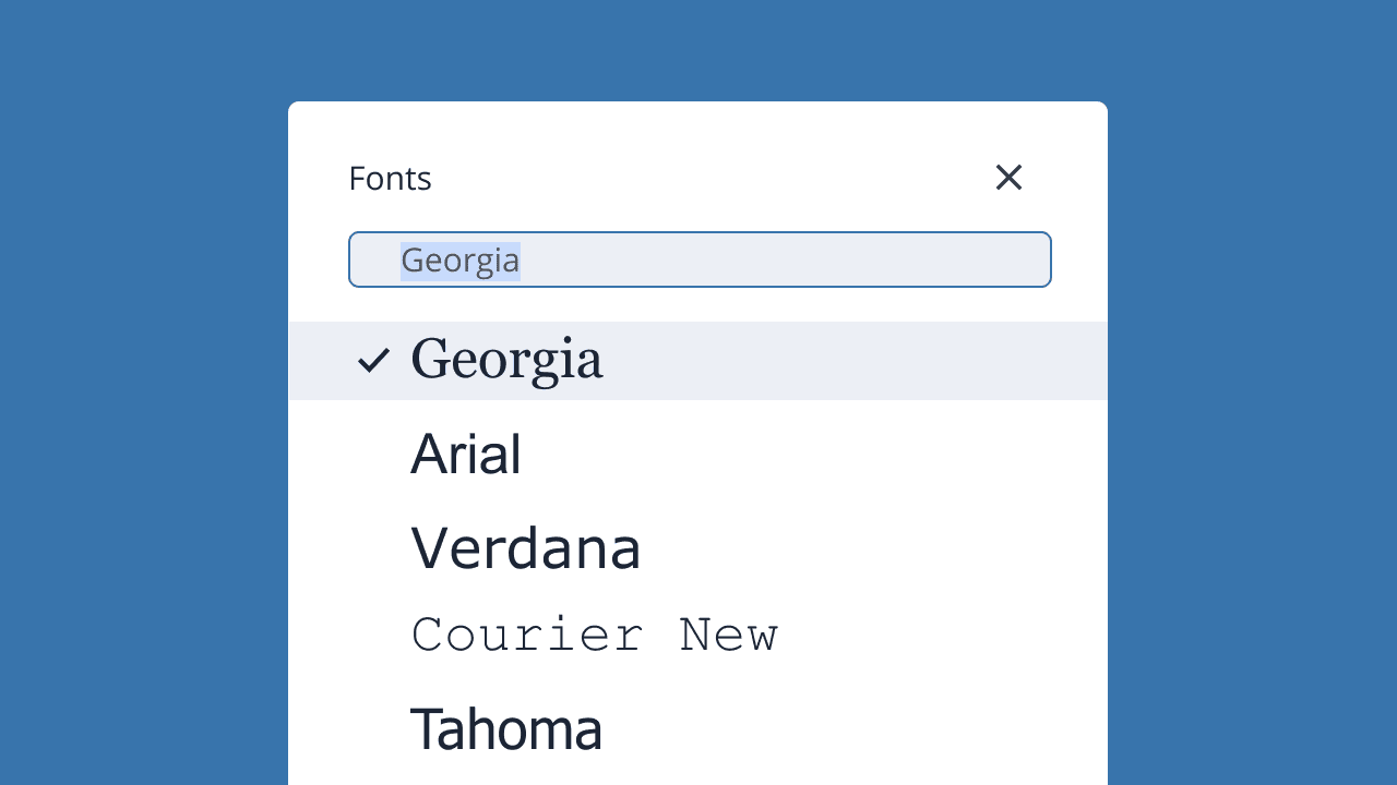
6. Georgia (serif): A more modern and web-friendly serif font, ideal for body text and articles.

7. Garamond (serif): Known for its elegant and timeless design, often used for literary or formal websites.

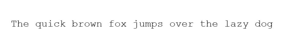
8. Courier New (monospace): A monospace font that’s commonly used for displaying HTML code snippets or technical content.
9. Brush Script MT (cursive): A script font that’s more decorative. This is best used for special headers or brand identity elements.

When to use them:
- Body text. Fonts like Arial, Verdana, Georgia, and Times New Roman are excellent choices for body text because of their readability.
- Headings. For headings, you might prefer fonts like Trebuchet MS or Tahoma to create emphasis.
- Special sections/branding. Use more decorative fonts like Brush Script MT for headers or logo text but keep it limited to avoid distraction.
Using Google Fonts in HTML
Google Fonts offers a wide selection of high-quality web fonts that are optimized for fast loading. When you integrate Google Fonts into your HTML, you dramatically enhance your website’s typography.
How to integrate Google Fonts for a wider range of style options
Google Fonts offers a variety of styles, weights, and character sets, allowing you to customize your font choices for different sections of your site. To get started, you can simply link to the desired fonts from the Google Fonts library.
1. Go to Google Fonts and choose a font.
2. Click Get font.
3. Select the <link> option above and copy the code below.
4. Then, use the font in your HTML document.
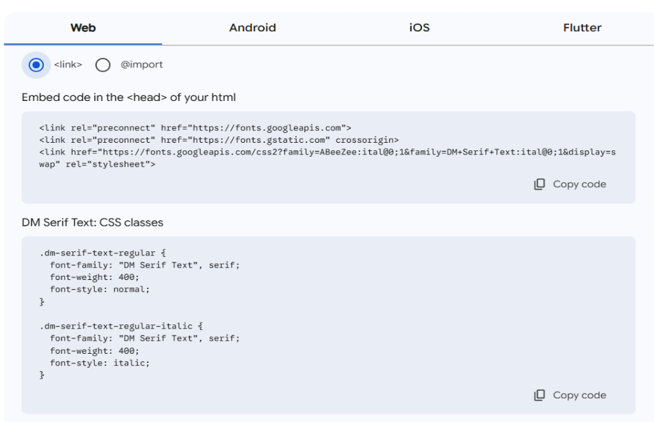
This way, you can ensure that your website uses a custom font, while still relying on Google’s servers to deliver it efficiently.
Custom fonts in HTML
For a unique and branded look, you might choose to use custom fonts that aren’t part of the standard system or web font collections. Custom fonts give your website a distinctive personality, especially if you want to create a specific feel or match your brand’s identity.
How to use custom web fonts:
There are two main ways to integrate custom fonts into your website: hosting the fonts yourself or using third-party services like Adobe Fonts.
1. Hosting your own fonts
If you have font files (e.g., .woff, .woff2, .ttf), then you can host them on your server. To do this, define the @font-face rule in your CSS.
@font-face {
  font-family: 'MyCustomFont';
  src: url('path/to/font.woff2') format('woff2'),
       url('path/to/font.woff') format('woff');
}
body {
  font-family: 'MyCustomFont', sans-serif;
}
2. Using third-party services (e.g., Adobe Fonts)
Another way is to use a service like Adobe Fonts. Adobe Fonts provides an extensive library of fonts that you can integrate into your website.
To use Adobe Fonts, you need to create an account, select the fonts you want, and follow the instructions to embed the fonts in your HTML.
<head>
  <link rel="stylesheet" href="https://use.typekit.net/xyz123.css">
</head>
<body>
  <p style="font-family: 'CustomFontName', sans-serif;">Text with custom font.</p>
</body>
How to use fonts in HTML
When fonts are properly implemented, you can control how your text looks across different devices. This ensures a seamless and attractive user experience.
Basic syntax for HTML fonts
Using the font-family property is the most common way to apply fonts in HTML. This property indicates the type of font for a text element, whether it’s a system font or a web font.
<style>
  body {
    font-family: 'Arial', sans-serif;
  }
</style>
In the example above, the font-family property is applied to the body tag, which means all text inside the body will use the specified font.
Adding fonts in HTML
There are three main ways to add fonts to your HTML:
1. Inline style
An inline style is applied to an HTML element using the style attribute. While it’s not the most efficient way, it’s good for quick and small changes.
<p style="font-family: 'Verdana', sans-serif;">This is a paragraph with an inline font.</p>2. Internal style
Internal styles are placed within the <style> tags in the head section of the HTML document. This style allows you to define fonts for different elements in one place, keeping your code organized.
<head>
  <style>
    h1 {
      font-family: 'Times New Roman', serif;
    }
    p {
      font-family: 'Georgia', serif;
    }
  </style>
</head>
3. External style
External styles are applied when you link to a separate CSS file. This is the most efficient and scalable method, especially for large websites. You can store your font styles in a single .css file and link to it from your HTML document.
<head>
  <link rel="stylesheet" href="styles.css">
</head>
Example of CSS file (styles.css)
body {
  font-family: 'Arial', sans-serif;
}
How to use the link tag for Google Fonts or other web fonts
Web fonts, like Google Fonts, can be added easily by using the <link> tag. Include the link to the font’s stylesheet in the <head> section of your HTML document.
For example, to add a Google Font like “Roboto,” use the following code:
<head>
  <link href="https://fonts.googleapis.com/css2?family=Roboto&display=swap" rel="stylesheet">
</head>
<body>
  <h1 style="font-family: 'Roboto', sans-serif;">This is a heading with Roboto font.</h1>
</body>
This method ensures that the font is loaded from Google’s servers, and it’s available for use in your styles.
Font fallbacks
Font fallbacks ensure that if a font isn’t available, the text will still appear in a similar style. A font stack is a list of fonts you want to use in a specific order. If the first font is unavailable, the browser will try the next one in the list.
Example of a proper font stack:
body {
font-family: ‘Roboto’, ‘Arial’, sans-serif;
}
In this example:
- The browser will first attempt to use Roboto.
- If Roboto is unavailable (for example, if Google Fonts is down or not linked correctly), it will try Arial.
- If neither is available, it will fall back to the generic sans-serif font.
Note: If your preferred font is unavailable on Google Fonts, feel free to explore other options.
Font style in HTML
Adding font styles to your web design gives you free rein to control how the text appears on your website. You can use bold headings to make text stand out or italics to emphasize certain words.
Below are codes for basic font styles and how to combine them with different font families.
Basic font styles
Two primary properties control font style in CSS: font-style and font-weight. These properties modify the visual appearance of text without changing its content.
Using the font-style property (normal, italic, oblique):
The font-style property allows you to display text is normal, italic, or oblique. By default, text is normal; use italic (or oblique) for emphasis, like for quotations or product names.
/* Bold text using named value */
h1 {
  font-weight: bold;
}

/* Regular text using numeric value (400) */
p {
  font-weight: 400;
}

/* Light text using named value */
p.light {
  font-weight: lighter;
}

/* Semi-bold text using numeric value (600) */
h2 {
  font-weight: 600;
}

/* Extra bold text using numeric value (900) */
strong {
  font-weight: 900;
}
Example:
<h1>This is bold text using "bold"</h1>
<p>This is regular text using 400</p>
<p class="light">This is lighter text</p>
<h2>This is semi-bold text using 600</h2>
<strong>This is extra bold text using 900</strong>
Combining font styles and families
Mixing font families for headings, body text, and other UI elements can improve your website’s design. This creates a visual hierarchy and makes it easier for users to read and navigate your site.
How to mix different fonts for headings and body text:
Use distinct font families for your headings and body text to create visual contrast and a clear visual hierarchy. Practice restraint by limiting to two font families only to avoid clutter and ensure consistency in font sizes, weights, and line heights for a stylish and readable website.
h1 {
  font-family: 'Roboto', sans-serif;
  font-weight: bold;
}

p {
  font-family: 'Georgia', serif;
  font-weight: normal;
}
Example:
<h1>This is a heading in Roboto</h1>
<p>This is a paragraph in Georgia</p>
Tips on pairing fonts for readability and visual appeal
When selecting fonts for your website, balance aesthetics and functionality. A good font pair ensures that text is attractive and easy to read.
Before you choose a combination, keep these fundamentals in mind:
Create contrast
Use contrasting fonts for headings and body text to create a visual hierarchy. For example, pair a serif font for body text with a sans-serif font for headings. This contrast helps guide the reader’s eye from one hierarchy to the next.
Limit font choices
Stick to two or three fonts for the entire website. Too many fonts can make the design look cluttered and distracting.
Prioritize readability
While creativity is important, readability should always be the priority, especially for body text. Go for clear, simple fonts like Arial, Verdana, or Georgia for paragraphs.
Match the brand tone
For example, use formal fonts like Times New Roman or Georgia for professional sites or playful fonts like Arial or Verdana for creative or casual sites.
Check the font pairing
For example, pairing Trebuchet MS (bold, modern) for headings with Georgia (serif, elegant) for body text creates a balanced and appealing contrast.
Best practices for using fonts in HTML
Fonts affect readability, accessibility, and how visitors perceive your brand. By following some best practices, you can ensure that your fonts look good and enhance your site’s usability.
Ensure readability and legibility
Below are recommendations for font size, line height, and color contrast to ensure your website’s readability and legibility.
- Font size. A good base size for body text is equivalent to 16px, but instead of using fixed pixels, use relative units like rem or em. This ensures your text scales properly across devices and respects user settings.
- Line height. For better readability, set the line height to about 1.5 to 1.6 times the font size. This spacing prevents text from feeling cramped and helps users follow along easily.
- Color contrast. Make sure your font color contrasts with the background. For example, dark text on a light background or light text on a dark background is advisable. Aim for a contrast ratio of at least 4.5:1 for body text (3:1 for large text) to ensure legibility.
body {
  font-size: 16px;
  line-height: 1.5;
  color: #333; /* Dark text on a light background */
  background-color: #f4f4f4; /* Light background */
}
Make fonts mobile-responsive
Use relative units and consider fluid type (e.g., clamp()), with media queries as needed. Test on multiple devices to confirm readability and consistent rendering. Ensure your font sizes are responsive by using media queries.
For instance, larger font sizes can be set for mobile devices to improve readability without requiring zoom. Additionally, test your fonts on multiple devices to ensure readability and a consistent user experience.
/* Mobile-responsive, fluid typography with relative units */
html {
  /* keep root scalable per user settings */
  font-size: 100%;
}

body {
  /* Fluid base size: min 1rem (~16px), scales with viewport, caps at 1.125rem (~18px) */
  font-size: clamp(1rem, 1rem + 0.5vw, 1.125rem);
  line-height: 1.5;
}

/* Fluid headings for clear hierarchy */
h1 { font-size: clamp(1.75rem, 1.2rem + 3vw, 2.5rem); }
h2 { font-size: clamp(1.375rem, 1rem + 2vw, 2rem); }
h3 { font-size: clamp(1.125rem, 0.9rem + 1vw, 1.5rem); }

/* Optional: fine-tune very small screens to improve readability without zoom */
@media (max-width: 480px) {
  body {
    /* slightly larger minimum on small devices */
    font-size: clamp(1.0625rem, 1rem + 1.2vw, 1.25rem);
  }
}
Maintain consistent fonts for your brand
When choosing fonts, consider your brand’s personality and the message you want to convey. For example:
- Professional brands. Use classic, clean fonts like Times New Roman or Georgia because they can exude a sophisticated and trustworthy feel.
- Creative or casual brands. Use friendly, approachable fonts like Trebuchet MS or Verdana to give your site a fun, casual look.
- Tech or modern brands. Choose clean, modern fonts like Arial or Tahoma, which are widely used for tech-related websites.
Common HTML font issues and how to fix them
These issues can affect user experience, making it difficult for users to read or causing it to render inconsistently across devices and browsers. Luckily, most of these problems have simple fixes that you can adopt to improve your website’s overall design and accessibility.
Font rendering issues across browsers
One of the most common font-related issues is font rendering inconsistencies. Fonts may look different across browsers and devices due to variations in how browsers handle CSS properties or font files.
These issues can include the following:
- Font not displaying at all. This can occur if the browser can’t access or find the specified font.
- Font rendering inconsistencies. Different browsers may display fonts with varying weights, styles, or spacing.
- Fallback fonts taking over. Sometimes, a fallback font may be displayed because the desired font is not available or accessible.
To resolve font rendering issues:
- Use web fonts. Web fonts from Google Fonts or Adobe Fonts help ensure that the font displays consistently across all browsers and devices. By using a web font, you won’t be relying on system-installed fonts that may not be available to all devices.
- Include font files for multiple formats. To prevent issues on different browsers, ensure you provide your web fonts in multiple formats, such as .woff, .woff2, and .ttf. Different browsers support different font file formats, so having multiple options ensures that the font renders correctly.
@font-face {
  font-family: 'CustomFont';
  src: url('font.woff2') format('woff2'),
       url('font.woff') format('woff'),
       url('font.ttf') format('truetype');
}- Use font loading strategies. To improve font loading times and avoid flash of unstyled text (FOUT), use the font-display property in your CSS. Setting font-display: swap; allows the browser to load a fallback font until the primary font is ready.
@font-face {
  font-family: 'MyCustomFont';
  src: url('myfont.woff2');
  font-display: swap;
}
Fixing text accessibility problems
Legibility and readability affect how users can consume your content easily. Here are a few common text accessibility problems and how to fix them:
- Low contrast. Ensure text and background colors have enough difference. Aim for a contrast ratio of at least 4.5:1 (normal text). Tools like WebAIM’s Contrast Checker can help.
Example:
body {
  color: #333; /* Dark text */
  background-color: #fff; /* Light background */
}- Small font size. Small font sizes can be hard to read, especially for users with low vision. Use relative units (em, rem) to ensure that text scales appropriately on different devices.
body {
  font-size: 1rem; /* 16px for body text */
}

@media (max-width: 768px) {
  body {
    font-size: 1.2rem; /* Larger font size for smaller screens */
  }
}- Unreadable text on mobile devices. Use responsive design techniques to adjust font sizes based on screen width. Make use of line height and letter spacing to improve readability on smaller screens.
body {
  font-size: 1rem; /* Base size */
  line-height: 1.5;
}

@media (max-width: 480px) {
  body {
    font-size: 1.25rem; /* Increase font size on mobile */
  }
}- Poor readability for users with cognitive disabilities. Certain fonts may be difficult for users with dyslexia or other cognitive disabilities to read. Simple, sans-serif fonts like Arial or Verdana are often easier to read than ornate or serif fonts.
body {
  font-family: 'Arial', sans-serif;
}
From font to function: Building your site with Network Solutions
Fonts may seem like a small detail, but they influence a lot on how your website looks, feels, and functions. From choosing between system fonts and web fonts to pairing typefaces for readability and ensuring accessibility, the right decisions help create a seamless experience for every visitor. Addressing common issues like rendering differences and text contrast ensures that your content remains clear, professional, and consistent across devices.
If you’re ready to put these best practices into action, the foundation matters just as much as design. With Network Solutions’ hosting plans, including reliable WordPress hosting—you’ll have the speed, security, and flexibility needed to build a site where your fonts and overall design shine.
Frequently asked questions
There’s no single “best” font. Instead, choose based on your design and content needs. Common options for readability include Arial, Verdana, and Georgia.
Visit Google Fonts, select a font, select the <link> option, then copy the code. Then, apply the font in your CSS.
Yes, you can use custom fonts by hosting them on your server or using third-party services like Adobe Fonts.
A web-safe font is a typeface that is universally available across all devices and browsers, ensuring consistent display (e.g., Arial, Times New Roman).
Use responsive design with relative units (e.g., em, rem) for font sizes, and adjust line height and spacing for better readability across different screen sizes.