Key takeaways:
- A well-designed 404 page should clearly explain the error, reduce confusion, and give visitors easy ways to keep navigating your website.
- The best 404 pages combine helpful features like navigation, links, and search with branding that makes the experience feel polished and trustworthy.
- Reviewing broken links and improving your 404 page over time can help protect user experience, reduce exits, and support stronger website performance.
A broken or missing page may seem like a small issue, but it can interrupt the user experience fast. When someone clicks a bad link, types the wrong URL, or tries to open a page that no longer exists, they land on a 404 page.
That page appears because of a 404 error, which means the requested page cannot be found.
Good 404 page design should do more than show an error message. It helps visitors recover, reduces confusion, and gives them a clear way to continue exploring your website. A poor 404 error page, on the other hand, can lead to exits, lost trust, and missed conversion opportunities.
You’ll learn what every effective 404 page should include, see examples for inspiration, and find practical best practices you can apply to your own site.
Create a custom 404 page with ease
Turn dead ends into better experiences and design a branded 404 page with Network Solutions Website Builder

Why does a 404 page matter?
A 404 page is easy to overlook, but it plays an important role in how people experience your website. When a visitor reaches a missing page, that moment can either feel like a dead end or a quick detour. Here are some advantages of a thoughtful error page:
- It reduces user frustration
- It keeps visitors on your website
- It protects brand trust
- It supports usability and site performance
It reduces user frustration
Hitting a missing page can quickly frustrate a website visitor, especially when they expected to find something useful. For example, if someone clicks a product link from social media and lands on an empty error screen, they may assume the item is gone or that the website is unreliable.
Without a clear explanation or next step, that dead end can make them leave. A helpful message, simple guidance, and clear recovery options make the experience easier to understand and navigate.
It keeps visitors on your website
A strong 404 page can keep visitors from bouncing right away. Links to the home page, homepage navigation, popular resources, blog articles, or key service pages give people a clear path forward and help them stay engaged with your website.
Let’s imagine a visitor landing on an outdated blog URL from a search result. A 404 page that points them to recent articles or the blog homepage can keep them browsing instead of leaving after one dead end.
It protects brand trust
Trust can drop quickly when a website feels broken. A generic 404 screen with no branding, direction, or suggestion can make visitors question whether the business is active, credible, or paying attention to its site. A custom 404 page helps turn that moment into a smoother recovery instead of a dead end.
If someone clicks an ad or directory listing and lands on a missing service page, they may assume the information is outdated and just leave. A branded 404 page with clear navigation gives them a reason to stay and continue exploring.
It supports usability and site performance
Custom error pages can make broken links easier to manage. They give visitors a better recovery path in the moment and give your team useful signals about where the website experience is breaking down.
For example, if a campaign URL is still getting clicks after a page has been removed, visitors may keep hitting the same missing page. A well-designed 404 page can redirect attention to useful content while also showing your team that the original link still needs attention.
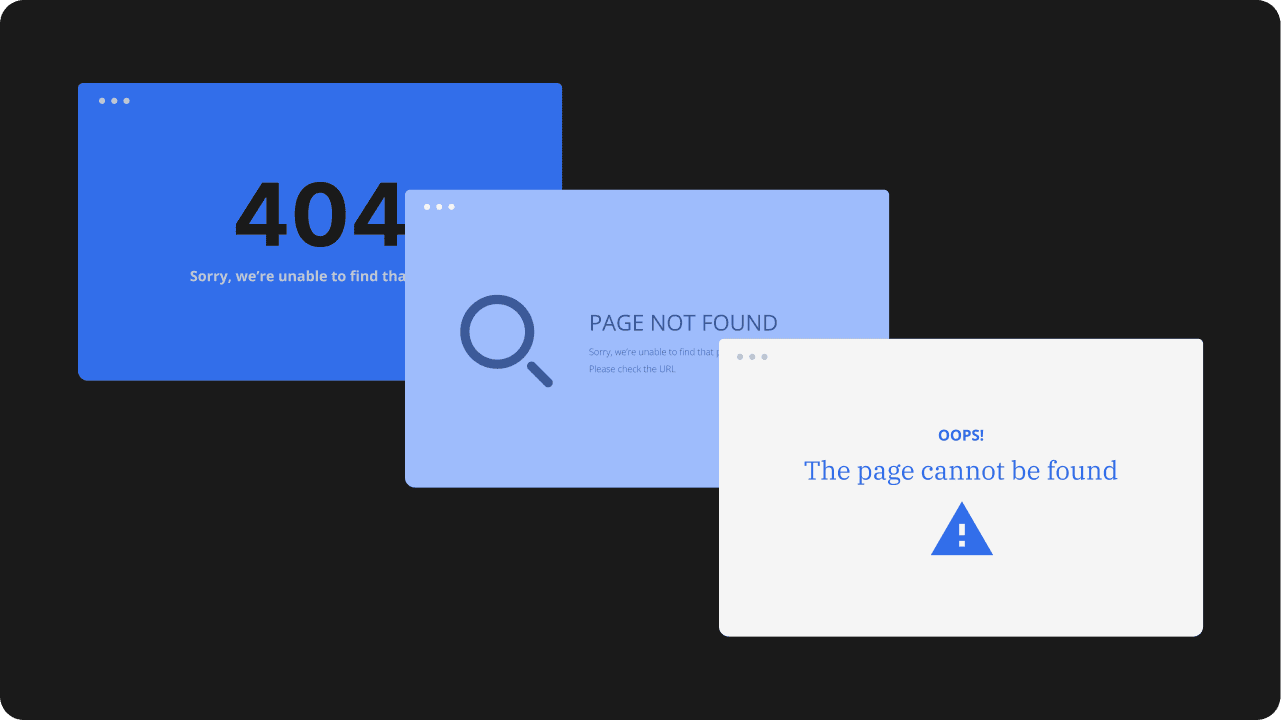
404 page examples for inspiration
The best 404 page examples balance clarity with creativity. Some use humor, some keep the layout minimal, and others lean on strong brand personality. No matter the style, the strongest examples make the error easy to understand and help visitors find a clear next step.
Here are some references you can use for your own 404 page design:
- Mailchimp
- GitHub
- Pixar
- Marvel
- Airbnb
- 9GAG
- HubSpot
- Lego
- IMDb
- YouTube
Mailchimp
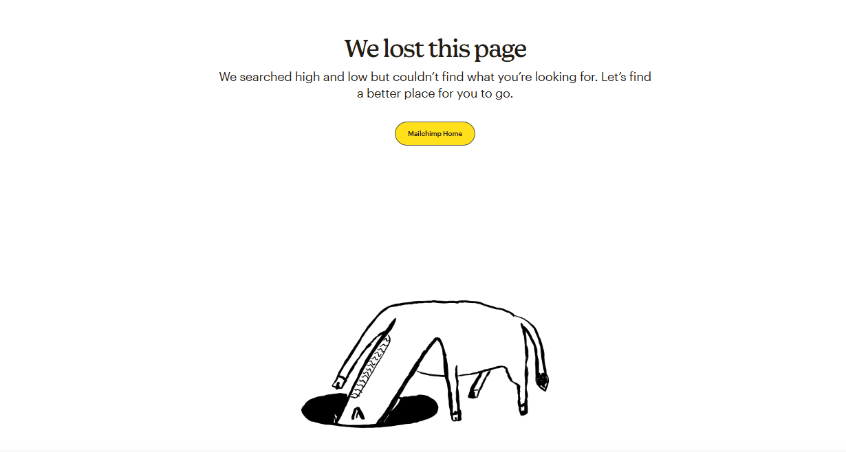
Link: https://mailchimp.com/error/
Mailchimp’s 404 page stands out for its playful tone and interactive feel. It makes the moment feel lighter without losing sight of the main goal, which is helping the user recover from the error. The page feels unmistakably on-brand, but it still works as a practical part of the website experience.
What you can learn: A little fun can make a 404 page more memorable, as long as the message stays clear and visitors still have a way forward.
GitHub
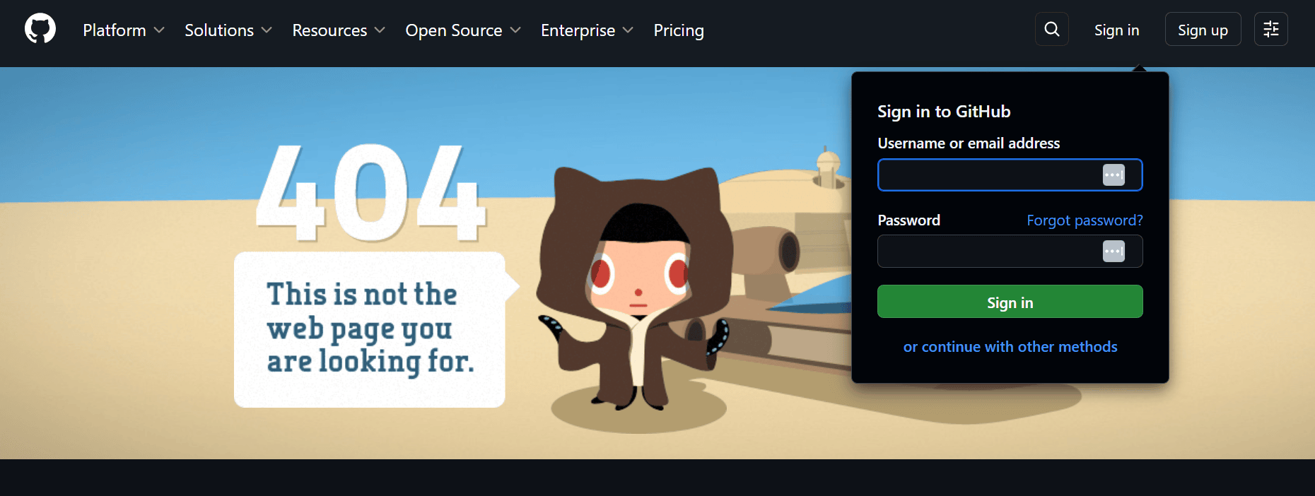
Link: https://github.com/error-page
GitHub takes a more minimal and direct approach. Its 404 page is easy to scan, visually simple, and focused on helping users move on quickly rather than adding extra personality for its own sake. That makes the experience feel useful instead of distracting.
What you can learn: A simple layout can be highly effective when it reduces confusion and gives visitors fast access to the next step.
Pixar
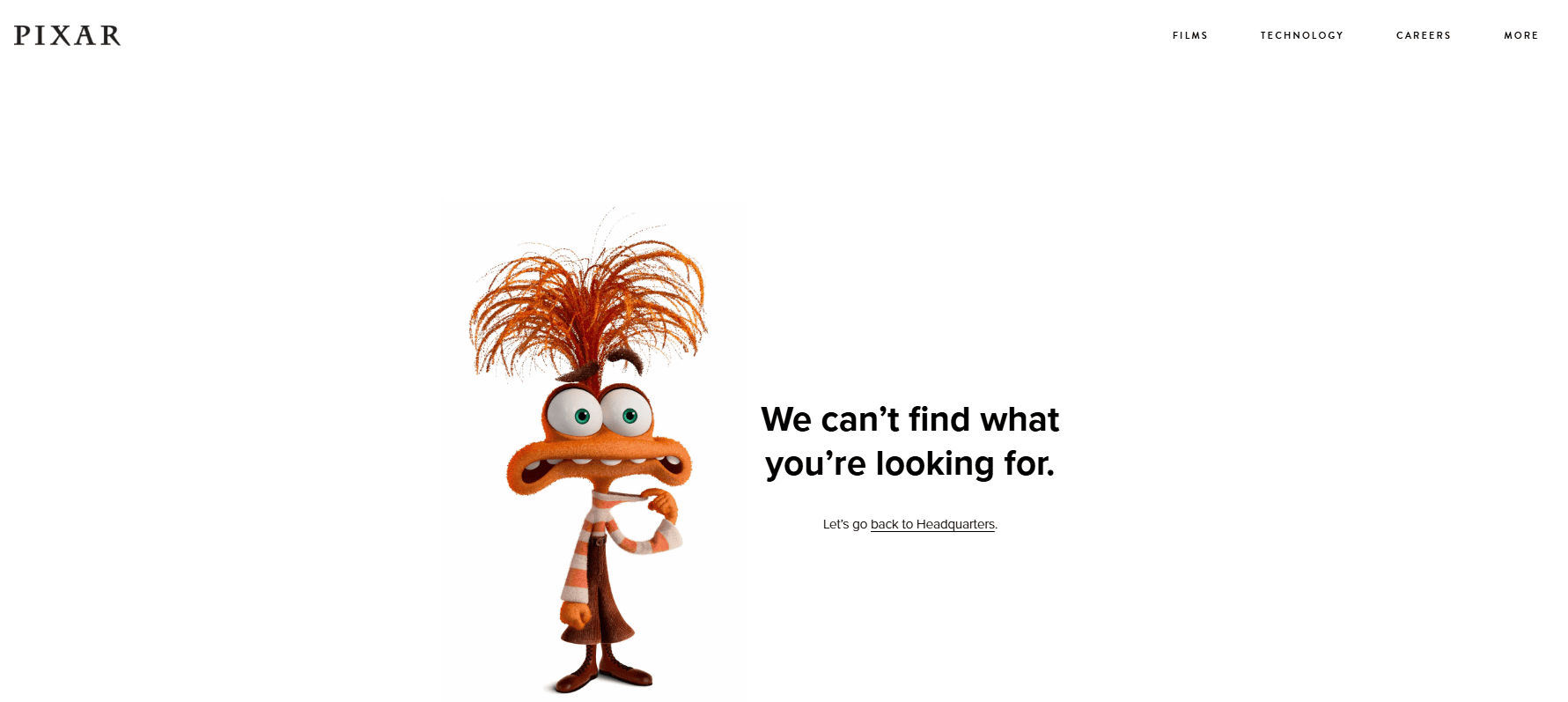
Link: https://www.pixar.com/error
Pixar uses a familiar character image to give its 404 page an immediate personality. The visual makes the page more emotionally engaging, but it still stays easy to understand. Instead of feeling like a generic error screen, it feels like part of the larger brand experience.
What you can learn: A recognizable image can reinforce brand identity and make the page more distinctive without getting in the way of usability.
Marvel
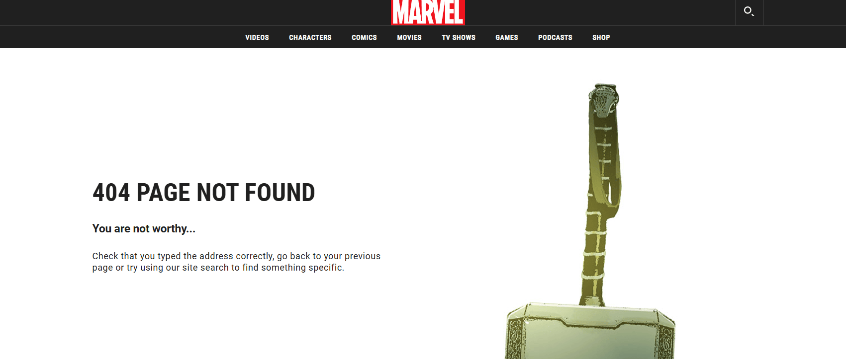
Link: https://www.marvel.com/error
Marvel leans into its comic-book world with a witty message and a strong character-driven visual. What makes it especially effective is that it does not stop at personality and also gives visitors practical ways to move forward.
What you can learn: Branded copy works best when it is paired with useful navigation and next steps.
Airbnb
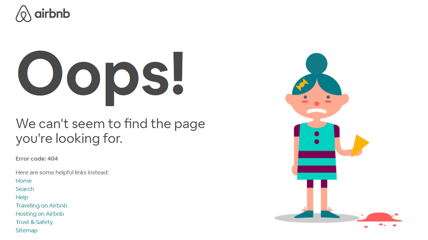
Link: https://www.airbnb.com/404
Airbnb’s 404 page feels polished, calm, and easy to navigate. The design does not overdo the experience, which helps soften the disruption of landing on a missing page. It feels considered, which is important when visitors are already dealing with a small moment of friction.
What you can learn: Clean layout, restrained copy, and a steady visual tone can make a 404 page feel more helpful and less abrupt.
9GAG
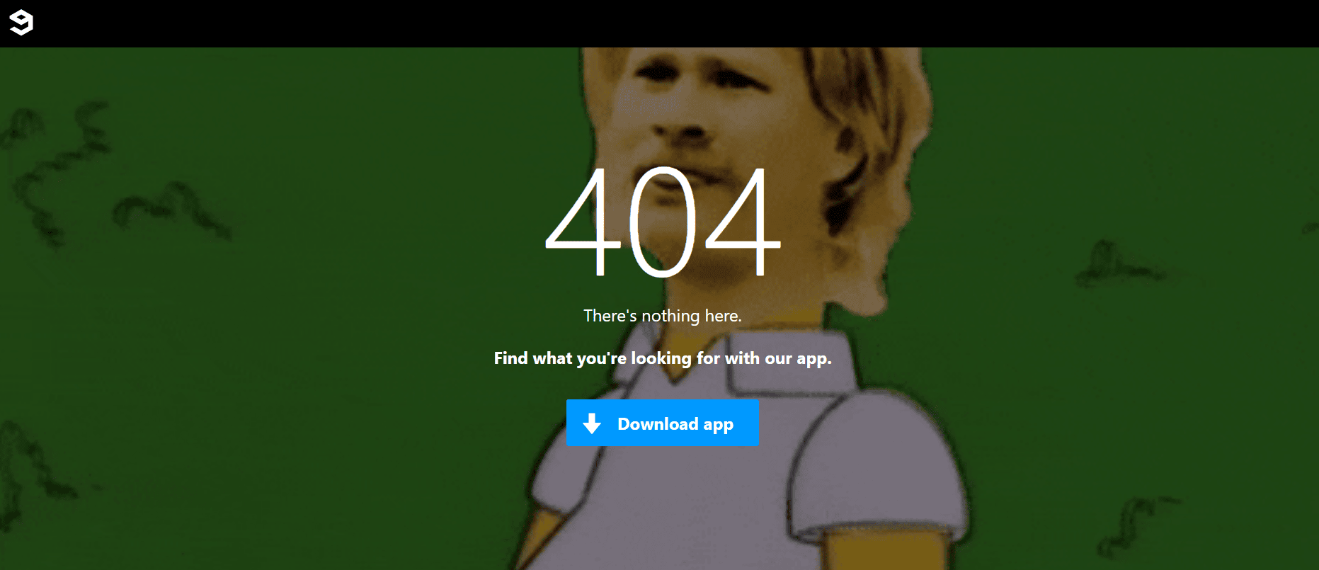
Link: https://9gag.com/error
9GAG leans into humor and community personality. Its 404 page feels casual and entertaining, which fits the brand well and helps turn a frustrating moment into something lighter. Even so, the page still needs to support navigation so visitors do not feel stuck.
What you can learn: Humor works best when it feels natural to the brand and still leaves users with a clear way to keep browsing.
HubSpot
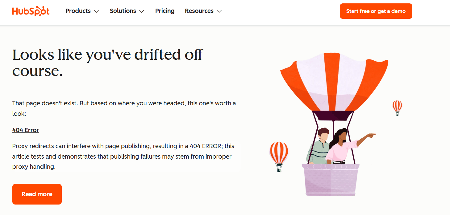
Link: https://www.hubspot.com/404
HubSpot pairs branded messaging with practical recovery options. The page is not only about style or tone. It also gives visitors helpful paths forward, which makes it a strong example of balancing personality with function.
What you can learn: Strong 404 page design is not just about visuals. Helpful links, clear structure, and recovery options matter just as much as the overall look.
LEGO
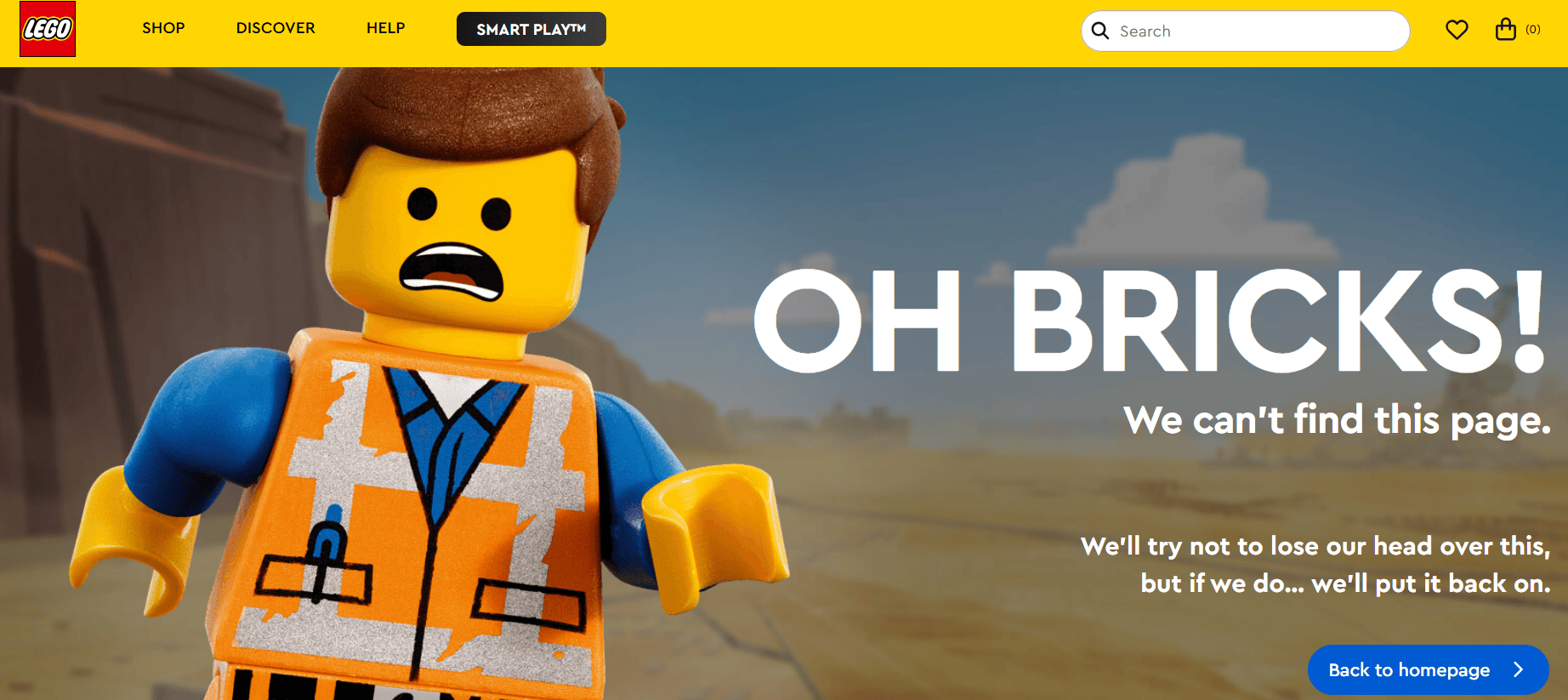
Link: https://www.lego.com/en-us/product/error-404
LEGO keeps its 404 page playful and unmistakably on-brand with a recognizable character and humorous message. At the same time, it gives visitors a clear path back to the homepage, so the page still feels functional.
What you can learn: Strong brand personality works best when it is backed up by clear navigation.
IMDb
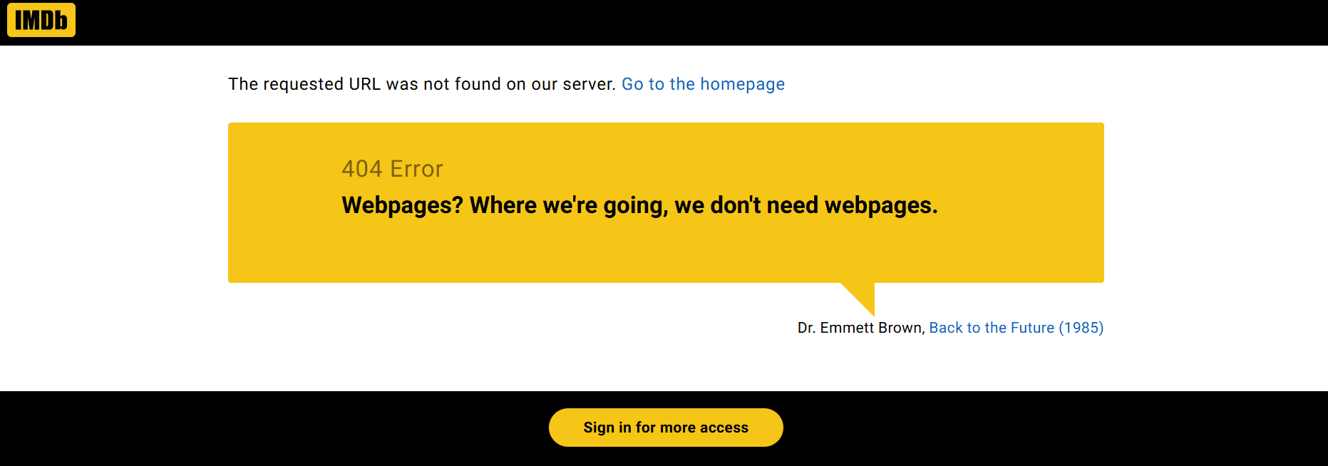
Link: www.imdb.com/error-404
IMDb uses rotating movie quotes to add personality without making the page confusing. The concept feels natural for the brand, while the message still reads clearly as an error page.
What you can learn: A creative concept can make the page more memorable, but the error should still be easy to recognize at a glance.
YouTube
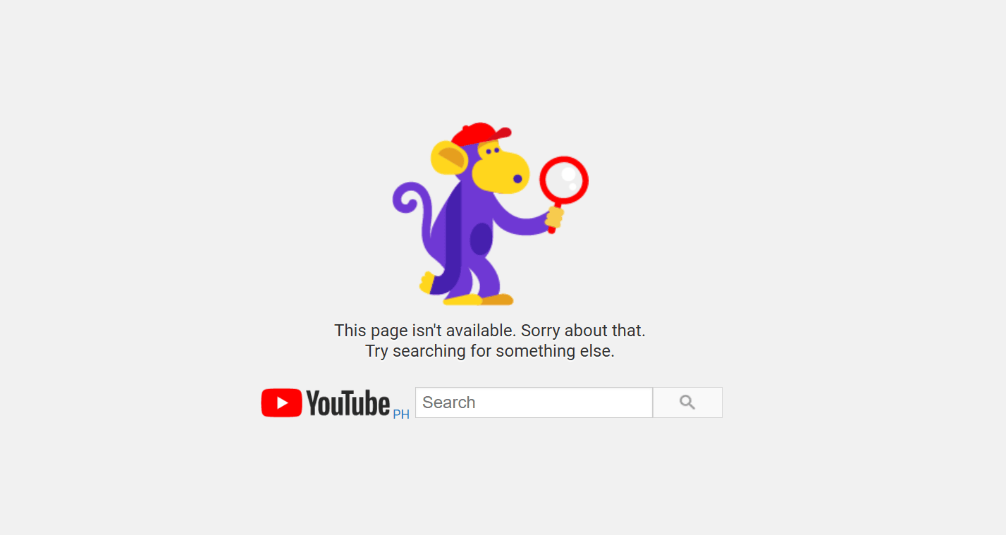
Link: https://www.youtube.com/error
YouTube takes a simpler, more utility-first approach with a search bar and a clean layout. It does not rely on heavy visuals, but it still works well because it helps visitors recover quickly.
What you can learn: Even a simple 404 page can be effective when it combines clear messaging with search and easy navigation.
Here’s a table with the key takeaways kept short and direct for an easy summary:
Example | Style | What stands out | What you can learn | Best for |
|---|---|---|---|---|
Mailchimp | Interactive or playful | Playful tone and interactive feel | A little fun can make a 404 page more memorable if the message stays clear | Creative brands with a strong personality |
GitHub | Minimal and direct | Simple layout and easy-to-scan design | A simple layout can reduce confusion and speed up recovery | Product, SaaS, or documentation-heavy websites |
Pixar | Branded or illustrated | Recognizable character and strong visual identity | A familiar image can reinforce brand identity without hurting usability | Entertainment, media, or visual brands |
Marvel | Branded or illustrated | Witty message and character-driven visual | Branded copy works best with useful navigation and next steps | Story-driven brands with strong visuals |
Airbnb | Minimal and direct | Calm layout and polished presentation | Clean design can make a 404 page feel more helpful and less abrupt | Lifestyle, hospitality, or service-led brands |
9GAG | Funny or humor-driven | Humor and community personality | Humor works best when it feels natural to the brand and still supports navigation | Brands with a casual voice or strong community |
HubSpot | Helpful utility-first | Branded messaging and recovery options | Helpful links and clear structure matter as much as visuals | Content-rich websites or service businesses |
LEGO | Branded or illustrated | Playful character and clear path forward | Strong brand personality works best with clear navigation | Family, retail, or playful consumer brands |
IMDb | Funny or humor-driven | Movie-themed copy and familiar concept | A creative concept can be memorable without creating confusion | Entertainment or content-led brands |
YouTube | Helpful utility-first | Search bar and simple recovery path | A simple 404 page can still work well with search and clear navigation | Large content platforms or searchable w |
Whether your style is playful or straightforward, the takeaway is the same: the best examples combine personality with practical recovery features. A strong 404 page should not just look good. It should help visitors get back on track.
Best practices for designing a 404 page
A strong 404 page design should reduce confusion, explain the problem, and help the user find the right next step. The most effective pages are clear, helpful, and consistent with the rest of the website. To get a good design, you should:
- Write a clear error message
- Include user-friendly navigation
- Offer useful links
- Add a search bar
- Reinforce your brand identity
- Use creativity carefully
- Track broken links and feedback
Write a clear error message
Tell visitors exactly what happened. A good error message should say that the page cannot be found without relying on technical jargon or vague wording. People should be able to understand the problem right away, so they do not waste time wondering whether the issue is with the page, the website, or their device.
Include user-friendly navigation
A 404 page should never feel like a dead end. Add clear navigation back to the home page, main menu, or top categories so users can quickly continue browsing. This is one of the most important parts of how to design a 404 page because it gives people an immediate way forward instead of forcing them to start over.
Offer useful links
Helpful links make the page more functional. Depending on the type of website, that might include popular resources, key service pages, product categories, recent blog posts, or support content. The goal is to connect the user to likely next steps instead of leaving them with only an error message and no direction.
Add a search bar
A search bar is one of the most helpful features you can include, especially on larger websites with lots of content. If visitors were trying to find a product, article, or service page, search gives them a fast way to recover. On content-heavy websites, this can be more useful than sending everyone back to the homepage.
Reinforce your brand identity
A 404 page should still look and sound like part of your website. Use the same tone, color palette, brand elements, and visual style people see on the rest of the site. This helps the page feel intentional and maintained, which matters when visitors are already dealing with a frustrating moment.
Use creativity carefully
A little humor, a playful imagery, or a unique layout can make the page more memorable. But creativity should support the user experience, not compete with it. A clever concept works best when users can still tell what went wrong and what to do next. If the design creates more confusion, it’s working against the page’s purpose.
Track broken links and feedback
A good 404 page is only one part of the fix. It also helps to monitor broken links, review repeated issues, and make it easy for your team to spot patterns.
If you regularly publish content, it can also help to review site performance and visitor behavior over time using tools like Google Analytics for small businesses.
We also provide a free Customer App to let you organize website inquiries when you register a domain with Network Solutions. That way, you can easily keep track of your customers’ actions in one app.
Common mistakes to avoid in 404 page design
A weak 404 page can make the original error feel even more frustrating. Instead of helping users recover, these common mistakes can create make it harder to avoid confusion and find the right next step.
- Using a generic or unclear error message: If the message is vague or overly technical, users may not understand what went wrong or what to do next. A clear explanation helps set expectations right away and makes the page easier to use.
- Failing to link to useful destinations: Without helpful links to the homepage, key pages, or support content, visitors are more likely to leave instead of continuing their journey. Even a few well-placed links can turn the page from a dead end into a useful recovery point.
- Hiding navigation: A missing menu, search bar, or visible path back turns the page into a dead end. Users should be able to spot their next step quickly without having to guess where to click.
- Overdoing jokes or visuals: Humor and creativity can work well, but not when they make the page harder to understand or use. If the design draws more attention than the recovery options, it can hurt the user experience instead of helping it.
- Ignoring broken links over time: If recurring errors are never reviewed, the same frustrating experience keeps happening for future visitors. Monitoring problem URLs can help your team catch issues earlier and improve the website over time.
Frequently asked questions
Start with a friendly message that explains the issue. Make sure the page looks consistent with your brand and gives visitors clear options such as a homepage button, product links, or a search bar.
A successful 404 page keeps people from leaving. It explains what went wrong, reflects your brand style, and points visitors toward useful next steps.
Most website platforms, including WordPress, let you replace the default error screen with your own design. You can add branded visuals, helpful links, and navigation so users stay connected to your site.
In Next.js, you can add a 404.js file inside the pages folder to replace the default error page. Use this file to design your own layout with your brand elements, message, and navigation options.
Web visitors usually see a 404 error page when the URL points to a page that has been removed, moved, typed incorrectly, or cannot be found for another reason.
It can be, but only if the humor supports the experience. A funny page can make the moment feel lighter, but it still needs to explain the issue clearly and give visitors a helpful next step.
A good 404 page should include a clear error message, user-friendly navigation, helpful links, and often a search bar. The goal is to explain the problem quickly and help users find the right page or another useful destination.
Turn a 404 page into a better user experience
Strong 404 page design reduces user frustration, protects your brand, and guides visitors back to helpful content on your website. The best 404 error page combines clarity, navigation, and useful next steps, even when the design itself is simple. When those elements are in place, a missing page becomes easier to recover from, and the overall website experience feels more polished.
That said, the broader experience starts even earlier with a domain people can remember and trust. Choose a domain that supports a clearer, more recognizable online presence from the beginning.
We offer free marketing tools that can support your website’s user experience from the start when you register a domain with us. While a 404 page helps visitors recover from missing pages or broken links, our coming soon page app helps guide them when content is still on the way. It keeps your domain active, gives visitors a clear place to land, and helps build anticipation before your full website launches.
Find the perfect domain
Ready to register a domain name? Check domain availability and get started with Network Solutions today.