Key takeaways:
- The right color scheme shapes your brand’s identity, guides user behavior, and enhances overall user experience, helping drive conversions.
- Different color schemes each have unique benefits and should be selected based on your brand’s message and user needs.
- Defining your brand’s personality, choosing the right color palette, and ensuring accessibility can create a cohesive and user-friendly website design.
Your website’s color scheme plays a bigger role than most people realize. It’s the first thing visitors notice and one of the key elements that shape their impression of your brand.
Think about Spotify. When you see that iconic shade of green, you immediately think—yep, that’s Spotify. But it’s not just about your brand identity. The colors your website uses can also help with your user’s navigation, content readability, and overall emotion. Spotify’s bold green and black color scheme creates energy and excitement, while also guiding users to important features like the play button.
Whether you’re designing a new website or refreshing an old one, choosing the best colors can create a smoother, more inviting user experience. We’ll discuss everything you need to know about website color schemes, from its importance, different types, how brands use them, and how to pick one that suits your goals.
What is a website color scheme
A website color scheme is a carefully selected set of colors used across your website to create consistent brand identity and guide user interaction (UI). It usually includes:
- Primary colors. These dominate the overall look of the site; used in headers, logos, etc.
- Secondary colors. Support the primary palette and add dimension
- Accent colors. Draw attention to key areas like buttons or links
- Neutral colors. Provide backgrounds, text colors, and spacing balance (e.g., white, gray, black)
The goal is to create a visual identity that reflects your brand’s personality while keeping everything accessible and easy to navigate.
Why are website color schemes so important
Colors influence human behavior more than you might think. WebFX’s statistics show that people make a judgment about a product within 90 seconds, and up to 90% of that judgment is based on color alone.
Let’s breakdown how color schemes can affect your website:
- Colors shape first impressions
- Users instantly judge a website based on its color scheme.
- The right colors convey trust, excitement, or professionalism.
- Poor color choices can create distrust or confusion.
- Colors guide user interaction
- CTA buttons should stand out with contrasting colors.
- Colors help define the visual hierarchy and indicate importance, so users know where to look first.
- They also help organize your website for easy navigation.
- Colors build brand identity and trust
- Consistent color use boosts brand recognition.
- Trustworthy and professional colors in psychology and color build credibility.
- Colors reflect your brand’s personality, mood, and values.
- Poor color choices lead to negative outcomes
- Overcomplicated color schemes can confuse users.
- Low contrast between text and background harms readability.
- Visitors may leave if the design isn’t visually appealing or intuitive.
Color psychology—the study of how colors impact moods and behaviors—directly influences UI design decisions. Our brain associates certain emotions with certain colors, which shape our judgement.
| Color | Associated emotions/perceptions | Common uses |
| Red | Excitement, Passion, Urgency, Energy, Love | Sales, Food & Beverage, Entertainment |
| Blue | Trust, Calm, Professionalism, Security, Peace | Tech, Healthcare, Finance, Corporate |
| Yellow | Optimism, Happiness, Warmth, Caution, Attention-grabbing | Calls-to-Action, Children’s Brands, Retail |
| Green | Nature, Growth, Health, Stability, Relaxation | Environmental, Wellness, Finance |
| Orange | Enthusiasm, Creativity, Warmth, Fun, Energy | Food, Events, Health & Fitness |
| Purple | Luxury, Creativity, Wisdom, Royalty, Calm | Beauty, Premium Brands, Creative Industries |
| Black | Power, Elegance, Sophistication, Mystery, Formality, Modern | Luxury Goods, Fashion, Corporate |
| White | Simplicity, Cleanliness, Purity, Peace, Neutrality | Tech, Healthcare, Minimalist Designs |
| Gray | Balance, Neutrality, Sophistication, Calm, Professionalism | Corporate, Technology, Sophisticated Brands |
| Pink | Femininity, Compassion, Softness, Romance | Beauty, Fashion, Charity |
When done well, color can create an engaging, intuitive experience that drives conversions. However, poor color choices can create confusion, hurt readability, and even drive visitors away.
Types of color schemes
Even if you know the meaning of colors, you still need to know how to combine those colors to make a visually pleasing aesthetic online. It can take time and skill to master color theory, but to simplify things for you, we made a cheat sheet of what color schemes you can experiment on.
| Color Scheme | Description | Best for | Pros | Cons |
| Monochromatic | Variations of a single color (shades, tints, tones). | Minimalist portfolios, modern blogs, clean UX | Simple, unified, easy to manage | Can feel flat or dull |
| Complementary | Opposing colors on the color wheel (e.g., blue & orange). | Retail, sports, bold CTA-heavy sites | High contrast, attention-grabbing | Can be too intense if not balanced |
| Analogous | Neighboring colors on the wheel (e.g., red, orange, yellow). | Lifestyle blogs, wellness brands, creative work | Naturally harmonious, soft on the eyes | May lack contrast; needs variation |
| Triadic | Three evenly spaced colors on the color wheel. | Youthful brands, playful or creative platforms | Balanced and vibrant | Can overwhelm if all colors compete equally |
| Tetradic | Two complementary color pairs (four total) spaced on the wheel. | Multi-section sites, marketplaces, large apps | Dynamic and flexible | Tricky to balance; may feel chaotic |
| Split Complementary | One base color + two adjacent to its complement (e.g., blue with red-orange & yellow-orange). | Personal brands, educational or creative sites | Good contrast with better harmony | Less punchy than full complements |
| Neutral with Accent | Neutral base (white, gray, black) + one bold accent color. | Agencies, startups, minimalist/professional sites | Clean, timeless, draws attention to key areas | May feel sterile without strong visuals |
Monochromatic
A monochromatic scheme is built from one base color and its variations—darker shades, lighter tints, and subtle tones. This makes it an excellent choice for a sleek, polished look, where visual cohesion is key. Since all the colors stem from the same root, they naturally harmonize without clashing.
When to use it: Perfect for brands that want to appear refined, minimalist, or focused. Think personal portfolios, modern blogs, SaaS platforms, or landing pages with clean UX.
Pro tip: Use depth and spacing to create contrast where color won’t. For example, pair dark navy text with pale blue backgrounds and include generous white space.
Pros:
- Simple to manage
- Always matches
Cons:
- Low contrast risk
- May lack emotional depth
Complementary
Complementary color schemes use colors from opposite sides of the color wheel like blue and orange. This creates natural visual tension, which draws the eye and adds energy. It’s commonly used for call-to-action buttons, banners, or product promotions.
When to use it: Retail websites, sports brands, fitness platforms, or anything that thrives on boldness and urgency.
Pro tip: Make one color dominant and use the complement as an accent. For example, use a deep navy site background and orange for buttons and highlights.
Pros:
- High contrast
- Great for attention-grabbing design
Cons:
- Can be harsh if both colors are used equally
- May cause eye strain without balance
Analogous
Analogous color schemes involve using colors that are next to each other on the wheel—such as red, orange, and yellow. These combinations create a smooth, harmonious experience that feels natural and pleasing to the eye.
When to use it: Wellness brands, nature-focused companies, creative portfolios, or personal blogs that focus on mood and flow.
Pro tip: Vary the saturation and brightness to introduce contrast. Use one as the dominant color, the second for support, and the third sparingly for highlights.
Pros:
- Easy on the eyes
- Creates a calm, unified aesthetic
Cons:
- Lower visual impact
- May not highlight CTAs well
Triadic
Triadic color schemes use three colors evenly spaced on the wheel, like red, yellow, and blue. This creates a lively, colorful design while keeping overall harmony.
When to use it: Youth-focused brands, eLearning platforms, creative agencies, and websites with playful or diverse content.
Pro tip: Use one dominant color and the other two for accents to avoid overwhelming users.
Pros:
- Energetic and vibrant
- Offers a balanced layout with plenty of variety
Cons:
- Can feel too busy
- Requires careful planning to avoid color overload
Tetradic (Double complementary)
Tetradic schemes involve two sets of complementary color pairs—four hues total. This provides maximum variety and flexibility but can be difficult to execute without a strong sense of hierarchy.
When to use it: Multi-section sites like eCommerce platforms, entertainment hubs, or design-heavy projects that need category differentiation.
Pro tip: Pick one primary color and treat the rest as support. Stick with one complementary pair in your core layout and use the other pair selectively.
Pros:
- Colorful and dynamic
- Useful for representing multiple categories or features
Cons:
- Can become chaotic without structure
- Accessibility and legibility must be monitored closely
Split complementary
This scheme uses one base color and the two colors next to its direct complement. For example, if your base is blue, instead of pairing it with orange, you use red-orange and yellow-orange.
When to use it: Ideal for brands that want contrast without the bold tension of a full complementary scheme. Great for personal brands, lifestyle sites, and creative professionals.
Pro tip: Anchor your design with the base color and use the other two for contrast and accents to avoid visual imbalance.
Pros:
- Offers contrast with more balance than full complements
- Safer and easier to implement
Cons:
- Less impactful than pure complements
- Can feel muted if used too softly
Neutral with accent
This modern approach pairs neutral colors like white, gray, or black with a single bold accent (such as teal or coral). The result is clean, timeless, and easy to update later.
When to use it: Professional services, startup landing pages, personal portfolios, and minimalist brands.
Pro tip: Use your accent color consistently across CTAs, links, and key visuals to establish a strong visual rhythm.
Pros:
- Elegant and versatile
- Focus stays on content
Cons:
- Can appear cold or uninviting without imagery
- Overusing the accent color reduces its impact
Real website color scheme examples
Now that you’ve got the basics of how color schemes are created, let’s take a look at how major brands use color strategically.
Network Solutions

Network Solutions uses a professional analogous palette of blue and green accents for important visual cues. However, it can also be considered neutral with accents due to its shades of white and gray. The dark blue conveys confidence and authority, while the green adds a fresh, action-oriented pop—especially effective for its CTAs. Meanwhile, its neutral colors show a modern, sleek, and reliable image that comes with Network Solution’s brand identity.
Netflix

Netflix employs a monochromatic black background with a white text color scheme, creating a sleek, modern, and immersive viewing experience. Red accents are used sparingly for buttons and highlights, reinforcing brand identity.
Forever 21
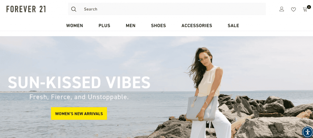
Forever 21 uses a neutral with an accent color scheme through its high-contrast yellow accent against minimalist soft whites and gray scales as its signature color pairing. The bold yellow is eye-catching and energetic, conveying youthfulness and urgency—ideal for fast fashion. This combination supports their messaging of affordability and trendiness.
The Coca-Cola Company
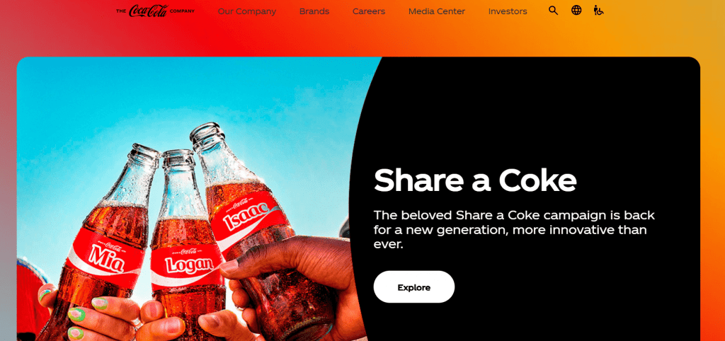
The Coca-Cola Company website uses an analogous color scheme of red, yellow, and orange with black and white accents. The vibrant red dominates, evoking energy and excitement, while yellow and orange complement it with warmth and optimism. Black provides contrast for readability, and white serves as a neutral backdrop, allowing the brighter colors to stand out. This combination creates a dynamic, inviting design that aligns with the brand’s joyful and refreshing identity.
Best color schemes for websites
If you’re still, looking for inspiration, we have 50+ ready-to-use palettes complete with HEX codes, sorted by theme for easier browsing:
Minimal & neutral
- Simple greyscale neutral
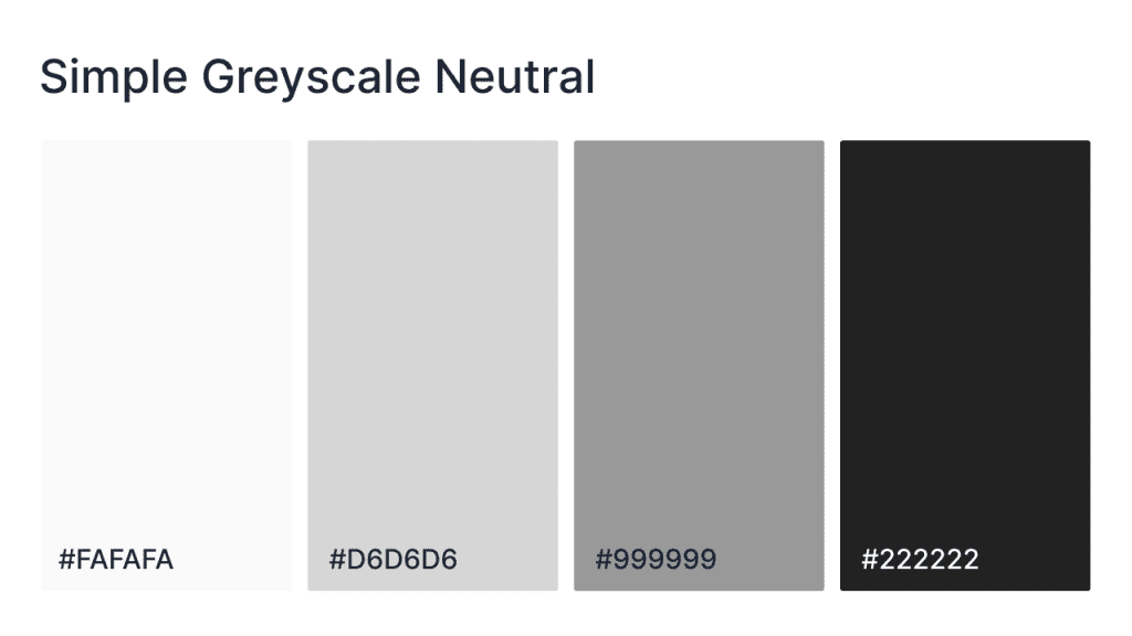
This palette embraces simplicity, focusing on neutral tones that highlight content and create a modern, clean design. Perfect for a timeless website that avoids overwhelming the viewer while still remaining visually interesting.
HEX codes: #FAFAFA, #D6D6D6, #999999, #222222
- Simple greyscale cool
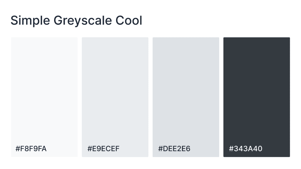
This cool greyscale palette incorporates soft shades of grey with a hint of blue, creating a tranquil and modern feel. Perfect for tech websites, creative portfolios, or wellness-focused designs, it offers a calming aesthetic while maintaining a sharp, professional appearance. The cool tones are ideal for contemporary designs that aim to feel fresh yet grounded.
HEX codes: #F8F9FA, #E9ECEF, #DEE2E6, #343A40
- Simple contrast
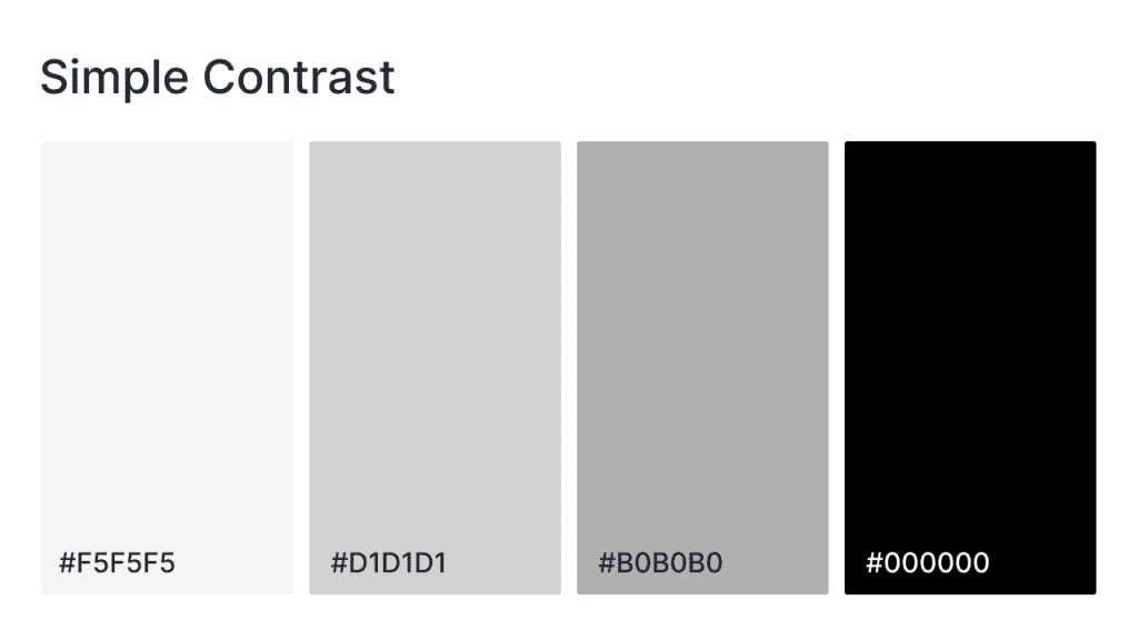
This high-contrast palette pairs light and dark tones to create a bold, dynamic look. It’s perfect for websites that want to make an impact with their design, especially when focusing on attention-grabbing elements like call-to-action buttons, navigation bars, or headlines. The subtle grey tones combined with deep black provide a striking yet balanced aesthetic.
HEX codes: #F5F5F5, #D1D1D1, #B0B0B0, #000000
- Simple greyscale warm
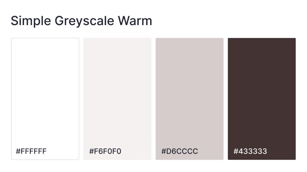
This warm greyscale palette combines soft, earthy tones with a hint of warmth, creating a welcoming and cozy atmosphere for your website. Perfect for lifestyle sites, eCommerce stores, or personal blogs, this palette exudes comfort while maintaining a professional look. The mix of light neutrals and deeper, warmer greys provides a refined, inviting design.
HEX codes: #FFFFFF, #F6F0F0, #D6CCCC, #433333
- Soft contrast
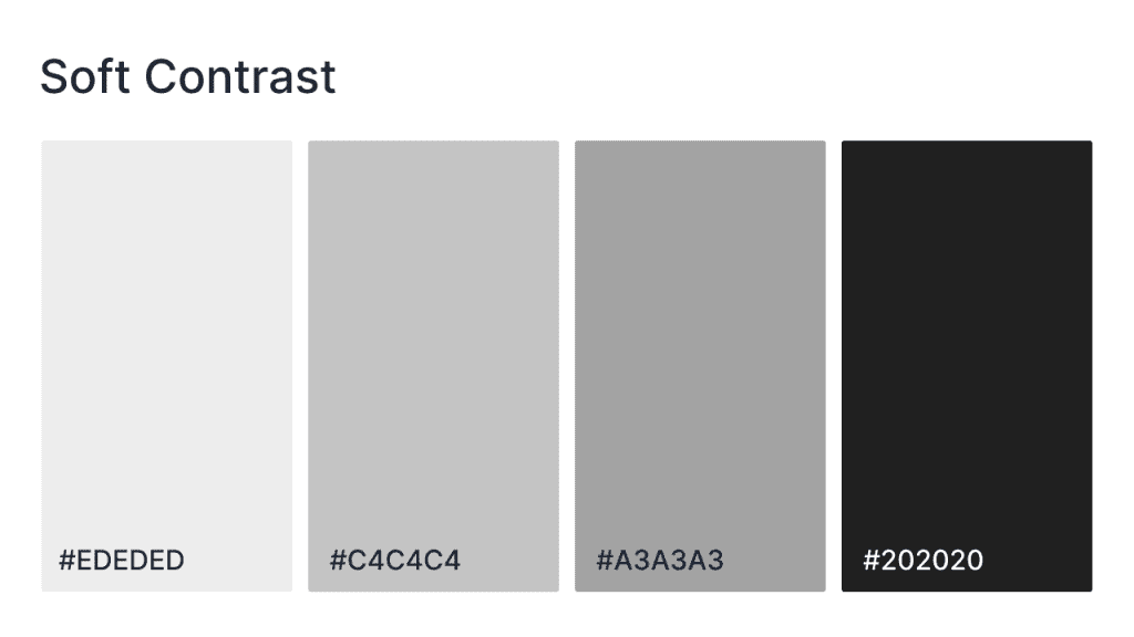
This palette offers a gentle yet distinct contrast between light and dark tones, creating an elegant and refined look for your website. It’s perfect for sites that aim for a sophisticated, yet approachable vibe such as lifestyle blogs, portfolio sites, or any design looking for a polished, understated aesthetic. The soft greys combined with deep charcoal create a relaxed but stylish visual experience.
HEX codes: #EDEDED, #C4C4C4, #A3A3A3, #202020
Calm and cool
- Cloudy day
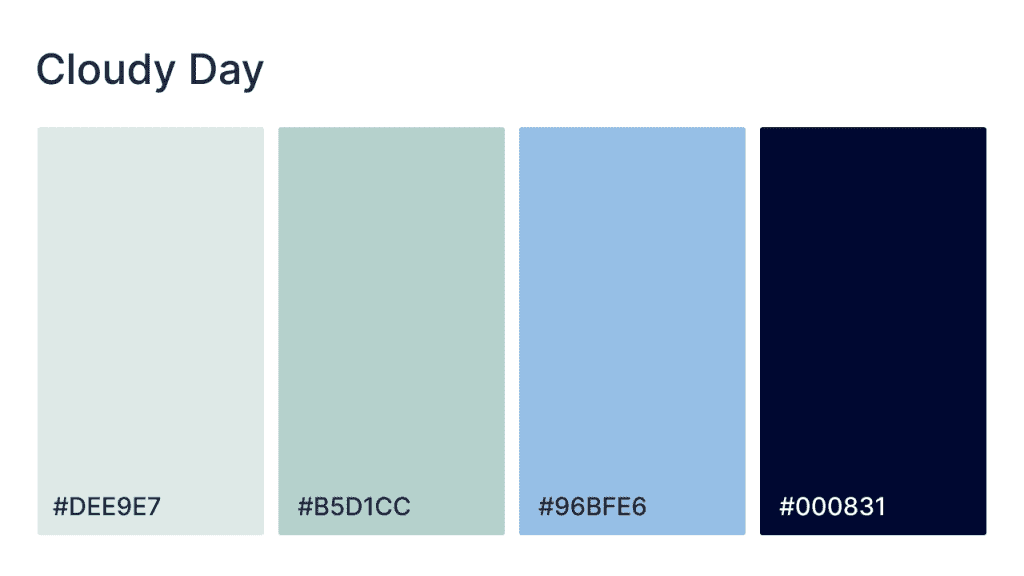
Inspired by soft, overcast skies, this palette evokes a calm, serene mood with cool, muted blues and greens. Ideal for websites that want to create a tranquil and refreshing atmosphere, perfect for nature-focused blogs, wellness sites, or any design looking to evoke peace and relaxation. The subtle gradients from light to dark offer a peaceful backdrop for content while still providing contrast.
HEX codes: #DEE9E7, #B5D1CC, #96BFE6, #000831
- Nantucket blues
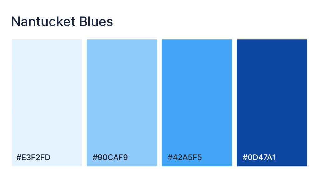
Inspired by the fresh, crisp blues of a coastal New England morning, the palette evokes a sense of breeziness and tranquility. It combines soft, light blues with deeper, rich tones, creating a balanced and calming design. Perfect for websites that aim for a refreshing, airy, and coastal feel, this palette works well for beach-related sites, travel blogs, or any brand that wants to bring a touch of calm elegance with a splash of vibrant energy. The combination of cool tones with contrasting deeper blues adds sophistication while maintaining an inviting atmosphere.
HEX codes: #E3F2FD 90CAF9 #42A5F5 #0D47A1
- High tide
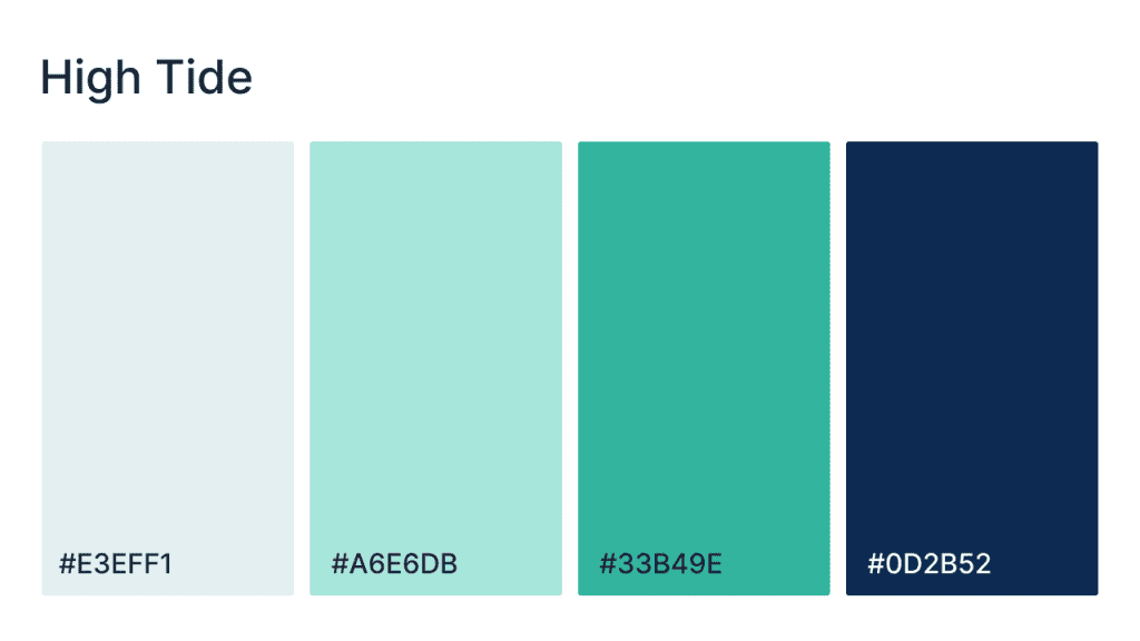
Drawing inspiration from the ocean’s ever-changing tides, this palette offers a refreshing mix of soft greens and blues with a bold navy accent. The color scheme is perfect for sites looking to evoke feelings of freshness, tranquility, and sophistication. The lighter blues and greens provide a calm foundation, while the dark navy adds depth and energy. Ideal for wellness, coastal travel, or environmental sites, this palette combines vitality and calmness in perfect harmony.
HEX codes: #E3EFF1, #A6E6DB, #33B49E, #0D2B52
- Moody mute
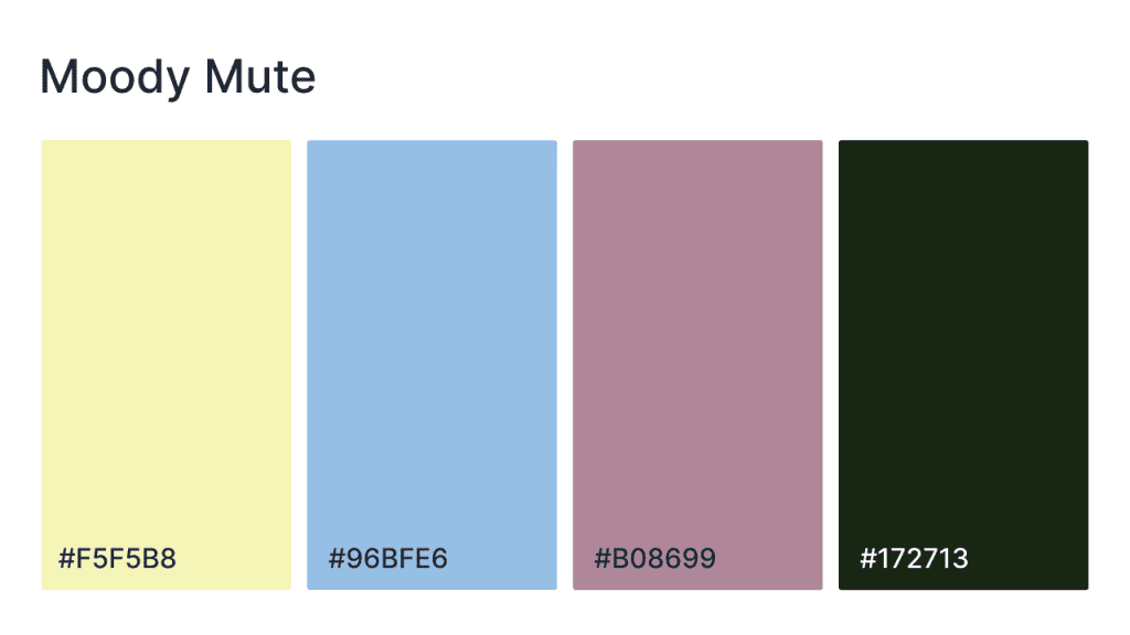
A rich blend of muted blues, soft pinks, and earthy greens, this offers a balanced, moody vibe. This palette is ideal for websites looking to evoke calm sophistication. The combination of pale yellow and cool blue adds a serene foundation, while the dusty rose and deep green bring depth and complexity. Perfect for fashion, wellness, or lifestyle blogs, it creates a relaxed yet intriguing atmosphere.
HEX codes: #F5F5B8, #96BFE6, #B08699, #172713
- Cool sand
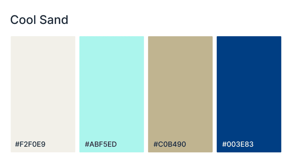
This palette brings the refreshing vibe of the ocean to your website design, effortlessly blending light, soft hues of blue and green with the grounding warmth of muted yellow and deep navy. Whether you’re designing a wellness blog, nature site, or a lifestyle brand, this palette brings openness and clarity. The light tones create a spacious, airy feel, while the darker shades provide contrast and sophistication, ensuring a balanced and inviting design.
HEX codes: #F2F0E9, #ABF5ED, #C0B490, #003E83
Warm and inviting
- Sunnyside
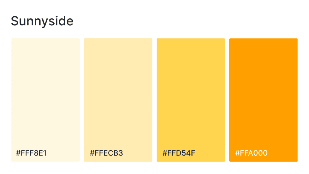
This palette is all about warmth, brightness, and positivity, evoking the cheerful vibes of a sunny day. With its rich yellows and soft golds, it creates an inviting and energetic atmosphere, perfect for websites aiming to make users feel happy, uplifted, and energized. Whether for lifestyle brands, eCommerce stores, or creative platforms, the Sunnyside palette ensures a bright, engaging design. The gradient from soft pastels to vibrant yellows gives the palette both warmth and depth, creating a welcoming space for visitors.
Hex codes: #FFF8E1 #FFECB3 #FFD54F #FFA000
- Candlelight
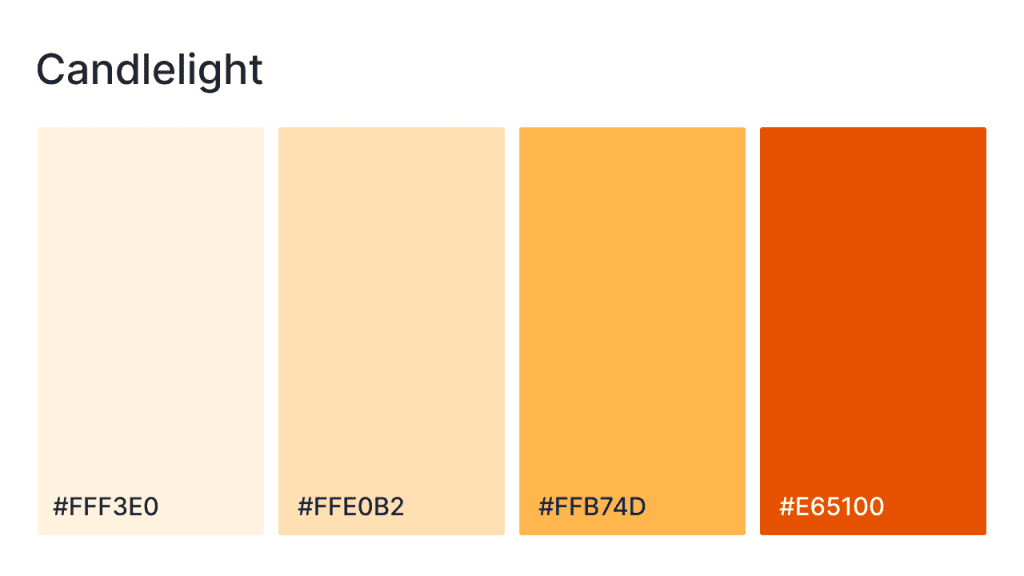
Soft, warm, and intimate, this palette is all about creating a cozy, inviting environment. Featuring a mix of delicate peaches, warm yellows, and soft pinks, bring out a gentle glow of candlelight, ideal for sites that want to offer a sense of comfort and relaxation. The muted, welcoming tones make it perfect for lifestyle, home décor, or wellness websites. The deep amber adds a bold yet warm contrast, making it perfect for buttons or headers that need to catch the eye while still maintaining an overall calming vibe.
HEX codes: #FFF3E0, #FFE0B2, #FFB7D4, #E65100
- Favorite sweater
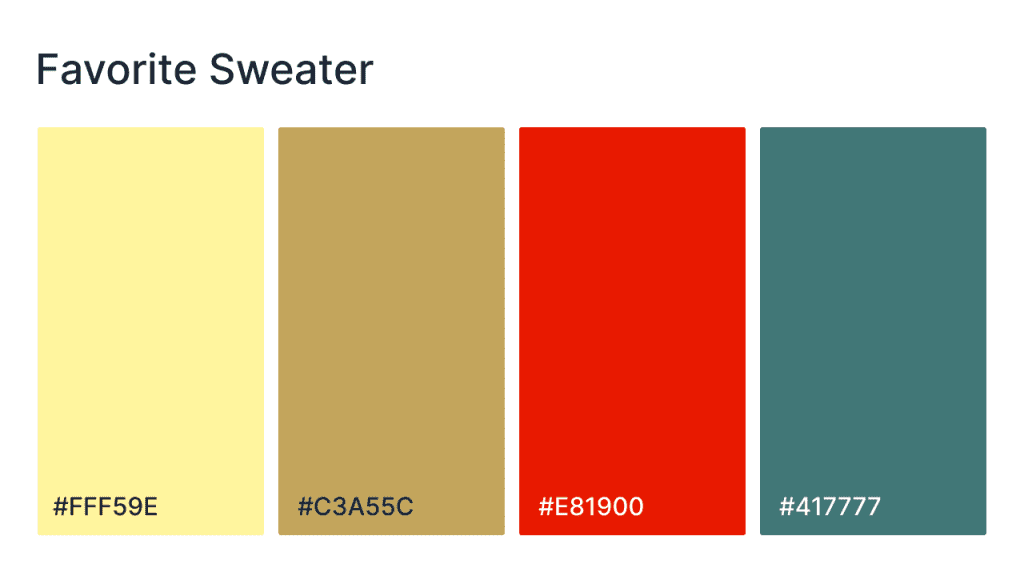
Wrap your website in warmth with this palette, featuring soft golden yellows, earthy greens, and pops of red and teal. Inspired by cozy autumn days, this palette is perfect for websites that want to create an inviting, down-to-earth vibe. The light yellow and muted green provide a gentle, calming backdrop, while the vibrant red and deep teal bring bold energy and contrast to make key elements stand out.
HEX codes: #FFF59E, #C3A55C, #E81900, #417777
- Peacock
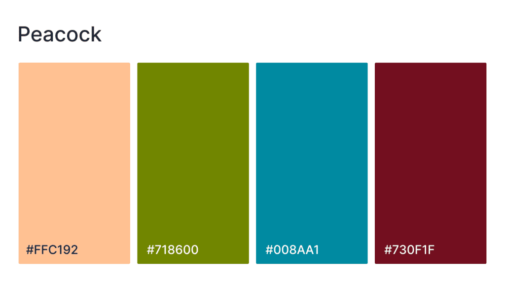
Bold, regal, and vibrant, the palette channels the striking beauty of peacock feathers. With its mix of soft peach, rich green, deep blue, and bold red, this palette is perfect for websites that aim to be both luxurious and visually captivating. The peach provides a warm, inviting base, while the green and blue offer depth and vibrancy. The deep red accentuates key areas of the design, making this palette ideal for high-end brands or artistic ventures that seek a bold, sophisticated aesthetic.
HEX codes: #FFC192, #718600, #008AA1, #730F1F
- Warm sunset
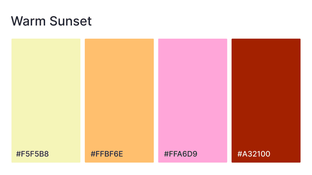
Evoke the vibrant colors of the setting sun, combining soft, golden yellows with rich, fiery reds and gentle pinks with this color scheme. Perfect for creating an inviting, warm atmosphere, this palette is ideal for websites that want to blend elegance with energy. The muted yellow and peachy tones offer a soothing backdrop, while the pink and deep red create striking contrasts, making this palette great for websites that want to convey warmth and creativity.
HEX codes: #F5F5B8, #FFBF6E, #FFA6D9, #A32100
Nature-inspired
- In the weeds
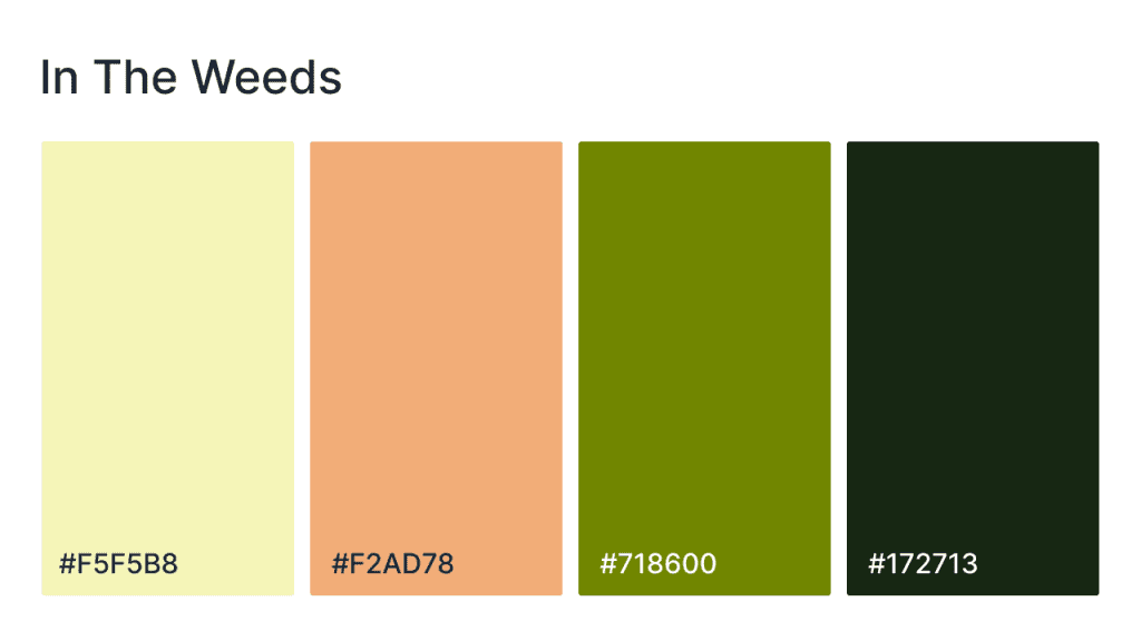
Earthy and vibrant, this color scheme brings together soft yellows, warm oranges, and deep greens to create a design that feels connected to nature. Perfect for websites in the agriculture, sustainability, or outdoor lifestyle spaces, highlight the richness of a garden or forest. The yellow and orange tones add warmth and energy, while the green and brown tones bring a calming, natural grounding, ideal for projects focused on the environment or organic living.
HEX codes: #F5F5B8, #F2AD78, #718600, #172713
- Verdant vine
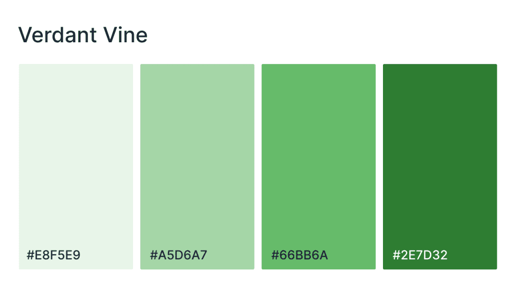
Embody the lush vibrancy of nature, blending soft greens with rich emerald tones. Perfect for websites focusing on wellness, sustainability, or eco-conscious design, this color scheme evokes growth, renewal, and natural beauty. The light, refreshing greens create a soothing backdrop, while the deeper greens bring depth and sophistication, making it ideal for organic brands, environmental organizations, or lifestyle blogs.
HEX codes: #E8F5E9, #A5D6A7, #66BB6A, #2E7D32
- Greenhouse
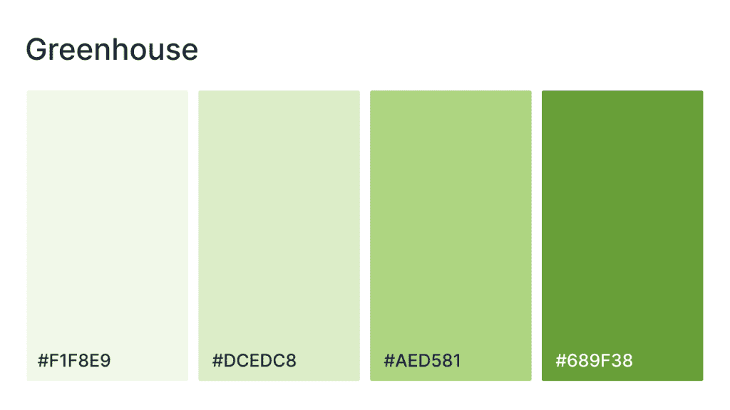
With its fresh, soft greens and earthy hues, channel the serenity and growth of a thriving indoor garden in your website. The lightest greens provide an airy, peaceful background, while the richer greens add contrast and depth, evoking a sense of natural vitality and renewal. The overall effect is fresh, vibrant, and full of life, creating a welcoming atmosphere for visitors.
HEX codes: #F1F8E9, #DCEDC8, #AED581, #689F38
- Dandelion tea
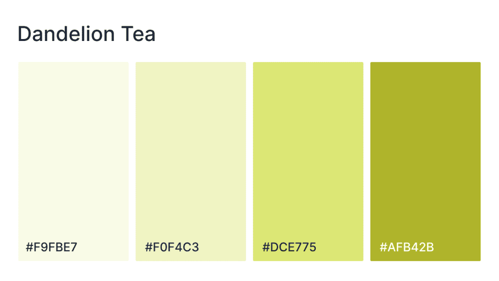
Inspired by the comforting simplicity of dandelion tea, this palette combines soft, delicate yellows and greens with a bold, grounding gold. The pastel shades offer a soft, serene base, while the richer gold brings warmth and depth, evoking the soothing yet vibrant nature of a cup of tea. These colors add a gentle, inviting energy to any design.
- Regal raspberry
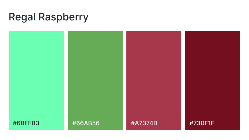
Regal Raspberry is a striking palette that balances the vibrancy of mint green with the richness of berry reds and earthy greens. This palette is perfect for websites that want to make a statement while maintaining an air of sophistication. The mint green adds a cool, refreshing touch, while the deep reds and greens provide contrast and depth.
HEX codes: #6BFFB3, #66AB56, #A7374B, #730F1F
Bold and vibrant
- Watermelon punch
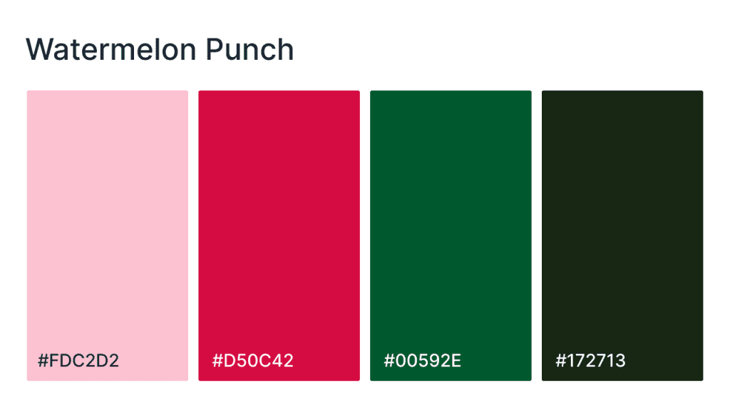
The palette is a bold and energetic combination of juicy pinks, vibrant greens, and grounding deep tones. Inspired by the refreshing burst of watermelon, these colors exude fun, vitality, and excitement. The soft pink and bright red evoke a playful, lively mood, while the rich green and dark brown provide balance and depth; perfect for websites that want to feel fresh, dynamic, and attention-grabbing.
HEX codes: #FDCD2D2, #D50C42, #00592E, #172713
- Violet vibe
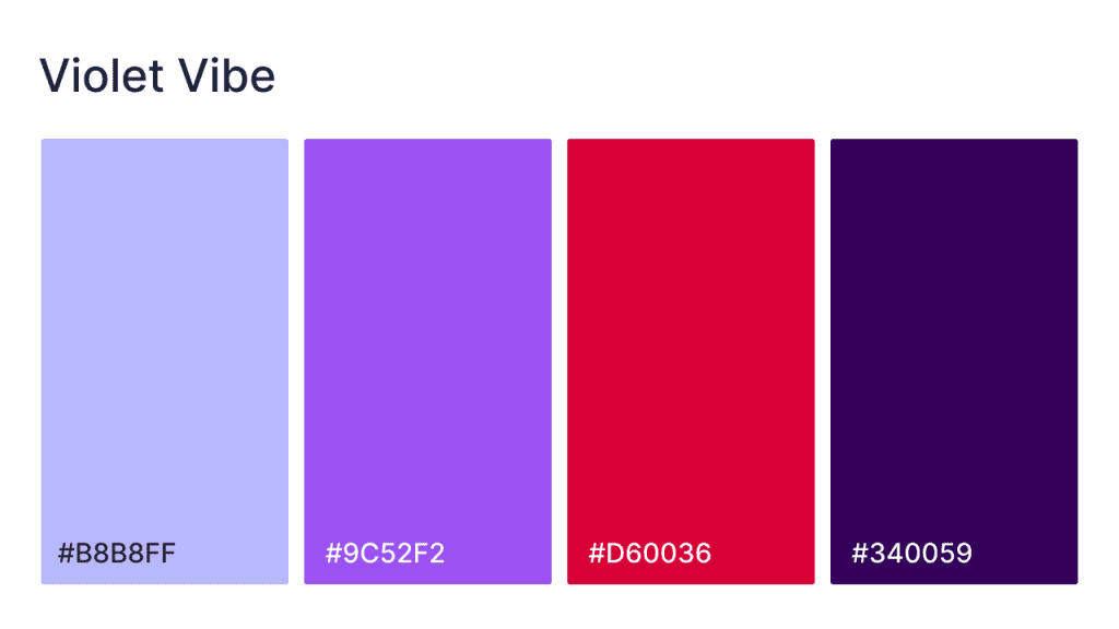
Vibrant and daring, the palette captures the intensity of bold purples and reds, balanced by the softness of lavender. Best for websites aiming to stand out, this palette blends energetic colors with a sophisticated edge. The lavender offers a calm, welcoming feel, while the purple and red tones add excitement and passion.
HEX codes: #B8B8FF, #9C52F2, #D60036, #340059
- Sunshine walk
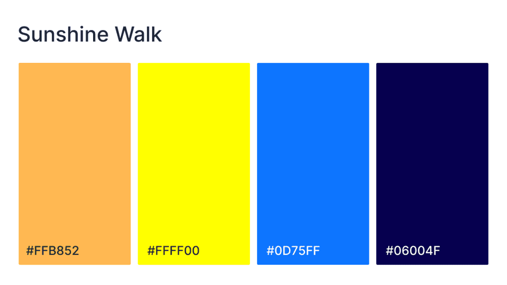
With its bold mix of bright yellow, vivid blue, and deep purple, these colors create an energetic, lively atmosphere. The warm yellow evokes the feeling of sunshine and joy, while the striking blue and deep purple provide depth and contrast, giving the design a modern, playful edge. Perfect for brands looking to make a statement and want to convey excitement and creativity.
HEX codes: #FFB852, #FFF00, #0D75FF, #06004F
- High energy
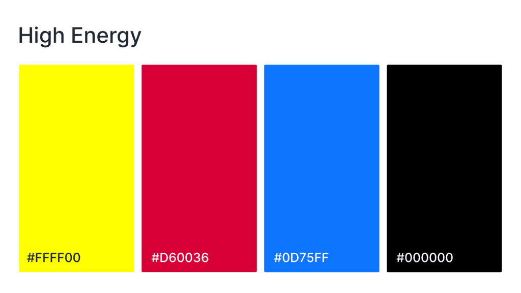
Bold, striking, and full of life, it combines the vibrant intensity of yellow, red, and blue with the sophistication of black. The yellow injects brightness and positivity, while the red adds energy and passion. The deep blue offers contrast and balance, and the black anchors the design with strength and elegance. If you want your websites to make a bold statement, this palette works well for you.
HEX codes: #FFFF00, #D60036, #0D75FF, #000000
- Racetrack realness
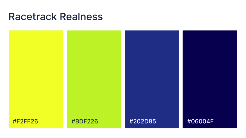
Bring the thrill of the racetrack to your website with this palette, which mixes vibrant yellows and greens with cool blues and deep purples. The bright, energetic yellow and green tones evoke speed and excitement, while the darker blues and purples provide contrast and depth. Perfect for sports, entertainment, or tech websites, this palette conveys high energy, competition, and modern style.
HEX codes: #F2FF26, #BDF226, #202D85, #06004F
Elegant and luxury
- Elegant ecru
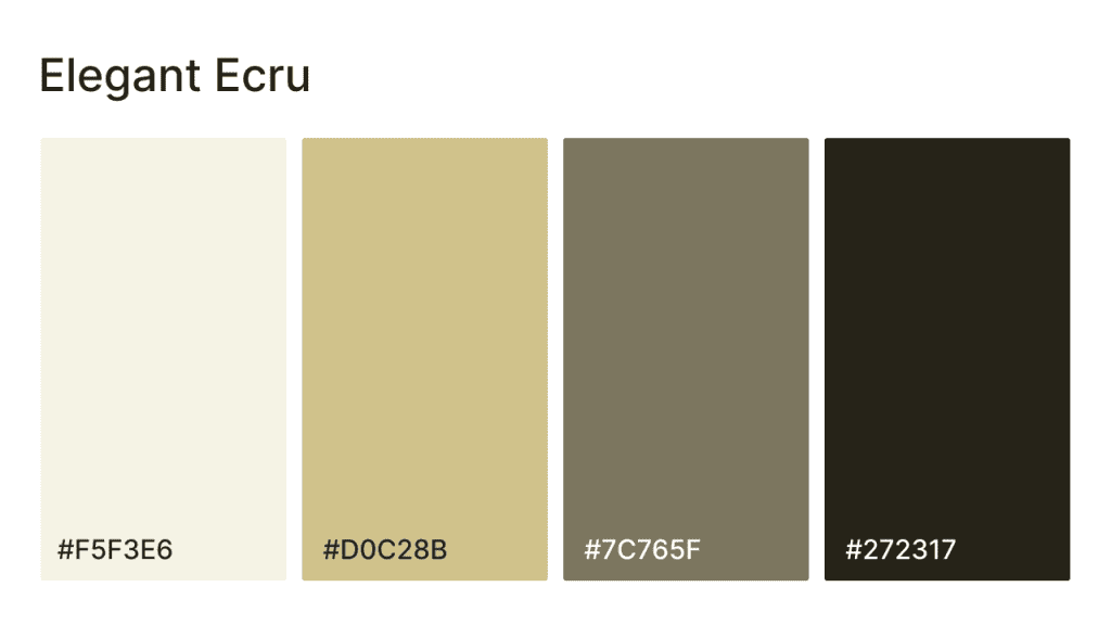
The Elegant Ecru palette exudes understated sophistication with its soft, neutral tones and subtle contrasts. Featuring warm beige, olive, and rich brown hues, this palette creates a timeless, elegant design that feels both cozy and refined. Ideal for websites in luxury, home decor, or lifestyle brands, the soft beige and olive tones set a calming foundation, while the deeper brown brings grounding depth and sophistication.
HEX codes: #F5F3E6, #D0C28B, #7C765F, #272317
- Intelligent indigo
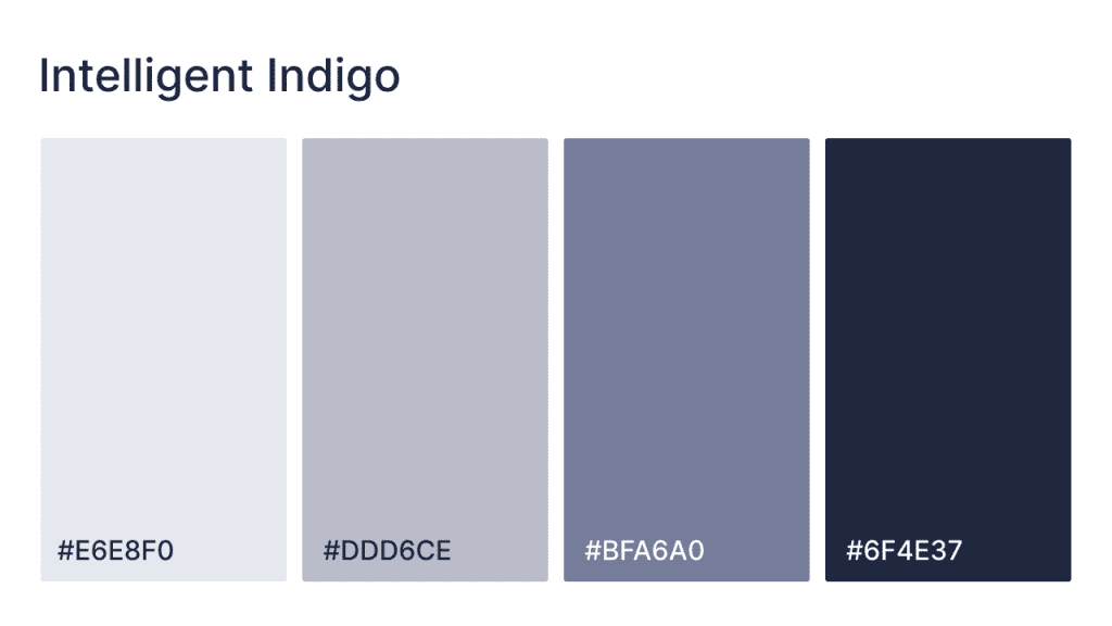
A perfect balance of bold and subtle, the palette pairs deep indigo with soft grey hues to provide a sense of wisdom, creativity, and professionalism. The indigo provides a vibrant pop of energy, while the neutral tones create a sophisticated and refined backdrop. The neutral grey grounds the design, making this palette ideal for tech startups, consulting firms, or any brand looking to combine innovation with elegance.
HEX codes: #E6E8F0, #DDD6CE, #BFA6A0, #6F4E37
- Cozy cashmere
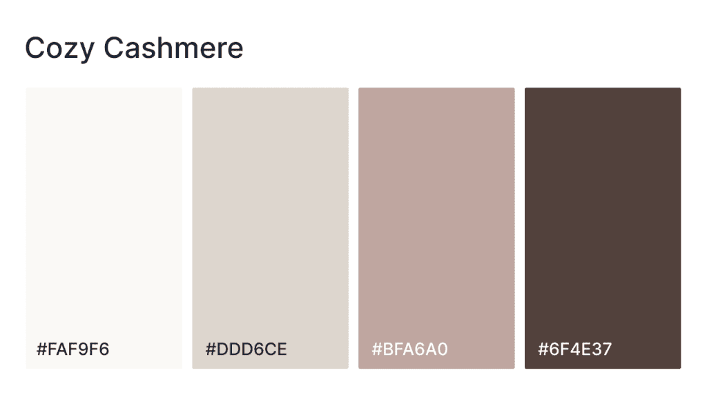
Inspired by the warmth of cashmere, this palette combines soft, inviting beige tones with deeper, earthier hues to create a soothing, elegant design. The creamy off-white provides a calm and luxurious backdrop, while the soft taupe and pink tones add richness and depth. The dark brown grounds the palette, giving it a sophisticated finish. Bring a sense of comfort, warmth, and understated luxury to your website’s vibe.
HEX codes: #FAF9F6, #DDD6CE, #BFA6A0, #6F4E37
- Naked neutral
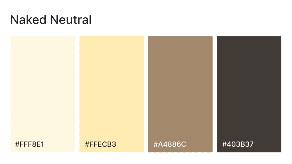
Combine soft, light yellows and creams with muted taupes and deep browns to create a refined, grounded design. The light yellow and cream tones add warmth and lightness, while the deeper brown and taupe create depth and balance. This palette offera a calm, elegant atmosphere that feels both inviting and sophisticated.
HEX codes: #FFF8E1, #FFECB3, #A4886C, #403B37
- Simply steel
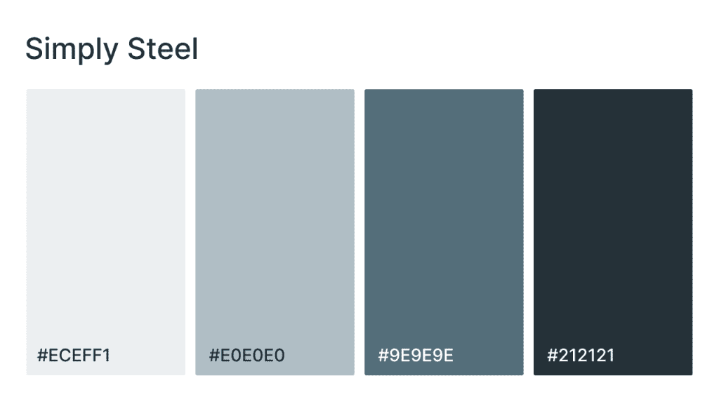
Sleek, modern fusion of cool grays and a rich charcoal base, the light gray tones give a soft, neutral foundation, while the medium grays add a touch of balance and depth. The dark charcoal brings a sense of sophistication and focus. Perfect for corporate, tech, or industrial websites, this palette embodies elegance and contemporary design with a minimalist edge.
HEX codes: #ECEFF1, #E0E0E0, #9E9E9E, #212121
Soft pastels
- Flower power
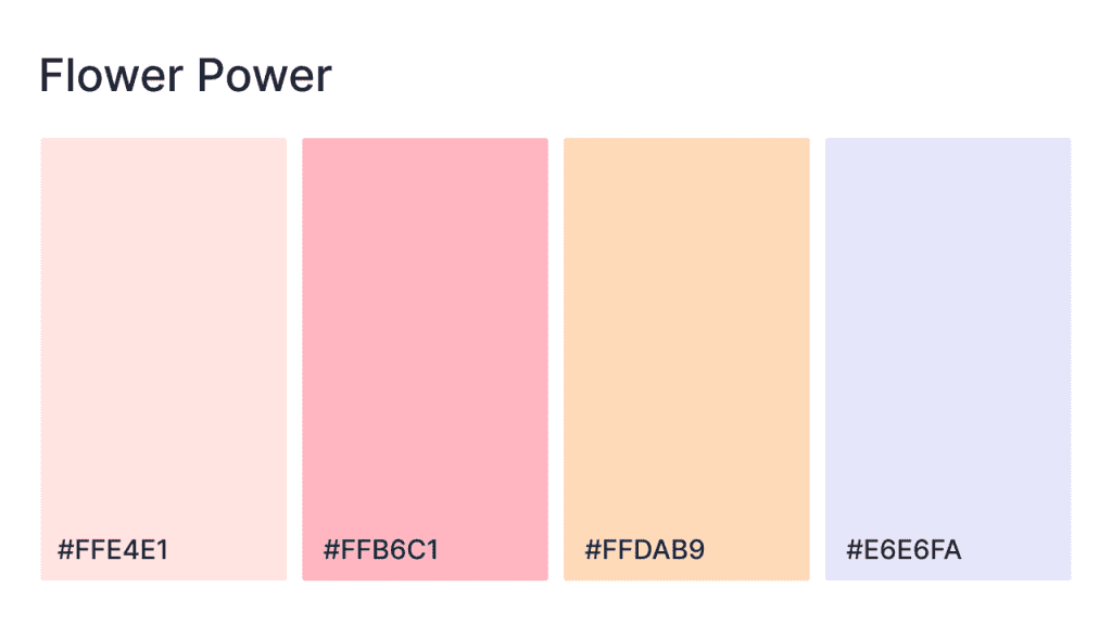
Inspired by the soft hues of spring flowers, the palette blends delicate pinks, peaches, and purples to create a light, airy, and joyful atmosphere. The light pink and peach tones provide warmth and subtle energy, while the soft lavender offers balance and tranquility. Ideal for websites in beauty, wellness, or feminine-focused brands, this palette feels fresh, cheerful, and nostalgic.
HEX codes: #FFE4E1, #FFB6C1, #FFDAB9, #E6E6FA
- Rose remedy
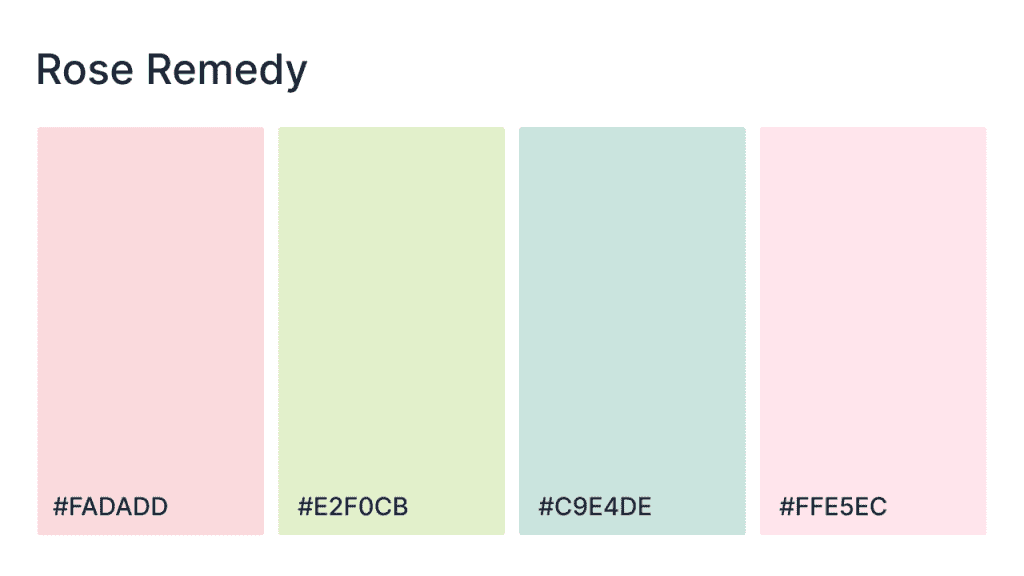
The palette uses soft pinks, calming greens, and gentle blues to create a soothing and healing atmosphere. The pale rose pink provides a comforting, gentle backdrop, while the soft green and blue tones evoke tranquility and freshness. The light peachy pink adds warmth and balance, making this palette ideal for wellness websites, beauty brands, or lifestyle blogs focused on calmness and rejuvenation.
HEX codes: #FADADD, #E2F0CB, #C9E4DE, #FFE5EC
- Spring fling
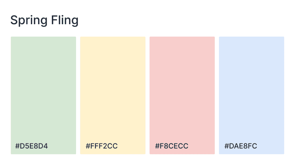
Delicate and refreshing, the palette blends soft pastels to evoke the essence of spring in full bloom. The pastel green creates a peaceful, serene foundation, while the soft yellow brings warmth and optimism. The light pink and blue add a gentle, joyful touch. This palette brings a sense of renewal, cheerfulness, and lightness to any design.
HEX codes: #D5E8D4, #FFF2CC, #F8CECC, #DAE8FC
- Cali surf
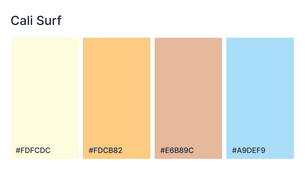
Captures the warm, laid-back vibes of California beaches, combining soft yellows, sandy peaches, and refreshing blues with this color scheme. The light yellow and warm peach create an inviting, sunlit foundation, while the soft peach and cool blue tones add a refreshing contrast. Ideal for beach-themed websites, travel blogs, or lifestyle brands, feel the relaxation, fun, and adventure under the sun.
HEX codes: #FDFCDC, #FDCB82, #E6B89C, #A9DEF9
- Cotton candy
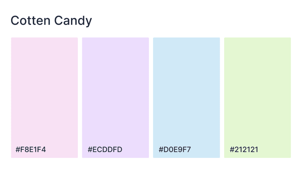
Inspired by the light, airy sweetness of cotton candy, this combines pastel pinks, lavender, and blue with a deep grounding gray. The pale pink and lavender tones offer a soft, dreamy backdrop, while the cool blue brings a refreshing contrast. The dark gray provides depth and sophistication, making the palette perfect for fashion, beauty, or lifestyle websites, where whimsy and elegance come together seamlessly.
HEX codes: #F8E1F4, #ECDDFD, #D0E9F7, #212121
Dark mode palettes
36. Darkmode dance
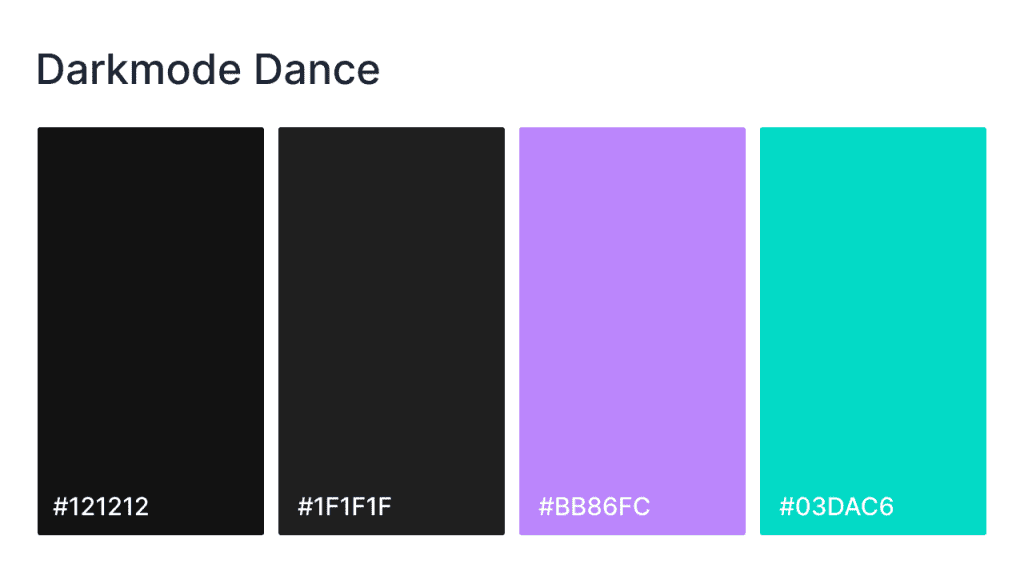
It blends bold dark tones with vibrant pops of color, creating a high-energy, modern design. The deep blacks and dark grays provide a sleek, sophisticated background, while the electric purple and teal inject a fresh, dynamic vibe. Perfect for tech, entertainment, or music websites, this palette shows modernity, style, and excitement, evoking the thrill of a late-night dance party.
HEX codes: #121212, #1F1F1F, #BB86FC, #03DAC6
- Deep sea
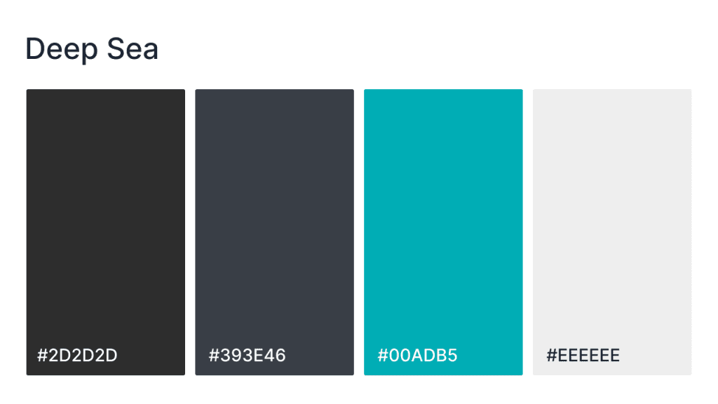
With its blend of rich, dark grays and vibrant teal, the palette brings a modern, sleek aesthetic inspired by the ocean depths. The dark grays provide a sophisticated foundation, while the teal adds energy and contrast. The light gray offers a refreshing touch of brightness, making this palette ideal for websites that want to combine professionalism with a pop of bold, vibrant color.
HEX codes: #2D2D2D, #393E46, #00ADB5, #EEEEEE
- High vibe
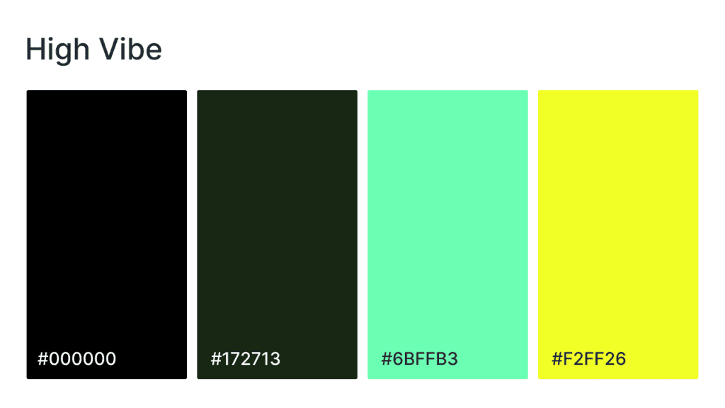
Blend bold, powerful contrasts with refreshing pops of color with this color set. The deep black and dark green provide a sleek and grounded backdrop, while the vibrant mint green and electric yellow infuse the design with energy and vibrancy. Perfect for websites focused on high-energy brands, tech, or creative platforms, this palette provides a modern, upbeat atmosphere that’s both striking and dynamic.
- Graphite glow
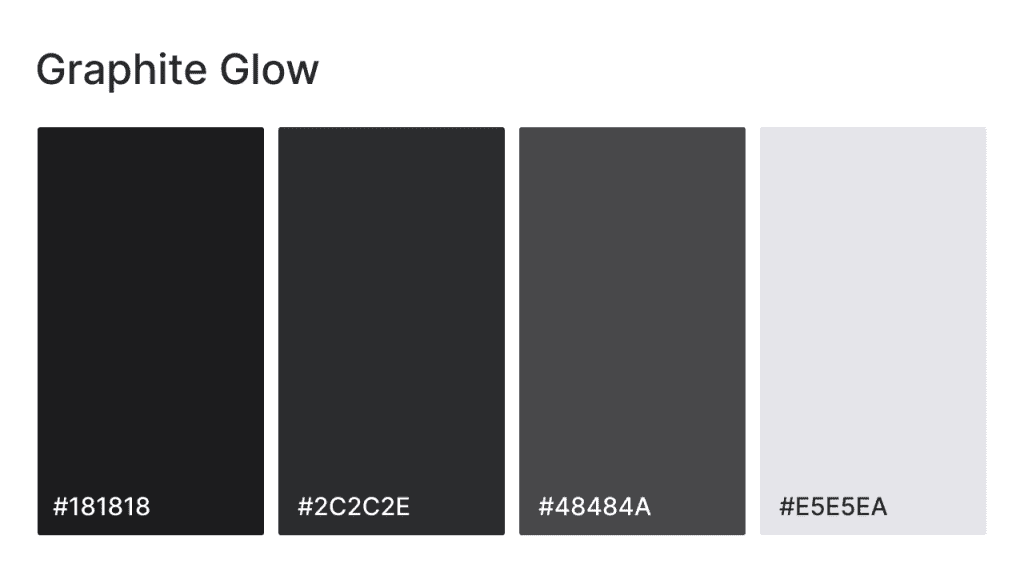
Sleek and sophisticated, it pairs deep grays with soft, glowing whites to create a refined, contemporary design. The dark charcoal and medium gray tones provide depth and structure, while the light gray and soft white infuse the palette with subtle brightness. Perfect for brands that want a modern, minimalist aesthetic, this palette works well for tech, business, or creative websites that need to convey professionalism and elegance.
HEX codes: #181818, #2C2C2E, #48484A, #E5E5EA
- Vibrant pop
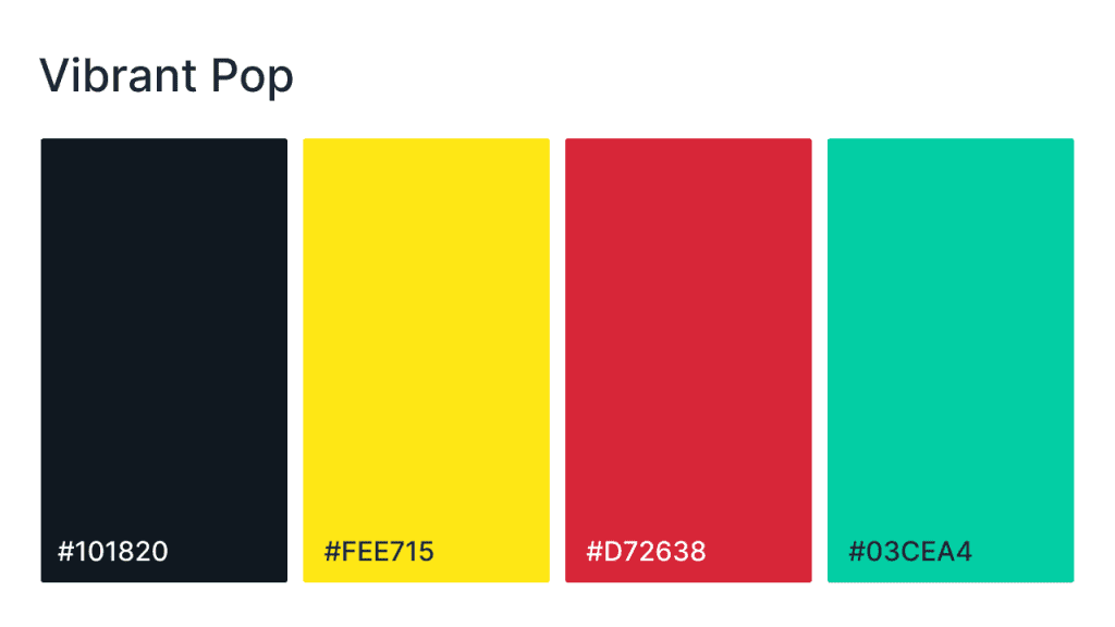
This is a high-energy fusion of dark tones and bold, vibrant colors. The deep black provides a sleek base, while the bright yellow, striking red, and cool teal inject powerful bursts of color. Perfect for websites in the creative, entertainment, or tech industries, this palette shows vibrancy, innovation, and excitement, making it ideal for brands that want to stand out and make an impact.
HEX codes: #101820, #FEE715, #D72638, #03CEA4
Professional and tech
41. Professional blues
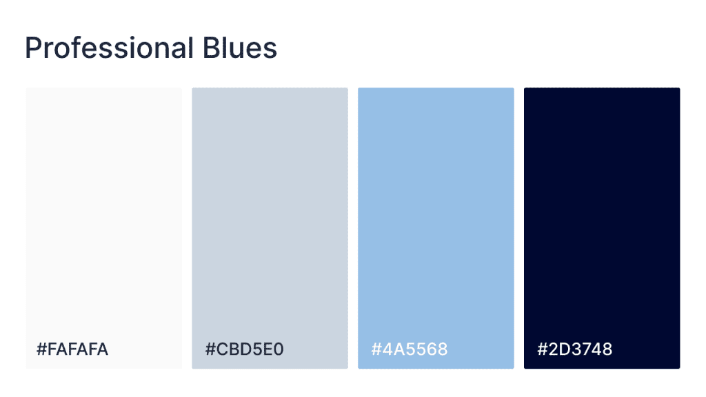
Clean, sophisticated, and professional, the palette features soft neutrals paired with deeper shades of blue and gray. The pale off-white provides a clean backdrop, while the light gray and cool blues create a calm, inviting atmosphere. The deep blue-gray gives the palette authority and stability. Perfect for business, finance, or corporate websites, these colors say trust, professionalism, and clarity.
HEX codes: #FAFAFA, #CBD5E0, #4A5568, #2D3748
- Corporate calm
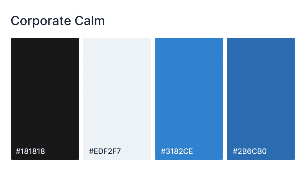
With its deep black, calming blue tones, and light gray accents, the palette strikes the perfect balance between strength and serenity. The dark black adds sophistication and stability, while the soft gray provides a light, welcoming touch. The bright blue accents bring energy and trust to the design, making this palette ideal for corporate, finance, or consulting websites that want to convey professionalism and reliability.
HEX codes: #181818, #EDF2F7, #3182CE, #2B6CB0
- Space cadet
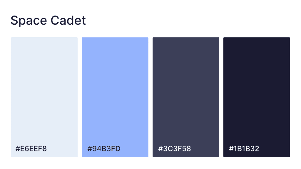
The Space Cadet palette is a striking blend of light and deep blues. The soft blue and pale tones provide a calming, cool background, while the deep blues and rich navy introduce bold contrast and depth. Perfect for websites in the tech, science, or space industries, this palette conveys a futuristic and sophisticated aesthetic, ideal for digital and creative projects.
HEX codes: #E6EEF8, #94B3FD, #3C3F58, #1B1B32
- Tranquil blue
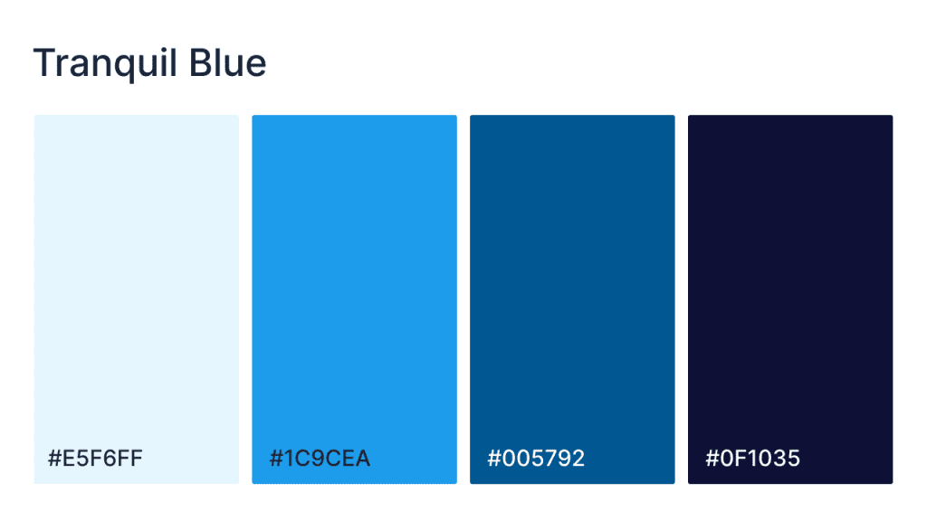
The palette combines soft, refreshing blues with rich navy and indigo tones for a balanced and serene design. The light blue offers a cool, calm foundation, while the deeper blues add a sense of depth and strength. This palette is ideal for websites in the healthcare, finance, or tech industries, where professionalism, trust, and a calming atmosphere are key to the brand message.
HEX codes: #E5F6FF, #1C9CEA, #005792, #0F1035
- Clean slate
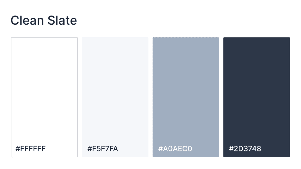
With its blend of fresh whites, cool grays, and deep slate, the palette is a clean slate that creates a sleek, contemporary atmosphere. The white and light gray offer a calm, neutral foundation, while the medium gray and dark charcoal tones provide contrast and depth. Perfect for corporate websites, design portfolios, or tech brands that aim to convey professionalism, simplicity, and modern sophistication.
HEX codes: #FFFFFF, #F5F7FA, #A0AEC0, #2D3748
Creative and playful
- Summer sunrise
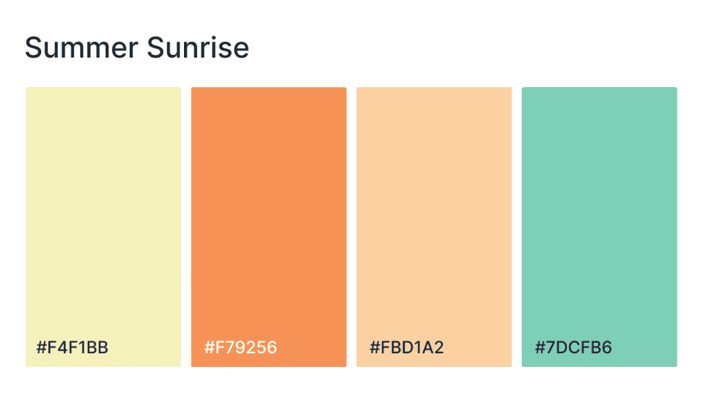
The Summer Sunrise palette brings the warmth and freshness of summer mornings into your design, with soft yellows, oranges, and light greens. The pale yellow sets a light, sunny tone, while the peach and orange tones evoke the vibrancy of a new day. The soft mint green adds a refreshing pop, making this palette perfect for websites in wellness, travel, or fashion, where brightness, positivity, and renewal are key themes.
HEX codes: #F4F1BB, #F79256, #FBD1A2, #7DCFB6
- Blissful breeze
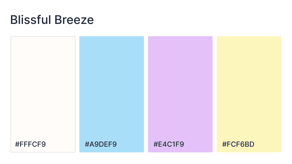
The Blissful Breeze palette combines soft neutrals and vibrant accents to create a refreshing and uplifting atmosphere. The light off-white provides a serene backdrop, while the soft blue brings tranquility. The vibrant pink offers a playful burst of energy, and the warm yellow adds a cheerful brightness. Perfect for brands in wellness, lifestyle, or creative industries, this palette evokes feelings of calm, joy, and light-heartedness.
HEX codes: #FFFCF9, #A9DEF9, #E41F9, #FCF6BD
- Blushing petals
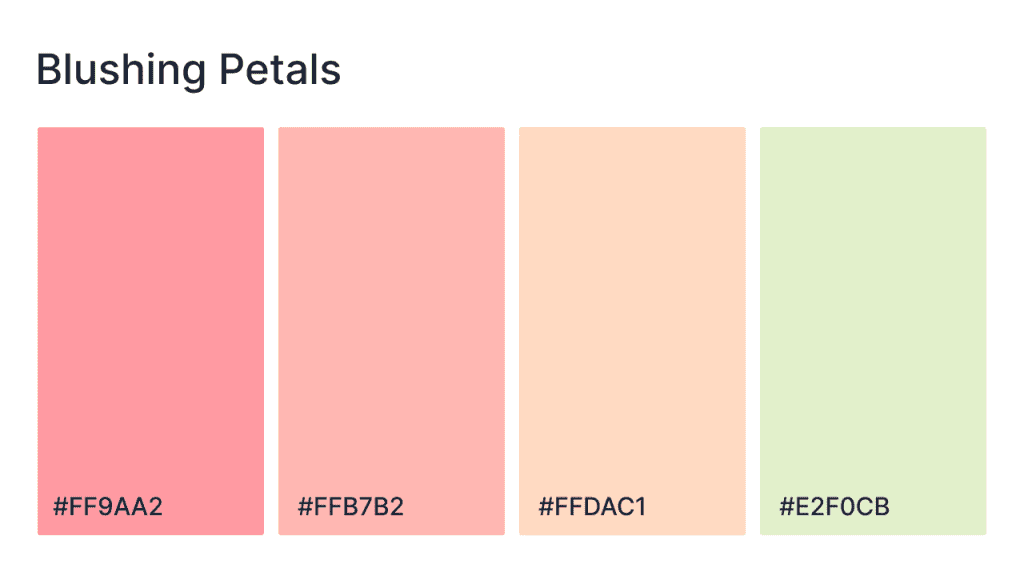
With its soft pinks, peaches, and light greens, the Blushing Petals palette brings a sense of softness and elegance to any design. The delicate pink and peach tones add warmth and romance, while the light green offers a refreshing contrast. This palette is perfect for websites in fashion, beauty, or wellness, creating an atmosphere of delicate beauty, grace, and tranquility.
HEX codes: #FF9AA2, #FFB7B2, #FFDAC1, #E2F0CB
- Golden hour
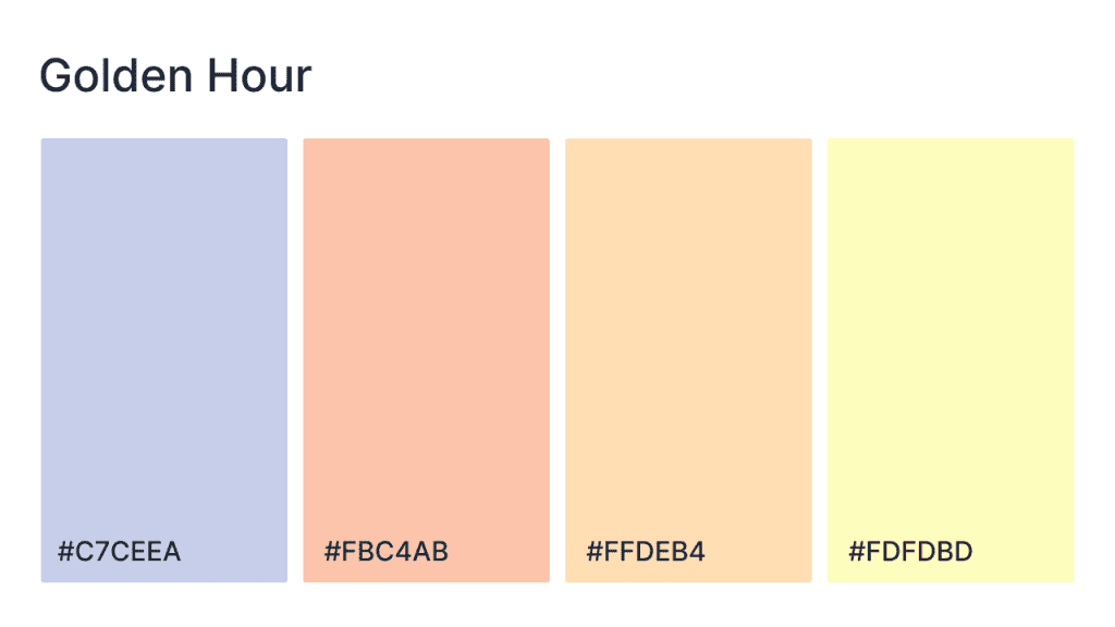
The Golden Hour palette is a soft, warm blend of lavender, peach, and golden yellows, evoking the gentle glow of a sunset. The pale lavender creates a peaceful and calming base, while the peach and yellow tones bring warmth and light. Ideal for websites in fashion, wellness, or beauty, this palette creates an elegant and serene vibe that embodies the peacefulness and beauty of the golden hour.
HEX codes: #C7CEEA, #FBC4AB, #FFDAB4, #FDFDBD
- Playful twilight
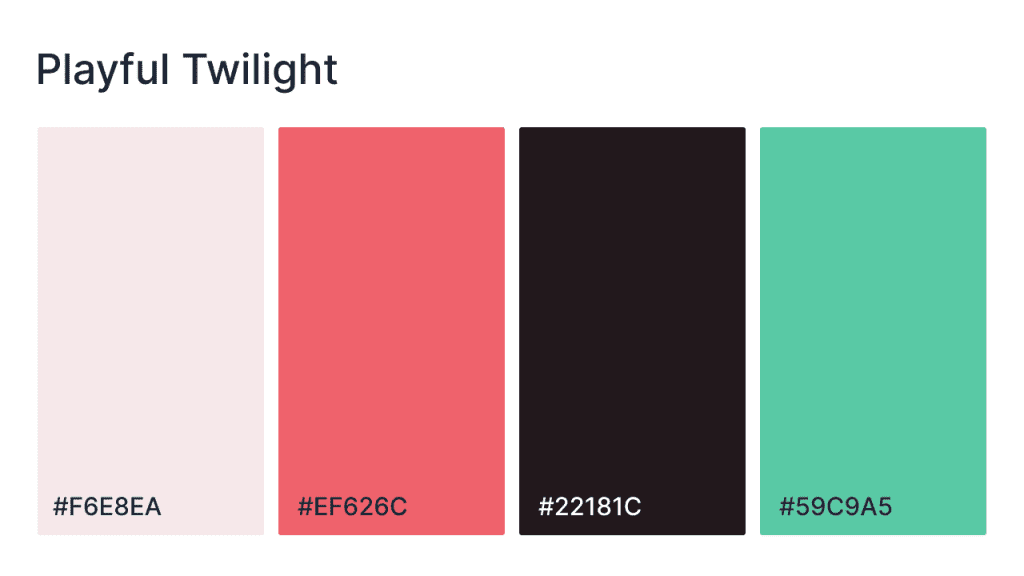
The Playful Twilight palette blends soft, romantic pinks with rich, passionate reds and cool, refreshing teal. The soft pink provides a calming base, while the bold red brings warmth and energy. The deep purple introduces contrast and sophistication, and the bright teal adds a playful and lively pop. Ideal for fashion, lifestyle, or creative websites, this palette balances vibrancy with elegance, creating a lively yet sophisticated feel.
HEX codes: #F6E8EA, #EF626C, #22181C, #59C9A5
How to choose your own website color scheme
Picking your own palette doesn’t have to be intimidating. Here’s a simple approach:
- Define your brand’s personality. Think about the emotion you want your brand to evoke. Is it fun and energetic, or calm and professional?
- Choose a base color. This is typically your primary brand color. Build your palette around it using analogous or complementary colors.
- Limit your palette. Stick to 3–4 key colors. Too many colors can overwhelm users and dilute your message.
- Use palette generators. Try tools like Adobe Color, Coolors, or Khroma to explore harmonious combinations.
- Check contrast and accessibility. Go beyond aesthetics. Make sure your color choices meet WCAG standards so all users can read and navigate your site comfortably.
Color your website with the right combination
Your website colors don’t need to be flashy—they just need to work. Color influences how visitors feel and what they do next. It affects your bounce rate, your conversion rate, and even how likely someone is to return.
Choosing the right palette means aligning your brand’s personality with color psychology and usability. Whether you go for a soft pastel scheme or a bold contrast combo, the best color scheme is the one that supports your message and helps users move through your site with confidence.
If you’re still not confident with your artistic sense, Network Solutions can help you build a visually pleasing website that evokes your brand’s identity. Our DIY website builders have plenty of aesthetic templates for any brand or industry. Or you can let our professionals do the creative work for you.
Create a website with the best color scheme today with Network Solutions.
Frequently asked questions
The best color scheme depends on your brand and audience. Popular options include neutral with accent, monochromatic, and complementary schemes. The goal is to create a balance that aligns with your brand’s personality while ensuring good readability and user experience.
The 3-color rule suggests using three primary colors: a dominant color for the majority of the design, a secondary color for contrast, and an accent color for highlights. This approach creates a harmonious and visually appealing design.
The 60-30-10 rule recommends using 60% of the dominant color, 30% for secondary elements, and 10% for accent colors. This ensures a balanced and well-structured design, drawing attention to key elements.
For websites, RGB or HEX is the best color mode, as they’re optimized for digital screens. CMYK is better suited for print and not recommended for web design.
Color contrast refers to the difference between background and text colors. It’s important because it ensures readability and accessibility, especially for users with visual impairments. Good contrast makes your content easier to read and improves overall user experience.
To choose the right colors, consider your brand identity, audience, and the emotions you want to evoke. Use color psychology to select hues that match your brand’s personality. Tools like Adobe Color or Coolors can help you create a harmonious color palette.
For call-to-action (CTA) buttons, bright, contrasting colors like red, orange, or green often work best. These colors stand out against the background, drawing users’ attention and encouraging interaction. Just make sure the color aligns with the overall design.
Yes, the color scheme should be consistent across both mobile and desktop versions. Consistency ensures brand recognition and a seamless user experience, no matter the device. However, ensure that colors still work well on different screen sizes and lighting conditions.
Limit your palette to around 3–4 main colors. Too many colors can overwhelm visitors and make the site feel cluttered. Stick to one dominant color, a secondary color, and a couple of accent colors for highlights.


