
Key takeaways:
- A well-structured plan guides your entire web design journey. Build a strong foundation by defining your website goals and identifying your target audience.
- Beyond functionality, thoughtful design elements attract attention, establish trust, and encourage engagement with your content.
- Thorough testing is the final, non-negotiable step in web design. This final review, including mobile optimization and usability testing, ensures your site is polished, fast, and performs smoothly for every visitor.
Website design is important because it builds your audience’s first impression of your brand. A well-designed site establishes instant credibility and trust and shows professionalism even before a visitor reads a word.
In this guide, we’ll show you how to design a website and offer valuable tips to help you get started.
How to design your own website in 9 steps
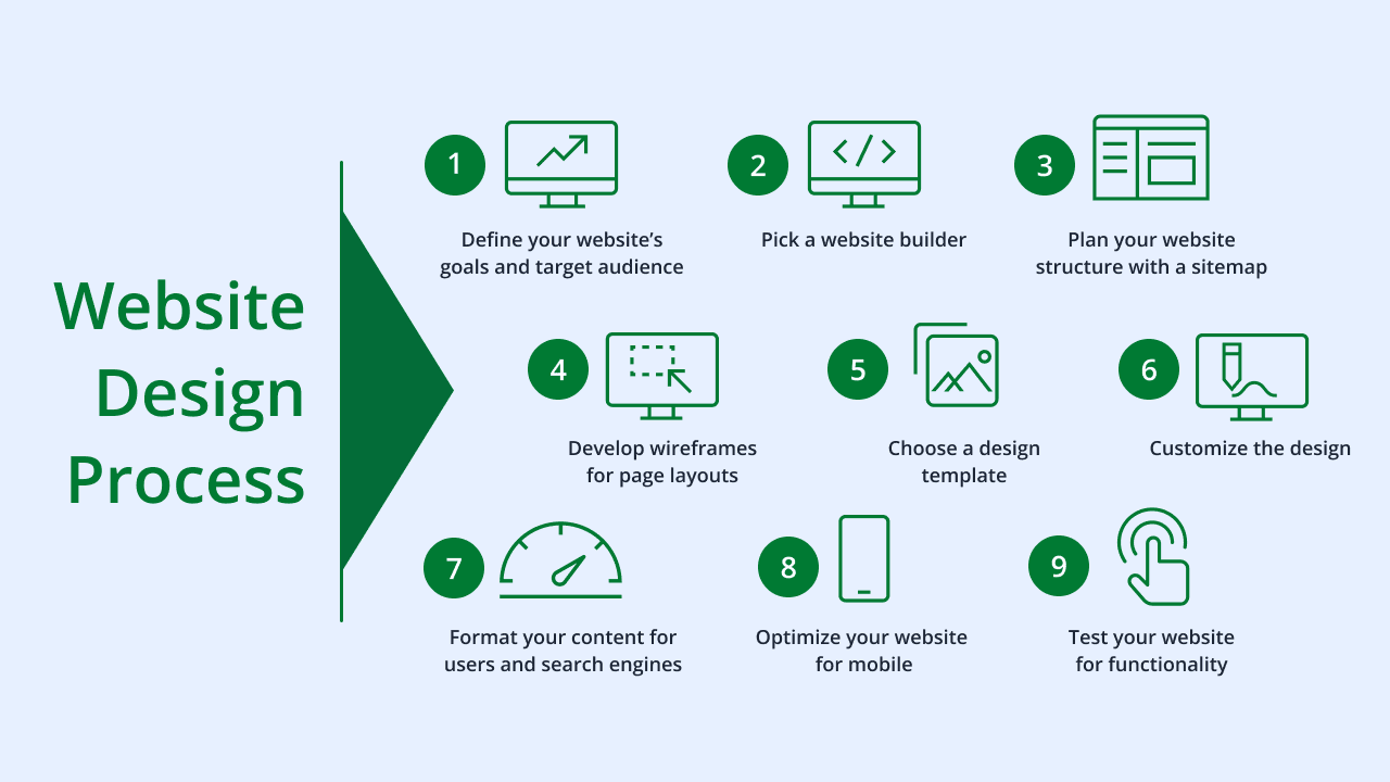
Designing your website can seem challenging at first. But following a clear, step-by-step process can empower you to approach this task all on your own.
Follow these nine easy steps to design a fully functional and visually appealing website:
- Define your website’s goals and target audience
- Pick a website builder
- Plan your website structure with a sitemap
- Develop wireframes for page layouts
- Choose a design template
- Customize the design
- Format your content for users and search engines
- Optimize your website for mobile
- Test your website for functionality
Step 1. Define your website’s goals and target audience
Defining your site’s purpose and intended audience forms the foundation of a successful website design.
Before you begin choosing colors or fonts, determine what you want your website to achieve. Do you aim to sell products or share valuable information on a specific topic?
Do you want to build a community or generate income on the side? Clearly outlining these objectives provides direction for every design choice you make.
For example, an online store mainly focuses on driving sales, so its design prioritizes elements like:
- Clear product displays
- Easy navigation to product pages
- A streamlined checkout process
Your target audience also heavily influences design decisions. Understanding your target market helps you tailor the website’s look, feel, and content to their preferences.
Consider these factors:
- Demographics
- Interests
- User interaction with websites
Let’s say you’re starting a blog targeting young adults interested in tech. You can use a modern, minimalist design with interactive elements and easy sharing options that suit a tech site perfectly.
Alternately, a professional site aiming for business clients would likely opt for a more formal, trustworthy aesthetic with clear calls-to-action (CTA) for consultations. This design emphasizes credibility and legitimacy.
Different types of websites have distinct goals that shape their design. Here are some other examples:
- Online portfolio
- News website
- Community forum site
- Fitness website
- Fashion website
- Event website
Online portfolio
An online portfolio intends to attract clients or employers with high-quality visuals and intuitive navigation to display projects effectively.
News website
A news website’s goal is to deliver information quickly. This requires a design that prioritizes:
- Readability
- Clear categorization of articles
- Fast loading times
Community forum site
Community forums aim to foster interaction, so their design emphasizes:
- User profiles
- Discussion threads
- Easy ways for members to connect
Fitness website
A fitness website typically aims to capture new clients and offer services or products. Its design needs to include:
- High-quality visuals of workouts and facilities
- Prominent CTAs for signing up for classes or consultations
- User-friendly online booking or progress tracking features
Fashion website
A fashion website displays clothing, accessories, and trends to drive sales and build brand identity. Its design elements should include:
- Large, high-resolution product images
- Virtual try-on features
- Clear categorization for easy browsing
- Seamless checkout processes
Event website
An event website draws in attendees and provides them with all the necessary information. The design often incorporates strong visuals like high-quality photos and videos from past events. This builds anticipation and gives potential attendees a clear idea of what to expect.
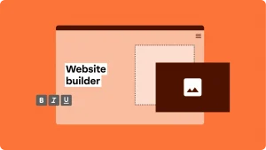
Step 2. Pick a website builder
Outline the factors you prioritize when picking a website builder. Considering these aspects helps you select a website platform that truly empowers your design process.
Think about the following elements to help you get started:
- Ease of use
- Customization options
- Built-in features and functionality
- Scalability
- Pricing and hidden costs
Ease of use
Ease of use is a main concern for beginners or small business owners with limited coding knowledge. A user-friendly builder lets you focus on creating content and designing your site without getting frustrated by complicated technical processes.
Many platforms, like Network Solutions, offer an AI website builder that streamlines your design process. Most of these builders typically have features like:
- Drag-and-drop editors
- Clear navigation menus
- Intuitive interfaces that simplify adding text, images, and other elements
Customization options
Website customization lets you create a unique brand presence. Different builders offer varying degrees of design freedom, from pre-set website templates with limited changes to extensive control over every visual element.
Having plenty of customization options allows you to align your website’s look and feel precisely with your brand’s identity. Look out for platforms that enable you to personalize:
- Colors
- Fonts
- Layouts
- Imagery
This helps your site stand out from competitors and provides a distinct user experience.
Built-in features and functionality
A website builder’s built-in features directly impact what your website can do. Consider what functionalities your website needs to achieve its goals, such as:
- eCommerce capabilities
- Search engine optimization (SEO)
- Blogging tools
- Contact forms
- Booking systems
Some builders specialize in certain areas, while others offer a broader range of general features. Choosing a builder with the right set of integrated tools minimizes the need for third-party add-ons, which simplifies management and saves you money.
Scalability
Scalability refers to a site builder’s ability to grow with your business over time. As your business expands, you’ll need to add more:
- Content
- Products
- Advanced features to handle increased website traffic
A scalable platform ensures your website can accommodate these changes without requiring a complete redesign or migration to a new system.
Look into whether the builder supports:
- Future integrations
- Increased storage
- Performance improvements
Pricing and hidden costs
Understanding the pricing structure of a website builder is important to manage your budget effectively. Most builders usually offer various plans with different features and limitations, so compare these carefully to find one that fits your financial restrictions.
Beyond the monthly or annual subscription, check for potential hidden costs like:
- Premium themes or plugins
- Domain registration fees
- SSL certificates
- Transaction fees for eCommerce
Awareness of all associated expenses enables you to make an informed financial decision for your website.
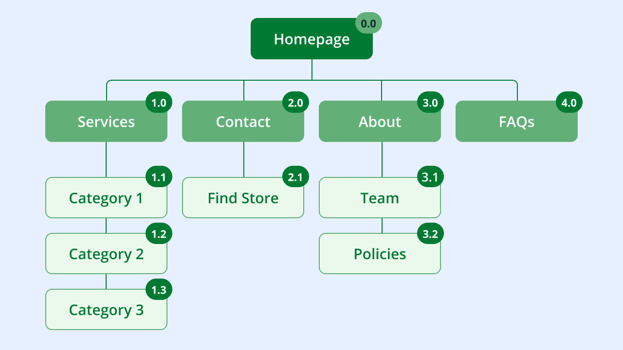
Step 3. Plan your website structure with a sitemap
A sitemap is like a blueprint for your site architecture that outlines all the web pages and files and how they connect with each other. This helps your visitors navigate your website and helps search engines crawl your site effectively.
Here’s a basic process for planning your site’s structure with a sitemap:
- List your main pages
- Map out subpages for each main section
- Determine user flow and navigation
- Outline your sitemap
- Refine and get feedback
1. List your main pages
Identify the core sections of your site. These are typically your top-level website pages, such as:
- Homepage
- About Us page
- Services page
- Products page
- Blog page
- Contact page
- FAQ page
Write these down as your primary categories. This initial list forms the backbone of your website’s main navigation that guides visitors to the most important areas.
2. Map out subpages for each main section
Think about the content that falls under each main page. For this part, let’s say you’re selling shoe care products and services.
So, your “Products” page can have subpages like:
- Shoe Polishes
- Shoe Creams
- Shoe Brushes
- Insoles
Meanwhile, for a “Services” page, you can have:
- Polishing and Finishing
- Patching and Stitching
- Heel and Sole Replacement
- Fitting Adjustments
These subpages add detail and depth to your website and allow you to organize your content logically.
3. Determine user flow and navigation
With your pages listed, consider how visitors will move through your website. Think about the most logical path a user might take to find information or complete a task.
Use lines or arrows to connect pages to show how they link to each other. This helps you visualize the navigation paths and make sure your website’s layout makes sense from a user’s perspective.
A well-planned user flow keeps visitors engaged and helps them find what they need quickly.
4. Outline your sitemap
Now, you can visually represent your sitemap. You can use a pen and paper for this, or you can lay it out on a whiteboard.
First, draw boxes for each page. And then, use lines to show their connections and organize them in a hierarchical structure. The homepage should sit at the top, with main sections branching out, and subpages extending further down.
This visual diagram provides a clear overview of your entire website, which makes it easier to spot any missing pages or confusing pathways.
5. Refine and get feedback
Once you have a draft of your sitemap, take time to review it. Check if all important content has a place and if the navigation feels intuitive.
It’s also helpful to share your sitemap with others, like friends, colleagues, or potential users, to get their input. They might suggest improvements to enhance user-experience.
Let’s look at a sample sitemap:
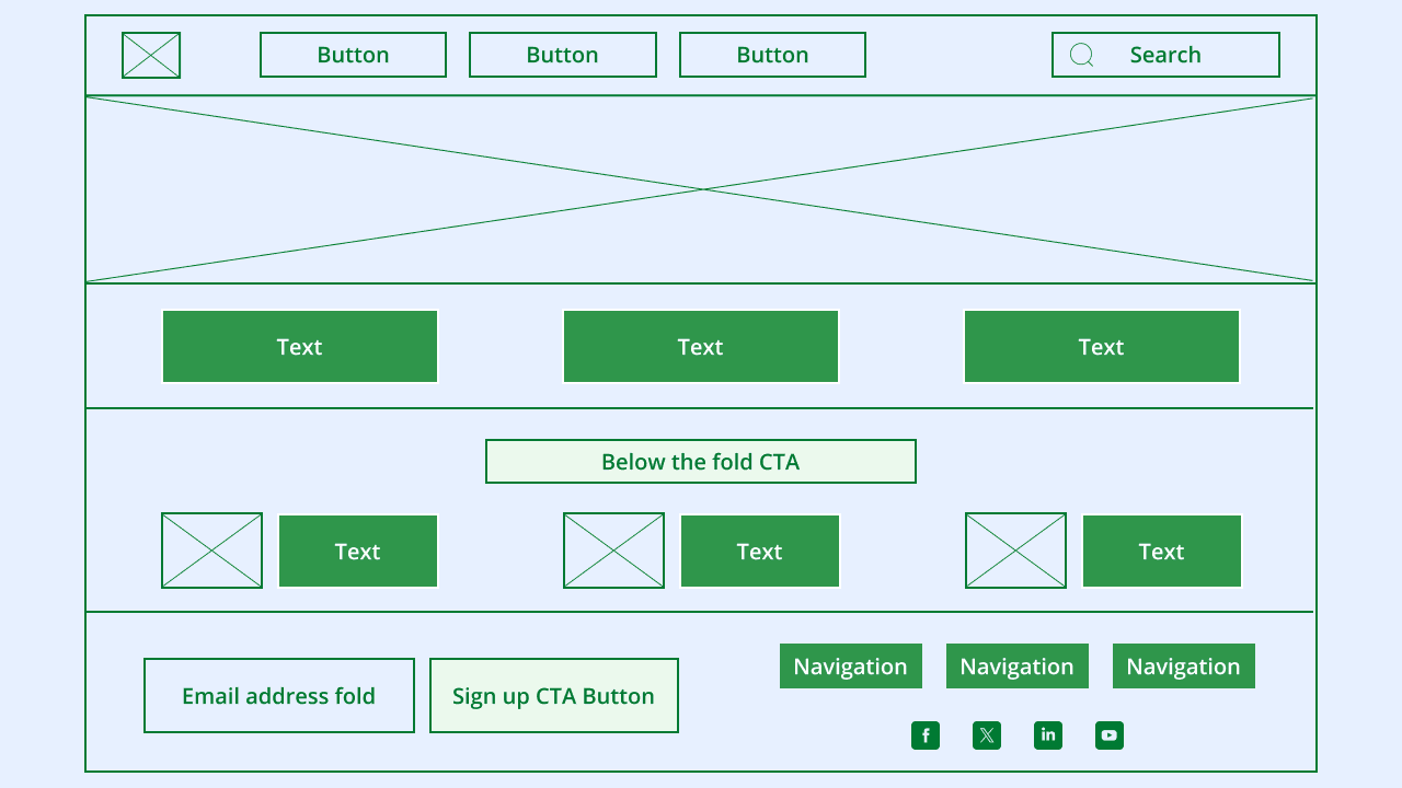
Step 4. Develop wireframes for page layouts
A wireframe focuses on the layout and arrangement of your website content for specific pages. It’s a simplified, grayscale representation that shows where you plan to place different components, such as:
- Texts
- Images
- Buttons
- Navigation menus
The main purpose of a wireframe is to establish the functional layout and user flow of a page before moving into detailed design. This ensures that the page is intuitive and user-friendly.
For a beginner, starting with paper sketches is often the easiest and fastest way to create wireframes. If you prefer digital, free online tools or basic drawing software can also work. The goal is to focus on placement and flow, not on making it look polished.
Follow these basic steps to develop your wireframe:
- Sketch the basic layout of main pages
- Position important elements
- Consider user interaction
- Review and refine
1. Sketch the basic layout of main pages
Sketch the main pages identified in your sitemap. For each page, draw rectangles and boxes to represent where elements will go. Think about the most important content that needs to be visible.
For example, on a homepage, you can draw:
- A large rectangle for a hero image
- A smaller box for a navigation menu
- A few more boxes for headlines and CTAs
2. Position important elements
Within your drawn boxes, indicate the types of content that will occupy each space. Use simple labels or placeholder text. You can also draw symbols like:
- A line for a headline
- A box with an “X” for an image
- A shaded rectangle for a button
Additionally, show where your main navigation will be and where the footer information will go. This step ensures that all necessary components have a designated spot, which makes the page functionally complete.
3. Consider user interaction
As you place elements, think about how a user will interact with the page. Where will their eyes go first? What action do you want them to take?
If you want users to fill out a contact form, for instance, make sure it’s placed prominently on the page.
Beyond that, use arrows or notes to indicate how a user might move from one section to another or what happens when they click a button. This helps optimize the page for a smooth user experience.
4. Review and refine
Review your wireframes after drafting them. Think like a first-time visitor to your site. Does the layout make sense? Is important information easy to find? Are there any missing elements?
Add to that, get feedback from others at this stage, as fresh eyes can spot areas for refinement.
Here’s an example of a wireframe you can use as a reference:
Step 5. Choose a design template
Design templates often offer a professional look without requiring you to design every element from scratch. They come with pre-set layouts, styles, and even demo content.
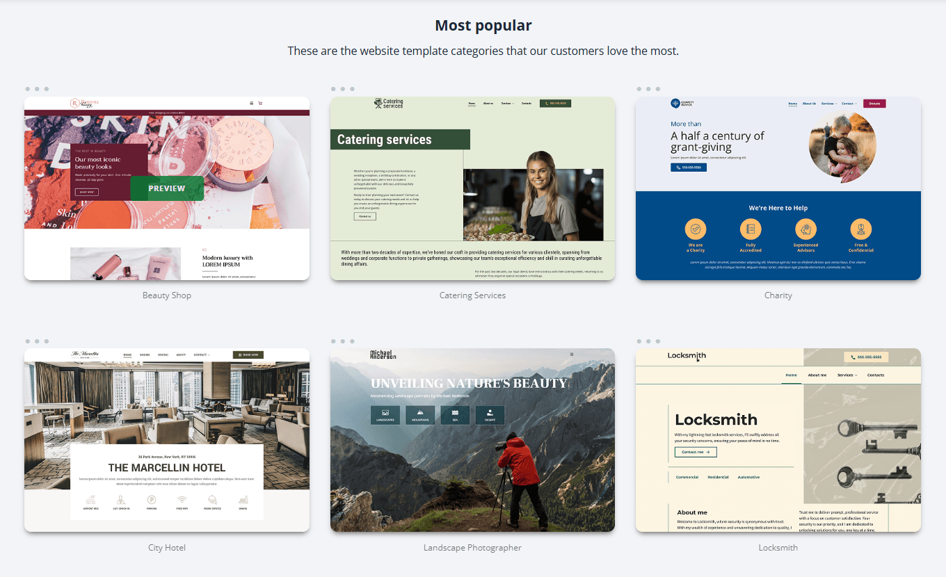
Working with a design template gives you a strong starting point that you can then customize to fit your specific needs.
Keep these practical tips in mind when selecting a design template:
- Consider your sitemap and wireframes
- Evaluate customization flexibility
- Check for mobile friendliness
- Review load speed and performance
Consider your sitemap and wireframes
Your sitemap and wireframes are important guides here. The template’s layout should ideally accommodate the structure you’ve already planned.
Check if the template has logical sections and dedicated page types that match your sitemap. Also, see if the template’s existing layouts can easily adapt to the element placement you decided on in your wireframes.
Choosing a template that mostly matches your planned structure saves you considerable customization effort.
Evaluate customization flexibility
While templates provide a starting point, it’s better to personalize them to reflect your brand. Look for customizable templates with various modification options, including being able to change different elements without needing coding experience.
Some templates offer limited modifications, while others provide extensive control over every design element. Ensure the template you pick lets you achieve the unique look and feel you envision for your brand.
Check for mobile friendliness
A significant number of people browse websites on mobile devices. It’s necessary to choose a template that automatically adjusts its layout to look good on various screen sizes. Most platforms create responsive templates, but it’s always wise to double-check.
Review load speed and performance
Your website speed directly impacts user experience and search engine performance. Some templates, especially those with many complex animations or large images, can result in slow load times.
It’s best to test out demo versions of templates you’re considering to get a sense of their load speed.
Step 6. Customize the design
This step involves personalizing your chosen template to reflect your brand’s unique identity. The goal is to make all visual elements make a cohesive and memorable experience for your visitors.
Focus on tailoring the following elements:
- Colors
- Fonts
- Header and footer
- Imagery (photos and graphics)
- CTA buttons
Colors
Colors are powerful tools that elicit emotions and represent your brand’s personality. When customizing your website, select a primary color that defines your brand. And then, choose a few secondary and accent colors that complement it.
Use your primary color for important elements like CTAs or important headings to draw attention. On the other hand, secondary colors can fill larger areas like backgrounds, while accent colors can make the design more visually appealing.
Using a consistent color palette across your website helps create a recognizable and professional appearance. This makes your brand feel unified and well thought out.
To take it further, read our guide that will help you choose the best color schemes for your website.
Fonts
Have you seen tiny texts in road signs or messy fonts in formal documents? They don’t help readers gain valuable information, right?
Same goes with your website. It’s necessary to prioritize readability and aesthetics when it comes to texts in your site pages.
Typically, you should pick two to three fonts for the following elements:
- Headings
- Body text
- Special elements
Make sure your chosen fonts fit together and are easy to read on all devices. For instance, a clean, simple font works well for body text, while a more distinctive font can be used sparingly for headings to grab attention.
Uniform font usage across all pages reinforces your brand’s visual identity and provides a smooth reading experience for your audience.
Header and footer
The header and footer act as consistent navigational and informational anchors. The header sits at the top and usually contains:
- Your logo
- Primary navigation menu
- A search bar or contact information
Design it to be easily recognizable to guide visitors to important sections of your site quickly.
The footer is located at the bottom of every page. It often includes:
- Copyright information
- Privacy policies
- Contact details
- Social links
- A sitemap
Both elements should use consistent colors and fonts to maintain a professional and unified look across your entire website.
Imagery (photos and graphics)
The photos and graphics you use on your site are visual communicators that immediately convey your brand’s message.
Pick high-quality, relevant images that resonate with your target audience and support your content. Whether you use professional photography, illustrations, or stock photos, ensure they have a coherent style, color tone, or thematic approach.
For example, a website selling eco-friendly products can use earthy tones and natural imagery to perfectly fit their brand. Cohesive visual branding through images helps tell your story and keeps visitors engaged.
CTA buttons
CTA buttons are interactive elements that encourage visitors to take specific actions. We see them all the time. Examples of these include:
- “Buy Now”
- “Sign Up”
- “Learn More”
Design these buttons to stand out by using a contrasting color from your accent palette so they’re easy to spot. Also, make sure the text on the button is clear, concise, and action-oriented.
Style your CTA buttons consistently across your pages to reinforce their importance and encourage user interaction. Format your CTA buttons with regard to their:
- Size
- Shape
- Hover effects
Step 7. Format your content for users and search engines
Apart from creating engaging content, it’s also important to format it so it’s effortless for visitors to read and easy for search engines to understand.
Here are tips for good content formatting:
- Use headings and subheadings effectively
- Incorporate bulleted and numbered lists
- Use short paragraphs and white space
- Embed visuals in your body text
Use headings and subheadings effectively
Organize your content into sections using clear headings, like H1, H2, and H3. Your main topic should use an H1, with subtopics falling under H2, and further divisions as H3, and so on.
This creates a logical structure that helps readers quickly scan the page to find relevant information. It also helps search engines understand your page and identify the content’s hierarchy.
Incorporate bulleted and numbered lists
Bulleted and numbered lists are excellent for making information scannable and easy to digest. When you have a series of points or steps, presenting them in a list format draws the reader’s eye and breaks up large blocks of text.
This greatly improves readability, as users can quickly grasp key takeaways without having to read through dense paragraphs. Lists also provide a visual break that makes the page more inviting.
Use short paragraphs and white space
Large, unbroken blocks of text can feel overwhelming for the reader. Instead, write in short paragraphs, typically three to five sentences long.
This makes your content less intimidating and easier to read on screens.
Add to that, generous use of white space (the empty areas around text and images) also improves readability. It makes the overall page design feel cleaner and more professional.
Embed visuals in your body text
Visuals capture attention and help convey information more effectively. These design elements help improve comprehension and overall user experience.
Integrate visuals within your text, such as:
- Images
- Videos
- Infographics
These graphic features serve many purposes, including:
- Breaking up text
- Illustrating complex ideas
- Making your content more engaging and appealing
Be sure to use high-quality images and videos that are relevant to the surrounding text. Apart from that, optimize them properly for web use. For instance, compress your images so they load quickly when users visit your pages.
Step 8. Optimize your site for mobile
Remember when we mentioned mobile-friendliness in a previous section? Now, we’ll discuss mobile optimization in detail and learn its importance in web design.
Mobile optimization provides a seamless browsing experience for users, regardless of the device they use to visit your site. A mobile-friendly website has many benefits, including:
- Improves user satisfaction
- Keeps visitors on your site longer
- Helps your search engine rankings
Apart from implementing responsive design, consider these other tips when making your website mobile-friendly:
- Prioritize fast load times
- Simplify navigation and layout
- Design for touch interaction
- Optimize texts
Prioritize fast load times
Website speed is important, as mobile users often browse while on the go or with less reliable internet connections. Slow loading times can frustrate visitors and force them to leave your site.
Other than compressing images, you can also minimize heavy animations or scripts on your pages. A fast-loading mobile site keeps users engaged and positively influences your visibility in search results.
Simplify navigation and layout
Mobile screens have limited space, so make sure you have a clean and straightforward navigation system. Consider using a “hamburger menu” (a three-line icon) to condense your main navigation into a collapsible menu.
Also, keep your overall layout uncluttered and prioritize the most important content at the top of the page. Lastly, avoid excessive pop-ups or text-blocking elements that are difficult to close on smaller screens.
Design for touch interaction
Mobile users interact with websites using their fingers. This means your buttons and links need to be large enough and spaced far enough apart to be easily clicked on.
Additionally, use simpler forms with larger input fields and clear labels. Also, remove features that do not work on touch devices like hover effects and focus on tap-friendly designs.
Optimize texts
Adjust your text and images to be perfectly readable and viewable on smaller screens. Use bigger font sizes for body text and ensure there’s enough line spacing to prevent them from looking cramped.
Step 9. Test your website for functionality
Testing your site’s functionality involves thoroughly checking every part to ensure everything works as intended. Comprehensive testing helps you catch issues before your website goes live. This also ties into building a trustworthy and professional online presence.
Here’s how to test your website for functionality:
- Test all links and navigation
- Verify forms and interactive elements
- Check for cross-browser and device compatibility
- Assess site speed
- Conduct usability testing
Test all links and navigation
Click all internal and external links on your website and ensure all of them lead to the correct pages. Also, thoroughly test your navigation menus on all pages to confirm they’re user-friendly and they match your sitemap.
Verify forms and interactive elements
Test interactive elements on your site, such as:
- Contact forms
- Sign-up forms
- Search bars
Try filling out forms with valid and invalid data to ensure they:
- Submit correctly
- Display appropriate error messages
- Send information to the right place
Check if dropdown menus and checkboxes function as expected. This validation ensures that you can collect information from visitors effectively and that all interactive components contribute to a positive user experience.
Check for cross-browser and device compatibility
You need to manually test your website on different browsers and screen sizes. Look for the following:
- Layout issues
- Distorted images
- Other elements that do not display correctly
Assess site speed
Evaluate how quickly your pages load using online tools and try accessing your site on different network conditions.
Identify any elements that might be slowing down your site, such as large images or complex scripts, and consider optimizing them to improve performance.
Conduct usability testing
Beyond checking if things simply “work,” we recommend conducting usability testing. This allows you to see how real users interact with your site.
To do this, ask a few people who represent your target audience to perform specific tasks on your site. These can include finding a particular product or signing up for a newsletter.
Do these three things during the testing:
- Observe their behavior
- Note any areas where they struggle or seem confused
- Gather their feedback
This helps uncover issues related to intuitive navigation and overall user satisfaction that you might not notice on your own.
When to hire a professional web designer?
While designing a website yourself is achievable, there are scenarios in which hiring a professional web designer is the smartest move. Recognizing these situations helps you decide the best path for your site.
Get pro web design services in these scenarios:
- When you need a highly customized or complex website
- When your brand requires an exceptional visual presence
- When your time is limited for DIY learning
When you need a highly customized or complex website
If your vision requires more than what standard templates or DIY builders offer, a professional designer can create a custom solution. This applies when you need:
- Unique functionalities
- Custom animations
- A highly specific user interface that sets you apart
An expert designer has the technical skills to custom-code these features into your website.
When your brand requires an exceptional visual presence
Some businesses rely heavily on a distinct and sophisticated visual identity to attract their audience. If your brand demands high-level aesthetics or a highly refined user experience, a professional designer’s expertise is invaluable.
Think of high-end fashion brands, art galleries, or luxury service providers where the website itself becomes a piece of art or a statement of quality. A designer can craft a visually stunning and cohesive digital experience that consistently reinforces your premium brand image.
When your time is limited for DIY learning
Designing a quality website yourself requires a considerable investment of time to:
- Learn the platform
- Understand design principles
- Troubleshoot issues
- Manage content
If you’re a small business owner already juggling multiple responsibilities, outsourcing website design makes sense.
A professional designer can deliver a complete, polished product efficiently, which allows you to focus your time and energy where it yields the most return for your business.
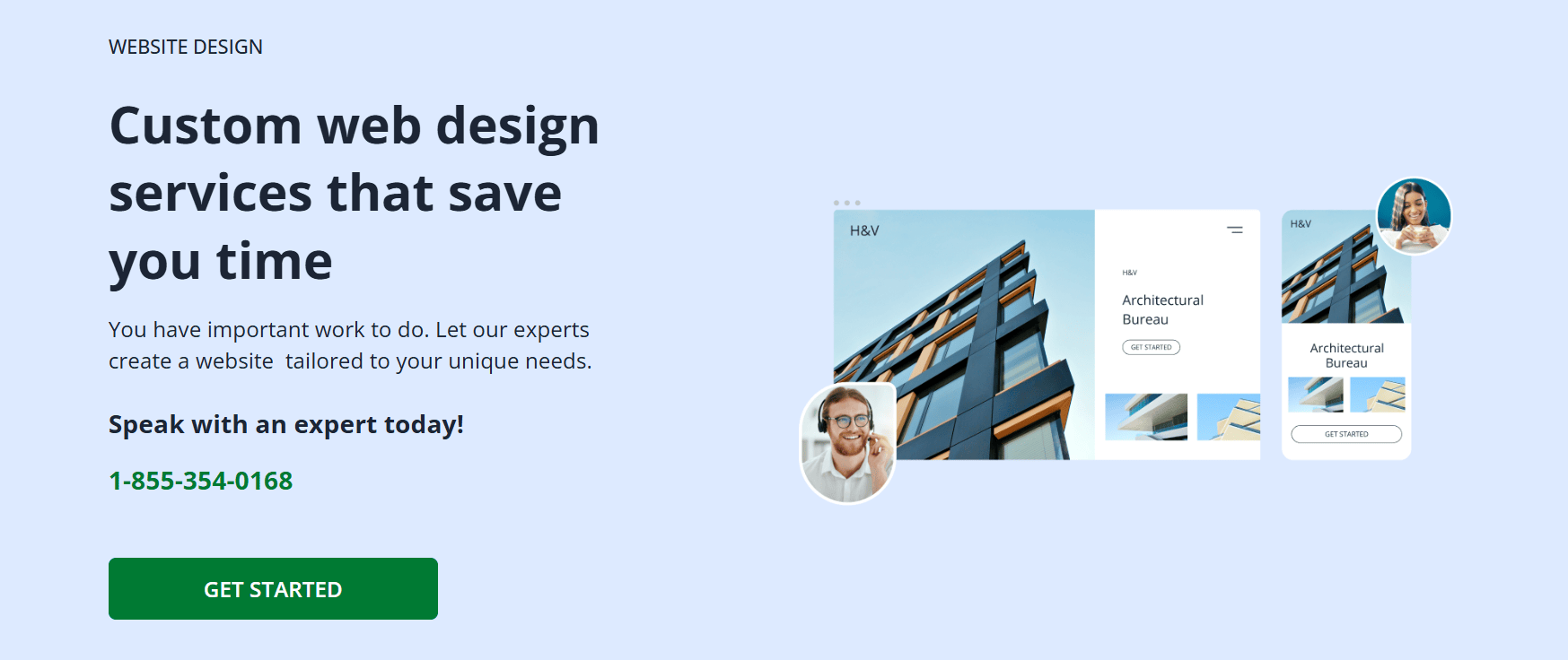
Design your own website with Network Solutions
Designing your own website involves steps like identifying your goals and target audience and testing your site’s functionality. It also requires planning your website’s structure and developing wireframes for every page.
If you’d like extra help, Network Solutions provides an AI-powered Website Builder with a wide range of customizable, great-looking templates. And not only that, you also don’t need to have advanced design skills to use them.
Should you prefer a hands-off approach, we also offer professional website design services. We provide various tools that will help you design the website you envision.
Build your website today, without the headaches!
Frequently asked questions
Yes, you can design a website without writing any code. Modern website builders use drag-and-drop interfaces and pre-designed templates that let you create a professional-looking website.
These platforms handle the technical coding in the background, which makes web design accessible to beginners. This means you can focus on your content and aesthetic, not on complex programming languages.
The best tools for web design depend on your needs and skill level. Platforms like Network Solutions are excellent for beginners and small businesses seeking an all-in-one website solution.
For more flexibility and scalability, platforms such as WordPress, combined with page builders like Elementor, offer extensive customization. Lastly, tools for graphic design, like Canva, also help create compelling visuals for your site.
Designing a website involves the following steps:
1. Defining your goals and target audience
2. Picking a suitable website builder
3. Planning your site’s structure with a sitemap
4. Developing wireframes for page layouts
5. Selecting a design template
6. Customizing the design
7. Formatting content for readability and search engines
8. Making it mobile-friendly
9. Testing for functionality
Yes, you can design a website without any cost, though with some limitations. Several website builders offer free plans that allow you to create and design a basic site. But these often including their branding in the footer or a subdomain for your address.
These free options are useful for personal projects or small, simple sites. For a professional presence with a custom domain and full features, you’ll need to subscribe to a paid plan.
While specific “golden rules” can vary, five important principles guide effective web design. The guidelines are as follows:
Your website should be easy to navigate
Your website should have clear and concise content
Your website should have consistent design elements
Your website should be mobile friendly
Your website should load fast