Key takeaways:
- Your choice of font is a business decision, since readability is directly tied to conversions, trust, and bounce rates.
- The best font for your website depends on your specific business type, balancing brand personality with high readability.
- A strong font strategy includes avoiding common mistakes like using too many fonts and ensuring sufficient color contrast.
The fonts you choose for your website are a major part of your branding and an important business decision. They contribute to a better reading experience, which builds trust, reduces bounce rates, and boosts conversions. On the other hand, fonts that are hard to read can confuse your message and drive visitors away.
To help you, we’ll show you which fonts are easiest to read and explain why they’re effective. We won’t just focus on their aesthetics; we’ll also delve into how they can help you help communicate clearly and professionally with your customers.
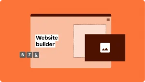
Want fonts that not only look great but also keep your visitors engaged? Our drag-and-drop website builder has easy-to-read fonts preloaded, so you can focus on building your business.
Why does readability matter for your business website?
Let’s compare your website’s readability to the lighting in a physical store. If the store has bad lighting, customers might trip and struggle to find what they’re looking for, eventually they’ll want to leave.
The same principle applies online. If your website is hard to read, visitors will get frustrated and “bounce” or leave your site quickly. A good reading experience, on the other hand, engages visitors and encourages them to act, like to complete a purchase or fill out a form.
Here are more reasons why it’s so important:
- First impressions. Readability directly correlates with professionalism. A clean, easy-to-read font makes your site look polished and credible right off the bat.
- Accessibility and inclusivity. Easy-to-read fonts help a wider audience, including people with visual impairments, understand your content. This also helps you comply with the Americans with Disabilities Act Standards for Accessible Design (ADA).
- Business impact. When customers can easily read your product descriptions and online content, they’re more likely to stay on your site and purchase.
In short, when your site is readable, you’re more marketable and accessible.
What makes a font easy to read?
Go beyond just picking whatever font looks good. You must consider several key design elements. Understanding them will help you make a smart decision for your website.
Here’s a breakdown of what to look for:
Letter spacing and kerning
Letter spacing, or tracking, is the uniform space between all letters in a word. Kerning, on the other hand, is the space between two individual letters for better appearance and readability. For example, the space between a ‘W’ and an ‘A’ might need to be reduced, while the space between an ‘L’ and an ‘I’ might need to be increased.
A font with proper kerning makes the text feel balanced and easy to read. Poorly kerned text can feel too cramped or loose, making it harder for the eye to scan words smoothly.
x-height and proportions
The x-height is the height of a font’s lowercase letter, like ‘x’ or ‘a’,. Fonts with a taller x-height are generally more readable, especially on mobile devices, because they make letter forms more distinct and open.
Additionally, the overall proportions of a font, or the relationship between the x-height and the height of capital letters, ascenders (like ‘h’ or ‘t’), and descenders (like ‘p’ or ‘g’), play a big role in legibility.
Serif vs. Sans-serif
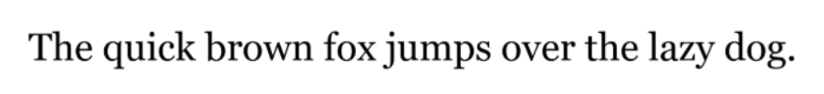
Serif fonts have small decorative strokes or “feet” at the ends of their letters, like, Times New Roman. These serifs are believed to help the eye flow from one letter to the next, making them excellent for long-form print formats like books and brochures.
Sans-serif fonts (from the French sans, meaning “without”) lack these strokes, like Arial, or Helvetica. They’re known for their clean, modern look and are generally considered much clearer on computer screens. This is because the pixels on a screen can make fine serif details appear blurry, while a sans-serif font’s simple, clean lines remain crisp and distinct.
| Feature | Serif fonts | Sans-Serif fonts | Best for |
| Screen readability | Often less clear at small sizes | Very clear on digital screens | Websites |
| Print readability | Excellent for long-form text | Works but less traditional | Brochures, flyers |
| Brand feel | Traditional, formal | Modern, clean | Depends on tone |
Font size and line height
Font size is the most basic factor in readability; too small or too big is simply unreadable. While there’s no single “correct” size, a body font size between 16px and 20px is recommended for an optimal reading experience.
Line height (or leading) is the vertical space between lines of text. When lines are too close together, the text turns into long blocks that are difficult to read. When the line height is too much, the lines of text become disconnected.
A good rule of thumb is to set the line height to be about 1.5 times the font size (e.g., if your font size is 16px, set your line height to 24px). Proper line height provides visual “breathing room,” making your text scannable and easy to follow.
Contrast with background
You also have to consider the contrast between your font color and the background; there should be enough contrast for the text to stand out clearly. The highest contrast is provided by dark text on a light background (e.g., black on white) or vice versa (e.g., white on a dark gray or black background).
Avoid low-contrast combinations like light gray text on a white background, as these can make your content difficult to read, especially for users with vision impairments.
11 of the easiest fonts to read for websites
Choosing the right font can be challenging, but these 11 options are known for their readability on screens. They are excellent choices for everything from a blog post to a product description.
- Open Sans
- Lato
- Roboto
- Helvetica
- Arial
- Verdana
- Georgia
- Montserrat
- Source Sans Pro
- Noto Sans
- Tahoma
Open Sans

A highly versatile font, Open Sans was optimized for legibility across all devices. Its clean, uniform look and details make it easy to read. It’s a great choice for long-form content and works well for nearly any business, from a service provider to an online magazine.
Lato

Lato adds a warm and human feel to graphic designs with its semi-rounded details and sturdy structure. This sans-serif font is professional without being too formal, making it ideal for business sites that want to feel sleek and approachable.
Roboto

Roboto, a well-known Google font, has the best mechanical elements and curves. Its strategic use of diagonal terminal cuts increases the openness of its letters, which has optimized it for body text online. It’s a clear, professional choice for many websites, especially those that use much data or text.
Helvetica

Helvetica is a direct sans-serif font known for its clarity and efficiency, making it one of the world’s most famous and widely used fonts. While sometimes criticized for tight spacing, its tall x-height makes it easy to read at a distance. It’s a great option for businesses that want a clean, classic, and minimalist look.
Arial
A standard font for many software programs, Arial is a versatile sans-serif considered one of the most readable fonts. It features soft, full curves and a diagonal cut on the top of the “t” for an approachable feel. Its widespread familiarity makes it a reliable and safe choice for any business website.
Verdana

Specifically developed for on-screen readability, Verdana features wide proportions, a large x-height, and generous spacing between characters. These features prevent letters from blurring together on low-resolution screens, making it an excellent choice for websites with a lot of text.
Georgia
A serif font designed for the screen, Georgia is an exception to the rule about using sans-serif fonts on websites. Its large x-height and thicker strokes make it easy to read on-screen, and its classic serif design gives it a timeless feel. Georgia is perfect for professional services or businesses that want to convey a sense of tradition and authority.
Montserrat

This geometric sans-serif font is a modern classic, known for its clean lines and high x-height. Its wide apertures and balanced proportions make it easy to read even at smaller sizes. Montserrat is a popular font for creative agencies or retail brands that need a stylish and legible font.
Source Sans Pro

Designed by Adobe, Source Sans Pro was primarily for user interfaces. Its more generous width than many other sans-serif fonts make longer text passages a more pleasing experience. Its clean, rational design makes it a solid choice for tech or professional services businesses.
Noto Sans

Part of Google’s Noto font collection, Noto Sans was designed for readability and accessibility. It supports over 800 languages, making it a great choice for businesses with a global audience or a need for a highly inclusive font.
Tahoma

Tahoma, a sans-serif font designed by Microsoft, is known for its clean, simple design and even spacing. Its strong vertical lines and clear spacing make it an excellent choice for smaller font sizes and dense paragraphs.
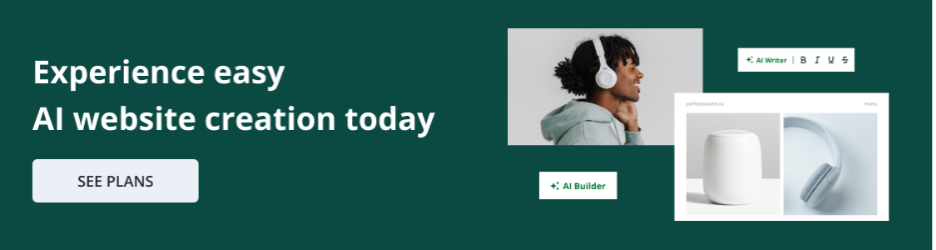
But you don’t have to install or test these fonts manually. Network Solutions’ Website Builder comes with preloaded readable fonts that you can preview and publish instantly.
How to choose the best fonts for your site
Choosing a font for your website goes beyond picking a list of good ones and hoping for the best. Here are some tips to help you select the best font for your website’s specific needs.
- Test for readability
- Prioritize consistency over trends
- Trust your gut (and a second opinion)
Test for readability
Before you commit, test your chosen font by creating sample text blocks. Use it for headings and body text and use it on mobile to see how it looks and feels. Does it strain your eyes at smaller sizes? Does it look clean and professional when used in a paragraph? The best fonts should be easy to read and work across different devices.
Prioritize consistency over trends
While it might be tempting to use trendy or decorative fonts, consistency is key to a professional-looking website. Choose one or two main fonts and stick with them throughout your site.
Trust your gut (and a second opinion)
After you’ve done your testing, show your design to a friend, colleague, or customer. Ask them to read a paragraph and give you their honest feedback.
If they struggle or seem hesitant, it might be a sign to choose a different font. You can even preview fonts directly on your site before publishing when you use a website builder.

Common mistakes to avoid with fonts
When it comes to website design, the wrong font choices can undermine your efforts and drive customers away. Avoid these common mistakes so your site remains professional and easy for everyone to use.
- Using too many fonts on one site. A website with a different font for every section can look chaotic and unprofessional. Stick to one or two complementary fonts for your site for a clean, consistent look.
- Over-stylized decorative fonts. Decorative or overly stylized fonts might look cool, but they are often difficult to read, especially in paragraphs or at small sizes. For your main body text, always prioritize legibility over style.
- Poor color contrast with the background. If your text is, for example, a dark blue on a black background, it strains your visitors’ eyes. Always ensure a clear and strong contrast so your text stands out and is easy to read.
Get better web design with Network Solutions
The fonts you choose for your website are powerful; they affect readability, engagement, and your brand identity. By choosing clear and easy fonts for the eyes, you’re benefiting your audience and, in turn, your bottom line.
With Network Solutions’ Website Builder, you get a professional, accessible site that’s ready to grow with your business. We offer numerous templates you can customize with your chosen fonts, colors, and images.
Frequently asked questions
While there isn’t one “easiest” font, sans-serif fonts, such as Arial and Verdana, are generally considered the most legible for on-screen reading.
Serif fonts are often preferred for long-form print materials because their small “feet” can help guide the eye across a line of text. On digital screens, sans-serif fonts are generally considered easier to read.
The ideal font size for body text on a website is typically 16px, but it can range from 16px to 18px to ensure comfortable reading on screens. For print, the standard is often 11pt or 12pt.
The Web Content Accessibility Guidelines (WCAG) do not specify which fonts are ADA-compliant, but they do provide guidelines for creating accessible text. These include using simple, familiar fonts that are easy to distinguish.
Google Fonts offers a vast library of open-source fonts that are free for personal and commercial projects, including websites, logos, and print materials.