Key takeaways:
- Visual identity helps your target audience recognize who you are. They should grasp your brand promise, identity, and story with one look.
- The elements of a visual identity include a logo, colors, typography, imagery, layouts, and patterns or textures.
- When you create your visual identity, make sure you’re consistent and authentic with how you want your audience to see you.
First impressions happen fast — often within seconds. When someone visits your website, sees your packaging, or scrolls past your brand on social media, your visual identity speaks first.
But what exactly is visual identity? How do you create one that reflects your brand and makes you stand out?
If you’re a small business owner, new to building your website, or just want to learn about marketing tips, this guide is for you. We’ll break down what visual identity means, why it matters, and how you can build one step by step — even without a designer.
What is visual identity?
Visual identity is the collection of design elements that represent your brand. It’s how your brand looks and feels across your website, products, social media, and any place your business shows up visually.
For example:
- To feel soothing, a yoga studio might use calm pastels, natural textures, and soft fonts.
- A tech startup could use sharp lines, dark backgrounds, and modern sans-serif fonts to look cutting-edge.
When visual identity is creatively done, your brand is easily recognizable from a quick scroll on Instagram or in the corner of your product packaging. Your potential customer sees your brand, understands your message, and recognizes your purpose; all this in just a glance.
Visual identity vs. brand identity vs. brand image
These terms sound similar, but they each describe a different part of how your brand exists and interacts with the world. Understanding the difference can help you build a more consistent and meaningful brand.
Let’s break them down.
| Concept | What it means | Example |
| Visual identity | The visual design system (logo, colors, fonts, images) | Your blue-and-white logo, clean fonts, and modern product photos |
| Brand identity | The whole personality, values, and tone of your brand | Friendly, eco-conscious brand that speaks casually |
| Brand image | How others perceive your brand in the market | Customers think you’re trustworthy, high-quality, and affordable |
So how do they work together?
- Visual identity is the design toolkit. It’s what people see. This includes your logo, brand colors, fonts, imagery, and layout choices.
- Brand identity is your brand’s whole personality. It combines your voice, messaging, values, purpose, and visuals. It’s how you want to be seen.
- Brand image is the impression people have of your brand. This could match your identity — or not — depending on their experience.
A brand’s visual identity helps reinforce its brand identity. And over time, that consistency helps shape a positive brand image.
Let’s say your brand identity is all about being bold, modern, and inclusive.
If your visual identity uses neutral colors, a serif font, and formal photography, there’s a mismatch. But if your visuals use bright colors, dynamic fonts, and diverse imagery, then everything aligns, and your audience will likely pick up on that.
The more aligned these three areas are, the more cohesive and trusted your brand will feel.
Elements of a visual identity
Your visual identity comprises key design components that work together to create a consistent brand look. Each element plays a role in shaping how your brand is seen and remembered. Here’s what to focus on:
- Logo
- Colors
- Typography
- Imagery
- Layouts
- Patterns or textures
Logo
This is the face of your brand — the most recognizable visual symbol. It could be a wordmark (like your brand name in a specific font), a symbol, or a combination of both. A strong logo should be simple, easy to scale, and versatile enough to work on your website, social media, business cards, and packaging.
Colors
Your brand colors help set the mood and build recognition. Most brands use a primary color and a few supporting ones. For example, a bold tech brand might use black and electric blue, while a wellness brand may lean into soft greens or pastels. Stick to the same colors everywhere, from your website’s color scheme, your packaging, all the way to your social media posts, to create consistency.
Typography
Fonts also shape how your brand feels. Choose fonts that reflect your brand’s tone. A handwritten font might feel friendly and casual, while a clean sans-serif gives a modern, minimalist vibe. Use your fonts consistently across all content, from your website’s headlines to product labels.
Imagery
Photos, illustrations, icons, and graphics are also part of your visual identity. The key is choosing a consistent style. If you use photos, are they light, airy, bold, and high contrast? If you use icons, are they simple outlines or filled shapes? Having a clear image style helps everything feel connected.
Layouts
This is about organizing your visuals — spacing, alignment, and structure. A clean, well-spaced layout makes your content easier to read and more professional. Whether you’re designing your homepage or a flyer, stick to a layout that reflects your brand personality and keeps things balanced.
Patterns or textures
Some brands use subtle patterns, textures, or design accents to add depth and uniqueness. Think of a repeating graphic, a hand-drawn background, or a paper texture overlay. These touches can reinforce your brand without overwhelming your main visuals.
Why is visual identity important?
Visual identity’s primary role is to make a good and lasting impression on your customers. You want to be remembered. Whether you’re running a bakery, coaching business, or eCommerce store, your visuals work like a signature. Done right, they can:
- Builds recognition
- Creates trust
- Sets you apart from competitors
- Tells your brand story without words
Builds recognition
When people repeatedly see the same colors, logo, or style, they associate it with your brand. This repetition builds familiarity, and familiarity builds trust.
What if you see a pink box with bold serif letters and sprinkles? Before your brain recognizes the name, you’ll think of a donut shop or playful bakery brand. That’s brand recognition in action. A real-world example would be the McDonald’s logo. When people see those golden arches, they immediately think of the fast-food chain.
The more consistent your visual identity is, the more likely people will remember and recognize your business wherever they see it, on social media, packaging, or even a digital ad.
Creates trust
Think about the difference between a messy website with mismatched fonts and a well-designed website with consistent branding. Which one would you trust more?
A polished visual identity shows that you’ve put thought and care into your business. It signals reliability and professionalism even before someone reads your reviews or product details. Customers can spot fakes or impersonators if the font and color don’t click together. Misspelled names, wrong color palette, a wrong tone or personality, customers who know your visual identity know who to trust.
For new or small businesses, a trustworthy look can help level the playing field with larger brands.
Sets you apart from competitors
Let’s say you sell handmade skincare products. Dozens of other brands do too, but your visual identity can make yours stand out.
Whether it’s through modern minimalism, bold vintage packaging, or nature-inspired graphics, how your brand looks gives people a reason to pause and take notice. It helps you communicate what makes you different, even if your product itself is similar to others.
Tells your brand story without words
Colors, fonts, and imagery aren’t just decorative. Your visual identity can show your personality, values, and energy at a glance.
A kids’ clothing brand might use bright, playful colors and chunky fonts to feel fun and energetic. A high-end consulting business might choose black-and-white imagery and refined serif fonts to feel serious and upscale.
Your visual identity is already saying something before someone reads your mission statement or product description.
How to create your visual identity system
Now, here’s the main part. Some people who aren’t well-versed in art might find creating a visual identity system intimidating. But you don’t need to be a designer to build a strong brand look. Here’s how to create your visual identity step by step:
- Know your brand first
- Try a mood board to shape your visual direction
- Choose your brand colors
- Design your logo
- Pick your fonts
- Define your imagery style
- Create a quick brand style guide
1. Know your brand first
Before diving into design choices like colors or fonts, it’s crucial to clearly define who your brand is. This foundational step will guide all your design decisions and ensure that your visuals accurately represent your brand’s essence. Ask yourself these key questions:
- Who are you serving?
- What’s your brand’s personality? Is it playful? Modern? Elegant?
- What emotions do you want people to feel when they see your brand?
This makes it easier to design visuals that match your message. If you don’t know who you are, you won’t know what image you want your audience to see. Figure out the details first. Finalize what kind of brand you want yourself to be known for.
2. Try a mood board to shape your visual direction
Before designing anything, start with a brand mood board. It’s a collage of images, colors, fonts, and textures that visually express your brand’s vibe. This is perfect when you’re having trouble visualizing who you want to be.
You can use Pinterest, Canva, or a simple folder of screenshots. Look for:
- Photos that match your tone
- Color swatches that feel right
- Typography styles that reflect your voice
- Examples from other brands you admire
This helps you and any designer or team member understand what your brand feels like before you finalize the visuals.
3. Choose your brand colors
Color is one of the most powerful tools in your visual identity. It doesn’t just add visual appeal; it communicates emotions, sets the tone, and reinforces your brand’s personality.
Pick a set of 2–4 main colors
A simple and balanced palette helps your brand look cohesive and professional. Too many colors can feel chaotic, while too few might lack variety. Aim for a primary color plus a few complementary shades.
- Primary color. This should be the main color that represents your brand. It is often used in your logo, website, and key visuals.
- Secondary colors. These can complement the primary color and add variety. They can be used in call-to-action buttons, accents, backgrounds, or other design elements to break up space and add visual interest.
Why color psychology matters
Colors evoke emotions and influence perception, often on a subconscious level. Understanding how different colors impact your audience helps you create a brand that speaks to them correctly.
- Blue. Trustworthy, calm, professional. Often used by financial institutions, tech brands, and health-related companies.
- Red. Energetic, passionate, urgent. Great for food brands, entertainment, or anything related to excitement or action.
- Green. Fresh, natural, healthy. Common for wellness, eco-friendly, and organic brands.
- Yellow. Cheerful, optimistic, attention-grabbing. Used by brands aiming to appear fun or youthful.
- Purple. Creative, luxurious, spiritual. Often associated with beauty, luxury, and personal care products.
- Orange. Friendly, vibrant, bold. Works well for brands that want to be seen as fun and approachable.
- Black. Sleek, modern, powerful. Often used in luxury brands, fashion, and high-end products.
- White. Clean, minimal, neutral. Perfect for modern and minimalist brands.
4. Design your logo
Your logo doesn’t need to be complex. Many great ones are simple and text-based. You can:
- Use logo makers like Canva or Looka
- Hire a freelancer if you want something custom
- Start with your brand name in your brand font and adjust spacing, size, and color
But if you’re planning to make a website for your business, Network Solution’s DIY website builder has an AI logo maker you can use. Just type in all the information you readied, and the AI will assist you in minutes.
5. Pick your fonts
Typography plays a significant role in shaping your brand’s visual identity. The right fonts convey personality, improve readability, and establish brand consistency. Here’s how to pick the right fonts for your brand:
Limit it to two fonts: headings and body text
Using only two fonts helps maintain visual harmony and consistency. A simple, clean approach with fewer font choices ensures your brand looks professional and avoids visual clutter.
- Headings. Choose a bolder or more decorative font for headings that makes a strong statement. This font will draw attention and highlight the main points of your content.
- Body text. Opt for a simple, legible font for body text. It should be easy to read, especially on smaller screens. This ensures the user experience remains smooth and accessible.
Why font selection matters
Fonts do more than just display text; they also communicate tone, personality, and brand values. Different font styles evoke different feelings, so choosing the right one helps reinforce your brand’s messaging.
- Serif fonts. These fonts have small “feet” or extensions at the ends of their letters (like Times New Roman). They often convey tradition, professionalism, and reliability. Suitable for law firms, academic institutions, and luxury brands.
- Sans-serif fonts. These fonts are clean and modern, like Arial or Helvetica, without the little “feet” at the end of each letter. They’re more contemporary and are commonly used in tech, fashion, and minimalist brands.
- Script fonts. These fonts mimic handwriting and can add elegance, creativity, or a personal touch. They work well for beauty, boutique, or wedding-related brands, but should be used sparingly for readability.
- Display fonts. Bold, unique fonts are used for special occasions. They’re great for grabbing attention but should be used carefully, as they may not be the easiest to read in large blocks of text.
How to choose the right fonts for your brand
- Align with your brand personality. A quirky script or hand-drawn font might be a good fit if your brand is playful and fun. Choose clean, traditional fonts like Helvetica or Georgia if your brand is more corporate and professional.
- Ensure readability. Even the most stylish font won’t work if it’s hard to read. Test your fonts at various sizes to ensure they’re legible on different screens (especially mobile).
- Contrast is key. Your heading font should be bold and attention-grabbing, while your body font should be legible and straightforward. Make sure there’s enough contrast between the two so each one serves its intended purpose.
- Consider pairing fonts. When pairing fonts, it’s important to choose complementary styles. A good rule of thumb is to pair a serif font for headings with a sans-serif font for body text, or vice versa. This creates visual contrast while maintaining a harmonious look.
6. Define your imagery style
Imagery plays a critical role in shaping how your brand is perceived. Whether it’s photographs, illustrations, or icons, your choice of imagery should reflect your brand’s personality and tone. Here’s how to define your imagery style:
Decide on the type of imagery
Choose what type of imagery aligns best with your brand and message:
- Real photography. Authentic, real-world images of people, products, and settings. This style works well for lifestyle brands, food brands, or anything where human connection and authenticity are important.
- Graphic or hand-drawn illustrations. These can add personality, creativity, and a unique, custom feel to your brand. Illustrations are often used in industries like fashion, tech, or the arts.
- Icons. Small, simple images or symbols that can represent your brand’s values or products in a concise, clear manner. Icons are widely used in web design, apps, and infographics.
- Mix. Some brands use a combination of photography, illustrations, and icons to create a dynamic and engaging visual presence. The key here is to ensure everything is cohesive and purposeful.
Whatever style you choose, it’s essential to maintain consistency. Whether you’re using real photos or graphics, ensure that your images reflect the same tone across all platforms.
7. Create a quick brand style guide
Once you’ve decided on your core design elements, it’s time to compile them into a brand style guide. Put all your choices into one place:
- Logo
- Color codes
- Fonts
- Image style
- Specific branding rules
A style guide ensures consistency and provides clear direction for anyone working on your brand. It helps when you plan to expand and hire more designers, marketers, and other workers in the future. So, make this guide available and accessible to all your future employees.
Visual identity tools and resources for beginners
Some might hire a professional designer to do the heavy lifting. But if you want to do it on your own, here are beginner-friendly, affordable tools to help move your ideas into branded visuals quickly.
| Tool | Useful for | How it’s used |
| Canva | All-in-one design platform for visuals and brand kits | Create logos, social posts, marketing graphics, and store your brand elements |
| Coolors | Quick color palette generation | Build and test brand color palettes with HEX codes and accessibility checks |
| Looka | DIY logo and brand kit creation | Enter your business name and preferences to generate logos and brand assets |
| FontPair | Helps you choose font combinations that work well together | Explore recommended font pairings and test heading/body font matches |
| Smartmockups | Create product and branding previews using your visuals | Upload your logo or designs to generate mockups for packaging, devices, and more |
These tools are especially helpful if you’re building your visual identity on your own. Many also integrate smoothly with website builders, making it easy to apply your brand kit across everything you create.
If you’re planning to make a website and prefer expert help bringing your brand visuals to life, Network Solutions’ Web Design Services can design, build, and launch your site for you — all based on your goals and brand style.
What makes a good visual identity?
A good visual identity isn’t just attractive; it should support your brand goals and connect with your audience. We all have our own aesthetic sense, but what looks good for you might not be what appeals to others. And sometimes, it doesn’t relate to how you want your brand to be seen.
You’ll want your visual identity to be:
- Memorable. Your visuals should leave a lasting impression. Think of a logo or color scheme that sticks with you after seeing it once or twice — that’s the goal. Simple, well-chosen visuals help people recognize and recall your brand quickly.
- Simple. Less is more. A good visual identity avoids cluttered layouts, too many fonts, or complicated graphics. Clean, focused design helps your message come through clearly — especially in fast-paced environments like social media.
- Flexible. Your branding needs to look good everywhere — on your website, business cards, packaging, emails, and social media posts. A flexible identity works across different formats and screen sizes without losing its impact.
- Consistent. Consistency builds recognition. Using the same colors, fonts, and style across platforms helps your audience feel familiar with your brand. It also makes your business look more reliable and organized.
- Authentic to your brand. Your visuals should reflect who you are and who you’re trying to reach. Your design choices should align with your personality, voice, and target audience.
Tip: When you’re reviewing your visual identity, ask yourself: “Does this feel like us?” If not, it may be time to refine it.
Real-life visual identity examples
These globally known brands have built visual identities that go far beyond logos. Their consistent use of color, typography, imagery, and layout has made them instantly recognizable and deeply memorable across every platform. Use them as your reference and inspiration.
Coca-Cola
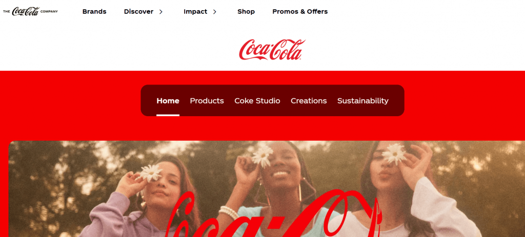
Coca-Cola’s visual identity is one of the most iconic in the world. It’s been consistent for over a century and evokes nostalgia, tradition, and joy.
- Logo: Classic script wordmark in flowing Spencerian script
- Colors: Bright red and white
- Typography: Custom script with curves and swashes
- Imagery: Smiling people, holiday campaigns, glass bottles
- Layout: Simple, bold use of white space and centered branding
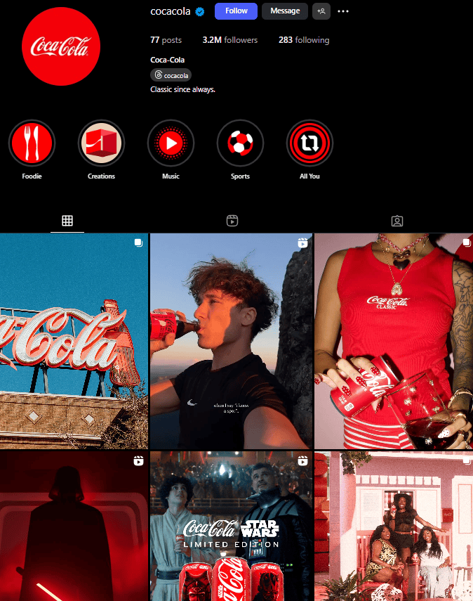
Coca-Cola’s visuals are timeless, emotional, and recognizable across languages and cultures.
Apple
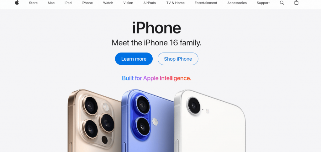
Apple’s visual identity is sleek, minimalist, and focused on precision. Every design element reflects the brand’s values: innovation, simplicity, and quality.
- Logo: The monochromatic apple with a bite taken out
- Colors: Black, white, silver, and space gray
- Typography: Clean sans-serif fonts (San Francisco)
- Imagery: Crisp product photography, high contrast, dark or white backgrounds
- Layout: Centered layouts with intentional white space and few distractions
Apple’s visual identity elevates the product, reinforces premium quality, and keeps the focus on usability.
Nike
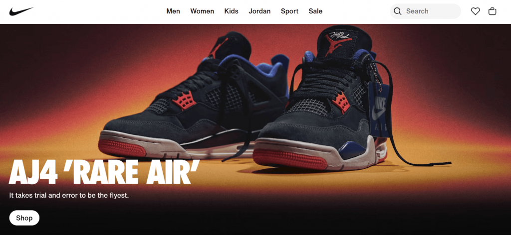
Nike’s visual identity is bold, energetic, and instantly recognizable worldwide.
- Logo: The iconic “swoosh” checkmark, symbolizing motion and speed.
- Colors: Predominantly black and white, with occasional use of bold accent colors.
- Typography: Strong, sans-serif fonts conveying strength and modernity.
- Imagery: Dynamic action shots of athletes, emphasizing performance.
- Layout: Clean, minimalistic design focusing on product and message.
Nike’s visual identity is consistently applied across its website, advertisements, and product packaging, reinforcing its brand message of empowerment and athletic excellence.
Starbucks
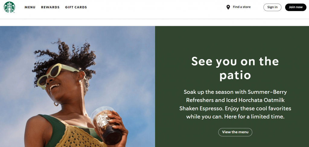
Starbucks’ visual identity is warm, inviting, and globally recognizable, reinforcing its focus on community and quality.
- Logo: The iconic Siren, a two-tailed mermaid, symbolizes the brand’s deep coffee roots and global reach.
- Colors: Green represents sustainability and freshness, with white and black adding balance and clarity.
- Typography: Clean, modern sans-serif fonts for easy readability.
- Imagery: High-quality, inviting photos showcasing coffee, people, and community.
- Layout: Minimalistic design with large visuals and plenty of white space, creating a clean, accessible experience.
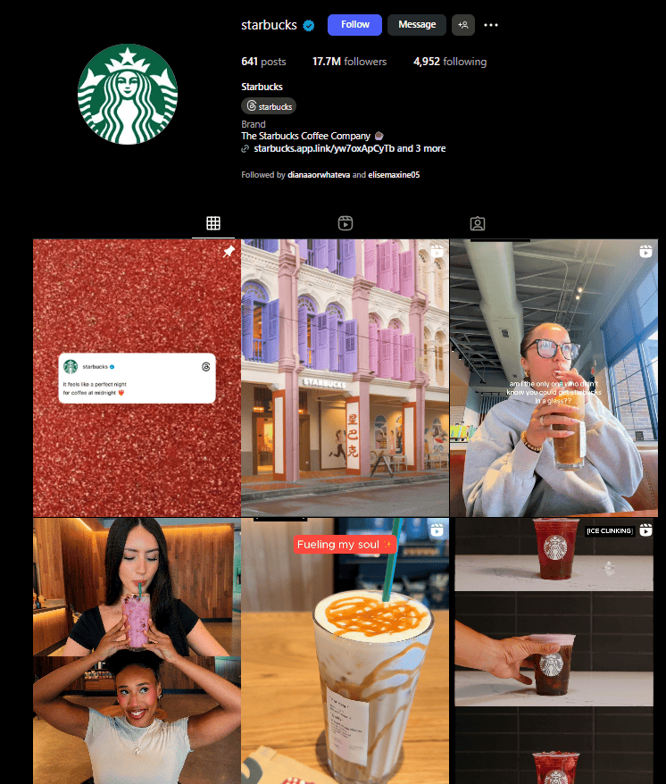
Starbucks’ consistent visuals across its website, packaging, and in-store design help reinforce its message of warmth, connection, and quality.
Spotify
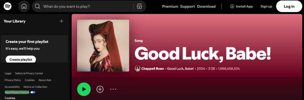
Spotify’s identity is modern and expressive, built to reflect motion, personalization, and creativity.
- Logo: Circle with three curved waves (the sound signal)
- Colors: Bright green, black, and white (with vibrant gradients in marketing)
- Typography: Gotham and Circular, bold and modern
- Imagery: Dynamic artist images, personalized playlists, bold color overlays
- Layout: Modular blocks and layered visuals
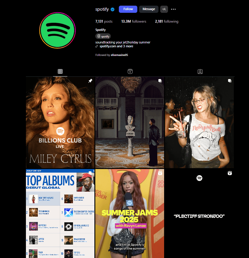
Spotify’s identity feels digital, fresh, and adaptable across platforms and devices.
Common visual identity mistakes to avoid
By now, you’ve learned how to make your visual elements. You might even have an idea or two you’re excited to try on. But just to top it all off, let’s also run through a quick checklist of what not to do.
Avoid these to keep your brand visuals clean and effective:
- Mixing too many fonts or colors. Too many fonts or colors can make your brand look disorganized. Stick to 2–3 fonts and 2–4 main colors to keep it cohesive.
- Using low-resolution or inconsistent images. Low-quality or pixelated images can hurt your credibility. Always use high-resolution, professional-looking photos and graphics for a polished look.
- Not aligning logo/text spacing correctly. Improper alignment can make your design look sloppy. Ensure proper spacing and alignment for a neat and balanced appearance.
- Inconsistent relationship between social media and your website. Inconsistent visuals across different platforms confuse your audience. Keep your logo, colors, and fonts the same across your website, social media, and marketing materials.
- Not documenting your design choices. Failing to create a style guide leads to inconsistency. Documenting your choices helps maintain a unified brand across all touchpoints.
Consistency builds trust and reinforces your brand. When your visuals are aligned, your audience will see you as professional and reliable.
Quick checklist for a consistent visual identity
Want to double-check your visuals? Run through this list.
- Logo is clear and high-resolution
- Colors match across site, social, and print
- Fonts are readable and consistent
- Images follow the same tone or filters
- Layouts have space and balance
- All choices are saved in one place (style guide or doc)
Once you’ve ticked off everything, your visual identity is ready!
Build your branding with a strong visual identity
Your visual identity is more than just how your brand looks; it’s how people feel when they see it. Starting with the basics, like a good logo, matching colors, and consistent fonts, can take you far. As your brand grows, so can your identity.
If you’re ready to bring your visuals to life, Network Solutions’ website builder offers easy-to-use tools that allow you to translate your brand and visual identity into a cohesive and reliable website. Whether you’re starting from scratch or updating your brand, it all starts with one design choice at a time.
Frequently asked questions
A visual identity consists of three main elements:
1.) Logo: The symbol or design that represents your brand.
2.) Color palette: A set of colors that reflect your brand’s personality.
3.) Typography: The fonts used to communicate your brand’s tone and ensure readability.
Visual identity shapes how people perceive your brand. It builds trust, enhances recognition, and communicates your brand’s personality. Consistent visuals help create a strong, memorable connection with your audience.
Visual identity is the design side — what your brand looks like. Brand identity also includes your mission, values, voice, and overall personality.
They’re closely related. Visual branding is the combination of strategy and visuals. Visual identity is the toolkit (logo, colors, fonts) you use to make that branding come to life.
Absolutely. Tools like Canva, Looka, and brand kits in website builders like Network Solutions make it easier than ever. If you’re short on time or want a professional touch, a freelancer can help.
If your brand has changed, your audience is shifting, or your products have evolved, it may be time to refresh.
Other signs that say it’s time for an update:
1.) Your logo looks outdated
2.) You’re using mismatched colors or styles
3.) Your visuals don’t reflect your values anymore
4.) Competitors feel more modern than you
Even a one-page guide helps. It keeps everything consistent when you create new content, update your website, or work with others.