Key takeaways:
- Effective website design considers mobile optimization, branding, and easy online reservations and orders.
- There are 13 restaurant websites that highlight the qualities of good website design that you can grab inspiration from.
- Website design trends like a storytelling approach to layout can help make your website stand out against the rest.
A weak restaurant website costs you more than design points. It drives customers away, frustrates visitors, and leads to lost reservations or missed online orders when important information like your menu, hours, or location is hard to find. In a competitive market, that friction quickly turns into lost revenue.
A strong restaurant website guides customers toward clear actions, whether that is booking a table or placing an order. In this guide, you will see 13 real examples, the elements worth copying, and a practical roadmap to build or improve your own site.
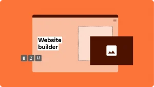
You can use a template, a website builder, or invest in custom development. The key is choosing an approach that supports growth and delivers a smooth experience.
Find the perfect domain
Ready to register a domain name? Check domain availability and get started with Network Solutions today.
What makes a great restaurant website (the checklist you can steal)
The best restaurant websites follow a clear structure. They make important information easy to find, guide actions, and reinforce the brand. Use this checklist as your baseline, then refine it to match your concept.
- Put essential details front and center
- Make the menu easy to browse
- Make actions obvious
- Use photos that sell the experience
- Keep it on brand and easy to navigate
- Add trust and reasons to return
- Design for mobile visitors
Put essential details front and center
Display your address, hours, contact info, and location map prominently in the header or footer. Guests should never have to search for basics.
Make the menu easy to browse
Avoid PDF-only menus. Publish a searchable online menu with clear categories, pricing, and descriptions that keep visitors engaged.
Make actions obvious
Highlight online ordering, reservations, and delivery with clear, tappable buttons. Calls to action should stand out without overwhelming the design.
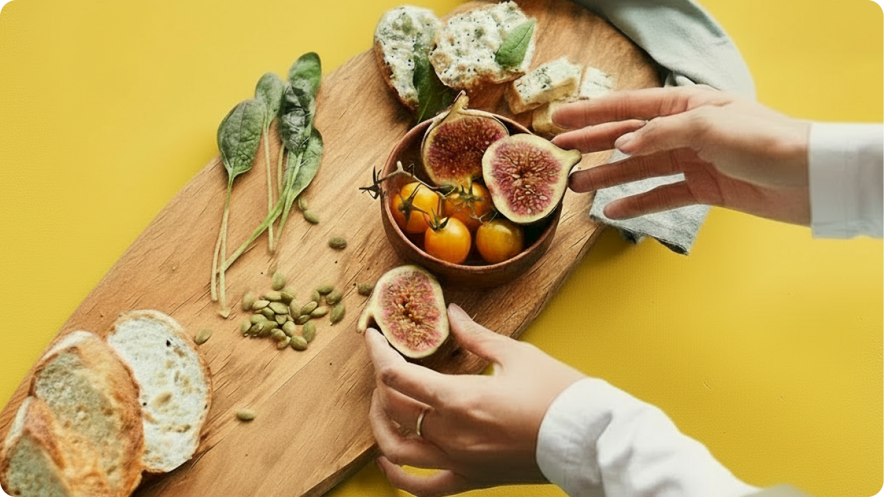
Use photos that sell the experience
Professional photos of food, drinks, and interiors build trust and capture the visitor’s attention. A curated gallery adds depth without slowing the site.
Keep it on brand and easy to navigate
Consistent colors, typography, and tone reinforce your identity. A clean layout helps guests browse and act quickly.
Add trust and reasons to return
Feature reviews, press mentions, events, or an email signup to encourage repeat visits.
Design for mobile visitors
Prioritize speed, readability, and tappable CTAs. Most guests will discover your restaurant on their phones first.
13 restaurant website designs to inspire your next refresh
The best restaurant web pages do more than look impressive. They combine strong restaurant website design with practical user experience that drives reservations, online orders, and repeat visits. Each example below follows the same criteria: a strong first impression, thoughtful details, and clear revenue-driving moments.
Mojo’s Tacos (Franklin, TN)
What it gets right: A dynamic homepage video immediately immerses diners in the brand.
Design pattern to copy: The hero section acts as a visual tour, paired with bold colors and straightforward navigation. The layout keeps the menu, locations, and ordering paths clean and easy to navigate.
Conversion moment: Prominent “Order Online” and reservation buttons capture attention early and reduce friction.
Salt Life Food Shack (Jacksonville, FL)
What it gets right: The homepage highlights daily specials alongside vibrant seafood imagery.
Design pattern to copy: Ocean-inspired bright colors reinforce the brand personality while location photos build trust. The structure makes key actions visible without clutter.
Conversion moment: Pickup and delivery links appear above the fold, guiding diners toward immediate action.
Fresh Kitchen (Multiple locations)
What it gets right: A clean, modern layout reinforces its health-focused cuisine.
Design pattern to copy: Clear top navigation makes the menu, catering, and locations easy to browse. Consistent typography and imagery create cohesion across pages.
Conversion moment: The scrolling journey naturally ends with online ordering, turning brand storytelling into action.
Mendocino Farms (Multiple locations)
What it gets right: Values and food quality are highlighted immediately on the homepage.
Design pattern to copy: Strategic placement of brand messaging builds credibility while maintaining strong restaurant web design fundamentals. Interactive elements deepen engagement.
Conversion moment: A persistent “Order Now” button ensures diners can act at any point.
Vale Food Co. (Multiple locations)
What it gets right: High-impact food photography dominates the homepage.
Design pattern to copy: A rotating slideshow of signature dishes keeps visual energy high while maintaining a clean structure. Bold typography reflects the brand’s personality.
Conversion moment: A fixed header with online ordering makes conversion effortless.
Urbanbelly (Chicago, IL)
What it gets right: Video storytelling reinforces the chef-driven concept.
Design pattern to copy: The desktop hero video adapts smoothly for mobile, providing a strong mobile-first restaurant website design. Visuals highlight cuisine without overwhelming usability.
Conversion moment: Clear navigation directs users to menu details and reservations within seconds.
Lucky Folks (Lieusaint, France)
What it gets right: Playful visuals immediately communicate a unique dining experience.
Design pattern to copy: Bright colors and quirky graphics align with the brand while maintaining structure. Even creative layouts remain easy to navigate.
Conversion moment: Clear reservation pathways prevent the playful design from distracting diners.
Disco Cheetah (Vancouver, BC)
What it gets right: Bold branding captures attention on arrival.
Design pattern to copy: The homepage walks visitors through a simplified customer journey, from menu highlights to ordering and events. Visual storytelling supports clarity.
Conversion moment: Online ordering and food truck booking links remain consistently accessible.
Quay (Sydney, Australia)
What it gets right: Elegant minimalism reflects fine dining prestige.
Design pattern to copy: Large-scale imagery and restrained typography create a refined, immersive atmosphere. The clean layout keeps focus on cuisine and setting.
Conversion moment: Reservation access is immediate and distraction-free.
Federalist Pig (Washington, DC)
What it gets right: Strong personality shines through smoky visuals and bold design.
Design pattern to copy: High-contrast colors and confident typography create memorable restaurant web design without sacrificing usability.
Conversion moment: Menus, catering, and online ordering are clearly separated for fast decisions.
The Tailor’s Son (San Francisco, CA)
What it gets right: A minimalist homepage delivers clarity.
Design pattern to copy: Essential information, including hours and menu, appears immediately. The clean structure reflects culinary precision.
Conversion moment: Reservations and ordering sit prominently in the header for instant access.
SusieCakes (Multiple locations)
What it gets right: Warm visuals evoke nostalgia and comfort.
Design pattern to copy: Soft colors and inviting food photography create emotional appeal while maintaining easy navigation. The structure scales well across devices.
Conversion moment: Clear location and ordering tools support both new diners and loyal customers.
Old Lady Gang (Atlanta, GA)
What it gets right: Branding takes center stage from the first scroll.
Design pattern to copy: Rich visuals and strong identity elements highlight the restaurant’s story and Southern cuisine. The layout remains clean despite bold styling.
Conversion moment: Menus, reservations, and contact details stay visible, ensuring storytelling leads to action.
How to make a restaurant website (simple path, no drama)
If you’re wondering how to make a restaurant website without overcomplicating it, keep it focused and practical. The best approach depends on your goals, timeline, and resources. Some operators prefer a website builder, others start with a restaurant website template, and some invest in custom development. What matters is launching something clear, fast, and easy to manage.
- Choose the right website builder or platform
- Claim your domain name
- Start from a restaurant website template
- Add the must-haves
- Publish, test on mobile, keep it updated
Choose the right website builder or platform
Pick a platform that matches your skill level and business needs so you can confidently create and manage your own restaurant website.
Claim your domain name
Secure a domain that reflects your brand and makes it easy for diners to find your website.
Start from a restaurant website template
Use a proven restaurant template, then customize it with your branding, colors, and imagery.
Add the must-haves
Publish your menu, hours, location, contact details, and clear online ordering or reservation options first.
Publish, test on mobile, and keep it updated
Before promoting, test speed and usability on phones, then update your site regularly for seasonal menus and events.
Quick win: Pair your restaurant website with a .restaurant domain
Your domain shapes first impressions. While many restaurants default to .com, a .restaurant domain instantly signals what you do and keeps your brand clear and memorable. It feels intentional, on brand, and easier to recall after someone searches for you once.
For example, BellaRoma.restaurant or OakStreetBBQ.restaurant is direct and descriptive without extra wording.
A strong domain supports your restaurant website by reinforcing credibility and helping diners find you faster.
Ready to claim a name that fits your brand? Secure your .restaurant domain and make it yours.
Frequently asked questions
The best restaurant websites make important information easy to find within seconds. At minimum, include your menu, hours, location, contact details, and clear paths for online ordering or reservations. If guests have to search for basics, you risk losing them before they take action.
If you offer takeout or delivery, online ordering should live directly on your website. It gives you greater control over the guest experience and reduces friction for diners seeking convenience. Even fine dining restaurants benefit from streamlined reservation tools.
Avoid PDF-only menus. Instead, publish your menu as a searchable web page that loads quickly and works well on mobile devices. This improves usability and helps search engines understand your content.
Review your website monthly and update it whenever hours, seasonal dishes, events, or policies change. Accurate information builds trust and prevents missed reservations or orders.
Final takeaway: Make it easy to choose you
Your restaurant website is part of the guest experience. When the basics are visible, the menu is easy to browse, and action buttons for ordering or reservations are obvious, you remove friction and capture more revenue.
Customers and visitors should never have to guess their next step. A clear, well-structured site strengthens your brand and supports your business every day. If you’re ready to create a restaurant website that performs, we offer domain registration, website design services, and tools to help you launch your online presence with confidence and keep everything running smoothly.
Now is the time to create a restaurant website that works as hard as you do.