Key takeaways:
- A brochure website is a simple, information-first site designed to build credibility and turn visitors into inquiries.
- It’s ideal for small businesses and service providers who rely on conversations by offering a clean, affordable way to establish a professional online presence.
- In 2026, success comes from keeping it fast, mobile-friendly, scannable, and built around one clear call to action.
Businesses used to introduce themselves by handing out crisp, glossy, printed brochures, a friendly smile, and a quick overview of what they offered. Sure, that worked then.
In 2026, if someone hears about your business, the first thing they do is reach for their phone, and if customers can’t find you on their phones, they may question whether you’re active or legitimate.
This is where a brochure website comes in. It’s like a printed brochure—only online. It has the same few pages and the same essential information, but now it lives where customers are actually looking.
In this guide, we’ll walk through everything you need to know about brochure websites. We’ll cover what they are, how they help your small business, design tips, realistic 2026 cost ranges, and how you can build one today without being a tech genius.
What is a brochure site?
A brochure website is a small, information-focused website that acts as a digital version of a printed brochure. It’s designed to look and feel like a printed brochure, showcasing a company’s products or services without selling them online. It has clear purposes:
- Establish your online presence
- Build trust with potential clients and customers
- Encourage them to reach out via phone or email
Unlike e-commerce sites, brochure websites are not built for online transactions. Take Amazon, for example. It’s designed for buying and selling thousands of products. A brochure website, on the other hand, is mainly built for interaction—to start a conversation.
This type of website design keeps things simple and effective with only a few pages. Brochure websites typically consist of 1-5 pages that provide essential information about a business. They’re designed to be simple and concise, making them quicker and easier to build and maintain than other types of websites.
A brochure website design follows a very specific structure, with only key pages: Home Page, About Us, Services/Products, Contact Us, and the legal essentials.
- Home Page: displays high-quality images, a clear headline about what you do, and a button that tells visitors what to do next
- About Us: explains your why, history, and why you care about customers
- Services/Products: lists what you offer in packages or categories (e.g., consultants list service packages; dentists list services like Teeth Cleaning, Teeth Whitening, etc.)
- Contact Us: includes a contact form and other contact methods such as phone number and email, plus a map of our location, and your operating hours
- Terms and Conditions, Data Protection Policy and Cookies Warning: keep your website compliant, safe, and professional
Brochure websites are accessible on desktops, smartphones, and tablets through any browser to maximize reach to potential customers.
Who needs a brochure website?
Brochure sites are used by small businesses, tradespeople, and local services to create an online presence, and they’re particularly effective for service-based businesses reliant on in-person sales. Many businesses—such as real estate agencies and dental clinics—plus professional services like lawyers, accountants, and creative portfolios can benefit from having one.
Choose this type of website if you want clarity, trust, and a fast path to contact rather than advanced functionality. Not every business needs one, but you’ll get the most value from a brochure website if you’re:
- Local service providers needing a clear, easy-to-find online presence: Customers want hours, services, starting prices, a map, and contact details in one place. A clean website homepage and just a few pages help them call, book, or visit without friction. Use high-quality images, clean white space, and clear headings to present information. If you’re a clinic, spa, salon, trades, real estate, legal, coaching business, then this works best for you.
- Small B2B and agencies needing a credibility hub and lead generation point: Show your positioning, a few short case studies, your team, and one primary call to action. Highlight core values and unique selling points to support sales conversations and turn curious visitors into leads without the weight of custom website tools.
- Freelancers and consultants wanting a simple, professional web presence: Present services, proof of work, and a direct way to book a call or request a quote. Keep your website lean so potential clients decide fast.
- Early‑stage startups validating an idea before investing in complex builds: State your value proposition, show basic features, answer essential questions, and collect signups or demo requests. Learn from real interest before you scale and before you commit to a heavier process.
What are the benefits of a brochure website?
A brochure website is easy to navigate, affordable to build, and can express branding efficiently. It fills the gap between having no website at all and investing in a full, feature-heavy system your business may not need yet.
Here are more reasons why an online brochure works for your business:
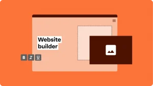
- Cost efficiency: Fewer pages and complex moving parts, like payment processing, mean lower build and maintenance costs. Brochure websites let you convey crucial information to your target audience at a low cost. Using tools like a Website Builder makes this even more affordable.
- Bigger reach and distribution: Physical brochures mostly only reach people who walk into your shop, whereas a brochure website can reach your target audience in your city, or anywhere in the world, who search for your services online. It’s also easy to navigate, with a few static pages, and is instantly shareable via social, email signatures, QR codes, and referrals.
- Better analytics and insights: A website shows what your visitors click, view, and convert on—data you never get from paper. You instantly see what your target customers care about, which helps sharpen your marketing and attract more users. It gives you real data about what visitors click, read, and respond to.
- Establish trust and credibility: If your website isn’t on search engines like Google, potential customers wonder whether you’re still in business. A personalized web design and consistent branding with your logo and colors show you’re an established, trustworthy professional.
- Next-level customer experience: Brochure-style websites are easy to navigate with just a few clean, visually appealing pages. Visitors never get lost in lengthy texts, and key information is easy to scan with a dedicated contact page. They can find your phone number in two seconds while sitting at a red light (but don’t text and drive!).
- Generate inquiries or leads: A brochure website’s goal is credibility first, but it can also be a strong lead-generation tool when built right. It can promote products, launches, special offers, and discounts, then guide visitors to take action through clear calls to action. The result is higher conversion rates and steady lead generation with minimal digital marketing setup. Your business grows faster because clients reach you easily.
- Maintenance, real-time updates, and flexibility: Your team can update essential pages in seconds because brochure websites stay lean. Change business hours, adjust pricing, or update homepage images in minutes. You get instant control over your company’s content and functionality, so customers always see the latest info and your business keeps running smoothly.
What are the current trends in brochure website design?
In 2026, the best brochure website designs focus on speed, simplicity, and storytelling. Trends emphasize bold minimalism, expressive type, and clean, scannable layouts, so users get the point fast.
Gone are the days of cluttered pages and “flashing” buttons. Today’s users want a website that loads instantly and looks beautiful on their iPhone or Android. They leave rather quickly when pages are slow or hard to use.
Here’s what your brochure website design should focus on in 2026:
- Easy to scan
- Built for action
- Modern expectations to meet in 2026
Easy to scan
People don’t “read” websites; they “scan” them.
Make your message visible at a glance. Use clear section headings and short paragraphs. Keep your text to 2–3 sentences, as big “walls of text” scare people away! Use white space, a logical hierarchy, and clear, important elements (headline, benefits, proof, CTA) so people can find key information quickly.
Place calls to action where intent peaks: top for quick deciders, mid‑page after value is clear, and bottom for readers who finish the page.
Built for action
Pick one primary CTA (example: “Get a quote,” “Schedule a consultation,” “Contact us”) and repeat it.
Make sure your contact form, a “click-to-call” phone number, and a Google Map are all easy to find. Then, add trust signals like reviews, certifications, guarantees, recognizable clients, before/after photos—whatever proof fits your work.
Modern expectations to meet in 2026
Design for every screen first. Multi‑device accessibility and speed are default expectations. Plus, search engines prioritize mobile usability. So make sure your web design is mobile-optimized, fast, and locally findable.
If your website takes more than three seconds to load, people bounce. To improve load time, use compressed images, clean layouts, and test load speed regularly.
Aside from being visually engaging, utilize SEO tactics to improve visibility in search results. Learn how to win the local SEO game. If you want a quick “where do I stand?” in regard to your site’s health and status, our Website Grader flags mobile-friendliness, speed, SEO, and security.
(Embed in WP: Most browsing starts on a phone—make sure your website is mobile‑friendly.Watch this video: Is my Network Solutions website mobile-friendly? Here’s how to check )
Brochure website examples that you can copy
Sometimes it’s hard to imagine what your site should look like until you see it. Below are four brochure‑style site patterns you can get design inspirations from. These are great examples of how a brochure website can be clear, trustworthy, and easy to act on, without piling on more pages.
We’ll cover:
- Deakin Dental — service/local business
- Unless Agency — professional/knowledge‑based services
- Moorlands School — education/organizations
- Yomira — lifestyle/luxury experiences
Deakin Dental (Service/local business)
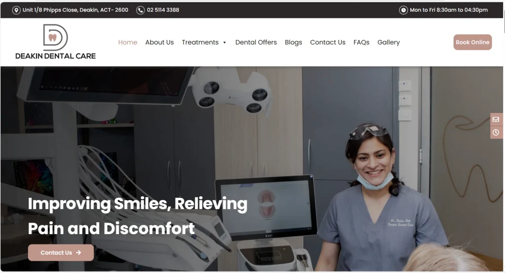
If you’re building a brochure website for a local service business, this is the blueprint. Deakin Dental’s headline doesn’t try to be clever. When you land on the page, you see a friendly face, a “Book Now” button, and a list of their three main services.
This website design feels clear and professional. The homepage shows the hours and phone number, and the CTAs stand out (“Contact Us” and “Book Online”).
Unless Agency (Professional/knowledge-based services)
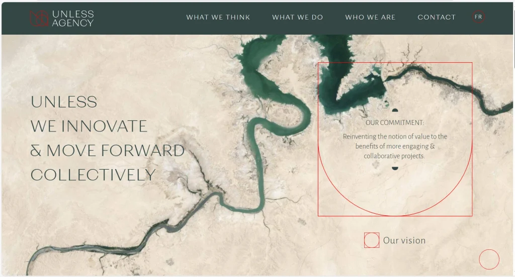
Unless Agency keeps the page calm. It leans into a minimalist, mission-led layout. It leads with a clear point of view, uses short sections, and lays out services in a structured way. A restrained color palette and one strong background image set the tone without stealing attention from the words. “Contact” is also visible on the homepage.
The site feels intentional, like a brochure that uses space on purpose. That is great for consultants and B2B teams who sell ideas and outcomes.
Moorlands School (Education/organizations)
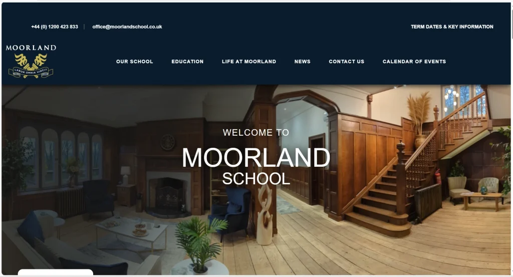
Moorlands School uses a warm welcome and a clear structure. It borrows the logic of a printed brochure prospectus. A warm, image‑led hero welcomes families, then the navigation maps to real decisions: Our School, Education, Life at School, News, Events, Contact.
It also uses short text so visitors can scan and find crucial information fast. It’s friendly, informative, and built around the tasks families actually come to complete.
Yomira (Lifestyle/luxury experiences)
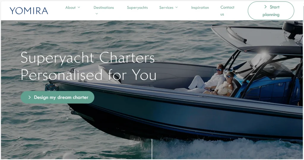
Yomira keeps it premium and simple. The headline and the CTA are clear. The visuals do most of the selling—high-quality images that carry the mood. Yomira also doesn’t overload you with all the detailed information upfront.
Their site uses “full-screen” imagery that makes you feel like you are already on the ocean. The copy is short and “premium.” They don’t list prices immediately but encourage you to inquire.
The site guides one clean action: start planning. This one secures conversions through pure “experience selling.”
Pro tip: If you’re building this yourself, tools like our Website Builder can generate a starting layout based on your business type. Just tell AI what you do, and it builds the layout for you!
How much does a brochure website cost in 2026?
One of the biggest questions new business owners have is: “How much is this going to set me back?” In 2026, you have two main paths.
| Feature | DIY with AI builder | Hiring a developer |
|---|---|---|
| Cost | $0 – $30 / month | $40 – $200 per hour |
| Time to build | 30 minutes to three days | two to five months |
| Technical skill | Zero (just typing/clicking) | High (requires coding) |
| Maintenance | You can do it yourself easily | You usually have to pay them to update it |
For most small businesses, starting with a Website Builder is the smartest move. It saves you thousands of dollars that you can spend on marketing your business instead!
Frequently asked questions
A brochure website is small, information‑first site (think online brochure or digital brochure) designed to build credibility, highlight your unique selling points, and generate inquiries.
An e-commerce site (like Amazon) allows customers to add items to a cart and pay online. A brochure website is for presenting information clearly and lead generation.
Most start with just a few pages—typically 4–6 (Home, About, Products, Contact + legal pages)—then expand or add more pages as needed.
Yes. Many businesses start brochure-style, then add booking, payments, or a store once demand is proven and the process is clear.
This is called SEO (Search Engine Optimization). Use clear headings, write specific service descriptions for your target audience, and keep the site fast so search engines understand what you do. Strong internal links across your key pages can help, too.
Start building your brochure website
In 2026, a professional brochure website is seen as vital for small businesses without e-commerce needs. If your goal is to look credible, explain what you do, and generate inquiries with minimal upkeep, a brochure website is one of the cleanest, fastest ways to get online.
A brochure website is a strategic, low-maintenance way to show up professionally online. Build it lean, keep the copy scannable, and you’ll have something you can ship fast. Start simple, get live, and improve over time as you let the site grow with you.
If you’re ready to build, start with the Network Solutions Website Builder. Get a clean first draft fast, then shape it into your brand. You can edit text, swap images, and move sections with a drag-and-drop editor.
Or if you’re not ready to build just yet, you can register your domain ahead before someone else takes it. That way, you can have the perfect domain secured before you’re actually ready to build your website.