

Key takeaways:
- A responsive design allows your content to seamlessly adapt to any screen size.
- Improving your website speed and navigation reduces frustration for mobile users.
- Testing with real mobile devices and diagnostic tools helps ensure your site performs correctly for every visitor.
Your site may look great on a desktop, but visitors won’t stick around if they struggle to use it on their phone.
Mobile users lack the patience to pinch, zoom, and scroll horizontally just to find a phone number. If the mobile experience fails, they bounce to a competitor. You wouldn’t want this as browsing on smaller screens generated 51.51% of worldwide web traffic in June 2026.
Fortunately, many fixes don’t require advanced coding. This guide explains what makes a mobile-friendly website, provides practical tips to improve your site’s mobile experience, and shows how to test it across mobile devices and browsers.
Build a site that’s ready for every screen
With Network Solutions Website Builder, you can customize your site with drag-and-drop tools and publish without writing code.

What makes a mobile-friendly website?
A mobile-friendly layout automatically detects the user’s device and adapts the design so the content remains usable and visually appealing.
Instead of forcing a visitor to view a tiny replica of your desktop site, the page restructures itself. Text enlarges to become readable without zooming, navigation menus collapse into easily tapped icons, and images scale down to fit the exact screen size available.
The core information and interactive features stay intact, but they stack and flow in a way that respects the physical constraints of a smartphone or tablet screen. Your goal is to make reading, tapping, and scrolling feel effortless.
The most common and effective way to achieve this is through responsive design.
A responsive website uses a single set of code and content that fluidly adjusts across everything—from a large desktop monitor to various mobile devices. This approach eliminates the need to build and maintain a separate mobile version of your online presence.
With a single responsive site, you update your content once, and the layout intelligently handles the display differences for every website mobile visitor. This strategy also boosts SEO value for websites.
15 tips on how to make your website mobile-friendly
Rather than overhauling everything at once, try to identify its biggest or most obvious issue. Fix this issue first, then it’s easier to work through the process on how to make a website mobile friendly.
These 15 steps can help you create a better experience on smaller screens:
- Start with responsive design
- Add and verify the viewport meta tag
- Use flexible layouts instead of fixed widths
- Optimize images and videos for mobile screens
- Improve mobile page speed
- Simplify mobile navigation
- Prioritize the content mobile visitors need most
- Make buttons and links easy to tap
- Use readable fonts and comfortable spacing
- Keep copy concise and easy to scan
- Simplify forms for mobile users
- Avoid intrusive pop-ups and overlays
- Use accordions and tabs selectively
- Design for accessibility on smaller screens
- Keep themes, plugins, and site content updated
1. Start with responsive design
Building with responsive design ensures your content adapts to different devices without requiring a separate site.
A responsive layout relies on flexible grids and breakpoints, meaning the design shifts smoothly depending on the available screen size.
Check your current builder or theme documentation to confirm it’s still responsive out of the box. Open your site on a desktop and slowly drag the browser window narrower. See if the content stacks logically. Ask your developer to remove any hard-coded, fixed-width elements that prevent the page from shifting.
If you lack technical support, using a modern DIY website builder handles the underlying code automatically, and you can focus entirely on your content.
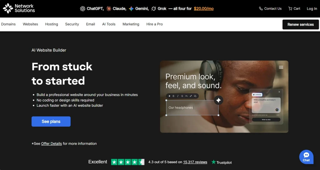
Here’s how a Network Solutions page with a responsive layout appears on desktop and mobile:

2. Add and verify the viewport meta tag
Implement the viewport meta tag to control scaling and display on mobile screens.
Without it, other mobile browsers may treat your page like a desktop website and shrink everything to fit the screen. It can make text hard to read and navigation difficult on the user’s device.
The standard code looks like this:
- <meta name=”viewport” content=”width=device-width, initial-scale=1.0″>
This tag belongs in the <head> section of your HTML. Most modern themes, website builders, and content management systems add it automatically.
Unless you understand HTML, don’t edit your core site files. For older custom-built websites, ask a developer to confirm that the tag is in place.
3. Use flexible layouts instead of fixed widths
Fluid layouts help your content stretch and shrink naturally. If you build sections with fixed pixel widths, they will stretch off the edge of smaller screens. This forces your visitors to scroll horizontally.
Developers fix this by using relative sizing for a true responsive layout. You may check your website mobile view for cut-off text or columns that stay side by side instead of stacking neatly.
A good design takes a wide desktop version and stacks it vertically on a phone.
4. Optimize images and videos for mobile screens
Images must resize themselves, so they never break past the edges of mobile screens. If you hire a developer, they use a quick setting (like max-width: 100%; height: auto) to make flexible images or for visual elements to shrink proportionally
You can also optimize images yourself. Large image files drastically hurt website speed, so upload pictures at the correct display size, compress them, and avoid videos that play automatically.
Image compression reduces load times and mobile data usage. This keeps your site mobile responsive, fast, and accessible.
Infographic: Oversized image versus compressed, responsive image on a mobile page (to request)
5. Improve mobile page speed
Mobile users may be browsing over weak cellular signals that affect loading speed and performance. Nevertheless, a mobile-friendly website should load in under three seconds. Google research found that 53% of mobile visits are likely to be abandoned if a page takes longer than three seconds to load. Search engines may also penalize a slow site, since Google favors mobile-friendly sites in search results or rankings.
To improve load times, compress large image files or optimize images, enable browser caching, and remove unnecessary scripts. Implement lazy loading, too, so images further down the page only load when the visitor scrolls to them. And test important landing pages, product pages, and forms—not only the homepage, so your site performs better overall.
Another tip is to upgrade to reliable web hosting to ensure your server reacts quickly.
Give your website a faster foundation
Explore hosting built for reliable performance, fast load times, and support when you need it.

6. Simplify mobile navigation
Your mobile navigation should guide visitors easily without cluttering up limited space on smaller screens. Multi-tiered menus that work on desktop monitors usually fail on a mobile website.
Keep your primary menu strictly to the essentials. Use crystal clear labels and put the menu in a consistent spot. Avoid deep drop-down menus that require multiple taps.
A hamburger menu hides navigation links until the visitor specifically requests them. This three-line icon saves screen space on mobile devices and keeps your simplified layouts clean on a mobile friendly site.
Below, you can see Dyson’s homepage on a desktop and mobile and how they utilized the hamburger menu:


Test the menu yourself on a phone and see if you can easily open and close it using only one hand. You can check this guide to website navigation for additional structure and labeling practices.
7. Prioritize the content mobile visitors need most
A mobile first approach means placing the most important information where mobile users can find it quickly. Think about why someone is visiting your site from their phone. They usually want to:
- Call your business
- Check your hours
- Find your location
- Make a purchase
Make these actions easy to see as soon as the site appears on their screen. Remove outdated promotions, duplicate content, and other elements that push key information further down the page.
But prioritizing a mobile version doesn’t automatically mean removing important details. Just organize your web pages so the most useful information appears first, and less urgent content from the desktop site comes later.
8. Make buttons and links easy to tap
Mobile users browse with their thumbs. And when links and buttons are too small or placed too close together, it’s easy to tap the wrong one.
Use touch-friendly buttons with enough space around them. Make sure buttons are large enough to tap comfortably on mobile devices—typically around 10mm by 10mm or 48×48 pixels minimum for easy tapping. And avoid cramming several small links right next to each other.
Keep calls to action short and clear so visitors know exactly what to do next. Buttons that visually change when tapped also make your website mobile friendly as it lets the users know their actions registered.
9. Use readable fonts and comfortable spacing
Visitors should be able to read the page without pinching and zooming. Use legible fonts to prevent eye strain and keep visitors engaged with your message.
Achieve good typography on mobile screens with these practices:
- Choose a clean, easy-to-read font.
- Use a comfortable text size for mobile users. A 16px body font is a common starting point.
- Leave enough space between lines and paragraphs.
- Maintain strong contrast between text and background colors.
- Create a clear heading hierarchy to make content easier to scan.
Fonts can appear differently across devices, so review your pages on several phones. If visitors need to zoom in to read content on smaller screens, your typography likely needs adjustment. Clear, readable text is a fundamental part of good web design.
10. Keep copy concise and easy to scan
People tend to scan web pages rather than read every single word. This habit grows stronger on mobile screens.
Help your mobile users digest your content or information by writing short paragraphs that focus on just one idea. Break up heavy text blocks. Use descriptive subheadings and selective bullet lists to create simplified layouts. Put your most important points right at the top of the section.
Keeping your site mobile friendly also means removing fluff so the customer gets the point faster. Focus on the important facts and clear, straightforward language.
11. Simplify forms for mobile users
Typing on mobile devices requires effort. So complex checkout processes or contact pages with a dozen required fields will destroy your user experience and cost you leads on a mobile friendly website.
Simplified forms enhance the mobile user experience by minimizing required fields. They should:
- Ask only for information the business genuinely needs.
- Use the correct input type so a phone shows an email, telephone, or numeric keyboard as appropriate.
- Keep labels visible after typing.
- Support autofill when it’s suitable.
- Display specific error messages beside the affected field.
- Make the submit button easy to tap.
Try completing your forms on real mobile devices to spot issues before your visitors do.
Network Solutions can simplify the process to create mobile-friendly checkout pages with our free Checkout App. It comes with every domain you register with us.
12. Avoid intrusive pop-ups and overlays
Pop-ups that cover the whole screen can be incredibly annoying on smaller screens. You may have a mobile friendly site, but users won’t hesitate to leave if they can’t find the tiny close button.
So, use compact, slide-in banners instead of full-screen interruptions. Wait to show your offers until the visitor has spent time reading the content. Always provide an obvious, easily tapped control to dismiss the message.
Test mandatory elements like cookie consent notices and live chat widgets on your own phone to guarantee they don’t trap mobile users.
13. Use accordions and tabs selectively
Accordions help organize FAQs and secondary details by letting sections open and close. Tabs separate related product categories cleanly.
Both tools prevent long web pages and keep them short on mobile screens.
Give them clear labels and large controls so mobile users can tap them easily and make it obvious when a section is open.
However, keep essential pricing, availability, contact information, or primary calls to action outside a closed panel so visitors don’t miss them.
14. Design for accessibility on smaller screens
Accessibility means your site is easy to use for more people, including those using mobile devices and assistive technologies.
A few accessibility best practices include:
- Using strong color contrast between text and backgrounds
- Writing descriptive alternative text for images
- Following a clear heading order
- Supporting keyboard navigation and visible focus states
- Adding captions or transcripts for videos
- Including clear labels for form fields and icon-only controls
- Using legible fonts and testing your site on different devices to ensure content remains easy to read and navigate, especially for mobile users
An accessible design often creates a more mobile-friendly website for everyone, especially for people with disabilities.
15. Keep themes, plugins, and site content updated
Outdated themes and neglected plugins cause display bugs on mobile browsers. They hurt how your site performs. To avoid this, back up your website regularly before installing updates. Apply supported updates and delete old tools you no longer use.
If you use WordPress, WordPress hosting makes maintenance much easier. Always double-check your checkout process on actual devices after making changes.
Your site remains responsive only if you consistently verify it on real devices. Keeping everything updated prevents security risks too.
How to test if your website is mobile-friendly?
No single test proves your website is mobile-friendly. Use the checklist below when testing on actual devices to evaluate how your site performs:
- Resize the browser window: Check whether text, images, menus, and columns reflow without horizontal scrolling.
- Use browser developer tools: Preview common device sizes and inspect responsive breakpoints.
- Run a performance audit: Use PageSpeed Insights or Lighthouse to find speed, accessibility, SEO, and code issues.
- Test on real mobile devices: Check at least one smartphone and one tablet when possible for accurate feedback about touch, keyboards, scrolling, and speed.
- Try multiple mobile browsers: Confirm key pages in Safari, Chrome, Firefox, and other mobile browsers or operating systems.
- Rotate the screen: Review and confirm the site appears correctly in portrait and landscape.
- Complete key tasks: Open navigation, use the search function, submit a form, call, and complete checkout or booking.
- Review analytics: Look for mobile-specific exits, poor engagement, or conversion drop-offs.
Frequently asked questions
Start with responsive design so your site fits any screen. Use clear text, flexible images, simple menus, and easy touch controls. Improve your speed and always test the final mobile friendly website yourself.
A “mobile friendly” site is the successful end result, and a responsive website is the best way to get there. It lets one site adjust to any screen. You avoid the hassle of maintaining a separate mobile version and a desktop version.
Your website mobile view might rely on rigid layouts. Missing the viewport meta tag, oversized images, tiny text, and outdated themes also break your design. Test the page to find exactly why the site appears broken on mobile screens.
Yes, you can upgrade an existing website to make website mobile friendly. The work required depends on your site’s age, platform, theme, and code. Your fixes could range from simple image updates to replacing an outdated template with a modern responsive layout to become truly mobile responsive.
Most modern websites don’t need a separate mobile version. A well-built responsive site runs perfectly across all screens. Running a distinct mobile version separate from your desktop site just creates messy maintenance issues.
Test your mobile site on real mobile devices before you launch and after you make any changes. Check your features like forms regularly on various mobile devices and other mobile browsers to catch issues early. Actual devices provide the most reliable feedback.
Make every mobile visit count
Building a mobile-friendly website starts with responsive design and continues through choices about content, touch interactions, accessibility, and website speed. And testing shows whether those decisions work on the mobile devices customers use.
Try testing one important page on your own phone right now. Focus on one small fix at a time. If you want a simpler path, our Website Builder creates a beautiful responsive site automatically for all mobile devices without any coding. And if you purchase a domain with us, we include free tools that help manage your business online—a Coming Soon page, Checkout app, Link in Bio, Customers app, Marketing Calendar app, and Social app.
You can make your website mobile-friendly today and protect your business. Make their next visit easier and ensure you never lose a customer again to a bad layout.