Key takeaways:
- A product landing page works best when it focuses on one thing and doesn’t ask visitors to figure out what to do next.
- Pages sell better when they explain the product in plain terms and remove anything that pulls attention away from the decision.
- When the page design and the words support each other, visitors are more likely to take action instead of clicking away.
You know that moment when you click on something online and instantly get it? No confusion. No hunting around. You understand what’s being offered right away and why it’s worth your time. That’s exactly what a product landing page is at its core, and it’s one of the most helpful tools a small business can use when selling online. On average, these pages convert about 6.6% of visitors, which is strong compared to most other page types.
Think of it this way. Your homepage welcomes everyone and talks about many things. A product landing page does the opposite. It focuses on one offer and one goal. One product. One message. One simple next step. It answers your visitor’s questions without making them work to find the details.
In this guide, we’ll break down what makes a dedicated product landing page work and how it supports real product benefits. No tech talk. No pressure tactics. Just practical steps to help you build a page that’s useful and easy to trust.
What is a product landing page?
A product landing page is a single page created to support one specific offer. Instead of talking about everything your business does, it zooms in on one product and explains who it’s meant for and what problem it solves. The page is designed to point visitors toward one next step, like making a purchase or leaving their contact details, without sending them off in different directions.
Let’s look at two things that make product landing pages work:
- How it differs from other landing pages and homepages
- Key purposes of a product landing page
How it differs from other landing pages and homepages
Not all web pages are created equal. Here’s how product landing pages differ from other landing pages and homepages:
- Product landing pages: Focus exclusively on promoting one specific product or offer. This gets rid of any unnecessary navigation links or content to minimize distractions.
- Other landing pages: General content with a goal to generate leads, collect user information, or promote general services rather than a single product.
- Homepages: Serve as the main entry point to a website, featuring navigation menus and multiple sections that cover various aspects of the brand, products, and services. They’re designed to encourage visitors to explore further rather than make an immediate purchase.
Key purposes of a product landing page
Understanding the purpose of a product landing page enables you to effectively achieve your marketing and sales objectives. Here are its main objectives:
- Credibility: A focused page shows real product details, visuals, and supporting proof so visitors can judge the offer for themselves
- Brand reinforcement: A consistent message and visual appeal help visitors connect the product with your brand values
- Lead generation: Some product pages collect interest first through forms or trials, instead of asking for a purchase right away
- Conversions: Designed to encourage visitors to make a purchase right away
- Focused promotion: Clearly and compellingly highlight the unique selling points of a specific product
- Specific actions: Guide users toward actions like making a purchase, signing up for a trial, or requesting a demo
- Simplified user experience: Reduce decision fatigue by limiting choices and keeping the focus solely on the product
Product landing page examples that convert
Want to see what works? The examples below show real pages that turn visitors into customers. Each one proves that simplicity and focus always prevail over clutter.
We’ve grouped 20 landing page examples by industry so you can see what’s working for businesses like yours. Whether you’re selling software, products, services, or wellness solutions, these pages show you how to speak directly to your target audience and get potential customers to take action.
- SaaS landing page examples
- E-commerce landing page examples
- B2B and professional service landing page examples
- Health and wellness landing page examples
SaaS landing page examples
Software-as-a-Service (SaaS) product pages need to get to the point quickly. People want to know what the tool does and how it helps them. These examples show how software brands use clear supporting copy, helpful visuals, and one strong call to action to make that happen.
Notion
On Notion’s page, each section focuses on one way you might use the product. You can quickly tell what it’s for just by skimming the headlines and examples.
Slack
Slack uses clean design and simple language to explain how teams communicate better. The page encourages visitors to start right away with a low-commitment action.
Webflow
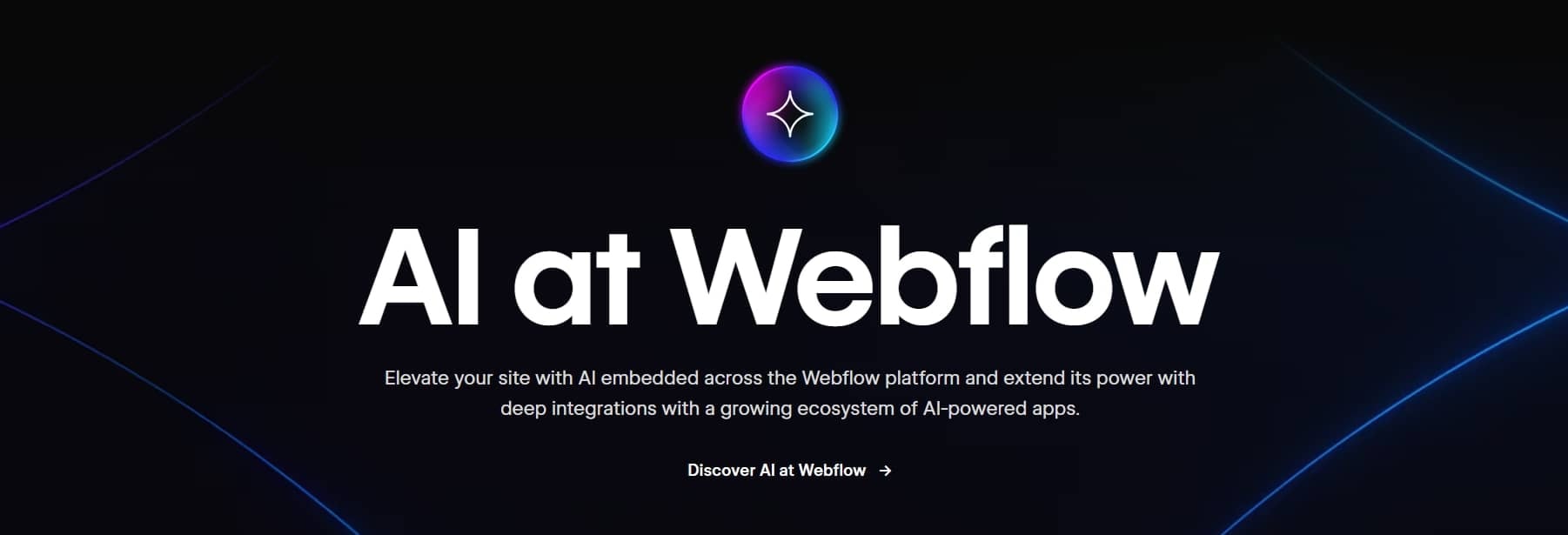
On Webflow’s page, visuals do most of the talking. You can scroll, look around, and understand what the product offers before deciding to sign up.
Airtable
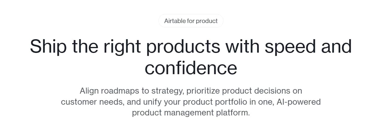
Airtable’s page is organized around how different teams might use the product. Each section speaks to a specific use case while still pointing toward one main action.
Figma
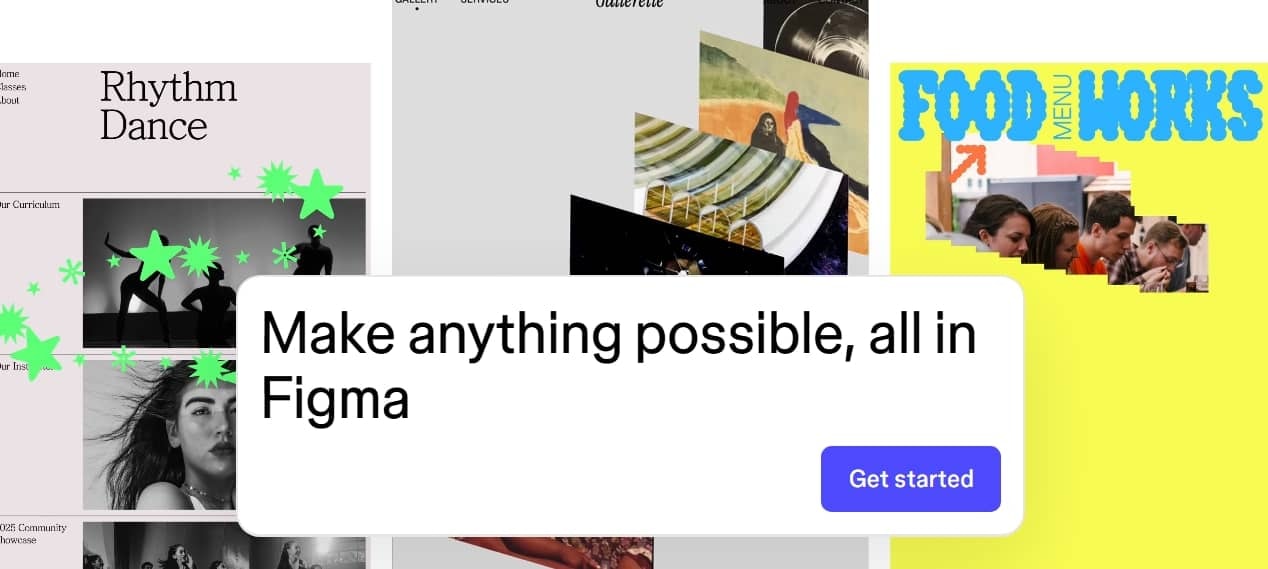
Figma emphasizes teamwork through real examples. You see how people actually collaborate using the tool in everyday design work.
E-commerce landing page examples
E-commerce pages focus on trust, visuals, and speed. These product landing pages help shoppers feel confident before buying.
Apple (product-specific pages)
Apple uses bold visuals and tight copy to spotlight one product at a time. The page removes clutter and keeps the attention on value.
Allbirds

Allbirds highlights comfort and sustainability. The page pairs lifestyle images with simple product descriptions and reviews.
Glossier

Glossier uses clean design and customer quotes to build trust. The focus stays on one product line per page.
Bombas

Bombas combines social proof with mission-driven messaging. This approach helps build credibility while encouraging purchases.
Away

Away’s pages focus on benefits and visuals. The layout supports quick scanning and clear decision-making.
B2B and professional service landing page examples
B2B pages often balance clarity and trust. These examples show how services use focused pages to explain value and build confidence.
HubSpot (tool-specific pages)

HubSpot breaks complex tools into simple sections. Each page highlights outcomes instead of features alone.
Salesforce

Salesforce uses clear sections and proof points. The page supports visitors who need reassurance before committing.
Zendesk

Zendesk focuses on solving specific problems. The message stays tight and relevant to business needs.
Asana

Asana’s page shows how teams stay organized. Visual examples help explain the product quickly.
Health and wellness landing page examples
Health and wellness pages rely on trust and clarity. These product pages avoid pressure and focus on benefits and reassurance.
Headspace

Headspace uses calm visuals and short copy. The page explains benefits without overwhelming the visitor.
Calm

Calm’s page highlights outcomes like better rest and focus. The design supports emotional connection.
Care/of

Care/of personalizes the experience through quizzes. The page builds trust before asking for a purchase.
Ritual

Ritual focuses on transparency. Clear explanations and clean visuals help remove doubt.
Noom

Noom’s page explains the program step by step. It guides visitors toward action through education first.
How to write a product landing page
A product landing page that converts requires strategic copywriting, straightforward messaging, and encouraging visitors to take action. Here’s how to write one effectively:
- Start with a clear focus
- Write clear, persuasive headlines
- Add a solution-focused sub-headline and hero section
- Create helpful product descriptions
- Keep sentences short and avoid jargon
- Use visuals to support the message
- Craft a clear call to action
- Use storytelling to guide engagement
- Include trust boosters
- Make it mobile-friendly
- Add extra trust signals where needed
- Optimize the page for search
Start with a clear focus
Every good landing page starts with one purpose. You might be selling a product, promoting one feature, or asking visitors to sign up. Pick one goal and build your own page around it. When the focus stays tight, visitors know what to do next without guessing.
Write clear, persuasive headlines
Your headline is the first thing visitors see, so make it count. It should be straightforward, concise, and compelling. Your focus should be on what makes your product stand out. For example, instead of saying “Best Camera,” you should consider saying, “Capture stunning photos with the GoCamera.” This headline directly addresses the major benefit of your product.
Add a solution-focused sub-headline and hero section
The sub-headline supports the main message by explaining how the product helps. Pair it with a strong hero image that shows the product in action. This top section is often where visitors decide whether to stay or leave.
Create helpful product descriptions
Instead of highlighting features, say how those features benefit the user. For example, instead of “12MP camera,” say “Capture professional-quality photos with a 12MP camera that excels in low light.” This helps potential customers see how the product will improve their lives or solve a problem.
Keep sentences short and avoid jargon
Simple writing works best. Short sentences make the page easier to scan and understand. This matters even more if your visitors are new to the product or industry.
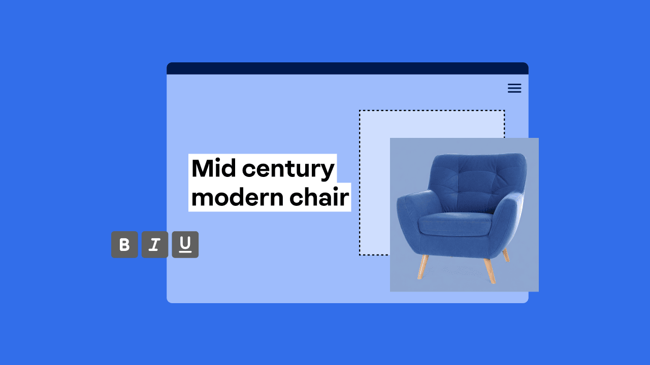
Use visuals to support the message
Visuals help explain faster than text alone. Use high-quality images, short animations, or a video demo to show how the product works. Showing builds trust and keeps visitors engaged.
Craft effective CTAs
Your call-to-action (CTA) should be action-oriented and specific. Instead of “Click here,” try something more straightforward like “Buy Now” or “Get Your Free Trial.” These CTAs are clear and urgent and encourage users to take immediate action.
Use storytelling to enhance user engagement
Weave storytelling to connect with your audience emotionally. For instance, describe a day in the life of someone using your product and highlight the challenges they face and how your product solves them. Storytelling adds a human touch and makes the product more relatable.
Include trust boosters
Potential customers need to trust you before they buy. Add real reviews, star ratings, or customer shout-outs to show that other people had a good experience. It helps them feel safer saying yes.
Make it mobile-friendly
Most people will pull up your page on their phone. If it takes forever to load, they’ll leave, so make sure your page is mobile-friendly. A quick page speed keeps them there long enough to actually see what you’re selling.
Add extra trust signals where needed
Badges, guarantees, and mentions of cutting-edge technology can help close the deal. Just don’t overdo it. Use them to back up your message, not distract from it.
Optimize the page for search
SEO helps people find your page. Use natural language and structure your content well when you create landing pages. This supports visibility without hurting readability.
How to optimize your product landing page for SEO
Optimizing a product landing page for SEO helps the right people find your offer and take action. A strong product page gets you seen organically in search while still being easy to use. That means potential customers can understand what you’re offering quickly and feel confident moving forward. This section covers the SEO basics that help with visibility, speed, and trust.
Here’s what we’ll cover:
- Basic SEO considerations
- Technical optimization
- Conversion rate optimization (CRO) tips
- Leverage psychological triggers
- A/B test best practices
- Analytics and tracking
Basic SEO considerations
Start with the basics. These steps help search engines figure out what your page offers and who should see it.
- Keywords: Use your primary keyword naturally in the URL, title tag, H1, and first paragraph. This helps search engines match your page with relevant searches while keeping the copy readable.
- Metadata: Write meta titles and descriptions that explain the value of the page. A strong title and clear headline can improve click-through rates from search results.
- URL structure: Keep URLs short and descriptive. A clean structure helps both users and search engines understand the page content.
Technical optimization
Your page needs to work well behind the scenes. Check these things to make sure it loads fast and works smoothly on any device:
- Speed: Fast pages keep visitors engaged. Compress product images, reduce extra scripts, and monitor load time to avoid drop-offs.
- Responsiveness: Your page should work well across devices. Good web design ensures content stays readable and usable on any screen.
- Mobile optimization: Mobile-first indexing means search engines evaluate the mobile version first. Make buttons easy to tap and text easy to read.
- Core Web Vitals: These metrics measure load time, interaction, and layout stability. Improving them supports rankings and usability.
- Security (HTTPS): Secure pages protect user data and help build credibility, especially when payments or forms are involved.
Conversion rate optimization (CRO) tips
SEO gets people to your page. CRO gets them to do something once they’re there. Here’s how to turn visitors into customers with smart design and content choices:
- Strategically place and design your CTA buttons: Make your CTA buttons stand out by placing them in visible, easy-to-find spots, and using contrasting colors. Your CTA text should be clear and action-oriented, like “Buy Now” or “Start Free Trial” for your users to take action immediately.
- Reduce friction: Simplify the purchase process for users by using short forms and clear, direct messaging. Minimize the steps required to make a purchase and avoid overwhelming users with too many choices.
Leverage psychological triggers
Subtle cues can make people feel more confident about making a purchase. Use these ideas to nudge visitors toward saying yes:
- Reassurance through guarantees and simple explanations: This helps people understand what they are signing up for without second-guessing.
- Trust signals that support the decision: Reviews, badges, or short testimonials show others have gone first.
- A friendly and direct sales tone: People respond better when the message sounds human, not pushy.
A/B test best practices
A/B testing shows you what actually works. Try different versions of your page to see what gets more people to act:
- Different versions of headlines, buttons, or layouts: Even minor tweaks can significantly impact how visitors respond.
- One change at a time: This makes it easier to tell what worked and what did not.
- Side-by-side comparison of variations: Real results show which version people prefer.
Analytics and tracking
Tracking shows you what’s working and what’s not. Measure these things to keep improving your page:
- Key metrics to watch: Monitor the conversion rate, bounce rate, and time on page using Google Analytics 4 (GA4). Track impressions, CTR, and average position in Google Search Console.
- How to use the data: Look for patterns that show what content resonates. Use insights to refine copy, visuals, and layout without overcomplicating the page.
Tools and resources to create product landing pages
With the right tools, you can design a page that looks great and encourages visitors to take action. Here are some recommended builders and free resources to get you started:
Network Solutions
Network Solutions boasts an intuitive drag-and-drop e-commerce website builder, making it easy to create landing pages without any coding knowledge. It also offers a range of customizable templates tailored to various industries. But if you prefer a hands-off approach, you can also avail of our e-commerce website design services to let the professionals design your e-commerce website for you. Plus, our reliable customer support ensures you can build and manage your pages with ease.
Unbounce
Unbounce is a versatile platform for creating landing pages with customization options. It has A/B testing, dynamic text replacement, and integrations with various marketing tools. While powerful, it may require a slight learning curve for beginners.
Leadpages
Leadpages provides a platform with pre-designed templates for creating landing pages, pop-ups, and alert bars. It’s a good option for businesses looking for quick solutions, though it might not offer the depth of customization that more advanced users need.
Instapage
Instapage focuses on optimization with features like A/B testing and personalization. It’s designed to help teams collaborate on landing page creation and integrates with marketing tools. It’s a good option if you are looking for straightforward features but may be more advanced for beginners.
Free tools/templates available
Google Sites
Google Sites offers a free option for creating basic landing pages. While its customization options are limited, it can be a good starting point for those with basic needs.
Canva
Canva provides free templates to help you design visually appealing landing pages. Though more design-focused, Canva’s drag-and-drop editor makes it easy to create custom visuals and layouts.
Mailchimp
Mailchimp has free landing page templates that integrate with their email marketing platform. It’s suitable for small businesses looking to streamline their email marketing efforts with their landing page.
HubSpot
HubSpot provides free landing page templates through its Marketing Hub. It allows seamless integration with their CRM. It’s a good option if you need to manage both marketing and customer relationship management in one place.
How to build a product landing page
Building a product landing page from scratch might seem tricky, but it’s actually pretty straightforward when you break it down. You don’t need fancy tools or design skills to create something that works. What matters most is knowing your offer, who it’s for, and what you want prospective customers to do next. Everything else just supports those basics.
Here’s how to build your page step by step:
- Define your goal and target audience
- Structure the page layout
- Add visuals and media
- Write copy that supports action
- Include trust signals
1. Define your goal and target audience
Start by deciding what you want visitors to do. This might be buying physical products, signing up for an online course, or requesting more details. Every good landing page begins with one clear goal.
Next, think about your target audience. What problem are they trying to solve? What questions do they have? When the message speaks directly to them, the page feels more relevant and easier to trust.
2. Structure the page layout
A well-structured layout helps visitors navigate the page with ease. Place the most important message at the top, followed by supporting sections that answer common questions.
Most effective pages include a header, content sections, and a footer. Keep navigation limited so visitors do not wander away. This structure helps people jump straight to the action you want them to take.
3. Add visuals and media
Visuals help explain faster than text alone. Use product photos, illustrations, or a short video demo to show how the product works. This is especially helpful for tools, services, or complex ideas.
Some brands use a dark background to create contrast and focus attention. Choose what fits your brand and keeps the content easy to read. Visuals should support the message, not compete with it.
4. Write copy that supports action
Good copy explains the value without sounding sales-heavy. Focus on user benefits and highlight your unique selling proposition early on.
Use short sections and simple language. Avoid surprises, such as hidden fees, which can undermine trust. End each major section by guiding visitors toward the primary call-to-action.
5. Include trust signals
Trust plays a big role in decisions. Add customer testimonials, reviews, or logos to show real results. This type of social proof reassures visitors that others have had a positive experience.
Quotes from happy customers work well near the call to action. They help remove doubt at the moment of decision.
6. Test and refine the page
Once the page is live, test small changes to improve results. Try different headlines, images, or button text. These tweaks can make a big difference over time.
You don’t need extensive coding knowledge to get started. Many tools let you create landing pages using templates or even launch a free landing page version to test ideas. Use these tools as landing page inspiration on how visitors respond.
Common landing page mistakes and how to avoid them
It’s easy to overlook important aspects that can lead to poor user experience and missed conversion opportunities. Here are some common mistakes to avoid, along with tips for how to improve your page’s effectiveness:
- Not matching messages between ads and landing pages
- Overloading the landing page with distractions
- Neglecting mobile optimization
- Lack of a clear CTA or a confusing user journey
- Missing social proof or credibility indicators
Not matching messages between ads and landing pages
One of the biggest mistakes is mismatched messaging between your ads and your landing page. If a visitor clicks on an ad offering a specific deal or product feature and is directed to a landing page that doesn’t have the same message, it can cause confusion and distrust. This can lead to a higher bounce rate.
How to avoid it: Ensure that your ad copy and landing page message align. If your ad promotes a sale, make sure your landing page also highlights that offer. The headline on your landing page should reinforce the ad’s message.
Overloading the landing page with distractions
A landing page with too many images, videos, or links can overwhelm visitors and distract them from taking the desired action (making a purchase or signing up for a service).
How to avoid it: Keep your landing page simple and focused. Limit navigation and only include elements that support your goal, such as product images, a clear description, and an easy-to-find call to action. The goal is to create a distraction-free environment where users know exactly what they’re supposed to do next.
Neglecting mobile optimization
Neglecting mobile optimization can hurt your landing page’s performance. A non-responsive page can frustrate users and lead to high bounce rates.
How to avoid it: Ensure your landing page functions properly on mobile devices. Make sure text is easy to read on small screens, images load right, and buttons are simple to tap.
Lack of a clear CTA or a confusing user journey
A lack of a clear CTA or a confusing user journey can make it hard for visitors to know what to do next. If users can’t easily find the CTA or are unsure of the next step, they’ll leave without converting.
How to avoid it: Use a strong, action-oriented CTA, like “Buy Now,” “Start Free Trial,” or “Learn More.” Place the CTA prominently on the page and ensure it stands out visually.
Missing social proof or credibility indicators
Lack of social proof or credibility markers like customer reviews, testimonials, or certifications can make your landing page feel less trustworthy and lead to missed conversions.
How to avoid it: Include customer reviews, testimonials, or logos of well-known brands that use your product. Highlight any awards, certifications, or guarantees that add credibility. Social proof reassures visitors that others trust your product.
Frequently asked questions
A product landing page is used to showcase a specific product, drive conversions, and guide visitors toward a desired action, like making a purchase.
Focus on clear messaging, a strong CTA, simple design, and relevant content that highlights your product’s benefits.
A product landing page focuses on promoting a single product, whereas a homepage covers broader content and navigation for the entire site.
A compelling headline, clear product benefits, strong CTA, high-quality visuals, and social proof like reviews or customer testimonials.
Use A/B testing, improve page speed, ensure mobile optimization, simplify the user journey, and highlight urgency or scarcity.
A product page should focus on one primary call-to-action, like “Buy now” or “Add to cart,” so visitors know exactly what to do next. You can add one or two smaller supporting options if needed, but keeping the message tight with persuasive copy helps even beautiful websites convert without confusing people.
Good conversion rates for a product landing page depend on what you sell and how simple the action is, but most pages land somewhere between 2% and 6%. Pages that highlight important benefits, use a strong hero shot, and focus on a single call-to-action often perform better, especially when the color palette keeps attention on the main message.
Most product pages work best between 200 and 600 words, with shorter pages for simple physical products and longer ones for offers that need more explanation. The key is to use clear supporting text that highlights user benefits and matches the goal of your marketing campaign, rather than aiming for a specific word count.
Build your product landing page today!
A strong product landing page helps people get what you’re offering right away. When your message is clear and the page is easy to use, visitors trust you more and are more likely to take action. Small tweaks to your layout, words, and flow can really boost your results.
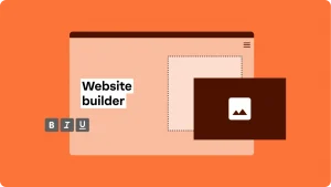
Ready to make it happen? Start with our Website Builder to craft your page. No time to DIY? Our online marketing and SEO support teams can do it for you.