Key takeaways:
- Your homepage communicates what your business is all about, encompassing your brand identity, objectives, and the value you deliver to customers.
- A well-designed homepage improves user experience, loading speed, and structure, which can indirectly support SEO performance.
- You can unintentionally sabotage your homepage’s efficiency with design strategies that drive visitors away.
Your homepage is often the first page visitors see when they land on your website. With a 46.9% average bounce rate for websites reached by organic search, you only have one web page to make a strong first impression, explain your business clearly, and help guide users to the next step.
A good homepage design brings your message, layout, images, links, and main call to action (CTA) together with a clear purpose. It should reflect your brand, highlight what you offer, and make it easy for potential customers to explore important pages on your site.
We’ll cover the essential homepage elements, design principles, homepage examples, best practices, common mistakes, and website builder tools that can help you create a more professional web presence.
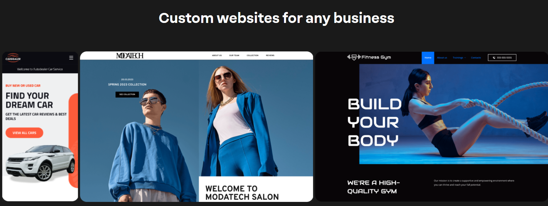
Build a homepage that works for your business.
Network Solutions’ Website Builder helps you create a polished site without coding.

What should a website homepage include?
A website homepage should include the essential elements that help visitors understand your business, explore your site, and take action. It doesn’t need to explain everything at once. Instead, it should give new visitors a clear path to learn more, contact your business, shop for your products, or explore your services.
When making your homepage, be sure to include a:
- Hero section
- Clear navigation
- Engaging visuals
- Social proof
- Benefits-driven content
- Footer
1. Hero section
The hero section is the first thing visitors usually see on your homepage. It should make a strong first impression and clearly explain your business.
A strong hero section usually includes a compelling headline, a short supporting message, an engaging visual, and a high-contrast main CTA. You can also use bold typography to make your most important message stand out.
Keep this section focused. Visitors should quickly understand what you offer, who it’s for, and what they should do next. You know you have a strong page when it can speak volumes before users scroll through the rest of the page.
If you need help creating your headline, you get a free Title Generator App when you register your domain with us.
Find the perfect domain
Ready to register a domain name? Check domain availability and get started with Network Solutions today.
2. Clear navigation
Clear navigation helps users explore your website without getting lost. Your menu should give visitors quick access to your most important pages: About, Services, Products, Pricing, Blog, and Contact.
Keep your navigation simple and easy to follow. Too many links can make it harder for users to decide where to go next. If possible, focus on the pages that matter most to your business and customers.
Good navigation should guide users naturally and function as a roadmap for your website. Whether someone wants to learn about your company, compare your services, or contact your team, they should be able to find the right page quickly.
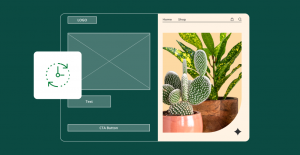
3. Engaging visuals
Engaging visuals help your homepage feel more memorable and professional. Engaging content like images, videos, graphics, and icons can reflect your brand, showcase your products, and make your message easier to understand.
The best visuals support your content instead of distracting from it. For example, a service business might use team photos or project examples, while an e-commerce site might highlight product images, category pages, or lifestyle photos.
Your homepage visuals should also feel consistent with your landing page and other pages on your site. This creates a smoother user experience and helps visitors recognize your brand wherever they go.
4. Social proof
Social proof helps new visitors feel more confident about your business. It shows that other customers have already trusted your company, used your services, or bought your products.
You can add social proof through customer reviews, testimonials, star ratings, customer logos, awards, certifications, or case study results. These elements build credibility and help potential customers feel more comfortable taking the next step.
Social proof works best when it feels specific. Instead of saying your business is trusted, show proof through real customer feedback, recognizable logos, or clear results.
5. Benefits-driven content
Your homepage should explain what visitors gain from choosing your business. Instead of just listing features, highlight the benefits behind them.
For example, “online booking” is a feature, and the benefit is that customers can schedule an appointment without calling. “Get fast hosting” is also a feature, and the benefit is that your site loads quickly, creating a smoother user experience.
Benefits-driven content helps communicate your value clearly. It tells visitors why your business matters and how your products or services can help them achieve their goals.
6. Footer
Your footer appears at the bottom of your homepage, but it still plays an important role. It gives visitors another way to access helpful links, contact information, legal pages, and other important parts of your site.
A good footer may include your business address, phone number, email, social media links, privacy policy, terms of service, sitemap, and links to popular services or important pages.
Think of your footer as a final guide. If visitors scroll to the bottom and still need something, your footer should help them find it quickly.
Design principles behind great homepages
A great homepage isn’t just made of good-looking visuals. It follows design principles that make the page simple, easy to use, and focused on helping visitors take action.
These principles help your homepage design elements work together so users can quickly understand your message, explore your site, and achieve what they came to do:
- Prioritize a simple layout
- Make your purpose easy to understand
- Use clear and actionable CTAs
- Design for all screen sizes
- Make sure content loads quickly
- Structure content to encourage scrolling
Prioritize a simple layout
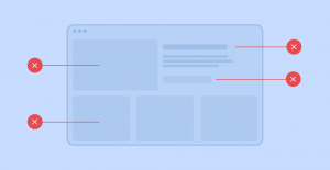
A simple layout keeps visitors focused on what matters most. When your homepage has too many sections, images, links, or competing messages, users may feel overwhelmed and leave before taking action.
Start with your main message, then organize the rest of the page in a logical order. A clear layout usually moves from your hero section to your benefits, services, social proof, and CTA.
For example, a local cleaning business can lead with its main service, service areas, customer reviews, and a “Book a cleaning” button, rather than listing every package at the top of the page.
Make your purpose easy to understand
Visitors should quickly know who you are, what you offer, and why it matters to them. If your homepage message is unclear, users may not stay long enough to explore your products or services.
Use simple headings, short copy, and helpful visuals to explain your business. Clear content improves usability by helping visitors make decisions faster and with less effort.
So instead of saying “Smart solutions for modern living,” a home repair company could say “Reliable home repair services for busy homeowners.”
Use clear and actionable CTAs
A CTA helps visitors understand what to do next. Without a clear button or link, users may like your business but still leave because they don’t know where to go.
Place your main CTA near the top of the page so visitors see it quickly. You can also repeat it near the bottom after they’ve learned more about your business.
A bakery website can use “Order a custom cake” at the top of the homepage and repeat the same CTA after showing flavors, photos, and customer reviews.
Design for all screen sizes
Mobile-responsive design makes your homepage easier to use on desktops, tablets, and mobile phones. This matters because visitors may discover your website from search, social media, email, or an app.
Your homepage should adjust smoothly across different screen sizes. Text should be readable, buttons should be easy to tap, and images should resize properly.
For example, a restaurant homepage should let mobile users view the menu, check hours, and tap to call without zooming or scrolling sideways.
Make sure content loads quickly
Fast loading time creates a smoother experience for visitors. If content loads slowly, users may leave before they even see your offer.
Compress images, avoid unnecessary videos, and keep extra design elements to a minimum. When your homepage loads quickly, visitors can explore your site with less friction. Your web hosting can also impact your site’s loading speed, so make sure to choose a reliable provider.
Let’s imagine an e-commerce homepage can use optimized product images instead of large files, so shoppers can browse featured items without waiting.
Structure content to encourage scrolling
A strong homepage gives visitors a reason to keep going. Engaging content, clear section headings, and helpful visual cues can show users that there’s more useful information below the fold.
Each section should build on the last. Start with your main message, then highlight your benefits, services, proof, and next steps as users scroll.
A fitness coach may start with a clear offer, then tease transformation results, client testimonials, program options, and a final CTA to book a consultation.
9 best homepage design examples
Looking at excellent examples can help you get inspired before you create or update your own homepage. The goal isn’t to copy another company’s design exactly. Instead, use these examples to understand what works and apply the same ideas to your own business.
- Grammarly
- Thrive Market
- Target
- Slack
- Asana
- Medium
- Wired
- Dropbox
- Airbnb
1. Grammarly
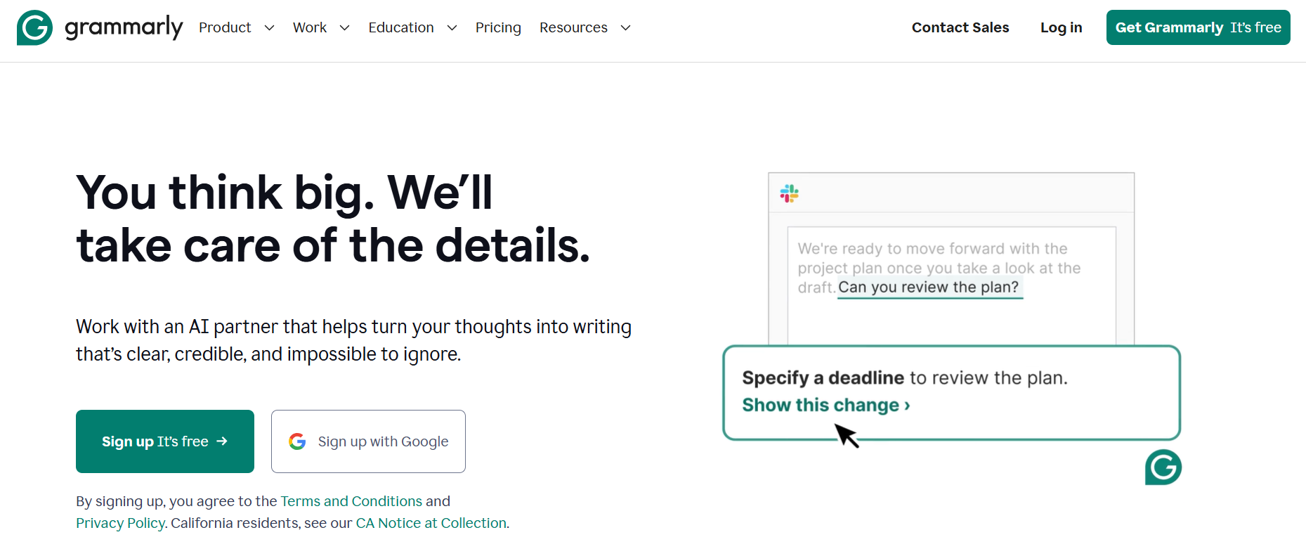
Grammarly is a strong example of a homepage with a clear message. The page quickly explains what the tool does and uses a clean layout to keep the focus on the product.
What works well:
- Clear value proposition
- Simple copy
- Strong CTA
- Clean visuals
Small business takeaway: Use your homepage to explain your main benefit in plain language. Visitors should understand what you offer without having to search for it.
2. Thrive Market
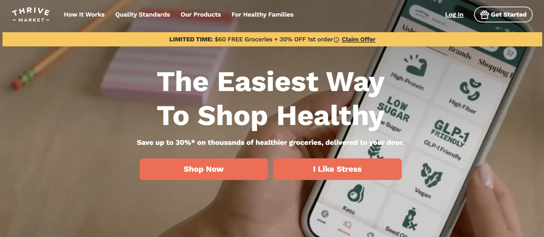
Thrive Market shows how visuals and benefits can work together. Its homepage uses product images, lifestyle content, and membership-focused messaging to reflect the brand and appeal to health-conscious shoppers.
What works well:
- Benefit-driven messaging
- Engaging visuals
- Clear product categories
- Customer-focused content
- Trust-building elements
Small business takeaway: If your products support a lifestyle or specific customer goal, use images and copy that help visitors picture the value of choosing your brand.
3. Target
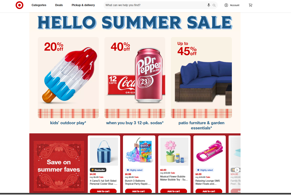
Target is a helpful example for e-commerce homepage design. The layout organizes many products, deals, and categories without making the page feel too difficult to explore.
What works well:
- Clear category sections
- Easy access to popular products
- Seasonal promotions
- Strong brand consistency
- Simple navigation
Small business takeaway: If you sell many products or services, don’t show everything at once. Highlight your most important categories and guide users to other pages for more details.
4. Slack
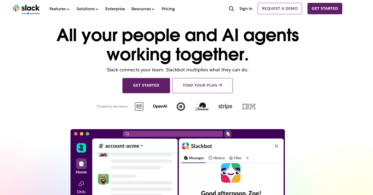
Slack’s homepage is a good example of explaining a product with several functions in a simple way. The page focuses on the main benefit first: helping teams communicate and work better together.
What works well:
- Clear headline
- Product visuals
- Benefit-focused copy
- Strong brand personality
- Easy-to-find CTA
Small business takeaway: If your service has many features, lead with the main problem you solve. You can explain the details later on your service or product pages.
5. Asana
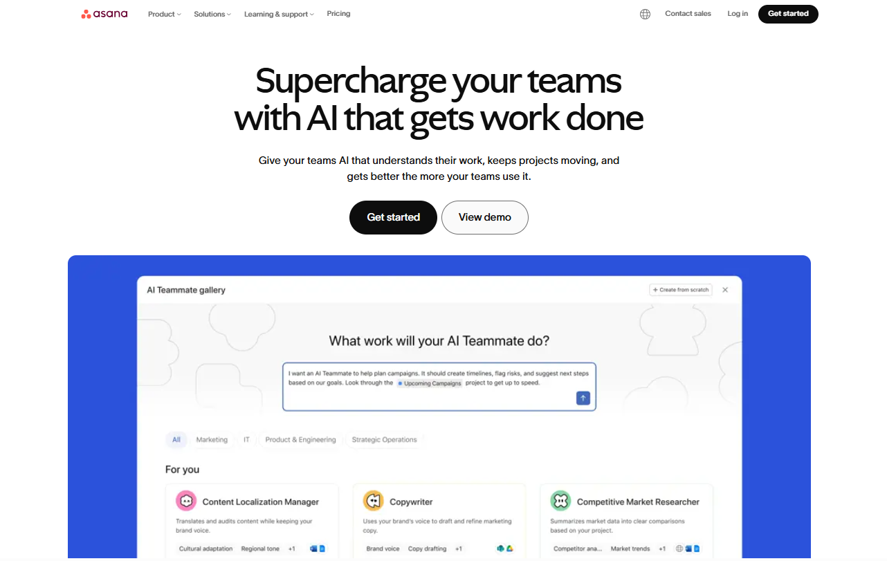
Asana’s homepage focuses on helping teams organize work and achieve goals. The design uses clean sections, helpful visuals, and short copy to explain how the product supports better project management.
What works well:
- Organized layout
- Clear product positioning
- Helpful screenshots
- Benefit-focused sections
- Strong visual hierarchy
Small business takeaway: Use your homepage to show how your product or service helps customers get something done faster, easier, or better.
6. Medium
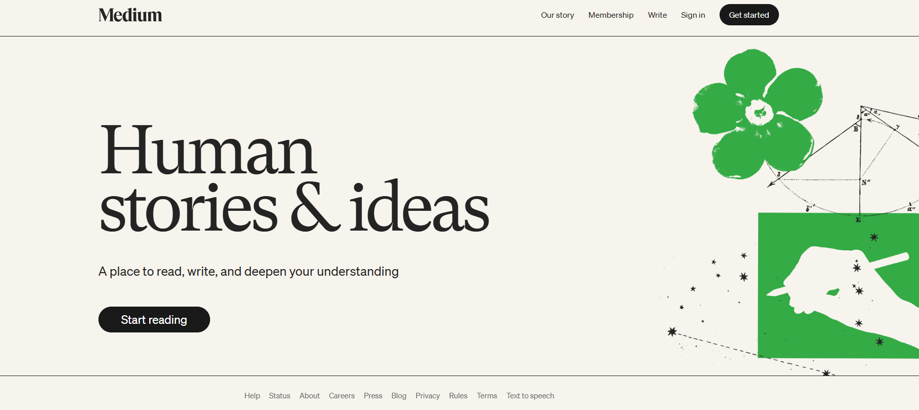
Medium is a strong example of a content-first homepage. Its design keeps the focus on articles, ideas, writers, and topics rather than on heavy visuals or complex design elements.
What works well:
- Simple layout
- Strong typography
- Easy browsing
- Clear content categories
- Minimal distractions
Small business takeaway: If your site relies on blogs, resources, or thought leadership, keep the design simple enough for your content to stand out.
7. Wired
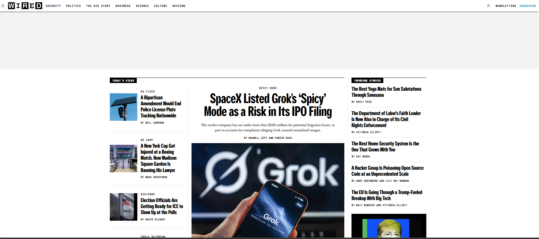
Wired is a useful example for websites with a lot of content. Its homepage organizes many stories into sections so users can scroll, scan, and choose what interests them.
What works well:
- Organized content sections
- Clear categories
- Strong editorial layout
- Visual variety
- Easy scanning
Small business takeaway: If your website has many articles, case studies, or resources, group them by category so visitors can find relevant content faster.
8. Dropbox
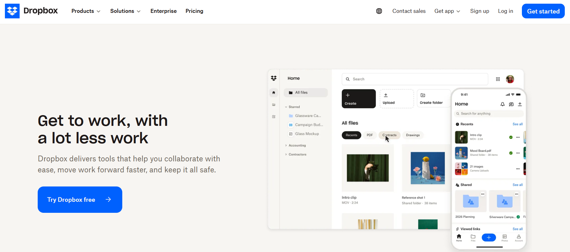
Dropbox shows how a homepage can explain a practical service without overloading visitors with details. Its design focuses on file storage, collaboration, and productivity in a clean, direct way.
What works well:
- Simple product explanation
- Clear CTA
- Clean visuals
- Feature highlights
- Professional layout
Small business takeaway: If your product is technical or service-based, keep the homepage focused on what users can do with it, not just what the tool includes.
9. Airbnb
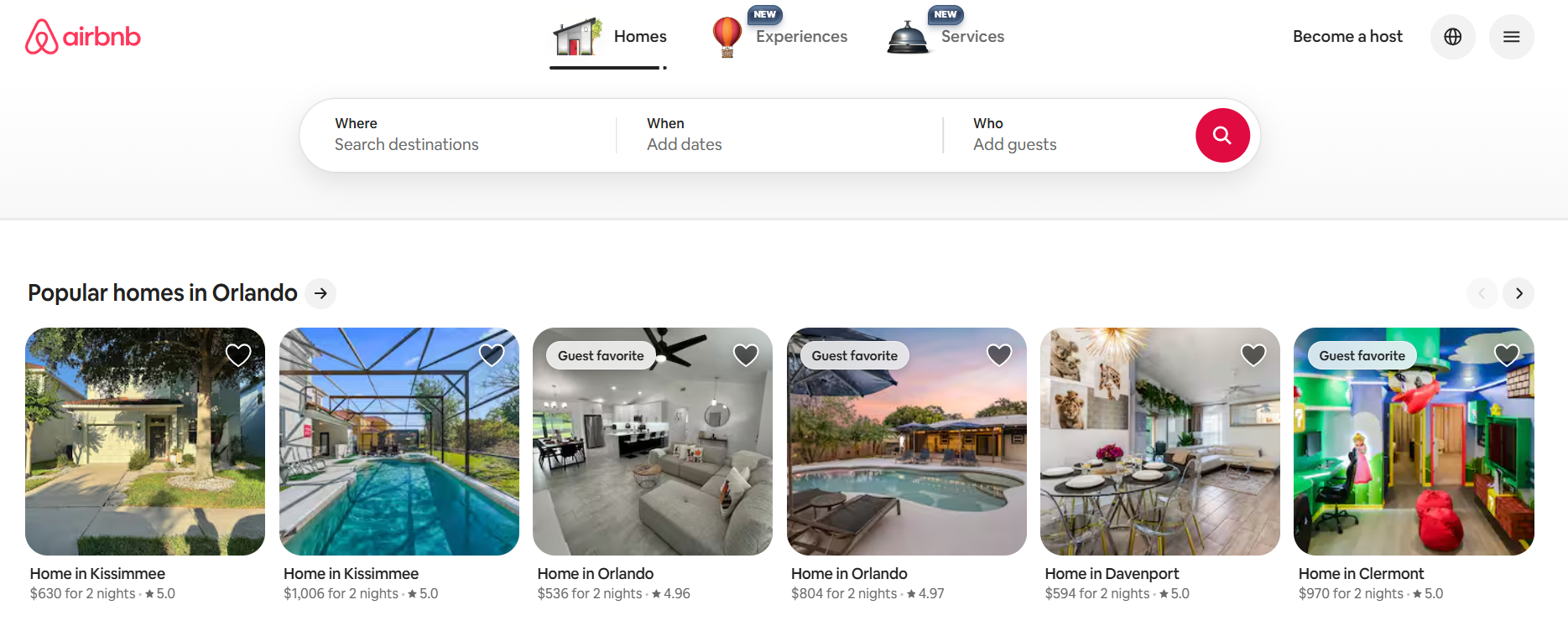
Airbnb is an excellent example of a homepage built around search and discovery. The page makes it easy for users to start exploring stays, locations, and experiences right away.
What works well:
- Search-focused design
- Strong visuals
- Easy browsing
- Mobile-friendly layout
- Clear user path
Small business takeaway: If your business depends on booking, browsing, or searching, make that function easy to find at the top of your homepage.
What are the best practices for homepage design?
The best practices for homepage design focus on making your page clear, useful, and easy to act on. Your homepage should help users understand your business, explore your site, and take the next step without confusion.
- Start with one clear goal: Before you create or update your homepage, decide what you want visitors to do. Do you want them to book a service, buy a product, request a quote, call your business, or sign up for updates? Once you know the goal, build your layout around it. Your headline, homepage elements, images, copy, and CTA should all support that main action.
- Write a headline that explains your value: Your headline should tell visitors what your business offers and why it matters. Avoid vague phrases that sound nice but don’t clearly explain your services. A strong headline is simple, specific, and focused on the customer. For example, “Professional websites for growing small businesses” is clearer than “Digital solutions for the future.”
- Keep your layout simple: A clean layout helps users scan your homepage quickly. Organize your content in a logical order, starting with your hero section, then your benefits, services, social proof, and CTA. Avoid crowding the page with too much text, too many images, or too many competing sections. Give each part of the homepage enough space so visitors can understand what they’re looking at.
- Make your main CTA easy to find: It should stand out and tell visitors exactly what to do next. Use direct button text like “Get started,” “Book a consultation,” “Shop now,” or “Request a quote.” You can include more than one CTA on the page, but they should not all compete for attention. Keep the most important action clear from the top of the homepage to the bottom.
- Design for mobile users: Your homepage should work well on mobile devices. Many visitors will find your website through search, social media, email, or an app, so your design needs to look good on different screen sizes. Check that your text is readable, buttons are easy to tap, images resize properly, and navigation is simple. A mobile-friendly homepage creates a smoother experience and helps users stay on your site longer.
- Help your homepage load quickly: A good homepage should load quickly. Slow pages can frustrate visitors and make them leave before they see your message. Compress images, avoid unnecessary videos, and keep extra scripts or design effects to a minimum. Use visual elements that support the page instead of slowing it down.
- Make the page easy to scan: Most users don’t read every word on a homepage. They scan headings, buttons, images, and short sections first. Use clear headings, short paragraphs, bullet points, and strong visual hierarchy. This helps visitors find relevant information faster and decide where to go next.
- Add trust signals near important sections: Trust signals can make visitors feel more confident about your business. Add testimonials, reviews, customer logos, ratings, awards, or certifications near your services, pricing, or CTA sections. This helps potential customers see that others have trusted your business before them.
- Keep testing and improving: Homepage design is not a one-time project. Review how visitors use your site and look for ways to improve using A/B testing. Pay attention to which buttons get clicked, where users stop scrolling, which pages they visit next, and whether they complete your main goal. Use that information to adjust your layout, content, and homepage elements over time.
If you need help with your website analytics, we offer a free Customers App with your domain. Track your visitors’ activity faster with a single, simplified dashboard.
What are common homepage design mistakes to avoid
Even a well-designed homepage can lose visitors if it feels confusing, slow, or difficult to use. Avoid these common mistakes so users can understand your business and move through your site with confidence.
- Adding too much information: Your homepage should give visitors a clear overview, not explain every detail about your business. Too much text, too many images, or too many sections can make the page feel overwhelming. Focus on your most important message first. Then, use links to guide users to other pages where they can learn more.
- Hiding the main CTA: If visitors have to search for the next step, they may leave without taking action. Your main CTA should be easy to find near the top of the homepage and repeated naturally throughout the page. Use clear button text like “Get started,” “Book a call,” “Shop now,” or “Request a quote” so users know exactly what to expect.
- Making navigation confusing: A confusing menu makes it harder for visitors to explore your site. Avoid using too many links, unclear labels, or hidden important pages. Keep your navigation simple. Use familiar labels such as About, Services, Products, Pricing, Blog, and Contact.
- Using slow-loading visuals: Images and videos can make your homepage more engaging, but they can also slow it down. Large files may cause visitors to leave before the page fully loads. Use high-quality visuals, but make sure they’re compressed and relevant to the page.
- Forgetting mobile users: Many visitors will view your homepage on a phone. If your layout only works on desktop, mobile users may struggle to read your content, tap buttons, or access important pages. Test your homepage on different screen sizes before publishing changes.
- Using inconsistent design elements: Too many fonts, colors, buttons, or image styles can make your homepage feel unpolished. Your design elements should work together and reflect your brand. Keep the layout clean, consistent, and easy to follow so your homepage makes a professional first impression.
Why the right homepage design matters
Good homepage design isn’t just about making your website look nice; it’s a business decision. It affects how trustworthy your brand appears, how many potential customers you attract, and how easily people find you online.
Put simply, an effective homepage:
- Tells what your business does
- Builds brand consistency
- Boosts brand awareness
- Improves SEO
- Helps you stay competitive
Let’s delve into the details.
Tells what your business does
Your homepage communicates what your company is all about, including your brand identity, objectives, brand’s story, and the value you deliver to customers. The following helps achieve this:
- Company name and logo: Your homepage is important because it identifies your business to your target market. When visitors see your name and logo, they know they’re in the right place and can start building trust.
- Tagline: A good tagline communicates your unique selling point and helps visitors understand if your business solves their problem. It also sets your company apart from competitors and explains why they should choose you.
- Visual media: Noticeable visual media capture visitors’ attention and bring them further into your website. Images, videos, and graphics can also strengthen communication, engagement, and retention.
Building a website with Network Solutions can make branding easier using our free Logo Maker, Business Name Generator, and Slogan Generator tools. We’ll assist your brand-building journey to create a cohesive identity for your business.
Haven’t registered a domain for your website?
Match your domain and business name for cohesive branding. Or find the closest alternative with our domain generator

Builds brand consistency
Your homepage design establishes a look and feel that carries throughout your site. It creates a brand experience that makes your business appear professional and trustworthy.
Design elements should be consistent across other channels that your customers might encounter to ensure brand cohesion. These include web pages, emails, and social media. Such consistency helps customers feel comfortable taking the next step, whether it’s making a purchase, scheduling a consultation, or providing their contact information.
Boosts brand awareness
The right homepage increases recognition and recall. Beyond aesthetics, the functionality of your homepage influences how visitors see your brand. The elements of your site—images, layout, and style—establish your identity and align with your brand’s story. They help more people discover, remember, and recommend your business.
Improves search engine optimization (SEO)
Search engine optimization (SEO) is the process of improving your website’s visibility and ranking in search results like Google to attract more organic, or unpaid, traffic. A well-designed homepage tells search engines that your website is valuable and relevant. This can lead to benefits that include the following:
- Improved crawlability and indexability: Your homepage is key to better Google search results. The search engine sees your homepage as the starting point for crawling and understanding the importance of web pages. Optimizing your homepage by including relevant keywords and employing proper visual hierarchy boosts its chances of appearing in search engine results pages (SERPs).
- Reduced bounce rate: A well-organized, visually appealing, and easy-to-navigate homepage encourages visitors to stay longer and explore more pages, reducing bounce rates. This signals to search engines that your site is worth sticking around and exploring, which can positively impact your rankings.
- High-intent traffic: Your homepage is key to drawing high-intent traffic, or visitors who are actively seeking specific solutions. It does so by presenting a clear value proposition that confirms they’re in the right place.
Helps you stay competitive
A professional homepage allows you to compete with more established businesses by attracting and retaining customers. It reflects your expertise and unique appeal, setting you apart from competitors by demonstrating why visitors should choose your services or products.
It can also support conversions by helping potential customers understand your offer, trust your company, and take the next step with more confidence.
What website builders offer good homepage templates
Website builders make homepage design easier by giving you ready-made templates you can customize for your business. The best option depends on your goals, budget, design preferences, and how much support you want as you build your site.
Website builder | Best for | Homepage template strengths |
|---|---|---|
Network Solutions | Small businesses that want website building, domains, hosting, and AI tools in one place | AI-powered website setup, industry-specific templates, built-in hosting options, ecommerce features, and tools for domains, logos, and content |
Users who want many templates and flexible design control | Drag-and-drop editing, AI-powered tools, and a large library of customizable templates | |
Design-focused brands, creatives, and service businesses | Professionally designed templates with ready-made pages, navigation, and design settings | |
Beginners who want a fast, simple setup | Ready-to-launch templates, drag-and-drop editing, built-in marketing tools, and ecommerce options |
Network Solutions is a strong choice if you want a website builder that helps you move from idea to launch with less guesswork. Ou DIY Website Builder can help you create a business website, online store, or portfolio without coding or design skills.
Frequently asked questions
To design a good homepage, start with a clear goal, write a headline that explains your business, use simple navigation, add relevant visuals, and include a clear main CTA. A good homepage should help visitors quickly understand what you offer and what to do next.
Designing a homepage for SEO requires optimizing for both users and search engines. Some of the most notable strategies include the following:
1. Using relevant keywords in content, titles, and headings.
2. Optimizing visuals by compressing images/videos, using descriptive file names, and adding alt text.
3. Ensuring fast loading and a mobile-friendly design for better user experience and rankings.
4. Implementing clear navigation.
A user-friendly homepage puts the visitor’s experience first, making interactions smooth and enjoyable. This happens through clarity and simplicity – users instantly understand your message without confusion, guided by a clear visual hierarchy.
A clear CTA on your homepage is crucial because it turns visitor interest into actual business results. They tell the user what to do next so they don’t get confused and can buy, sign up, or contact you. This makes the user experience smooth and leads to more conversions and engagement. Clear CTAs also give you data to track how your homepage is working, so you can improve it for better results.
Common homepage mistakes include adding too much information, using confusing navigation, hiding the main CTA, using slow-loading images or videos, and forgetting to optimize for mobile users. These mistakes can make your homepage harder to use and cause visitors to leave.
A professional homepage usually has a clean layout, consistent branding, readable text, strong visuals, clear navigation, and a focused CTA. It should also load quickly and work well across different screen sizes.
No. A homepage introduces your overall business and guides visitors to different parts of your site. A landing page usually focuses on one specific offer, campaign, or action.
Take your business to a whole new level with the right homepage design
A strong homepage helps visitors understand your business, trust your brand, and take action with confidence.
Use tools built to help your business break through. Use our DIY Website Builder or professional web design support to create a homepage that’s ready to support your big breakthrough.
But if you’re not ready to launch a full website yet, you can start with your domain and use a Coming Soon Page to build interest while you prepare your full homepage.
Find the perfect domain
Ready to register a domain name? Check domain availability and get started with Network Solutions today.