Key takeaways:
- A single-product website simplifies the buying journey by helping visitors decide faster.
- Successful one-product stores focus on clarity and trust through clean design, strong messaging, and targeted content.
- With the right product, tools, and strategy, you can build a high-performing store that attracts visitors, builds trust, and drives purchases.
A single-product website is built to sell just one thing. That’s it. One offer, one page (or a few), and one clear goal. Unlike bigger online stores that feature many items, one-product stores keep the focus streamlined. Every part works together to explain, highlight, and sell that core item.
Why do businesses choose this approach? Because it works.
A simpler website is easier to build, faster to update, and clearer for your customers. There’s no jumping from page to page and no extra choices to weigh. Just one product with a clear message that helps people decide faster and buy more often.
In this article, we’ll look at real examples of single product websites that are doing it right. And if you’re thinking about creating one yourself, we’ll also share a few tips on how to get started. l examples of single product websites that are doing it right. And if you’re thinking about creating one yourself, we’ll also share a few tips on how to get started.
Bokksu
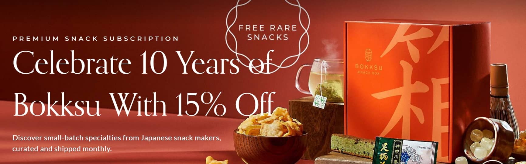
Bokksu’s website is a strong example of how a strong brand identity can highlight something useful and specific. Bokksu uses a clean layout, warm tones such as its branded color orange, and messaging that speaks to its target audience. A video, team photo, and FAQs help visitors feel confident about buying. All these elements guide customers through the decision-making process and help drive sales in a busy market.
Kulala Land
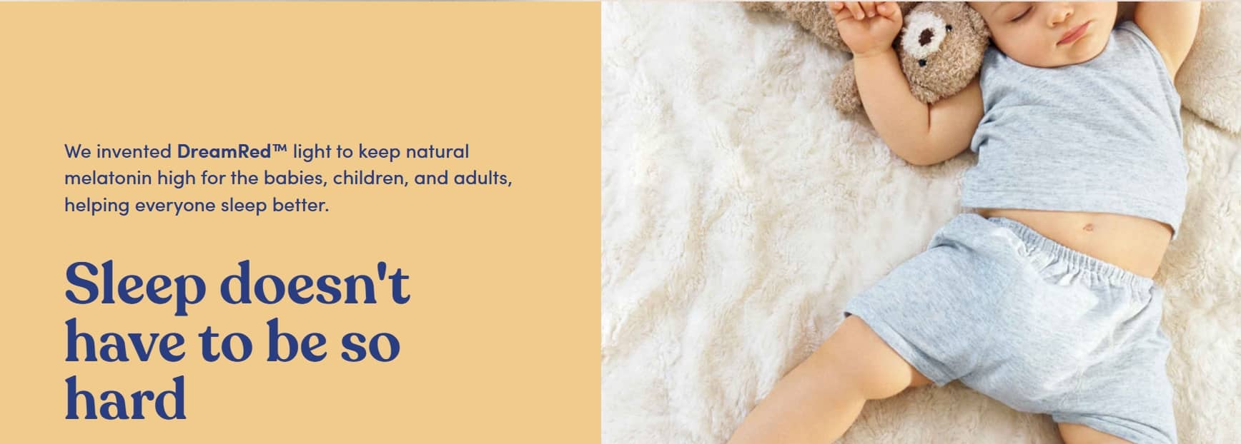
Kulala focuses on solving one clear problem: helping babies fall asleep faster and stay asleep longer. Its one-product store speaks directly to its target audience with a clear product page that breaks down the science, shares real social proof, and leads smoothly to the checkout page. With a strong brand story, simple messaging, and press coverage that supports brand recall, Kulala makes the purchase feel simple and reassuring.
Radio Coffeehouse

Radio Coffeehouse is a faith-driven brand that blends coffee, radio, and merchandise around one clear mission: “Jesus by way of coffee and radio.” This eCommerce site focuses on one core offering—Hebrews Bold, a bold espresso blend with a message rooted in scripture.
This one-product store stands out for its clear purpose. Its clean layout and focused design connect with a specific niche, while the message behind the product helps create a memorable experience for its customers.
Truff
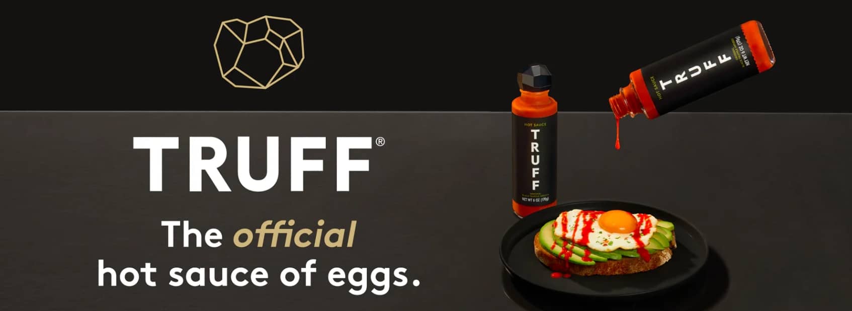
Truff is a premium eCommerce platform that started with one flagship item: its signature truffle-infused hot sauce. Since then, it has expanded into related condiments like oils, mayo, pasta sauce, and salt. But everything still revolves around one central theme: luxury flavor powered by truffles.
It’s a good example of a one-product Shopify store that grew with purpose. The website focuses on creating a strong first impression through sleek visuals, strong packaging, and clear storytelling.
From the first scroll, site visitors see proven results from customers and major media outlets like Forbes and CNN, which help build instant trust. Its bold branding speaks to a specific niche: people who want gourmet products with style.
BALLS

BALLS is a men’s grooming company built around a single-product Shopify store. Its main offering is the Archibald Trimmer, a waterproof, ergonomic tool designed for safe grooming. This product is positioned at the heart of the business.
While a few add-ons are available, the website stays focused on helping customers understand, trust, and purchase this one product.
It’s a strong example of how to lead with a clear offer and clean design. The platform highlights the product’s benefits right away and builds trust through customer testimonials and mentions from outlets like GQ and Men’s Health. Its tone is bold but approachable, which makes the shopping experience feel easy and direct.
Fybelle

Fybelle is a one-product Shopify store that sells an FDA-approved IPL handset for at-home hair removal. The business runs on a single product. This setup makes it easier for a small team to manage since it doesn’t require much maintenance.
Everything on the site, from the soft pink palette to the product-in-use hero section, is made to connect with women looking for a more affordable alternative to salon treatments.
Fybelle shows how to position a product clearly in a busy market, using tools like cost comparisons, a trial guarantee, and social proof—including reviews and before-and-after photos—to help people feel confident about their purchase.
BlendJet
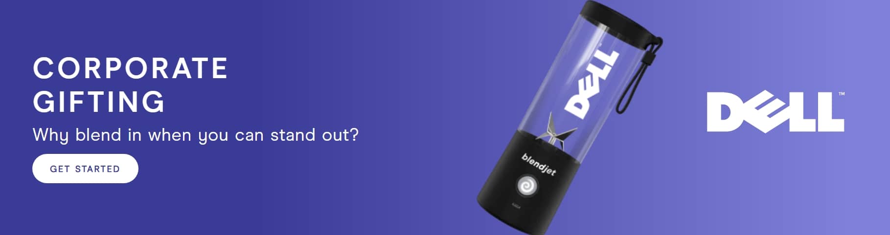
BlendJet is a one-product Shopify store that sells portable blenders for people who want to make smoothies or protein shakes on the go. Videos throughout the site show the blender in action, including how fast it blends, how it charges with USB-C, and how it cleans itself with just a splash of water.
Its bright and well-organized layout is one of the strongest one-product Shopify store examples, with well-defined branding built around convenience, portability, and everyday use.
The Oodie

The Oodie is a single-product Shopify store that offers oversized wearable blankets designed for maximum comfort.
Their website keeps things simple by highlighting a single product—the Oodie. A clean layout, helpful features, and real customer testimonials allow buyers to easily understand and shop.
SNOOZ

SNOOZ is a one-product Shopify store selling a travel-friendly device that helps people sleep better using the sound of a fan.
The hero section of the website features a peaceful bedroom scene and a message that reads, “Turn your bedroom into a haven for restful sleep.” As a single-product store, it keeps things simple, highlighting key benefits, reviews, and a fun brand video that helps the product feel both useful and approachable.
Cookie Chips
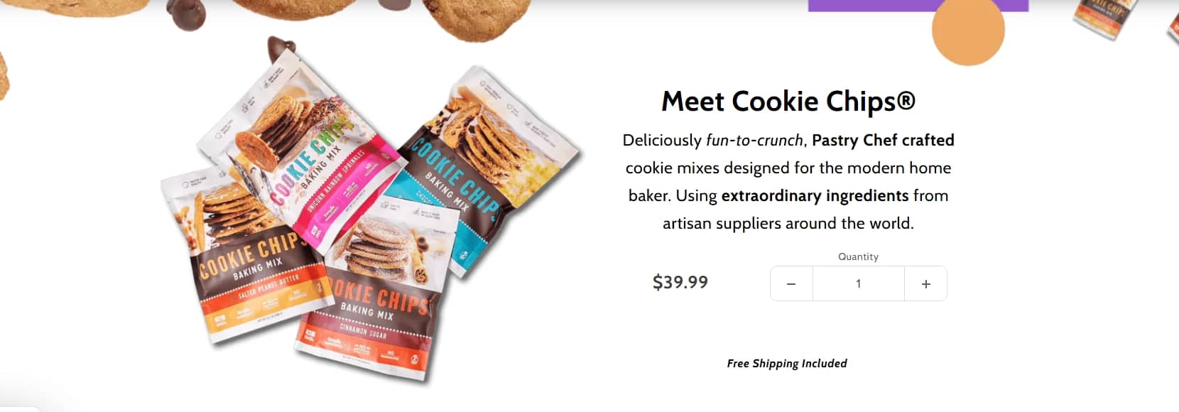
Cookie Chips is one of the thoughtfully designed one-product Shopify store examples, built around a single baking mix. It was created by a pastry chef with 25 years of experience, using simple, high-quality ingredients like Brazilian sea salt and Saigon cinnamon.
The website uses strong visuals, like motion images of the packaging, to highlight the product. And even with a few flavor options, the brand stays clear and easy to shop.
WaveBeamPro

WaveBeamPro is a motion-sensor headlamp designed for outdoor use—perfect for runners, hikers, and campers.
Its one-product store highlights key features using a mix of visuals, testimonials, and bold text. Customer reviews appear near the top, building trust quickly. Details like battery life, brightness range, and water resistance are easy to find, which makes the buying decision simple for visitors.
Death Wish Coffee
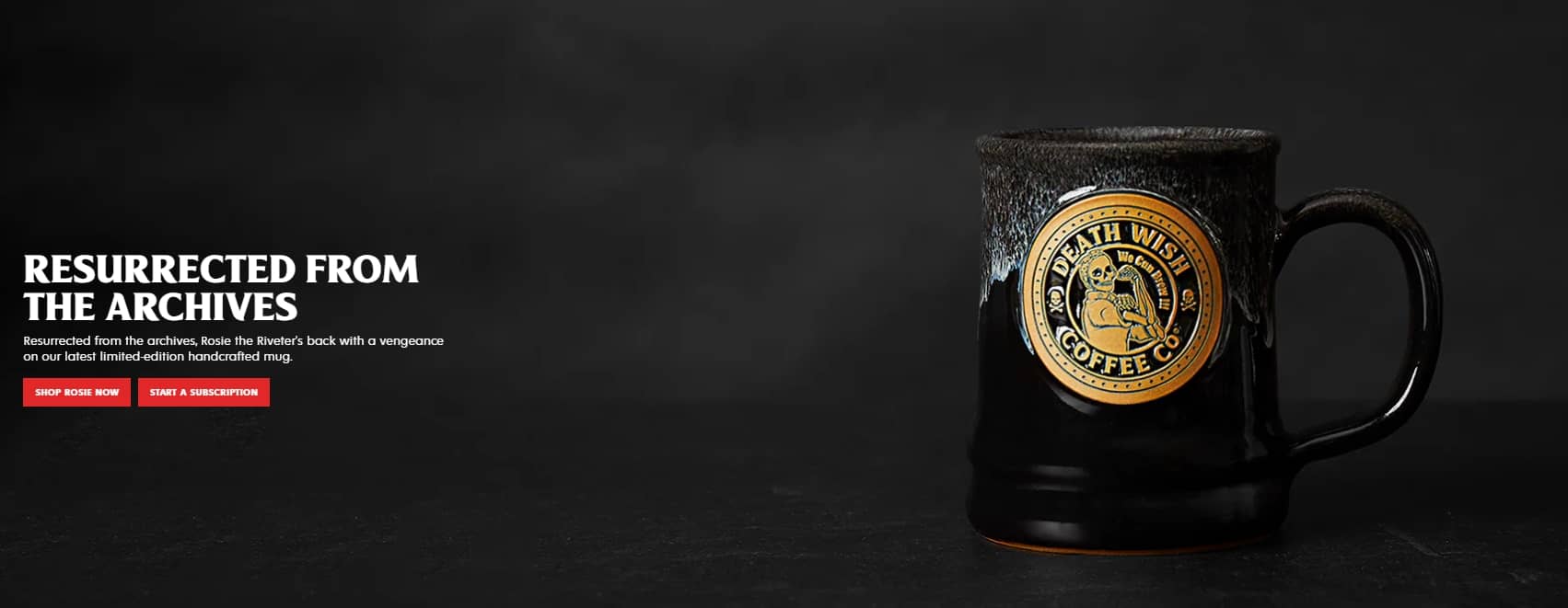
Death Wish Coffee is one of the boldest one-product Shopify store examples out there. The store built its brand around one message: “The world’s strongest coffee.” The skull-and-crossbones logo, black packaging, and no-nonsense tone all back that up.
The company keeps things simple by putting the story, product info, and reviews all on the same page. This clear layout supports its bold message and makes the site easy to follow.
State of Kind

State of Kind is a great example of a one-product Shopify store. It offers just one item: Kindly Restore, a night cream made with organic ingredients like bakuchiol, CBD, rosehip seed oil, and blue tansy.
The website reflects the same values: clean, simple, and intentional. It highlights the brand’s “less is more” approach through a short ingredient list, minimalist visuals, and an “Our Philosophy” page that explains the thinking behind the product.
Her Stories
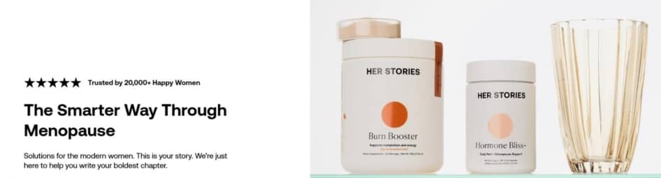
Her Stories, formerly known as Brew Blue, is an Australian wellness brand offering a supplement called “Hormone Balance Bliss,” designed to support women going through menopause.
This one-product Shopify store makes a strong first impression through its soft color palette and calming design. The main banner highlights key benefits right away, followed by real customer reviews and a clear money-back guarantee. This approach enables visitors to easily find what they need and feel confident about buying.
Bullies and Co.
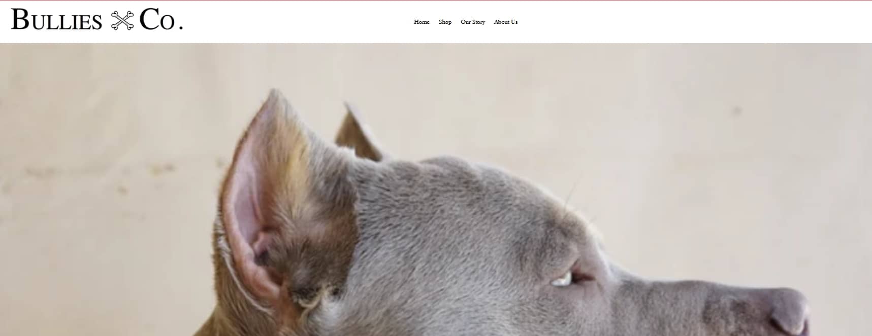
Bullies and Co. is a one-product Shopify store that sells luxury dog chains, mostly Cuban link collars in gold, silver, and rose gold finishes. Though there are a few sizes and colors, the focus stays on one bold product made for strong, stylish pups.
The brand’s website leans on bold visuals—full-width images, crisp product shots, and clean navigation. Shoppers can browse by style or dog size in just a few clicks. With a clear message and sharp branding, Bullies and Co. proves that single-product stores can grow by owning a niche and telling a strong story.
Tushy

Tushy is a one-product Shopify store that built its name around eco-friendly bidet attachments. The brand sells a few accessories, but its focus remains on the Tushy Classic, a product designed to make bathroom hygiene simple, sustainable, and affordable.
The site nails it by spotlighting the hero product with bold visuals, clear messaging, and reviews that back it up with real credibility. The design lets visitors quickly compare models, see reviews, and understand installation steps. Tushy shows how a brand can create a fun, memorable experience while still driving conversions.
FurMe
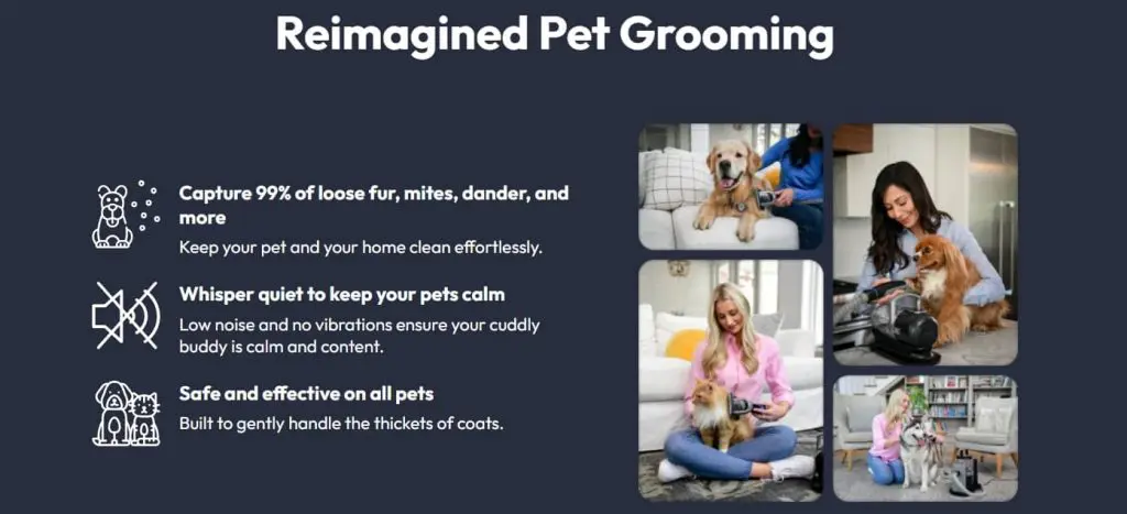
FurMe is a one-product Shopify store example built around one hero item: a pet grooming vacuum kit. The brand keeps its message tight with one tool that clips, brushes, de-sheds, and vacuums. With a quiet motor, smart design, and over 100,000 happy customers, the business shows how focus can win a crowded pet care market.
The site uses playful pet visuals and reviews to make the product feel fun and trustworthy. It proves that a one-product store can grow from a niche into a global market while staying simple and conversion-driven.
Turned Yellow

Turned Yellow is a standout one-product Shopify store that lets anyone become a yellow-cartoon version of themselves in the style of The Simpsons. The brand focuses on one quirky offer, “Turn Me Yellow!” which sells digital portraits with optional prints on mugs, canvases, and apparel. It targets the novelty-loving market and has earned over 330,000 customers. This proves that one bold idea can grow into a successful business.
The site uses bright visuals, playful copy, and social proof from over 530,000 people who turned yellow! It guides users straight to “Add to Cart.” And as a one-product store, it nails the experience by keeping the customer journey tight, whimsical, and ultra-engaging.
HeySilkySkin

HeySilkySkin is a leading one-product Shopify store built around a high-performance at-home IPL laser hair removal device. The store keeps customers focused on one innovative offer with clear visuals, streamlined navigation, and global pricing options
What makes this brand compelling is how efficiently it drives purchase decisions. With clean design, minimal distractions, and strong social proof (think glowing before-and-after visuals and positive feedback), HeySilkySkin highlights how a focused brand can scale in a competitive beauty market.
Bleame

Bleame is a one-product Shopify store built around its Crystal Hair Eraser, a sleek and eco-friendly alternative to shaving. The brand keeps the focus on one hero item but frames it as part of a complete self-care routine, backed by free shipping and a 30-night guarantee.
What sets Bleame apart is how it proves results and drives demand. Thousands of reviews, before-and-after visuals, and strong social media marketing on TikTok and Instagram make the product feel both trendy and trustworthy.
Trimmer Boss

Trimmer Boss is a one-product Shopify store that offers a durable, eco-friendly trimmer head. The brand positions it as a stronger, greener alternative to plastic string trimmers, backed by bold claims, video testimonials, and customer reviews.
The site keeps the pitch simple with comparison tables, free shipping, and a 30-day guarantee. Trimmer Boss focuses on one hero tool and proves that a single product can thrive even in a crowded market.
Thinx

Thinx began as a one-product store centered on period-proof underwear, but it has since grown into a production line with multiple products, including activewear, sleepwear, and postpartum options. The brand’s messaging stays clear: comfortable, absorbent, and reusable underwear that replaces or supports traditional menstrual products.
The site relies less on text and uses product videos, lifestyle photography, and simple navigation to guide visitors. Thinx expands from a single hero item to multiple products within the same niche and shows how a brand can scale while keeping its core values intact.
Ka’Chava

Ka’Chava markets itself like a one-product Shopify store and centers everything on its plant-based meal replacement shake. It offers flavors like vanilla, chocolate, chai, and coconut acai, but all are sold through one streamlined product page that keeps the experience simple for customers.
The brand emphasizes nutrition, sustainability, and lifestyle benefits and makes it easy to subscribe or buy once. Ka’Chava presents multiple options within a single hero product and shows how a focused model can attract a wide, health-conscious audience.
Seattle Cider Company
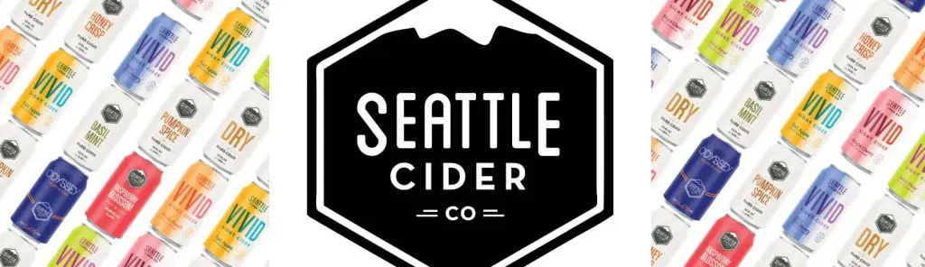
Seattle Cider Company isn’t a classic one-product Shopify store, but it runs its online presence with the same focused energy. The business highlights cider as its hero category, packaging multiple flavors under one clear identity that stands apart from mass-market beer brands. Bold design and playful displays help the brand reach cider drinkers while keeping its storefront simple and inviting.
Grouphug Solar

Grouphug Solar runs like a one-product Shopify store with its Window Solar Charger. The brand makes renewable energy stylish and accessible while showing customers how a simple panel can power devices from any window.
The site builds urgency with sold-out notices, waitlists, and bold messaging like “Solar is sexy.” It also leans on storytelling, sharing the founder’s Shark Tank journey to inspire trust.
What makes a single product website unique?
Focus is what gives single-product stores their strength. Instead of juggling many items like multi-product sites, these stores highlight one hero item and guide visitors to buy. This focused design offers clear advantages, but it also comes with compromises. Let’s weigh both sides.
| Pros | Cons |
| Easier to design and launch | Growth is limited if you add more products later |
| Stronger brand focus | Success depends heavily on one product’s performance |
| Higher conversion potential | Fewer upsell opportunities |
| Clearer message for the target audience | Harder to adjust if demand drops |
Calm shows how these trade-offs play out in practice. It’s a wellness app with one main product that earned over $17 million by the end of 2024 through in-app purchases. This shows how one strong offer, supported by clear messaging and design, can carry an entire business.
How to build a single-product eCommerce site
You’ve seen how brands succeed with one-product stores. Now let’s break down the steps to build your own single-product eCommerce site.
- Start with product research and find the right product to sell
- Create a brand identity that clicks with your audience
- Design a product page that sells your product with impact
- Strengthen your one product store with honest and helpful content
- Optimize your one-product Shopify store for search visibility
- Use online store promotion to drive traffic and sales
- Watch for common mistakes in your creation process
Step 1. Start with product research and find the right product to sell
Before building your store, you need to pick the right product. Not every item works well on a single-product website. The best ones solve a specific need, have room in the market, and bring something fresh to the table.
Pay attention to what’s missing from your customers’ day that your product can fix. Then ask yourself: Can it remove some of the frustration from their everyday lives? A product that’s clear, helpful, and easy to explain is much more likely to connect—and lead to sales.
Here’s a quick checklist you should look at when making a decision:
- Does your product solve a real problem your customers are dealing with? Are people already talking about it or searching for it?
- Do your customers understand it right away?
- Does it give people a better choice—not just another version of what’s already out there?
- Does the price cover your costs and still leave room for sales?
Once you’ve landed on a good option, you’re ready to move forward. But since everything points back to this one item, make sure it’s strong enough to carry the store.
Step 2. Create a brand identity that clicks with your audience
When your product is ready to go, the next step is to decide on the kind of impression you want to make. This is when your brand identity starts doing the work. A strong identity helps your single-product website feel clear, trustworthy, and built with purpose.
Think about your customers’ needs—look at how they communicate, what they believe in, and what kind of brand draws them in. This helps you design a website that speaks to them in a way that feels familiar.
Each part of your branding should send a clear, consistent message. It doesn’t matter if you’re going for friendly and fun or clean and professional. Your branding has to be consistent across your site. If you do this right, your brand identity will support your sales, build loyalty, and show people why you’re the better choice in the market.
Step 3. Design a product page that sells your product with impact
Your product page is where people decide if they should buy. Your single-product website does all the talking, so it’s important to keep it clean, simple, and focused.
Let a high-quality image do the talking before any words are read. Show your product from different angles or in use, so customers can easily picture it in their hands. Beside the photo, include a short, clear description that highlights the product’s benefits, not just the features. You can also add a background video or a GIF to showcase your product’s unique features and how it fits into real life. These visuals help most people understand the value quickly, without much explanation.
Follow it up with the price and a clear call-to-action button that’s hard to miss. Make sure this leads straight to the checkout page, especially on mobile. Less friction means more conversions.
Some of the best one product stores follow this exact setup. Take a look at the examples mentioned earlier and see how a single product can carry a brand when the page is built to sell to a target audience.
Step 4. Strengthen your one product store with honest and helpful content
In a one-product store, every word and image matters. Selling is just one part of it—the real work is earning trust. So instead of simply listing specs, explain how the product helps solve a real problem, eases a pain point, or makes someone feel more confident.
Add honest reviews or testimonials as social proof to show how others responded to the product. When your message matches what the market is looking for, your product page becomes a trusted space to buy, not just a plain pitch.
Need inspiration? Let’s take a look at brands with simple layouts, helpful copy, and real-world visuals that make their product feel trustworthy from the first scroll.
Step 5. Optimize your one-product Shopify store for search visibility
Search engines can’t show your product store if they don’t know what it’s about. Start marketing by covering the basics of search visibility. Use clear titles and descriptions with words most people might search for.
Make sure your product name appears in the hero section and explain what it does and what it’s made of. Add alt text to every image and compress photos so your pages load quickly. This keeps your website smooth and easily accessible, especially on mobile.
You can also create a short FAQ section to answer common questions and help your store show up in more searches. Even if you don’t sell multiple products, these pages build trust and help people feel ready to buy.
For newer single-product stores, try simple link-building, like listing in directories, asking for shares from happy customers, or getting featured on smaller blogs. You can also get help with SEO basics to make sure your store is optimized from the start. These small moves can help your store show up—and stand out.

Step 6. Use online store promotion to drive traffic and sales
To bring in more potential customers, connect with shoppers where they naturally hang out online. A lot of traffic starts with good social media marketing.
Social media profiles like Instagram, TikTok, and Facebook are great places to promote your store, especially if you’re selling a single product.
You can also join Facebook groups in your niche to build awareness. Many brands also run targeted ads through Facebook Ads and Google Shopping to attract buyers who are already thinking about making a purchase.
If you can, add a background video to your social media page as it helps create an instant connection and gives your offer more visual punch.
Once people visit your store, guide them toward purchase with a few simple tools—like email flows that welcome new subscribers and remind them about abandoned carts. Add social proof, like reviews or customer quotes to create a sense of security.
Step 7. Watch for common mistakes in your creation process
When you create a one-product store, simple doesn’t always mean easy. Watch out for these common mistakes:
- Cluttered layouts that distract from your product
- Too many clicks or unclear navigation
- Overexplaining with long blocks of text
- Using the wrong tone—informal language can help if it fits your brand
- Forgetting trust elements like reviews, contact details, or guarantees
- Slow site speed, especially on mobile devices, which can hurt conversion rates.
These small things can add up—and make it harder for customers to feel confident about buying.
Running a single-product website has its downsides too. You won’t have many chances to upsell, and if your one product stops selling, it can impact the whole business. To avoid that risk, choose something with steady demand and healthy margins. Build an email list, share content that helps your audience, and look for simple ways to support your store over time. A focused site works best when it’s clear, reliable, and built to grow.
Must-have pages for one-product stores
A one-product store should include at least six core pages that highlight the product, earn credibility, and make checkout simple. Here are the basics every single-product website needs:
- Home page. Put the hero product in focus with a clear value message. Use high-quality images or a demo video so visitors instantly see what makes your product worth buying.
- Product page. Go deeper with details, features, and benefits. Show pricing clearly, add reviews, and include policies like refunds or guarantees to reassure buyers. High-quality images from different angles can help customers picture the product in use.
- Checkout page. Keep it simple, fast, and secure. Limit the number of steps so shoppers can complete their order without friction, whether they’re on desktop or mobile.
- Contact page. Provide easy ways to reach you, such as email, chat, or a short form. Single-product stores often rely on direct customer relationships, so being accessible is important.
- Shipping and returns page. Be transparent about delivery times, refund options, and guarantees. A clear policy helps remove hesitation and strengthens social proof.
- FAQ page. Answer common questions upfront, from shipping costs to product use. This saves time for your target audience and helps your Shopify store handle objections before they happen.
Having these pages in place gives your one-product store a strong foundation. This setup lets you start marketing, build social proof, and expand your product line as your business grows.
Start marketing faster with a one-product website by Network Solutions
What makes a single-product eCommerce site so appealing is how focused it is. When you build a store around just one product, everything from your message to your design works together to make it easier for people to understand, trust, and buy. Do take note that fewer choices also mean less confusion, which can lead to higher conversion rates.
So, ready to kickstart your journey? Let Network Solutions help you create the best eCommerce platform that highlights your product and supports your company’s next move!
Frequently asked questions
A single-product website is a laser-focused eCommerce store centered on one item. It simplifies the shopping experience with clear messaging and strong visuals that direct site visitors to shop.
A single-product website can be better if you know exactly who you’re selling to and what they need. Since all your traffic focuses on one thing, it’s easier to get a higher conversion rate than stores with lots of options.
Absolutely! You can build a single-product website without any coding skills using beginner-friendly tools. Our AI-powered website builder, for example, lets you create a clean, professional store quickly and easily—all without touching code.
A multi-page website is usually better for businesses because it supports SEO, scalability, and long-term growth. A one-page website works well for simple, focused sites such as portfolios, landing pages, or a single product store where the goal is to deliver a clear message and guide visitors quickly to a purchase.
A landing page is typically made for a specific campaign or ad. Its goal is to get people to do something right away—like sign up, click, or make a purchase. A single-page website, on the other hand, covers everything about a brand or product on one scrollable page. It often works as a complete website, not just a one-time promo.