
Key takeaways:
- Website navigation is a core element of web design that directly impacts user experience, search visibility, and conversions.
- Using clear labels, simple structures, and mobile-friendly menus helps visitors explore content with ease.
- A thoughtful menu structure with prioritized pages, sticky menus, and supporting tools like sitemaps creates a smoother path for users and search engines alike.
Did you know that 88% of online consumers are less likely to return to a site after having a bad user experience? That means seamless navigation and intuitive design are essential for keeping visitors engaged and coming back.
In this article, we’ll cover what website navigation is, why it matters, and how to build a structure that works for your audience. These tips will help you create a smoother, more user-friendly experience.
What is website navigation?
Website navigation is the system of menus, links, and buttons that help people move around your site. It’s how visitors get from your homepage to your product pages, your blog, your contact form. If your navigation is clear and well-organized, people can quickly find what they’re looking for without getting frustrated or leaving the site.
Google and other search engines also rely on your website’s structure to crawl and index your pages. Good navigation means better visibility in search results and a better experience for users at the same time.
Check out our guide on homepage design tips for small businesses to learn how to create an intuitive, user-friendly site that makes a great first impression.
Types of website navigation
Not all websites use the same navigation style. The type of navigation you choose depends on how much content you have, what your visitors need, and how you want them to move through your site. Below are the most common types of website navigation and how they work.
- Top (or primary) navigation
- Sidebar navigation
- Footer navigation
- Breadcrumb navigation
- Hamburger menus
- Mega menus
Top (or primary) navigation
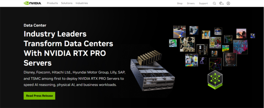
Source: https://www.nvidia.com/en-us
This is the most familiar type, the horizontal navigation bar you usually see at the top of a webpage. It often includes key links like Home, About, Services, or Contact. It’s designed to give visitors quick access to your most important pages. On most websites, this menu stays the same across every page for consistency.
Sidebar navigation
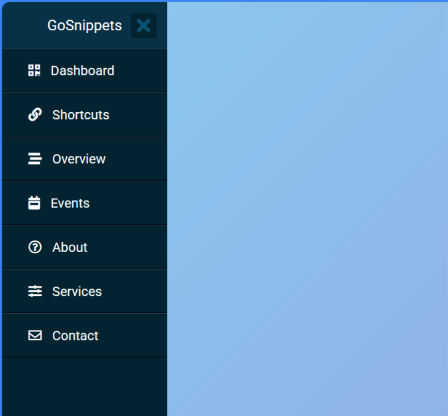
Source: https://gosnippets.com/snippets/side-navigation-menu-bar-with-pure-css
Sidebar menus appear along the left or right side of a webpage. They’re often used on blogs, knowledge bases, or resource-heavy websites to show categories, filters, or related links. Sidebars help visitors explore content without having to go back to the main menu.
Footer navigation
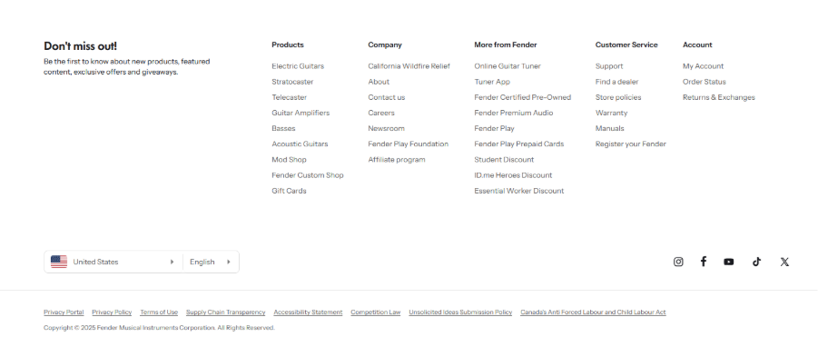
Source: https://www.fender.com/?shpxid=1e3aeb2b-9b0b-4d8b-8481-b7e240bbb972
Located at the bottom of the page, a footer menu is a good place for less prominent (but still important) links like your privacy policy, terms of service, FAQ page, or social media icons. While people don’t always scroll to the footer navigation menu first, it’s often the last chance to help them find something before they leave the page.
Breadcrumb navigation
Breadcrumbs are small text links that show the path a user has taken to get to the current page. For example: Home > Products > T-Shirts > Graphic Tees. They’re especially helpful for websites with deep structures or lots of subcategories, like eCommerce stores or large content sites. They help visitors know where they are and easily go back a step.
Hamburger menus
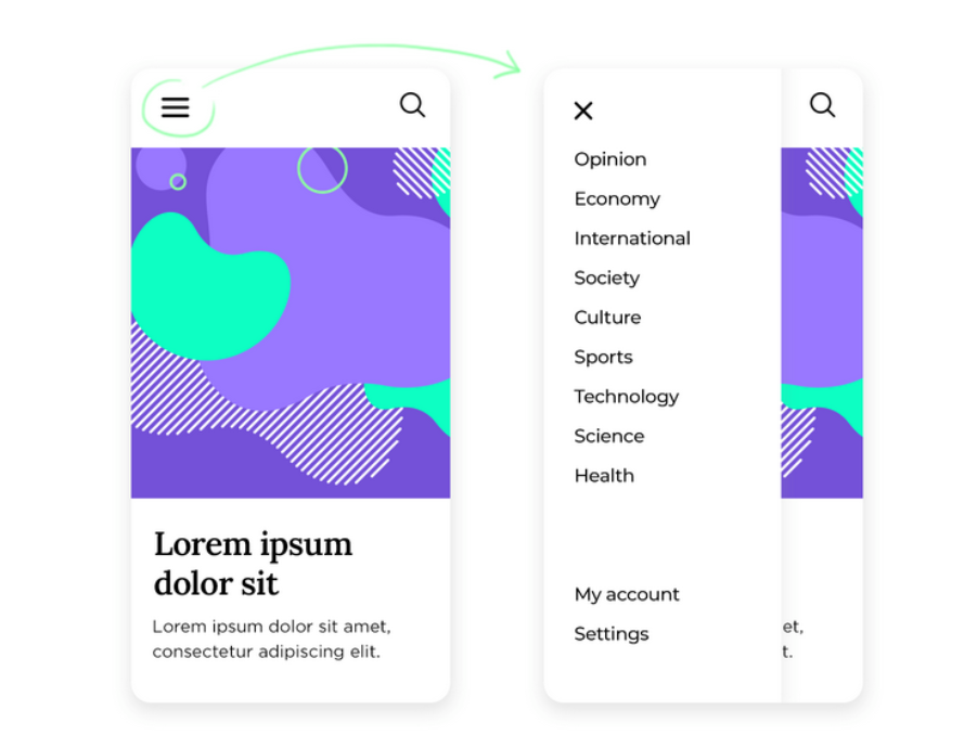
Source: https://www.justinmind.com/ui-design/hamburger-menu
On mobile devices, space is limited so instead of a full menu bar, many sites use a “hamburger” icon (☰) to hide the menu until it’s tapped. When opened, it shows the same main navigation items in a vertical sidebar menu. A hamburger navigation menu helps keep small screens clean and less overwhelming.
Mega menus
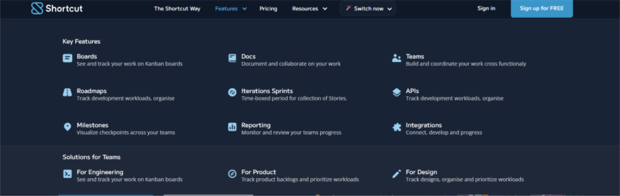
Source: https://shortcut-app.webflow.io/
Mega menus are large dropdown menus that appear when you hover over or click a menu item. A dropdown navigation menu can show dozens of links, grouped into categories with headings or even images. These are great for websites with lots of pages — like online stores, universities, or major news sites because they help users scan a lot of options without feeling lost.
Why good website navigation matters
Great design can draw people in, but great navigation is what keeps them moving. When visitors can easily find what they need, they’re more likely to stay longer, explore more, and take action. Here’s why strong website navigation is so important:
- It improves user experience
- It helps search engines understand your site
- It supports conversions
It improves user experience
Think of navigation like a tour guide for your website. Clear, well-organized menus help people feel confident as they browse, instead of getting stuck or giving up. Industry benchmarking shows 76% of leading eCommerce sites still perform “mediocre” to “poor” on homepage & category navigation, so there’s plenty of room to stand out by getting this right.
It helps search engines understand your site
Search engines rely on internal links and a logical structure to discover and interpret your pages. Google explicitly notes that crawlable, descriptive links help it find pages and understand relevance, so clean navigation doubles as SEO scaffolding.
For more tips on strengthening your site structure, read our post on how to create a strong internal linking strategy.
It supports conversions
If visitors can’t reach pricing, services, or contact in a couple of clicks, they bounce. In a published case study, improving website navigation increased conversion rate by 18.5%, underscoring how reducing friction translates directly to business results.
Website navigation best practices
Even simple websites can become confusing if the navigation isn’t done right. These best practices will help you build a navigation system that’s easy to understand, easy to use, and easy to maintain — no matter the size of your site.
- Use clear and descriptive labels
- Keep it simple and organized
- Design for mobile first
- Optimize for accessibility
- Make navigation consistent sitewide
- Include a search function
Use clear and descriptive labels
Avoid vague words like “Stuff” or “Things We Do.” Instead, use labels that clearly describe what the page is about, like “Web Design Services” or “Pricing Plans.” The more specific your labels, the easier it is for visitors (and search engines) to know what to expect.
Keep it simple and organized
Stick to 5–7 items in your main menu whenever possible. Too many options can overwhelm visitors. Group related pages under dropdowns and create a clear hierarchy — for example, grouping all service-related pages under “Services.”
Design for mobile first
Most people visit websites from their phones, with mobile devices making up about 63% of global traffic in 2025. So, make sure your navigation works just as well on small screens. Use hamburger menus, collapsible sections, and large tap targets so users can easily find and select what they need.
Optimize for accessibility
Navigation should be usable for everyone—including those using screen readers or keyboards. Use semantic HTML, ARIA labels, and ensure all menus can be navigated without a mouse. Clear focus states and skip links also go a long way in improving access.
Make navigation consistent sitewide
Don’t change your menu layout or style from page to page. Keeping your navigation consistent helps visitors feel more confident as they move through your site. It also reduces the chance of someone getting lost or confused.
Include a search function
If your site has a lot of content, add a search bar in a visible location — usually in the header or top right corner. This gives users a quick way to find exactly what they’re looking for, especially if it’s not in the main menu.
How to craft a strategic menu structure
A good navigation menu should not be just a list of pages. The way you organize your menu affects how people explore your site and how easily they can find what matters. Here’s how to build a strategic menu that works for your visitors and supports your goals.
- Sort your content into logical categories
- Prioritize important pages
- Use sticky menus for better usability
Sort your content into logical categories
Start by grouping your pages into categories that make sense. Think about how your visitors think, not just how you name things internally. For example, instead of “Solutions,” you might say “Small Business Tools” or “Marketing Services.” If you have a lot of pages, consider using dropdowns to keep things clean while still offering depth.
Prioritize important pages
Put your most valuable pages front and center — the ones that drive business, answer key questions, or help people take action. These might include your Services, Contact, Pricing, or Portfolio pages. The goal is to reduce the number of clicks it takes to get to the good stuff.
Use sticky menus for better usability
Sticky (or fixed) menus stay visible as users scroll down the page. They’re especially helpful on long pages or mobile devices where people don’t want to scroll all the way back up to find the menu. A sticky menu always keeps your navigation accessible, making it easier for users to jump between sections.
Once your menu is in place, don’t forget the bigger picture. Check out our guide on creating and uploading a sitemap to make your site easier to crawl and navigate.
Build a website that guides visitors with ease
Website navigation is the backbone of a smooth user experience. Clear menus and organized structures help visitors find what they need quickly, improve SEO by guiding search engines through your site, and increase conversions by leading users to the right pages.
If your navigation feels outdated or overwhelming, small updates like using descriptive labels, simplifying categories, and adding sticky menus, can make a big difference.
For a more professional touch, work with our team to enhance your website, improve usability, and create a polished, user-friendly site that reflects your brand. Speak to one of our web design experts to get started today.
Frequently asked questions
There’s no single “best” structure—it depends on your content and audience. That said, a simple top navigation with 5–7 clear menu items, grouped logically with dropdowns if needed, works well for most websites. The key is clarity and consistency.
Ideally, keep your main website navigation menu between 5 and 7 items. This helps prevent overwhelming visitors and makes it easier to scan quickly. Use a drop-down menu or submenus to organize additional pages without crowding the top-level navigation.
Navigation is what website visitors see and use on your website like menus and links. A sitemap, on the other hand, is a behind-the-scenes file (or page) that lists all your site’s URLs. It helps search engines understand your site structure and crawl it more efficiently.
Mobile users have less screen space, so the navigation bar needs to be compact and easy to tap. Hamburger menus, collapsible sections, and large touch targets make it easier to navigate on small screens. Mobile-friendly navigation improves usability and helps keep visitors engaged. A vertical sidebar navigation menu can also help on smaller screens.