Key takeaways:
- Dark mode has become a standard part of modern digital experience across major apps and websites.
- A strong dark mode design depends on sufficient contrast, careful color choices, readable typography, and clear visual hierarchy.
- The best dark mode websites give users control. To support both light and dark themes, make the toggle easy to find and test the experience in different lighting conditions.
Everyone seems to love dark mode these days. Is it really easier on the eyes, or just mostly popular with young users? Statistically speaking, about 82% of iOS users and 76% of Android users use it. On Windows desktops, there’s a 69% preference on dark background. And in 2026 alone, more than 80% of device users switched to dark mode.
So if your website still only works in light mode, adding a dark theme option is both timely and necessary.
But dark mode only works when it is designed well. You need a version that reads well, feels balanced, and is easy to use. Otherwise, it may worsen the experience for your users and turn them off.
In this guide, we’ll walk you through the basics of dark themes, why they have become so popular, and how you can properly create dark-mode designs for websites.
What is a dark mode design?
Dark mode is a user interface (UI) design approach that uses a dark background with light-colored text, icons, and other UI elements. That background is usually black or dark gray.
It’s the opposite of light mode, or light theme, which uses a light background with darker text.
For decades, the light theme has dominated modern interfaces to the point that it can feel like the original. Ironically, dark mode UI design came first.
It dates back to the early days of computing in the 1940s, when black screens with green or amber text were the norm. Back then, it was more of a necessity than a choice because earlier technology could not light up the entire screen.
Later, as display technology improved, companies like Xerox and Apple adopted lighter backgrounds to mimic the look of printed text.
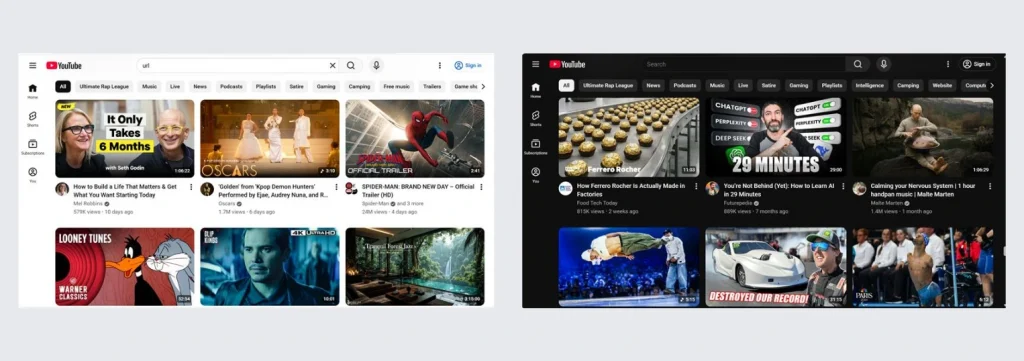
Dark mode then made a strong return by 2016. Major apps and platforms like Twitter, Apple, and Android reintroduced dark themes. Soon, almost every app and website followed and introduced its own dark theme. Users see it as visually appealing, modern, and more comfortable, especially for nighttime use.
That shift changed the role of dark mode design. It grew from a simple aesthetic choice to a key part of user experience design. What was once simply a visual preference is now a standard feature in many popular apps and websites.
Why should you create a dark mode for your website?
Most users now expect the option to switch between light and dark modes. Adding a dark theme option helps meet that expectation without forcing every visitor into the same experience.
Here are a few more reasons your website should offer a dark mode option:
- High user preference: If your site does not support dark mode yet, you may miss out on users who prefer a dark theme—over 80% of them, to be exact. Even users who stick to light mode simply expect the option to exist, since dark mode has become a standard part of modern UI design.
- Reduces eye strain: Dark mode lowers overall brightness, which can make browsing feel more comfortable in low-light, dimly lit environments, and other settings with less light. When designed well, it can help reduce eye strain during longer sessions.
- Increased engagement: Many users browse at night, especially on mobile devices, where a dark theme can feel easier on the eyes because the screen emits less light. When the interface feels comfortable, they are more likely to stay longer, explore more pages, and keep interacting with your website.
- Improves readability: Dark mode designs can make on‑screen text easier to read and enhance accessibility. This is especially true in low-light environments, where bright backgrounds can feel harsh and distracting.
- Reduces screen glare in low-light environments: Bright screens can feel intense when someone opens them in a dark room. A good dark theme design reduces that shock, softens the viewing experience, and adds comfort in low-light settings.
- Improves visibility of design elements: In dark-mode interfaces, buttons, cards, charts, and media can stand out more with the right contrast ratio. This strengthens visual hierarchy, reduces visual noise, and guides the user’s attention to your primary content and actions.
- Improves power efficiency and device battery life: For a mobile-heavy audience, a battery-friendly site is also more user-friendly. On OLED screens, dark pixels use less power than bright ones, which means dark mode can help improve battery life and help users save battery.
- Supports a more modern look: A polished dark UI can make your website feel more current, more intentional, and more visually appealing. For some brands, it can also reinforce brand identity and create a more premium feel.
These benefits explain why dark mode has become so popular and why there are now many great examples of dark mode websites in use today. But popularity doesn’t mean it’s always the better choice in every situation.
When shouldn’t you use dark mode?
Though there is an overwhelming user preference for dark mode, like every trend, not everyone finds it better. Poorly executed dark designs can hurt readability, create harsh contrast, and make the interface harder to use.
This does not mean you should avoid dark mode completely. It just means you should understand where it can fall short before adding it to your website.
Here are some of its drawbacks to keep in mind:
- Low readability in bright environments: Obviously, dark theme works best in low light. In bright light or outdoor settings, dark interfaces can be harder to read because glare on the screen reduces visibility.
- Requires complex color schemes: With dark mode, you need more careful color decisions than light mode. Adjustments should be done carefully because contrasts behave differently on dark surfaces. It is not as simple as reversing colors. A pure black background with pure white or white text can create high contrast, while poorly chosen accent colors can feel visually jarring.
- Affects users with visual impairments: For some users with astigmatism, myopia, low vision, or other visual impairments, bright text on a dark background can create a halo or glow effect. That can make letters feel less sharp and long-form reading more tiring.
- Depends on the task: Context matters. Some people may prefer dark mode for casual browsing at 11 pm in bed, but switch to light mode for editing, comparing prices, or reading detailed content during work at 2 pm. Some users still find dark text on light surfaces easier to process because it feels closer to reading on paper.
To get the benefits without introducing new usability problems, you need to carefully build your website’s dark theme.
How to design dark mode websites
You do not need to rebuild your whole website from scratch to design dark mode. These simple steps will help you build a dark theme that feels polished and easy to use:
- Pick one main background for the whole page.
- Create surface colors for cards, sections, nav bars, and boxes.
- Choose your text colors.
- Make sure the text is readable with contrast.
- Pick your accent color carefully.
- Fix your buttons, links, inputs, and icons.
- Use shadows and depth properly.
- Adjust your typography.
- Check your images, logos, charts, and illustrations.
- Make dark mode follow the user’s device and test it in real life.
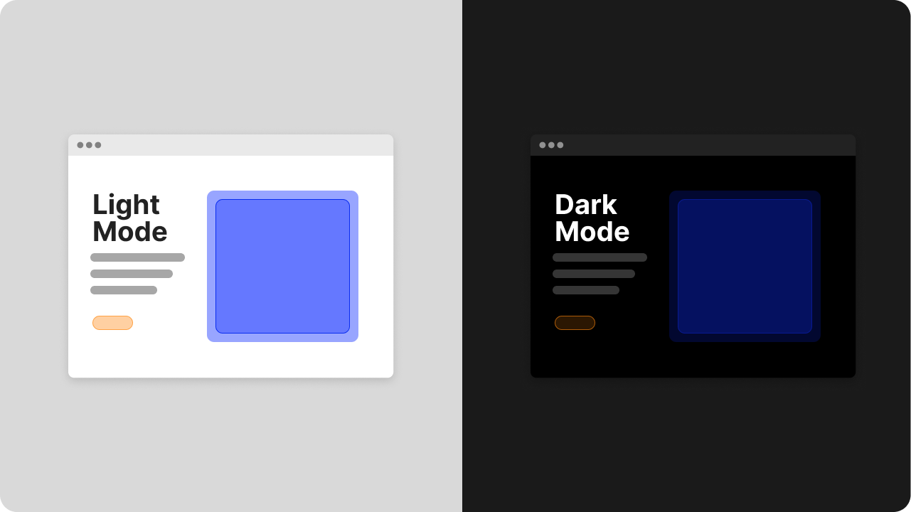
Step 1: Pick one main background for the whole page
Start with the base of the interface.
Do not begin with pure black (#000000). A pure black background can feel harsh and create high contrast when paired with light text. It is also harder to balance, which can make the interface look flat rather than layered.
Use a dark gray instead. Compared to pure black, dark gray reduces glare, improves text clarity, and makes depth easier to create, resulting in a more balanced page.
Step 2: Create surface colors for cards, sections, nav bars, and boxes
Create slightly lighter dark surfaces for other UI areas, such as cards, containers, menus, sidebars, and modals.
Dark mode needs layers, and a consistent color palette helps define how those layers relate to each other. If every section uses the exact same dark color, users can’t easily tell where one area ends and another begins. This slight shift establishes visual hierarchy and makes the layout easier to scan.
Step 3: Choose your text colors
Off-white or light gray text usually works better in dark mode. Pure white text on a dark background can feel too sharp and may even blur around the edges for some users.
Usually, you will need primary and secondary colors for body and headings, and for descriptions, captions, or less important content. You can use a soft white or light gray for the main text so it stands out more, and a medium gray for the secondary texts so they stay readable but quieter.
Step 4: Make sure the text is readable with contrast
Good dark mode design aims for sufficient contrast. The colors can’t be just pretty; more importantly, your users should be able to read them easily.
The Web Content Accessibility Guidelines (WCAG) recommend a minimum contrast ratio of 4.5:1 for normal text under AA level contrast standards, while large-scale text can go as low as 3:1. Your body text, headings, links, buttons, high emphasis text, and other UI elements all need to be checked to provide sufficient contrast against the background.
Step 5: Pick your accent color carefully
Dark mode works best when most of the page uses dark colors in a carefully controlled color palette. Bright accents often look more intense on a dark background, so desaturated colors tend to work better in a darker shade.
Again, choose one main accent color and another secondary accent color if you really need it. Then, test those brand colors on buttons, links, hover states, active states, and icons.
If your website already relies on strong brand colors, build a dedicated dark theme color palette instead of reusing saturated colors from light mode. Your primary brand colors should still feel recognizable, but they may need a different brightness or saturation level to work well on dark surfaces.
Step 6: Fix your buttons, links, inputs, and icons
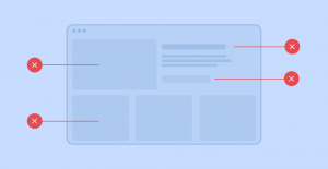
Once your background, surfaces, and text are set, review every interactive element of your UI design. Borders are often too faint, icons too dull, or buttons too flat in dark mode interfaces if not designed properly.
Go through your buttons, links, inputs, icons, tabs, toggles, and menus one by one. Check whether each state is obvious and easy to understand. Users should be able to tell what they can click, tap, or type into right away. Focus on these states:
- Default
- Hover
- Active
- Focus
- Disabled
Step 7: Use shadows and depth properly
Shadows are harder to see in dark backgrounds, so it is better to avoid shadows and rely on surface contrast instead.
As an alternative to dark shadows, you may use slightly lighter surfaces, thin borders, subtle highlights, or a semi-transparent overlay to show elevation. This makes cards, drawers, menus, and modals easier to separate from the background. It also gives the page a cleaner sense of structure, especially when multiple content blocks appear close together.
Step 8: Adjust your typography
Don’t make text tiny just because it looks sleek in a dark theme. It is useless if your users cannot read it.
Dark mode can make white text feel heavier, blurrier, or more tiring if the spacing and contrast are off. For strong typography, review your font sizes and ask these questions as you go through your text elements:
- Is the body text large enough?
- Is the line height comfortable?
- Are headings clearly different from paragraphs?
- Are the links obvious enough?
- Is the secondary text still readable?
This is especially important if you are updating a content-heavy website. Dark mode can quickly expose paragraphs that are too dense, headings that do not stand out enough, or links that blend into body copy.
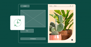
Step 9: Check your images, logos, charts, and illustrations
Dark mode can make your website imagery either amazing or terrible. Some images may look too bright, too low-contrast, or awkward against a dark background. Your logos may also need a separate dark-mode version, especially if they were designed for light surfaces.
To make sure, carefully check these assets:
- Logo
- Hero images
- Icons
- Illustrations
- Charts and graphs
- Screenshots
- SVGs and PNGs with transparent backgrounds
If needed, adjust brightness, contrast, or transparency so these assets still feel clear and comfortable inside the dark theme. If your logo needs a quick refresh or a dark-mode-friendly variation, our Logo Maker can help you create and test options quickly. You get free access to this tool and more when you register your domain with us.
Step 10. Make dark mode follow the user’s device and test it in real life
Not everyone wants the same mode all the time. Some people want dark mode at night but light mode during the day. Therefore, a smart approach is to let the website follow the user’s system preferences first, then provide a visible dark mode option so they can switch manually between the light and dark versions.
Then, test your dark mode design in real conditions. A dark theme that looks beautiful on your monitor can fail in bright daylight, on other screens, or for users with sensitivity or low vision.
Check it in dim rooms, bright environments, on mobile and desktop screens, and during accessibility tests for contrast and readability.
If possible, test with real users too. A few quick observations can reveal whether your dark mode design feels comfortable, clear, and easy to navigate.
Frequently asked questions
Dark mode design is a website or app design style that uses a dark background with light text and UI elements. Its goal is to make the interface clear, comfortable, and visually modern.
Dark mode UI refers to the full user interface in dark theme. This includes the texts, buttons, cards, forms, icons, menus, and every other part of the experience.
Start with a dark gray background instead of pure black. Then, adjust your text, contrast, accent colors, interactive elements, and media so the whole website feels readable and easy to use.
Yes, if you build it well. Dark mode can improve comfort in low-light conditions and make your website feel more current. It should work well alongside light mode rather than replace it.
For most users, yes. It can help in low-light settings by reducing the amount of bright light on the screen. But poor contrast can still cause eye strain, so the design details matter.
Not always. Dark mode often works best in low light, while light mode can still be better for bright environments and long reading sessions. The best setup usually gives users both.
Build a website that works beautifully in dark mode
Dark mode is now a standard part of modern UI design.
Users increasingly expect websites to support it, including yours. And it has gone beyond mere aesthetic appeal. When done well, it improves comfort, readability, and the overall feel of your site.
To begin, focus on the design changes that matter most: contrast ratio, color choices, readability, and a smooth toggle between light and dark modes.
If you want a faster way to get there, we can help. You may be refreshing an existing website or building a new one—either way, we can make the process easier.
Our Website Builder can help you create a polished dark mode experience more easily. But if you’d rather get expert help, our professional website design services can help you build a site that looks modern and works beautifully in both desktop and mobile.
Work with us to build a website that looks modern, reflects your brand identity, and delivers a better experience on every screen.