Key takeaways:
- Responsive design is vital for SEO, user experience, and keeping visitors engaged on any device.
- Core techniques like fluid grids, flexible images, and media queries help your site adapt seamlessly to different screen sizes.
- Testing and optimization across real devices ensure your website remains fast, accessible, and visually consistent.
With the exponential growth of mobile browsing in 2026, users expect websites to load fast and look great, whether on a phone, tablet, or widescreen monitor.
If your site isn’t responsive, you risk losing visitors, valuable search engine rankings, and potential revenue. A non-responsive site can lead to high bounce rates and a frustrating user experience that drives away customers.
This comprehensive guide will cover everything you need to know about responsive design. You’ll learn how to create a responsive website from scratch, understand the fundamental principles behind the practice, and discover best practices to ensure your site adapts flawlessly to any screen size. We’ll also cover common mistakes to avoid and the best tools for testing your work.
What is a responsive website design?
A responsive website design automatically adjusts its layout, images, and content to fit different screen sizes and orientations. It is a modern approach to web development that prioritizes a single codebase.
Instead of designing and maintaining separate websites for mobile and desktop users, you use one set of HTML and CSS. This single set of code is designed to be flexible. It adapts based on the characteristics of the user’s device, such as screen width, resolution, and whether it’s in portrait or landscape mode.
The layout rearranges itself, images scale down, and font sizes adjust to provide a tailored viewing experience without needing a dedicated mobile site.
At its heart, responsive design is about creating a flexible and resilient user interface. This is achieved through a combination of techniques, which we will explore in detail throughout this guide. The goal is to provide an optimal experience for everyone, everywhere.
A glossary of responsive web design terms
Before you can build a responsive website, it’s helpful to understand the core concepts and vocabulary. This glossary breaks down the essential terms you’ll encounter, from media queries to breakpoints, giving you the language you need to speak with confidence and build sites that look great on any screen.
- Responsive web design
- Media query
- Viewport
- Fluid grid
- Flexible images
- Breakpoints
- Mobile-first design
- Graceful degradation
- Progressive enhancement
Responsive web design
A web design approach that makes web pages render well on a variety of devices and screen sizes. A responsive site adjusts its layout, images, and text to provide an optimal user experience whether it’s viewed on a desktop, tablet, or mobile phone.
Media query
A CSS3 technique that allows you to apply different styles to a web page based on the characteristics of the device displaying it. These characteristics include the viewport’s width, height, and orientation. A media query lets you define breakpoints to change the layout for different screen sizes.
Viewport
The visible area of a web page on a screen. The viewport varies with the device, and web developers use a <meta> tag to control its size and scaling, ensuring the website scales correctly on mobile devices.
Fluid grid
A design concept where the website layout is built using proportions (like percentages) instead of fixed pixel values. This allows the layout to resize proportionally as the screen size changes, which is a core principle of responsive design.
Flexible images
Images that are sized using relative units, such as percentages, instead of fixed pixel dimensions. This ensures they scale up or down smoothly with the fluid grid, preventing them from overflowing their containers and breaking the layout on smaller screens.
Breakpoints
Predetermined points where a website’s layout changes. These are typically set using media queries to adapt the design for different screen sizes, such as a desktop, tablet, and mobile device. For example, a breakpoint might be set at 768px to switch from a three-column layout to a single-column layout.
Mobile-first design
A strategy where you start designing and developing a website for the smallest screen (mobile devices) first, and then add features and styles for larger screens (desktops) later. This ensures a fast and efficient experience for mobile users.
Graceful degradation
A design philosophy that focuses on building a full-featured website for modern browsers first, and then ensuring it still provides a basic, functional experience on older browsers or devices that don’t support all the latest technologies.
Progressive enhancement
The opposite of graceful degradation. This strategy starts with a basic, functional version of a website that works on all devices and browsers and then adds more advanced features and enhancements for more capable browsers. This is often the preferred approach for responsive design.
Responsive design vs. adaptive design
While responsive and adaptive design both aim to improve user experience across devices, they use fundamentally different techniques to achieve this goal. Understanding the distinction helps you choose the right approach for your project.
Here’s an overview of their differences:
| Feature | Responsive design | Adaptive design |
| Layout | Continuously fluid; it adapts to any screen size. | Rigid; it snaps to a few fixed layouts based on breakpoints. |
| Codebase | Uses a single HTML codebase and a flexible CSS file to handle all layouts. | Uses a single HTML codebase but may use different CSS files or layouts within one file for specific breakpoints. |
| Performance | May load all assets and hide or rearrange them with CSS, potentially slower but modern techniques have largely mitigated this. | Can be faster because it only loads the assets needed for a specific device size. |
| Flexibility | Highly flexible; content and layout adjust smoothly as the screen size changes. | Less flexible; content and layout “jump” or “snap” at predefined breakpoints. |
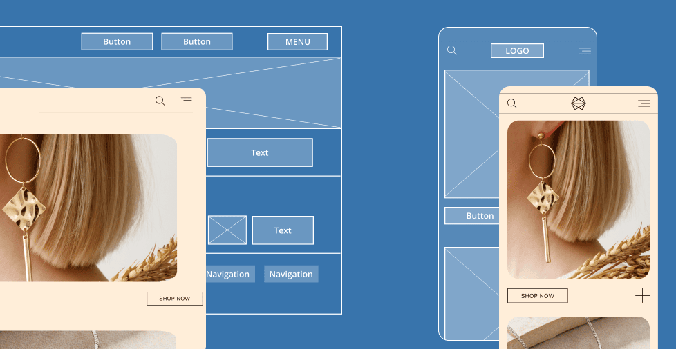
Understanding responsive design
Responsive design uses fluid layouts that change dynamically to fit any screen size. It’s like water filling a container; the website layout flexes and adjusts continuously as the screen size changes.
This is achieved using a combination of percentage-based grids, flexible images, and media queries. The design is fluid from the outset and built to handle any width from the smallest phone to the largest desktop monitor.
For example, a responsive site might use a single-column layout on a phone, a two-column layout on a tablet, and a three-column layout on a desktop.
The transitions between these layouts are seamless because the elements are designed to scale and reflow naturally. The primary benefit is a truly universal experience for every possible device.
Understanding adaptive design
Adaptive design, on the other hand, relies on a series of fixed layouts that switch between a few predefined sizes. Instead of a single, fluid design, an adaptive site detects the user’s device and serves the most appropriate pre-built layout. It’s a more rigid, “snap-to” approach.
For instance, an adaptive site might have one layout for screens under 600px wide, another for screens between 601px and 992px, and a third for anything larger. The site detects the device and serves the correct layout.
If a user resizes their browser window between these breakpoints, the layout will not fluidly adjust; it will simply jump to the next predefined design.
Today, responsive design is the preferred method in most cases. It offers a more seamless user experience and is easier to maintain in the long run, especially as new devices with different screen sizes emerge.
Why responsive web design matters for SEO and user experience in 2026
With the growing dominance of mobile browsing and evolving user expectations, having a responsive website is no longer optional. It’s critical for staying competitive, boosting SEO, and delivering a seamless experience across all devices.
The following points highlight why it’s an absolute necessity:
- Mobile-first indexing
- Better user experience
- Improved SEO and lower bounce rates
- Growth in mobile results
- Stronger SEO results
- Quicker page loads
- Cost efficiency and future-ready designs
Mobile-first indexing
Google now ranks your site primarily based on its mobile version. This significant shift in search engine algorithms means that if your mobile site is slow, clunky, or challenging, your search rankings will suffer—even for desktop searches.
A responsive design ensures that your mobile version is a high-quality representation of your content, a prerequisite for good SEO.
Better user experience
A responsive website provides an easy-to-read, smooth-to-navigate, and fast-loading experience across all screen sizes. Users don’t have to pinch, zoom, or scroll horizontally to view your content.
This reduction in friction leads to higher user satisfaction, increased engagement, and a greater likelihood of them returning to your site. A positive user experience is a direct ranking factor for Google.
Improved SEO and lower bounce rates
When a site is responsive, users can find the information they need quickly and efficiently, regardless of their device. This leads to a lower bounce rate (the percentage of visitors who leave after viewing only one page) and higher engagement.
Search engines view these positive metrics as a signal of high-quality content, which in turn can lead to improved search engine rankings.
Growth in mobile visitors
Mobile browsing now makes up the majority of internet traffic. By having a responsive website, you attract and retain users on smartphones and tablets, which are the primary devices for a large percentage of the global population.
Ignoring this demographic means you’re alienating a considerable portion of your potential audience.
Stronger SEO results
A responsive site aligns perfectly with Google’s mobile-friendly standards. Because it provides a consistent, high-quality experience across devices, it earns the “mobile-friendly” label from Google, a positive ranking signal. This alignment with search engine best practices gives your site a competitive edge in search results.
Quicker page loads
When implemented correctly, responsive design delivers fast loading speeds that are critical for modern users. Techniques like flexible images and mobile-first design can significantly reduce page load times, which keep visitors interested and lower bounce rates. Search engines also favor fast-loading sites.
Cost efficiency and future-ready design
A responsive website eliminates the need for separate desktop and mobile websites, saving a significant amount of time, money, and ongoing maintenance efforts. Furthermore, a flexible design easily adjusts to emerging devices and technologies. This ensures your website remains accessible and functional for years without requiring a complete redesign.
The key elements of responsive web design
Responsive design relies on key concepts that work harmoniously to make your website flexible and adaptable across devices. Let’s break down these essential principles.
- Fluid grids and flexible layouts
- Responsive images
- CSS media queries
- The mobile-first approach
Fluid grids and flexible layouts
The foundation of a responsive website is a fluid grid system. Instead of using fixed pixel values for element widths, you use relative units like percentages (%), viewport width (vw), or viewport height (vh). This allows elements to scale naturally and proportionally as the screen size changes.
For example, a column that is 33% of the container’s width will always take up a third of the available space, whether that container is 1200px or 320px wide. This continuous scaling is what gives responsive design its smooth, flowing characteristic.
Responsive images
Images are a common source of layout problems in responsive design. An image with a fixed pixel width can easily break a flexible layout.
The solution is to use responsive images, which scale down to fit their containers without exceeding their natural size.
The simplest way to achieve this is by setting a max-width: 100% property in your CSS. This ensures that an image will never be wider than its parent container. Still, it will maintain its aspect ratio and not get blurry if it needs to be displayed larger than its native resolution.
For more advanced control, you can use the srcset attribute in your HTML to serve different image sizes based on the device, optimizing for both display and performance.
CSS media queries
CSS media queries are the most powerful tool in the responsive design toolbox. They allow you to apply specific CSS styles only when a particular condition is met, such as when the screen is a certain width. This is how you create “breakpoints” in your design.
For example, you can use a media query to tell the browser to display a three-column layout on desktops but to switch to a single-column layout on mobile phones.
This targeted approach allows you to tailor the user experience for different device types without affecting the core HTML structure.
CSS

@media (max-width: 768px) {

  body {

    font-size: 16px;

  }

  .column {

    width: 100%;

    float: none;

  }

}
This code snippet tells the browser that for any screen size up to 768px wide, the font size should be 16px and all elements with the class .column should be 100% wide.
The mobile-first approach
The mobile-first approach is a design philosophy that guides the entire development process.
Instead of designing for a large desktop screen first and then trying to “shrink down” the layout for smaller screens, you do the opposite. You start with the styles for the smallest possible screen size.
This forces you to prioritize content and a simple, clean layout from the beginning. Once you have a functional and well-designed mobile version, you can progressively use media queries to add enhancements for larger screens.
This approach ensures a great mobile experience and leads to more efficient code and faster loading times.
How to make a responsive website: Step-by-step guide for beginners
Ready to build your first responsive website? Follow these clear, actionable steps to create one from the ground up—even if you’re a beginner. Each step builds on the core principles we just covered.
- Set up the HTML/CSS base
- Use flexible units
- Define breakpoints with media queries
- Add responsive images and media
- Implement Flexbox or CSS Grid
- Test on different devices
Step 1: Set up the HTML/CSS base
Every website starts with a basic HTML file. You’ll need to create a clean, semantically sound HTML structure that includes all your main content. Your HTML should be styled-free and straightforward; CSS will handle all the layout and design.
Crucially, you must add the viewport meta tag to the <head> of your HTML document. This tag is an important part of responsive design. It tells the browser to initially set the page’s width to the device’s width and scale the page to 100%.
Without this tag, mobile browsers will display the page at a desktop width, and your responsive styles will not work as intended.
HTML

<!DOCTYPE html>

<html lang="en">

<head>

    <meta charset="UTF-8">

    <meta name="viewport" content="width=device-width, initial-scale=1.0">

    <title>My Responsive Website</title>

    <link rel="stylesheet" href="style.css">

</head>

<body>

    </body>

</html>
Step 2: Use flexible units
Next, remove fixed pixel values in your CSS file. Replace fixed widths for containers, fonts, and margins with relative units like percentages, em, or rem.
- Percentages (%): Ideal for defining the width of containers and columns. They ensure that the elements scale in proportion to their parent.
- Em and rem: Perfect for typography. An em is relative to the font size of its parent element, while a rem is relative to the root <html> font size. Using rem for typography is a popular choice because it makes scaling the entire site’s font sizes much easier.
Modern CSS also offers powerful functions like min(), max(), and clamp() for even more flexible sizing. These allow you to set minimum and maximum sizes for elements while letting them scale fluidly in between.
Step 3: Define breakpoints with media queries
Breakpoints are where your website’s layout needs to change to adapt to different screen sizes. The most common breakpoints are based on typical device sizes, including:
- 576px (mobile)
- 768px (tablet)
- 992px (desktop)
- 1200px+ (large desktop)
You can define these breakpoints in your CSS file using media queries. Start with your mobile-first styles (no media queries needed for the smallest screens) and then add media queries to apply new styles for larger screens.
CSS

/* Mobile-first styles (applied to all screens) */

body {

  font-size: 1rem;

}

.container {

  width: 90%;

  margin: 0 auto;

}

/* Tablet styles (screens 768px and wider) */

@media (min-width: 768px) {

  body {

    font-size: 1.1rem;

  }

}

/* Desktop styles (screens 992px and wider) */

@media (min-width: 992px) {

  .container {

    width: 80%;

  }

}
Step 4: Add responsive images and media
To ensure images and other media (like videos) don’t break your layout, you must make them responsive. The simplest and most important rule is to set max-width: 100% and height: auto on your images.
CSS

img, video, iframe {

  max-width: 100%;

  height: auto;

}
For more advanced image optimization, use the srcset attribute. This allows you to specify a list of different image sizes and let the browser choose the most appropriate one for the user’s device, which can significantly improve page load times on mobile. You can also use the <picture> element for more control, serving different images for different screen sizes.
Step 5: Implement Flexbox or CSS Grid
For years, developers relied on floats to create multi-column layouts, but these techniques were often clunky and unreliable. Today, modern CSS offers much more powerful and intuitive tools for creating layouts: Flexbox and CSS Grid.
- Flexbox is best for one-dimensional layouts. It’s perfect for aligning items in a row or column, such as a navigation bar or a row of cards. It makes it easy to space, align, and distribute items within a container.
- CSS Grid: Best for complex, two-dimensional layouts. It allows you to create a grid of rows and columns, making it ideal for the overall page structure or a complex photo gallery. You can easily define grid areas and place items within them, regardless of their source order.
It is common practice to use Flexbox and Grid together. Use Grid for your main page layout (header, sidebar, content, footer) and Flexbox to align elements within a single component, like a footer navigation menu.
Step 6: Test on different devices
The final and most crucial step is to test your website. What looks perfect on your desktop monitor may be broken entirely on a small phone screen. Don’t rely solely on one device.
Use Chrome DevTools’ device emulator to get a quick idea of your site’s appearance on different screen sizes. However, nothing beats testing on actual phones and tablets.
This will give you a real-world perspective on touch-friendliness, performance, and overall user experience.
Best practices for responsive web design
To ensure your responsive site performs at its best, follow these tried-and-true best practices that enhance usability, speed, and accessibility. These go beyond the basic technical steps and focus on the user experience.
- Optimize for page speed
- Ensure touch-friendly navigation
- Prioritize content above the fold
- Use scalable typography
- Accessibility considerations
Optimize for page speed
Page speed is a critical ranking factor and a significant determinant of user satisfaction. To keep your responsive site fast:
- Compress all images before uploading and use modern image formats like WebP
- Minify your CSS and JavaScript files to reduce their size
- Leverage browser caching to store files locally, so repeat visitors experience faster load times
A quick site on mobile is significant, as cellular connections are often slower than Wi-Fi.
Ensure touch-friendly navigation
On mobile devices, users interact with their fingers, not a mouse cursor. This means buttons and links must be large enough and have enough spacing to be easily tapped without accidentally hitting an adjacent element.
A good rule of thumb is to make clickable areas at least 44px by 44px. This makes the interface more forgiving and usable, thereby reducing user frustration.
Prioritize content above the fold
The “above-the-fold” area is the portion of the webpage visible without scrolling. On a small mobile screen, this area is much smaller than on a desktop.
Prioritize your most important content and call-to-action (CTAs) to appear in this area. This ensures users get the key information they need immediately without having to scroll down.
Use scalable typography
Using em or rem units for text is a best practice. It ensures that your typography scales proportionately to the user’s default font settings, making your site more accessible.
You can also use media queries to adjust font sizes at different breakpoints to guarantee readability on large and small screens.
Accessibility considerations
A responsive site must also be accessible to users with disabilities. Check your site’s color contrast to ensure text is readable against its background.
Use ARIA labels and semantic HTML to help screen readers understand your content. Ensure that your site can be navigated using only a keyboard, as not all users can use a mouse or trackpad.
Common web responsive design mistakes to avoid and how to fix them
Even experienced developers can fall into common traps when building a responsive site. Avoiding these frequent pitfalls can save you a lot of time and frustration.
Mistake 1. Designing for desktop first and shrinking down
This is the most common mistake and the opposite of the mobile-first approach. When you design for a desktop first, you often create a complex layout that is difficult to simplify for a small screen.
How to fix it: Always start with a mobile-first mindset. Build your site’s simplest, core functionality and layout for the smallest screen, and then use media queries to add more complex styles and features for larger screens.
Mistake 2. Using fixed-width elements that break layouts
Fixed pixel values for widths on elements like containers, columns, or images can easily break a responsive layout. When the screen width shrinks, these elements can cause horizontal scrolling or overflow outside their containers.
How to fix it: Stick to relative units like percentages, em, rem, and vw. These units ensure that your elements will always scale proportionally to their parent containers, preventing overflow and layout issues.
Mistake 3. Failing to test on multiple devices
It’s easy to assume your site is responsive after only testing it in one or two browser sizes. However, different devices, operating systems, and browsers can render your site slightly differently.
How to fix it: Test on a wide range of devices. Use browser dev tools for a quick check, but always test on a few real devices, including smartphones and tablets, to catch any unexpected behavior or performance issues.
Mistake 4. Ignoring landscape/portrait changes on mobile
Users frequently rotate their mobile devices from portrait to landscape orientation. A well-designed responsive site should gracefully handle these changes, adapting the layout to the new dimensions.
How to fix it: Test your site in portrait and landscape modes. Use media queries to apply specific styles for each orientation if needed, although a well-built, fluid responsive design will often handle this naturally.
Testing and tools for web responsive design on various devices
Testing is the key to a successful responsive design. You must verify that your site looks and functions correctly across all screen sizes. Fortunately, many tools are available to help you streamline this process.
Browser DevTools for quick checks
Modern browsers like Chrome, Firefox, and Edge have built-in developer tools, including a powerful device emulator.
This lets you view your site at various standard screen sizes and resolutions and even simulate different network conditions. It’s perfect for quick checks and for identifying and fixing issues on the fly.
Online testing platforms
For more comprehensive testing, platforms like BrowserStack or Responsinator provide multi-device previews.
These services allow you to see how your site renders on dozens of real devices and browsers without owning them.
This is especially useful for checking compatibility across different operating systems and browser versions.
Performance and accessibility audits
Tools like Google Lighthouse, which is integrated into Chrome DevTools, provide automated audits of your site’s performance, accessibility, SEO, and responsive design best practices.
Running these audits will give you actionable advice on improving your site’s speed and user experience.
Examples of great responsive websites
Check out these top websites that masterfully implement responsive design principles and set the standard for modern web development.
- Airbnb
- Smashing Magazine
- Dropbox
- The Boston Globe
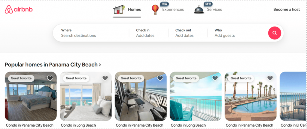
Airbnb
Their website uses a clean, grid-based layout that adapts fluidly across all devices. The booking functionality remains intuitive and easy to use on a small smartphone and a large desktop monitor.
Smashing Magazine
This web development publication is a perfect example of a text-heavy site that adapts beautifully. The typography, images, and content blocks adjust perfectly to reading on any device, ensuring an excellent reading experience.

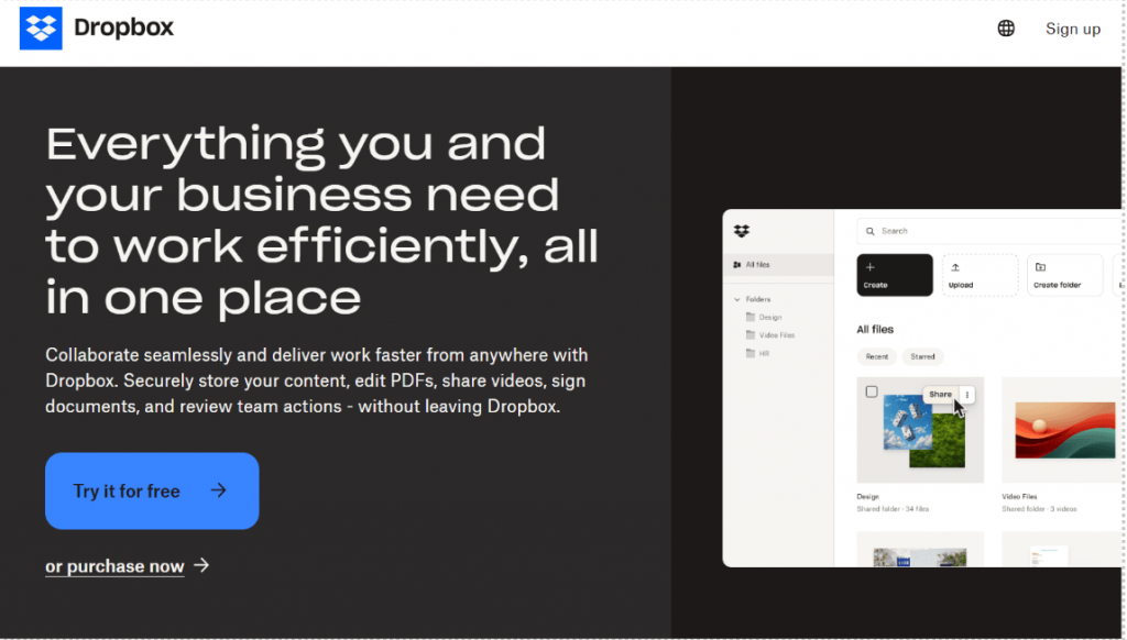
Dropbox
Dropbox’s site has a minimalist design that uses clear calls to action and adaptive typography. Its content is prioritized for mobile, making it easy to understand the product and sign up regardless of screen size.
The Boston Globe
This website was one of the first major news organizations to adopt a fully responsive design. Its layout dynamically adjusts to serve content in a readable format, whether you’re on a phone, tablet, or desktop.

Build a website that adapts to every screen width
Responsive design is a core part of creating a positive user experience, strong SEO, and brand credibility. By applying the core principles of fluid grids, flexible images, media queries, and a mobile-first approach, you can ensure your site looks and works flawlessly everywhere.
With Network Solutions, you can build it yourself using our intuitive website builder or let our professional design team handle everything for you. Either way, you’ll end up with a fully responsive site without the hassle of coding or complex setup.
Frequently asked questions
A responsive site improves user experience by providing a consistent interface across devices. It also boosts SEO rankings because Google prioritizes mobile-friendly sites. A single codebase saves time and money on maintenance, and the design can adapt to new devices.
How can I test if my website is responsive?
You can test your website’s responsiveness in several ways. Use browser developer tools to resize your browser window and view the site on different emulated devices. For more robust testing, use online platforms like BrowserStack, which lets you preview your site on real devices and browsers.
A mobile-friendly site works well on a mobile device but may have a static, separate design. A responsive site, by definition, is mobile-friendly, but it also adapts dynamically to all screen sizes for an optimal viewing experience, using the same underlying code.
Do I need coding skills to make a responsive website?
Not necessarily. While coding with HTML and CSS gives you the most control, many modern website builders and content management systems (CMS) like WordPress offer templates and tools to build a responsive site without writing a single line of code.
Your content should determine the number of breakpoints you use, not a list of standard device sizes. However, most designs can function well with 3–4 breakpoints, such as one for mobile, tablet, small desktop, and large desktop. Start with mobile-first design and add new breakpoints as your content dictates.
Replace fixed widths with flexible units (%, em, rem), add the viewport meta tag, use media queries foIt’s a site that adapts its layout and content to look and work well on any screen size or device. r layout changes, and make images scale with max-width: 100%.
It’s a site that adapts its layout and content to look and work well on any screen size or device.
You’ll need the viewport meta tag, flexible layouts, responsive images/media, media queries, and a mobile-first approach.