Key takeaways:
- Adaptive web design uses pre-built layouts for different screens and devices, while responsive design relies on code to detect screens and scale appropriately.
- Adaptive web design often suits established brands with a budget for designing separate web layouts, while responsive design is better for brands with budget constraints.
- Both come with their share of challenges. Adaptive web design might look awkward on devices with uncommon screen sizes. Responsive design requires more testing to ensure it automatically adjusts properly to different devices.
Adaptive and responsive web motifs are website design architectures that dynamically adjust website layouts to ensure they display correctly on any device. They aim for the same goal but achieve it in different ways.
- Adaptive design has pre-designed layouts for various screen sizes.
- Responsive design has a singular layout that automatically adjusts the site’s appearance based on detecting factors, known as media queries, such as screen size and resolution.
If you’re into cars, you can relate to it in terms of traditional automatic transmissions and continuously variable transmissions (CVT). Both “shift gear speeds” (or “adjust screen size”)automatically, albeit through different implementations:
- Adaptive design is like a traditional automatic transmission with actual gears. It has a fixed number of gears (usually up to four forward gears and one reverse) and shifts between them at set speeds determined by the computer. Similarly, an adaptive website has a few pre-built layouts and “shifts” to the one that best fits your specific device.
- Think of responsive design like a car with a CVT. It has one flexible system that smoothly adjusts to literally any speed, just as a responsive website has one fluid layout that seamlessly scales to any screen size.
In this article, we’ll discuss adaptive vs. responsive design. You’ll get a rundown of their differences, pros and cons, and real-world examples of both web designs.
What is adaptive web design?
Adaptive design means you build several distinct layouts for specific screen-width ranges and serve the one that fits a visitor’s device.
Web designer Aaron Gustafson first conceived of the method in his 2011 book Adaptive Web Design: Crafting Rich Experiences with Progressive Enhancement.
This design methodology depends on a set of fixed layout templates. When a user visits, the server detects their device type or screen characteristics and serves the layout optimized for that device.
Adaptive design builds templates based on the screen size of the device accessing the website. Here are the common screen widths web designers account for:
- 320 px – Small smartphones (portrait)
- 480 px – Large smartphones and phablets (portrait)
- 640 px – Mid-range smartphones (portrait)
- 768 px – Tablets (portrait)
- 1024 px – Tablets (landscape) and Chromebooks
- 1280 px – Standard desktop monitors
- 1440 px – Large, high-end monitors
- 3840 px – 4K screens
Modern adaptive design can:
- Use dynamic serving. Same URL, different HTML/CSS served based on device detection.
- Use separate URLs. It’s possible but now discouraged by Google, as it adds complexity to SEO and maintenance.
When is adaptive web design suitable?
- Your audience uses a select number of devices. Most visitors use a few known screen sizes, so you can design layouts that fit them exactly.
- User-friendly design. Adaptive design helps with faster site browsing on phones by selectively loading assets.
- Device accessibility. Mobile devices need custom features, like a touch-friendly gallery to make a convenient browsing experience.
- Legacy support. Older browsers don’t handle flexible layouts well, necessitating an adaptive design.
- Flexible testing. This method makes device-specific A/B tests, such as swapping in different banners or navigation styles, possible.
- Precise control. This approach provides tight control over each layout’s appearance.
What is responsive web design?
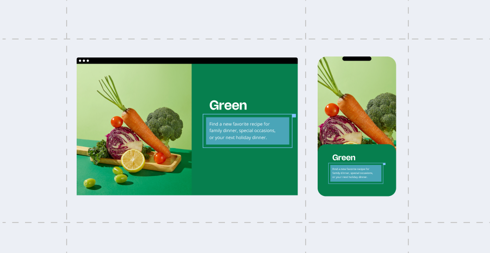
Responsive web design means building a single website that shifts its layout and content to fit whatever device and screen size someone uses — phone, tablet, or desktop.
Responsive web design relies on three factors to keep the site’s look consistent across any desktop or mobile device:
- Fluid grids
- Flexible media
- Media queries
How does responsive web design work?
A website running on responsive web design requires flexibility to work correctly. These are the items that make responsive web design work:
- Fluid grids. You build your website on a grid that scales proportionately, not in fixed pixels. Columns adjust automatically so content keeps its balance as the screen narrows or widens.
- Flexible media. Images, videos, and other media carry a rule like “max-width: 100%.” This rule tells them to shrink inside their container instead of overflowing it.
- CSS media queries. These are the rules set in your website’s code that determine the layout based on different factors:
- Min width
- Max width
- Min height
- Max height
- Orientation
- Resolution
- Aspect ratio
- Color scheme (light mode vs. night/dark mode)
When is responsive web design suitable?
- Better viewing experience. Visitors use a mix of phones, tablets, and desktops, a flexible layout covers them all.
- Budget friendly. More viable when on limited time or budget and want one site instead of separate mobile and desktop versions.
- Update convenience. You only need to update content once to reflect on every site version.
- SEO performance. Google favors mobile-responsive sites.
- Uniformity. Responsive design applies a consistent look and feel across all devices.
- Low upkeep and maintenance. It reduces instances of ongoing maintenance.
- Saleable. It makes it easy to add new devices without affecting your active websites.
Web design is about arranging a layout that leads your audience to find exactly what you want them to find. You can learn from our guide about leveraging website design for both better usability and conversions
What are the positives of using adaptive web design?
Adaptive web design can produce professional-looking websites that display correctly on most devices.
Here are some of the benefits of applying adaptive web design for your brand’s website:
- Precise layout control
- Faster load times on target devices
- Tailored content and features
- Better support for old browsers
- Simplified A/B testing
- Targeted asset management
- Predictable maintenance
Here’s how each make the design method feasible:
Precise layout control
Adaptive web design requires fixed screen layouts for different displays. That means you can fine-tune every element so they look just right on phones, tablets, and desktops — buttons, fonts, icons, and colors. Small business owners get pixel-perfect branding at each breakpoint.
Faster load times on target devices
Pages stay lean because you load only the styles, scripts, and images needed for a given layout. Mobile users avoid downloading desktop-sized assets, which cuts data use, boosts speed, and helps keep visitors from tapping away.
Tailored content and features
You can show or hide sections based on the visitor’s device. For example, you might swap a full-size video for a static banner on phones, or offer a touch-friendly gallery on tablets. This lets you match user needs on each device without compromise.
Better support for older browsers
Legacy browsers sometimes struggle with fluid grids or flexible media. Serving a fixed layout at known breakpoints sidesteps those quirks, so your site stays reliable even on older devices.
Simplified A/B testing
Adaptive design makes it easy to swap entire layouts per device. For example, testing a sidebar on desktop vs. a bottom navigation menu on mobile. You can run tests without extra code to hide or rearrange elements.
Targeted asset management
Adaptive setups let you assign different image sizes or formats to each layout. For example, you might serve a high-res JPEG to desktops and a compressed WebP to phones. This keeps your site looking sharp where it counts and keeps file sizes small where it matters.
Predictable maintenance
You know exactly where to tweak code when you update your site because you only manage the breakpoints you’ve designated. You don’t have to hunt for fluid-grid bugs at odd widths. That saves time and lowers the risk of unexpected layout shifts.
What are the benefits of using responsive web design?
Responsive web design works well for small business owners who are growing their brand. It allows for a flexible, scalable website that grows with their business.
Here are some of the benefits you can leverage with a responsive design:
- A singular codebase
- Cosistent user experience
- Faster development
- Better SEO
- Easier analytics and tracking
- Future-proof
- Easy maintenance
- Better conversion rates
- Consistent branding
- Better accessibility
Here’s how you can make responsive design enhance your brand:
One codebase to manage
You build and maintain a single site. Your updates reflect on every device, whether on phones, tablets, or desktops, saving time and cutting costs.
Consistent user experience
Visitors see the same content and branding no matter what device they use. That builds trust and keeps your message clear.
Faster development
You don’t have to design separate layouts or rewrite code for each device. Most modern themes and frameworks come with built-in responsive grids, so you get up and running more quickly.
Better SEO performance
Google favors responsive design for its consistent user experience, simplicity, and ease of implementation. A responsive layout helps your pages rank higher, bringing more traffic to your business.
Easier analytics and tracking
Unlike adaptive design, responsive web design doesn’t require separate URLs for different site templates. You don’t have to stitch together reports from mobile and desktop versions.
Future-proof design
You can configure a responsive web design website to display correctly on new screen sizes and resolutions. That means your site stays ready for the next tablet or foldable phone without extra work.
Lower maintenance overhead
You fix bugs and make tweaks in one place — no need to remember two codebases or sync content across sites.
Improved conversion rates
When visitors can read text, tap buttons, and view images without zooming or pinching, they’re more likely to explore and act — whether that’s making a purchase, filling out a form, or calling your business.
Consistent branding
A single responsive design ensures your logos, colors, and typography stay uniform, strengthening recognition and professionalism across all devices.
Accessibility benefits
Responsive sites often complement other best practices, such as scalable text and touch-friendly controls. This allows more people to use your site comfortably, including those with visual or motor challenges.
Note: Small business owners like you should prioritize web design to let potential customers learn about their brand. Our guide for homepage design can get you on the right track.
What are the challenges of using adaptive and responsive web design?
You might sometimes favor adaptive web design over responsive and vice-versa.
- For instance, if you have a team of web designers and developers working with you, the complexity of adaptive web design is not an issue.
- On the other hand, responsive web design works better if you’re under budget constraints.
Here are some challenges you might encounter when using adaptive and responsive web design:
| Adaptive web design | Responsive web design | |
| Challenges | 1. More layouts to maintain increase code complexity. 2. Each layout can take more time and effort to test adequately. 3. Fixed breakpoints can leave visual gaps on uncommon screen sizes. 4. Device or viewport detection may not always pick the correct layout. 5. Complicated caching and slow page loads can occur due to loading assets from each layout. 6. New devices and screen sizes mean adding or tweaking breakpoints. 7. Legacy browser quirks can still cause unexpected layout problems. 8. Higher upfront design and development costs than a single responsive setup. | 1. Unexpected layout glitches at odd widths, since fluid grids must cover every possible screen size. 2. Slower page loads if you don’t optimize large images or assets for smaller viewports. 3. Complex CSS (cascading style sheets) can be hard to maintain when you have many media queries as your site grows. 4. Images or videos may look fuzzy or get cropped if their containers shrink too much. 5. Harder to tailor content per device — every user sees the same elements, even if some don’t need them. 6. Potential font-size and touch-target issues unless you explicitly adjust them in your queries. 7. An “infinite” range of widths makes testing take longer than checking fixed breakpoints. 8. Older browsers that don’t fully support media queries or flexible layouts can still misrender parts of your site. |
What websites use adaptive web design effectively?
Despite the complexity, adaptive web design can deliver highly tailored user experiences. Here are some websites that effectively leverage adaptive web design to promote their business:
- Amazon. Amazon detects your device and loads a layout built for its size — mobile, tablet, or desktop. On phones you’ll see one-column product listings, thumb-friendly buttons, and smaller images. On desktop, you get multi-column grids, richer filters, and larger photos. It even serves lighter image formats to mobile to speed up loads.
- BBC News. The BBC picks from a handful of fixed breakpoints to serve different layouts. On mobile, it removes sidebars and trims down headlines to a single column. Meanwhile, on a tablet, it adds a smaller sidebar with trending topics. Desktops get the whole “front-page” grid with multiple modules. Each layout uses only the scripts and styles it needs.
- Starbucks. Starbucks’s site swaps hero images, navigation, and background effects per breakpoint. Phones get a simple “Order” button front and center, while desktops show a full carousel of promotions. Assets like video backgrounds are turned off on smaller screens to save bandwidth.
- ESPN. ESPN chooses adaptive layouts so that live scores, video highlights, and stats panels appear in ways optimized for each device. On desktop you’ll see real-time tickers, interactive graphs and multiple video streams. On mobile it pares back to a single video player and a concise ticker to keep performance snappy.
- Dropbox. Dropbox uses device detection to serve layouts optimized for clarity and speed. Mobile users get a streamlined sign-up form and compressed illustrations. Tablet and desktop visitors see richer animations, full-width feature panels, and larger calls to action.
Note: As web design is a constantly evolving field, the design approaches used by these brands may have changed since publication.
Which websites use responsive web design effectively?
Responsive web design is an efficient option for brands wanting to remove the complexity from their websites. Its SEO benefits and scalability make it a strong choice for a growing brand.
Here are some businesses that make perfect use of responsive web design:
- Airbnb. On your phone, you see one column of places to stay, so you can scroll easily with your thumb. On a tablet or computer, you get two or three columns, so you spot more options at once. You don’t have to pinch or zoom to parse the website.
- GitHub. When you visit on a phone, you get just the main content — code, issues, or pull requests all in one column. Buttons stay big enough to tap on your mobile device. On a larger screen, you see extra menus and sidebars, so you can jump between repo details without hunting through hidden menus.
- Medium. Articles center in a narrow column that’s easy on the eyes. The text fills most of the width on small screens, so you don’t have to scroll sideways. It stays the same comfortable width on desktops instead of stretching out, so each line reads smoothly.
- Pinterest. Pins stack in a single column on a phone so you can scroll without gaps. Switch to a desktop and the grid expands to fill the space, showing more pins side by side. Images flow into new columns without awkward blank areas.
- The New York Times. You get one straight column of headlines, images, and story text on your phone. On a tablet, you’ll see a slim sidebar with quick links to trending topics. On a desktop, you get the full navigation bar, extra feature modules, and larger photo galleries.
Note: As web design is a constantly evolving field, the design approaches used by these brands may have changed since publication.
If you want your website at the forefront of your audience’s minds, our guide on website accessibility features can get you on the right foot.
Leverage flexible web design with Network Solutions
Both adaptive and responsive web design have their uses. Established brands with financial flexibility might leverage adaptive web design to build websites that are tailored to every screen size and device.
On the other hand, small and growing businesses might prefer responsive design’s flexibility. They can take advantage of the code’s one-size-fits-all nature. Additionally, a responsive design website can easily scale with your business.
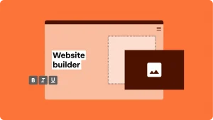
Regardless of your position on the adaptive vs. responsive web design debate, Network Solutions can help you build the website of your dreams. Our DIY Website Builder can get you up and running with a professional website, whether you’re a single small business owner or have a dedicated development team.
Frequently asked questions
It depends. One is not better than the other. Adaptive web design has a simpler A/B testing process, which makes it easier to customize your website to your customers’ preferences. On the other hand, responsive web design has benefits like improved SEO performance.
Yes. For example, if a new device with a new screen size enters the picture, editing your responsive design code to accommodate the new device will take some effort to implement properly. On the flip side, adaptive websites can encounter issues when visitors use legacy browsers to visit their site.
Adaptive web design has pre-designed layouts that respond to the kind of device accessing the website. Responsive web design uses media queries in its code to assess what device is accessing the site, and automatically scales the assets to display correctly on the visitor’s screen.