Key takeaways:
- A website contact form is a simple way for visitors to send you messages, inquiries, or requests directly from your site.
- Contact forms can help generate leads, support communication, and build trust with visitors.
- Clear labels, efficient fields, mobile-friendly design, accessibility, and simple language improve web form completion rates.
People will contact you when it feels simple to do so—and your website’s contact form is often the first and fastest path. But small details like field layout, wording, load time, and accessibility can significantly affect whether someone completes the form or gives up halfway.
In this guide, we’ll walk you through practical ways to make your contact form more user-friendly, more secure, and more effective, so anyone who wants to reach you can do so without obstacles.
What is a website contact form?
A website contact form is a simple online form that lets website visitors send messages, questions, or requests directly to a business. It usually includes basic fields such as:
- Name: Identifies who’s contacting you and helps personalize your reply. Many forms use separate “First Name” and “Last Name” fields for clarity.
- Email: Provides a way to respond directly. Always mark this field as required and validate entries to avoid incorrect addresses.
- Subject: Summarizes the purpose of the message—such as “Quote Request” or “Technical Support.” It helps you organize and route inquiries quickly.
- Message: Lets visitors describe their question, request, or feedback in their own words. A larger message box encourages more complete information.
Some forms also include dropdowns or checkboxes to efficiently route inquiries. Basically, it’s a direct bridge between your visitors and your business. Most website builders make it easy to add a basic contact form in minutes.
How a website contact form works
Website contact forms aren’t as complicated as you might think. When someone fills out the forms, this simple process happens behind the scenes:
- The visitor enters their information: A user types details such as their name, email address, and message into the form fields and clicks ‘Send’.
- The form securely transmits the data: Once submitted, the form collects the input and sends it through your website’s secure server connection—often protected by SSL encryption—to prevent unauthorized access.
- The system processes the form submission: Your website automatically stores or routes the information to your designated inbox, CRM, or database. This ensures the message reaches you instantly.
- You receive a notification: Most builders immediately send an email alert or dashboard notification so you can respond quickly.
- The visitor sees a confirmation message: A short thank-you or success message confirms that the submission went through, giving users the confidence that their message was received.
Once you receive a form submission, the next step is to respond quickly and thoughtfully. Review the message details, categorize the inquiry (whether they’re sales, customer support requests, or general questions), and follow up within 24 hours if possible.
Prompt, personalized replies build trust and increase the likelihood of conversion. You can also track responses in a customer relationship management (CRM) or email tool to monitor leads and spot patterns that can improve your website’s form and overall customer experience.
Why a website needs a contact form
Not all websites have a contact form, but if you’re building a website for your business, it’s a key tool for engagement and conversions. However, even if you’re a non-e-commerce site, as long as interacting with your site visitors is a goal, then a contact form is still a must-have.
Let’s break down its main advantages:
- Generates leads
- Allows direct business communication
- Exudes a professional image
- Ensures spam protection
- Creates better conversion rates
Generates leads
Contact forms help capture visitor details and convert interest into actionable leads.
For example, a visitor browsing your page isn’t ready to buy yet, but they fill out your contact form to ask for pricing or request a callback. That one submission gives you their name, email, and intent, allowing your team to make a follow-up.
You can nurture the lead and guide them toward a purchase. You have their details, use them to your advantage. Consider sending newsletters, coupons, free items, or sale announcements. And since you know their demographics. You can create custom marketing strategies that would relate to them. After all, what a teenage boy in Texas wants is probably very different from what a middle-aged entrepreneur from California needs.
It’s a low-friction way to turn website traffic into real opportunities.
Allows direct business communication
A form gives users a simple, structured way to contact you; no need to copy an email address or open another app. Calling customer support is traditionally how your site users connect with your business, if not through email. However, studies show that 75% Millennials avoid phone calls, citing their dislike for its time-consuming nature as the primary cause.
A contact form can solve this since all the interested party needs to do is fill out the fields with their inquiry. The easy process encourages more inquiries and faster responses.
Of course, this doesn’t mean you replace all methods of communication with a contact form. It’s meant to complement other communication methods like chatbots, emails, and phone calls.
Exudes a professional image
Including a contact form tells visitors your business is accessible and responsive. Owning a website already shows your investment in being accessible online; a good and functional website with a working contact form shows you’re also investing in your potential customers’ user experience. They’ll see you as a professional. Plus, if you answer their inquiries quickly, they’ll see you as trustworthy since you’re open to communicating and willing to cater to their needs.
Ensures spam protection
Displaying your email on your website helps customers contact you, but it also helps bad actors reach you. Unlike plain email links, contact forms hide your address from spambots and phishing attempts, keeping your inbox clean and secure.
Statista’s study shows that 15 million cybercrime incidents were registered worldwide in 2024, and it’s estimated to cost internet users $15.63 trillion by 2029. You can avoid future hassle and financial costs by taking the smallest security measures.
Creates better conversion rates
A study from Ruler Analytics suggests that websites with optimized contact forms see an average of 2.9% conversion rate across 14 industries, with professional service industries cited with the highest rates at 4.6% and B2B e-commerce at the lowest at 1.8%. The numbers essentially show that forms remove barriers and boost engagement.
What makes a contact form effective in 2025?
Creating a contact form is easy with most website builders that offer drag-and-drop functionality and plug-ins. However, there’s a difference between a good form vs. a frustrating one.
Use the following criteria to benchmark your form’s performance and user experience:
- Efficient fields
- Optimized for mobile
- Fast and seamless submission performance
- Clear and simple language
- Secured and protected
- Optimized for conversion
- Accessible and navigable
Efficient fields
A good contact form asks only for what’s essential, typically:
- Name
- Subject
- Message
Too many fields create friction and discourage submissions. Users will also question why you need too much information from them, especially when it’s no longer related or relevant to ask. Every field should have a clear purpose, stay visible while users type, and follow a natural flow from top to bottom.
Optimized for mobile
There are projected to be 7.49 billion mobile phone users globally by 2025. Naturally, these people also complete forms on mobile devices, so responsiveness is non-negotiable. The form should automatically resize for smaller screens, keep large tap targets for buttons and fields, and eliminate horizontal scrolling or zooming.
Fast and seamless submission performance
A form should load in under two seconds, process entries instantly, and display a visible confirmation or thank-you message. Built-in validation for incorrect emails or empty fields helps prevent user frustration and data errors.
Uses clear and simple language
Clear and simple language builds trust and reduces confusion. Replace vague instructions and generic buttons with conversational calls-to-action (CTA) such as “Send Message“ or “Request Info.“ Every field label should describe exactly what’s needed, while optional fields are clearly marked to set expectations.
Secured and protected
Users are more likely to share information when they know it’s protected. Effective contact forms use SSL encryption (HTTPS) for secure data transfer. The form should route submissions internally. Never display your actual email address—to prevent spam or phishing.
Include a short privacy statement or consent checkbox to comply with privacy laws. If you’re taking people’s information, it’s your responsibility to secure these. You want to comply with data privacy rules to avoid legal hiccups in the future.
Read through the General Data Protection Regulation (GDPR) for your European users. Although there isn’t a comprehensive data law for the US yet, California has its own California Consumer Privacy Act (CCPA) to protect California internet users.
Optimized for conversion
A high-performing contact form is measurable. Businesses should track completion rates and review analytics to identify where users abandon the form. Simplifying fields, refining CTAs, and improving design consistency can raise conversions.
Accessible and navigable
An effective form must be user-friendly. All fields should include descriptive labels readable by screen readers, color alone should never indicate required inputs, and users must be able to navigate entirely with a keyboard. Website accessibility isn’t just inclusive—it improves usability for all visitors.
Contact form design tips for non-designers
How your visual form looks can affect its completion rate. If it’s visually irritating or not legible, your site viewers won’t look at it long enough to answer.
Here are tips on how to make a great contact form:
- Use clear field labels: Always include visible labels, such as “Name” or “Email.” Don’t rely on placeholder text alone—once users start typing, that text disappears, making forms harder to understand. Clear labels improve accessibility and reduce errors.
- Avoid generic buttons: Replace vague buttons like “Submit” with specific, action-oriented CTAs such as “Send Message”, “Sales Inquiry”, or “Book a Call.” Action-based language reassures users about what will happen next.
- Keep it short: Ask only for essential details, usually name, email, and message. Each extra field can lower completion rates. A concise form saves users time and removes friction when contacting you.
- Use logical field order: Organize fields naturally from name and contact details to the main message. A logical flow helps users navigate the form smoothly without confusion.
- Maintain plenty of white space: Avoid cramped layouts. White space enhances readability, reduces mistakes, and enables users to focus on one field at a time, particularly on mobile screens.
- Ensure mobile-friendliness: Design for small screens first. Use large buttons, easy tap targets, and responsive stacking so fields adjust cleanly on phones and tablets.
- Add a confirmation message: After submission, show a thank-you message or redirect users to a confirmation page. This reassures them that their message was received and encourages trust in your brand.
Accessibility tips for your contact form
A contact form is a doorway into your business, but if that doorway isn’t accessible, you’re unintentionally shutting out a portion of your users. Strong accessibility also reduces friction for all users, not just those with disabilities. Clear labels, readable text, and predictable navigation benefit someone browsing on a cracked phone screen just as much as someone using a screen reader.
Below are key principles to make your contact form usable for everyone:
• Label every form field
• Ensure keyboard navigation and focus indicators
• Use clear, readable fonts and contrast
• Don’t rely on color to show required fields
• Support screen readers with semantic HTML
Label every form field
Clear, persistent labels help every user understand what information is required, even after they start typing. Placeholder-only designs appear clean, but once text is entered into the field, the prompt disappears, which confuses the user.
Let’s say you’re a business that uses a booking form. You want to give it an update after you realized clients repeatedly submitted inquiries without dates. You realized the old form used “Event date” as placeholder text, which vanished when users typed. Busy customers on mobile screens often forgot what the field was asking for.
After switching to fixed labels above each field, the number of incomplete submissions dropped noticeably because people no longer had to guess halfway through the form.
Ensure keyboard navigation and focus indicators
Not everyone uses a mouse. There are users with mobility impairments or laptop users who prefer keyboard shortcuts. They should still be able to tab through each field in a logical order. Adding a strong focus indicator, such as a visible outline or highlight, can further help them with navigation, as it enables them to better understand exactly where they are.
After you fixed the disappearing labels, you notice another pattern: a few clients—especially those using tablets with attached keyboards—reported that the form “kept jumping around.” Tabbing from “Event Date” unexpectedly skipped straight to the message box, forcing users to backtrack. Your developer found that two fields were out of order in the tab sequence. Once they corrected the tab flow and added a strong focus outline, the form became easier for everyone to navigate—especially clients filling it out quickly between meetings or on mobile keyboards.
Use readable fonts and contrast
Fancy typography, pale gray text, or low-contrast borders may look modern, but they become nearly unreadable on older screens or in bright light. Accessibility guidelines recommend a minimum contrast ratio of 4.5:1 for body text.
So you’ve fixed your navigation and your labels, but you still have high mobile exit rates.
After rechecking your form, you found the culprit: a thin, stylish font paired with a washed-out pastel background. Aged users mentioned that the text “felt blurry” on their tablets. After switching to a standard sans-serif font and using a darker text color, visitors spent more time on the page, and many of them completed the donation inquiry form.
Don’t rely on color alone
Colors can be a good way to differentiate sections or highlight important parts of your form. But if you use the wrong color schemes, like only using red text to indicate required fields, someone with color-vision deficiencies (or simply a dim screen) may miss the cue. Visual indicators should be reinforced with symbols or text.
You noticed clients were still leaving key fields blank. You marked required fields with a subtle red border, which is easy to miss, especially when someone was filling out the form outdoors on their phone. By switching to a clear asterisk (*) and adding the word “required” beside each critical field, you drastically reduced incomplete submissions and stopped needing to chase clients for missing details.
Support screen readers with semantic HTML
Screen readers rely on clean, semantic HTML to understand what each part of a form is supposed to do. Semantic HTML simply means using the correct HTML elements for their intended purpose—like real buttons for actions and proper labels for form fields—so assistive technologies can interpret them accurately. Properly paired labels, real button elements, and meaningful error messages allow these tools to guide users smoothly through each step.
Let’s say you received feedback from a client who relied on a screen reader and couldn’t submit the inquiry at all. The issue turned out to be a “Submit” button that was actually just a styled <div>—it looked fine visually, but a screen reader couldn’t identify it as something you could press. After replacing it with a proper <button> element and ensuring each field label was correctly linked to its input, the studio’s form became fully navigable for screen-reader users.
Where should you put your contact form?
Where your form appears directly influences how many people see and use it. If it’s buried deep on a page, many visitors will never scroll far enough. Mobile users, in particular, benefit from accessible placement because they move quickly and tap less. The closer your form sits to moments of high intent—like pricing or service details—the more likely visitors are to convert.
Let’s break down the best places to put your contact form:
- Contact page: This is the most expected and intuitive place for a form. Anyone who clicks “Contact” already intends to reach out, so conversion rates are naturally strong. A dedicated page lets you keep the experience focused and add helpful context like hours, maps, or alternative support options.
- Homepage or hero section: Adding a short form—or even a prominent “Get in Touch” button—above the fold captures visitors while their interest is at its peak. This works well for service-based businesses, but keep it simple: a few fields only, so you don’t overwhelm first-time visitors.
- Sticky sidebar on service or pricing pages: When people are comparing services or reviewing pricing, they’re closer to taking action. A sticky form or floating “Contact Us” button follows them as they scroll, making it easy to ask a question the moment it arises without navigating away.
- Footer: Many visitors instinctively scroll to the bottom of a page to look for next steps. A small form or a clear button linking to your full contact page gives them a frictionless way to reach out. This is especially effective for mobile users who scroll more often than they click.
Contact form examples that work
Theory is good, but seeing real practices can help you put everything together. Here are three actual contact form examples you can reference and learn from.
1. Stripe
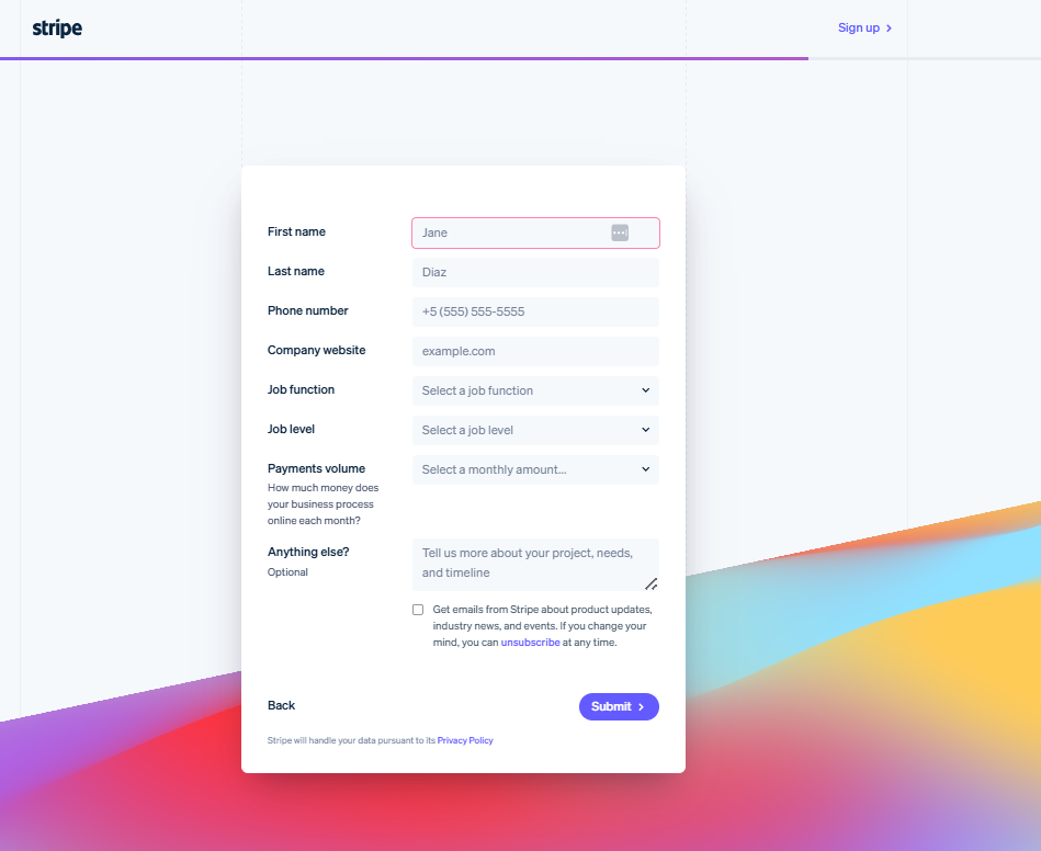
Why it works:
- The form is short and to the point—it asks for work email, region, then a few key business details on the next page.
- The button leading to this page was clearly labelled as “Contact Sales”, so visitors know exactly what will happen and they don’t feel lost.
- It uses a multi-step approach to segment inquiries effectively and avoid overwhelming the visitor with too many fields at once.
What you can replicate:
- Use a clear destination so your visitors know what the form is for.
- If you need extra data (company size, budget, region), use progressive steps rather than piling fields up front.
2. HubSpot
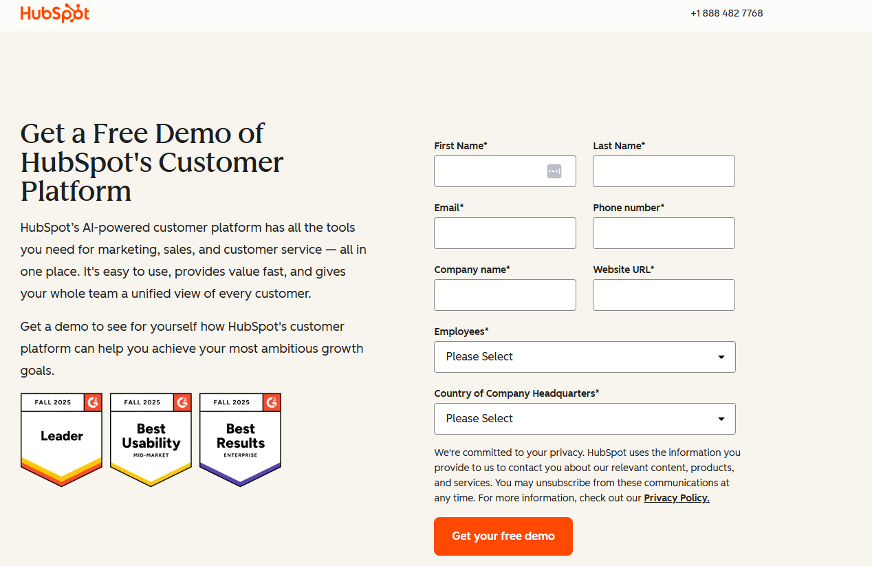
Why it works:
- HubSpot offers multiple contact channels from the same page—letting different visitors pick their path.
- They provide immediate clarity and multiple touchpoints, while still keeping forms on-brand and well-structured.
What you can replicate:
- If you have multiple functions, show them visibly at the top, then lead each visitor to a streamlined form for their need.
- Use descriptive CTAs and headings like “Get your free demo” rather than a generic “Submit”.
Asana
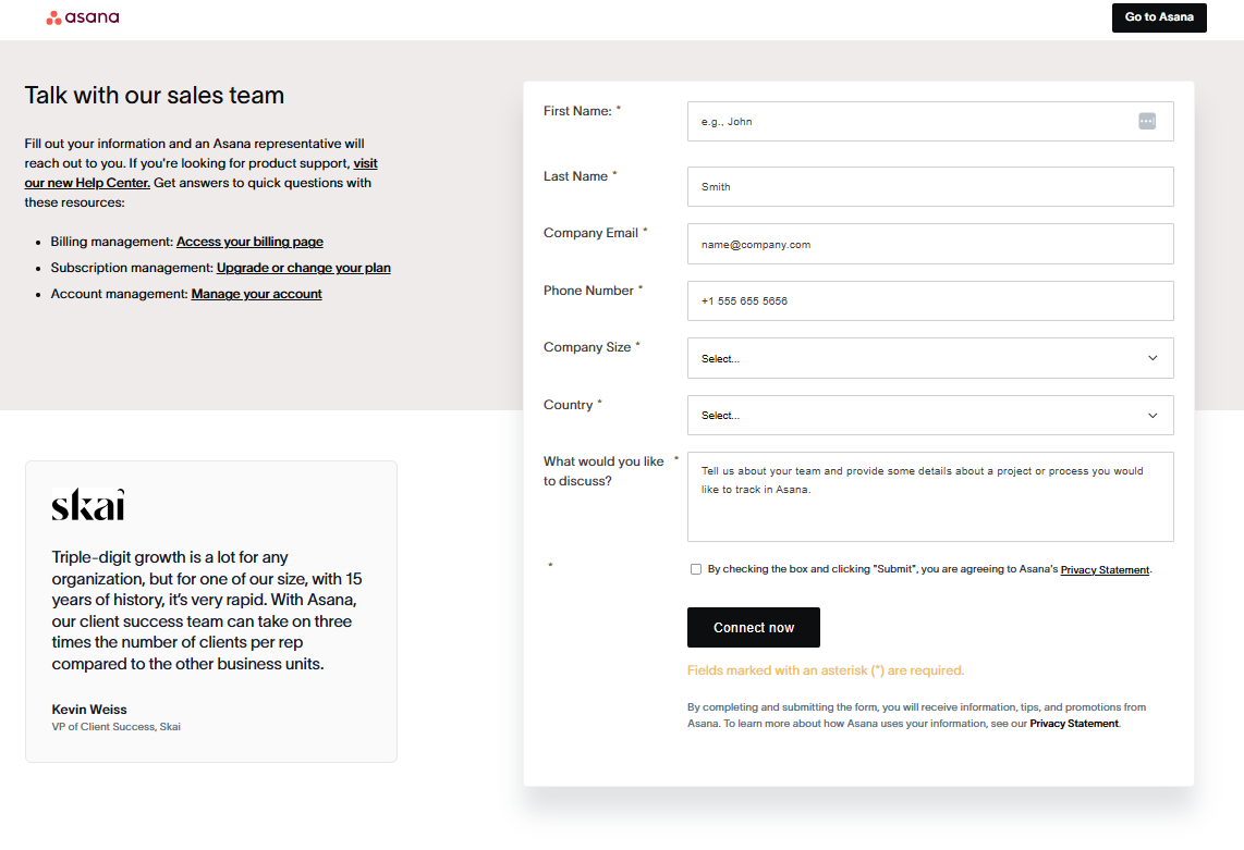
Why it works:
- Asana’s “Contact Sales” form is deliberately minimal. It asks for only the essentials: name, email, company size, and a short description of needs. This respects the visitor’s time while still giving the sales team enough context.
- The form uses a clean layout on desktop, which shortens perceived length and keeps fields visually organized.
- Each label is clear and persistent, making the form friendly for screen readers and mobile users.
- Their CTA “Connect now” clearly communicates what will happen next, reducing friction and uncertainty.
What you can replicate:
- Use a clean and simple layout to make longer forms feel easier to complete.
- Keep labels outside the fields to maintain clarity and accessibility.
- Use expectation-setting CTAs like “Request a Demo” or “Talk to Sales” instead of vague submits.
How to add a contact form to your website (without code)
You don’t need a developer to add a working contact form. Here’s how to do it.
Option 1: Use Network Solutions Website Builder
Contact forms make it easy for visitors or customers to reach you, ask questions, or share feedback. With Network Solutions, you can create these forms without writing a single line of code. Here’s how:
For Websites (Hosting Control Panel)
If you have a hosting package with Network Solutions, you can create a custom MailForm or Feedback Form:
- Log in to your account manager: Go to Network Solutions Login and sign in.
- Access Hosting Settings:
- Click Hosting on the left menu.
- If you have multiple hosting packages, select the one you want and click Manage.
- Open Site Enhancements: In the Hosting Control Panel, scroll down to Site Enhancements and click Forms.
- Create a new form:
- Click Add New Form.
- Enter a Page Title and Page Intro, then click Next.
- Define your fields:
- Add fields for Name, Email, Message, etc.
- Choose the field type (single line, multiple lines, or email address).
- Mark fields as mandatory if needed.
- Important: Include at least one Email field.
- Customize the design: Select text color, background color, font style, and font size.
- Set message and email options:
- Add a confirmation message for visitors.
- Enter the email address where submissions should be sent.
- Include a link back to your site.
- Preview and save:
- Click Preview to check your form.
- Enter a filename (with .html or .htm) and click Next.
- You’ll get a confirmation with the form’s location and link for your HTML source code.
Tip: Print the confirmation page for reference. Once saved, you can link the form from any page on your site.
For e-commerce stores (Online Store and Marketplaces)
If you’re using Network Solutions’ E-commerce Website Builder, you can create and manage contact forms directly in your store dashboard:
- Log in to your e-commerce account.
- Click Customers on the left menu, then select Forms.
- Click Create Contact Form.
- Choose a template by clicking the Templates icon on the left menu. You’ll have two template options—select the one that fits your needs.
- Customize the fields and design as needed.
How to manage contact forms
- Go to Customers > Forms in your e-commerce account.
- On the right side, you’ll see a list of your contact forms.
- Switch between Grid View or List View using the icons at the top.
For more assistance, read our knowledge base articles on How to Create a Customized Feedback or Contact Form for Website, How to Manage Contact Form Emails, and How to Make Contact Forms on Online Store and Online Marketplaces.
Option 2: WordPress plugin
If your site runs on WordPress or you prefer using a third-party tool, adding a contact form is just as easy—no coding required.
- Log in to your WordPress dashboard: Go to your site’s admin panel.
- Install a contact form plugin:
- Navigate to Plugins > Add New.
- Search for popular options like Contact Form 7, WPForms, or Ninja Forms.
- Click Install Now, then Activate.
- Create your form:
- Open the plugin settings (e.g., WPForms > Add New).
- Choose a template or start from scratch.
- Add fields like Name, Email, Message, and customize as needed.
- Configure notifications:
- Set the email address where form submissions should be sent.
- Customize confirmation messages for users.
- Embed the form on your site:
- Copy the shortcode provided by the plugin.
- Paste it into any page or post where you want the form to appear.
- Publish or update the page.
How to keep your contact form secure
Remember, contact forms collect your viewers’ personal information. If they feel like your site isn’t secure, they won’t trust your forms enough to provide answers.
Make your form secure with these tips:
- Use SSL encryption: Always host your form on an HTTPS page. SSL encryption ensures that the form submission data from the users—like names, emails, or messages—is transmitted securely between their browser and your server. Without it, information can be intercepted or altered in transit. If your site doesn’t have an SSL certificate, you can get one directly from Network Solutions SSL Certificates to keep your website and forms fully protected.
- Add CAPTCHA or honeypot fields: CAPTCHA tools (like Google reCAPTCHA) and hidden honeypot fields help block spam bots from flooding your inbox. CAPTCHA asks users to complete a quick verification, while honeypots use invisible fields that only bots can trigger. Adding either method helps prevent fake submissions without slowing down real visitors.
- Include a GDPR checkbox and privacy note: A brief privacy message and consent checkbox show visitors how their data will be used. This isn’t just about compliance with GDPR—it builds trust. Make it clear that information will only be used to reply to inquiries and won’t be shared or sold. Transparency helps users feel safe submitting their details.
- Never expose your email address: Instead of displaying your email address directly on your site, route all form submissions through your server or CMS. This prevents automated scrapers and phishing bots from collecting your contact details. It also helps you track form performance while keeping communication secure
- Avoid auto-responders with sensitive info: If you send an automatic “Thank You” email, don’t include the user’s full message or personal data in the reply. Mask or omit sensitive information like phone numbers or addresses. Echoing raw submission data in emails can expose users if their inbox is compromised.
A secure contact form protects both your visitors and your business. Even if your site doesn’t collect payments, contact forms often contain personal details—so keeping them safe is essential. Use those security standards mentioned above to maintain trust and compliance.
Frequently asked questions
A contact form is a simple web form that allows visitors to send you messages, inquiries, or feedback directly from your site. It usually includes fields like name, email, and message.
Yes, most websites benefit from having a contact form because it makes communication easy and secure. It also helps reduce spam compared to displaying an email address.
Absolutely. Contact forms remain a standard way for businesses to collect inquiries, leads, and feedback because they’re convenient and protect user privacy.
You can use a website builder like Network Solutions, install a WordPress plugin such as WPForms, or embed a third-party tool like Google Forms or Jotform. These options require no coding.
Keep it simple: name, email, subject, and message are standard. Adding too many fields can discourage submissions, so stick to essentials.
Most builders and plugins let you adjust colors, fonts, and layouts. Preview your design before publishing to ensure it matches your site branding.
Typically, the visitor sees a confirmation message, and the submission is sent to your designated email or stored in your dashboard. Some tools also allow integration with CRMs or spreadsheets.
Use a clean, single-column layout, clear labels, and a strong call-to-action button. Keep fields minimal and ensure the form is mobile-friendly.
Yes. Free tools like Google Forms or Jotform let you create a form and embed it on any site using an iframe or HTML snippet.
Check your form regularly to confirm it works, notifications are sent, and the design is responsive. Update fields if your business needs change.
Turn more visitors into real conversations
A contact form seems small, but it quietly does a lot for your business. When it’s fast, secure, mobile-friendly, and accessible, it becomes a reliable engine for generating leads, handling support requests, and fostering customer relationships.
You don’t need to reinvent anything to get there. Keep your fields clean, write clear labels and CTAs, ensure the form works properly on mobile devices, and protect every submission with basic security and privacy measures. Then, place your form where intent is highest and anywhere people are most likely to reach out.
Use what you’ve learned in this guide, open your website builder, and create or improve your contact form today so more of your visitors turn into real conversations, leads, and customers. Or hire a professional web designer to do the heavy lifting for you.