Key takeaways:
- Landing page popups work best when they appear at the right moment, offer something useful, and feel like a natural next step instead of an interruption.
- The most effective popups keep things simple by focusing on one clear message, one clear benefit, and one action that is easy for visitors to take.
- Small tweaks like better timing, stronger offers, and cleaner design can improve results fast.
We all kind of hate popups, and many users leave websites because of them.
Except they work unbelievably well with an 11.09% conversion rate. And as a marketing rule of thumb: if it hadn’t worked, no one would have done it. So instead of avoiding them altogether, the goal is to make better ones that won’t frustrate your users or interrupt their flow.
To design a smart, non‑annoying landing page popup for your specific brand, let’s look at the types, the proper timing, and some examples that actually worked.
What is a landing page popup?
A landing page popup is a targeted, on-screen interactive window that appears on a specific landing page to capture visitors’ attention and support your page’s primary goal.
These are highly contextual mini-landing pages triggered at specific moments—such as scrolling, exiting, or after a time delay—to offer relevant value without disrupting the user experience.
A landing page popup works when it feels useful rather than intrusive. If the timing is right and the message makes sense in context, the popup feels like part of the journey instead of an interruption.
That’s what separates a random overlay from a high-converting landing page popup. A good one grabs attention and helps visitors make the next move with less friction. That move might be signing up, claiming an offer, starting a trial, downloading a resource, or getting one step closer to purchase.
What are the benefits of using landing page popups?
When used intentionally, popups can support different goals across your site:
- Guide your visitors to the next step: Often, site visitors find what they need and leave. A popup lets you show them there is still more worth checking out and encourages them to keep going.
- Increase engagement: Scrolling through long pages can feel repetitive. Website popups add a new interaction that breaks the pattern and pulls their attention back in.
- Boost conversions: Popups are perfect for promoting offers and deals upfront. You may have shown a special discount or opportunity right when a user is considering a purchase. A well-timed promo or reminder can turn browsing into buying.
- Generate more leads: Being dynamic isn’t the only thing popups do. Sure, they add variety, but they can also help you gather valuable data. Some popups include quick surveys, like asking for age or gender. For specific sites, like pet stores, it could even be something as simple as asking whether visitors have a cat or a dog.
What are the different types of popup landing pages?
To get your popups right, you need to understand how each type works. The ones built around timing and user behavior create the strongest foundation because they appear based on what the visitor is actually doing.
Here’s what you need to know about the different types of popup landing pages:
- Time-delayed popups
- Scroll-triggered popups
- Exit intent popups
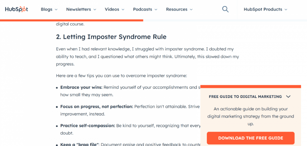
Time-delayed popups
A time-delayed popup appears after a visitor has spent a few moments on your site. This gives people time to focus on your content before an offer shows up.
It works especially well when someone has had a chance to settle into the page. These popups often appear on blog posts, tutorials, or product guides where visitors tend to stay longer. This works well on text-heavy or information-rich landing pages. It gives readers a much-needed break. And since they’ve already been dialed in for a while, you know they are at least somewhat interested in what you have to say or offer.
Used strategically, this type of popup form reduces friction and makes the offer feel timely. HubSpot uses this approach often. They prompt readers to subscribe, download a course, or start a free trial after they have engaged with the content for a bit.
Scroll-triggered popups
A scroll-triggered popup appears after a visitor has moved through a portion of your page. It usually shows up once someone has scrolled through at least 10 – 50 % of the page.
This scroll depth shows that they’re engaged. It’s the perfect time to offer something useful that moves them forward.
It’s like reaching a really good part of the book or show. You’re caught in that moment of wondering what to do next. A scroll popup answers that question for your visitor.
Instead of leaving them to decide where to go, the popup offers direction right when they’re ready to take it. It might include a discount code, a newsletter signup, a related article, or a featured product.
Exit intent popup
An exit intent popup shows up when a visitor is about to leave your site. It is a last-ditch effort to catch visitors’ attention before they go.
You might offer a discount code, a quick lead capture form, or an invite to come back later. The goal is to not let them leave without at least trying to bring them back in.
It’s a small move, but one that can boost conversions, reduce bounce rate, and help turn a lost visit into a potential customer.
What makes a good landing page popup?
Now that you know the types and when to use them, it’s time to build them. But creating a great popup takes more than just bold fonts and flashy graphics.
Even the highest-performing popups can fall flat if they miss the basics. The ones that actually convert visitors into customers usually share six traits:
- They show up at the right moment
- They offer real value
- They have a clear, catchy message
- They are designed with a purpose
- They rely on fast, reliable hosting
- They work well on small screens
They show up at the right moment
There is no one-size-fits-all timing for popups. Some show up early. Others wait until someone scrolls or moves toward the exit. The truth is that every site and every landing page has its own rhythm.
The best way to find your moment is to explore your site like a visitor. Ask your friends or family to do the same. Pay attention to where things feel exciting and where they start to drag. Those emotional highs and lows are where a popup form can do the most good.
If your article is long and light on visuals, that might be the perfect time to add a gentle nudge. If a product page feels overwhelming, try placing a popup where website visitors might need a little encouragement or direction.
When a popup feels like a helpful part of the journey, it works. Not because it followed a rule, but because it respected the moment. That is how you capture attention and generate conversions without disrupting the experience.
They offer real value
Popups can be a powerful tool to engage visitors on your site. But they have to offer something that feels worth the interruption. Instead of just collecting email addresses, give your visitors something that fits naturally into their experience.
Here are a few ways to add real value:
- Capture leads through a popup form: A lead capture form lets visitors sign up without leaving the page. This reduces friction and makes it easier for people to create an account or join your list in just a few clicks.

- Offer a coupon code: Discounts are a great way to encourage people to make a purchase. When you match your coupon with relevant offers based on where visitors are on the landing page or anywhere on your site, you create natural conversion opportunities. Tie it to a product launch or a popular item, and make it feel like a well-timed bonus.
- Share valuable content: Offer something helpful, like a free guide, checklist, or mini-course. If someone is reading a recipe, a popup offering a downloadable cookbook or sneak peek extends their experience in a way that feels natural.
- Present exclusive offers: A limited-time deal creates urgency, but exclusivity adds something more. When an offer feels like it is only available to a few, it becomes more appealing. This is what makes limited editions and premium releases stand out. People want to be part of something that only a few people have access to.
- Make event registration simple: Let people sign up for a webinar, live demo, or online event directly through a popup. The fewer steps, the better. Making it easy increases the chances they will say yes
- Ask for feedback with polls or surveys: A quick poll can yield valuable insights and show visitors that their opinions matter. It’s a small interaction, but it can go a long way in building trust and improving their experience.
The best website popups feel like a natural part of the visit. If they serve a clear purpose, visitors are more likely to welcome them. But if the content feels random or out of place, it just adds friction instead of value.
They have a clear, catchy message
Popups show up fast, and people decide even faster whether to care. That’s why your message has to be clear, direct, and impossible to miss.
It’s okay to be creative. You can add personality, visuals, or clever copy as long as everything supports the message. The best popups use simple language, one clear focus, and a clear call to action. Whether you’re offering a discount, a freebie, or a signup, the benefit should be obvious, and the ask should feel fair.
Think about how you deal with popups yourself. Most of the time, you’re already hovering over the close button before you have even read the headline. That’s the challenge and the opportunity. When the message is right, even skeptical visitors will pause.
Let’s look at two quick examples:
- Popup 1: Get 10% off for every 5 donuts when you subscribe to our newsletter
- Popup 2: Subscribe to our newsletter and get $10 off your next 5 donuts
Both say the same thing. But the first hides the conditions. It sounds like a reward, but it comes with two steps: a purchase and a subscription. The second is more upfront. It lays everything out clearly, which makes it easier to trust and easier to click.
Clarity wins every time.
They are designed with a purpose
A good-looking popup might grab attention, but purposeful design is what gets results. It should feel intentional, not just decorative. The best popups are easy to read, focused, and built to support a single action.
Use this checklist to guide your design:
- Use clean, readable fonts: Avoid overly decorative styles that distract from the message. Your content should be easy to read on any screen.
- Make your call to action stand out: Use contrast, size, or spacing to highlight the button or link. Don’t let it blend into the background.
- Use fewer form fields: Ask for what really matters. Too many questions will drive people away before they complete the form.
- Use space to guide the eye: Give each element room to breathe. A crowded layout makes it harder to understand what the popup is offering.
- Include visuals that support the message: Use images that match the offer or reflect your brand. If it helps explain or elevate the message, it belongs.
A purposeful design guides the visitor to the action that matters most.
They rely on fast, reliable hosting
Even the best popup cannot do much if your site takes too long to load. If the page is slow, visitors may leave before the popup even appears. Or the popup might load late, shift the layout, and create a worse experience than if it had never appeared at all.
Fast-loading pages make popups feel smoother and more natural. They also give your targeting rules time to work properly. If your landing page struggles with speed, every conversion element on it becomes harder to trust.
That’s why popup performance depends on site performance. Good hosting, stable infrastructure, and lightweight assets make it easier for your landing page popup to appear when it should and behave the way you intended.
If you are not sure what setup your site needs, it helps to start with the basics: a domain that fits your brand, hosting that can handle your traffic, and a site builder that lets you make quick design changes without breaking the experience.
They work well on small screens
Mobile deserves its own attention because popup performance increasingly depends on it. Wisepops’ 2026 popup report found that mobile popup campaigns converted at 4.98% versus 3.67% on desktop, or about 36% more conversions on mobile.
Mobile popups need their own design logic. It takes more than taking your desktop popup and simply shrinking it. Shorter headlines, fewer fields, larger tap targets, obvious close buttons, and more breathing room all matter more on smaller screens.
Google also continues to discourage intrusive mobile interstitials that block the main content right away. The safest pattern is to avoid immediate full-screen takeovers from mobile search, make the popup easy to dismiss, and trigger it after a level of engagement rather than on first load.
A clean, mobile-friendly popup protects both conversion and user experience. It helps more of your users and visitors take action without making the page feel difficult to use.
The best landing page popup examples
Sometimes the best way to learn is by looking at what already works. Here are seven high-converting landing page popup examples and exactly why they get results:
Example 1: Crown & Paw uses exit intent with a clear discount
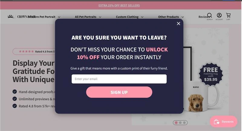
Crown & Paw’s popup appears right as the visitor is about to leave, which makes the timing feel strategic instead of random. The headline creates urgency, the offer is easy to understand, and the email field keeps the action simple.
Everything feels direct: there’s one message, one benefit, and one next step. That clarity matters for an exit-intent popup. The visitor gives one email address and gets one clear reward. There are no extra conditions hiding in the fine print and no competing CTAs pulling attention in different directions.
Example 2: HexClad turns the offer into the visual hook
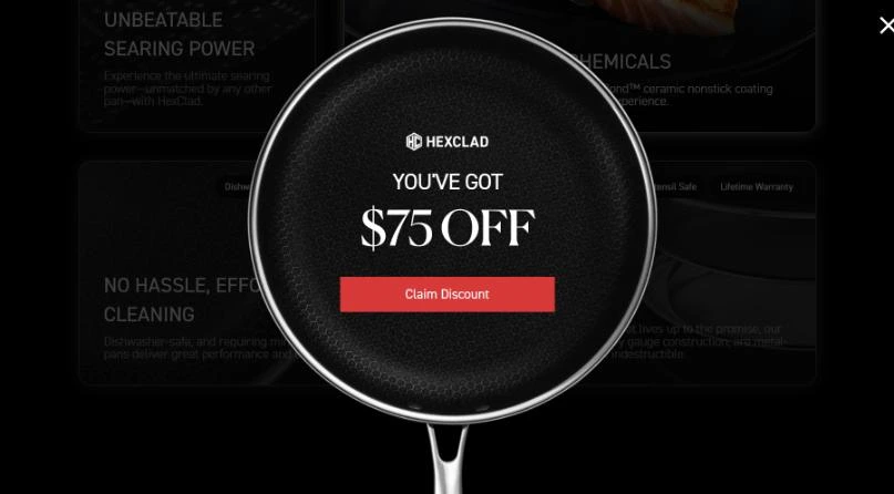
HexClad’s popup makes the discount the center of attention by placing it inside the pan itself. This visual choice instantly connects the offer to the product and makes the popup feel branded instead of generic.
It also keeps the action focused. There’s no extra copy to wade through. Visitors see the value fast, which is exactly what a strong landing page popup should do. They get one simple button to move forward, and the product image does not distract from the offer but rather strengthens it.
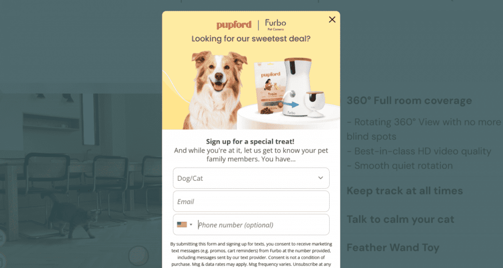
Example 3: Thursday Boots adds light personalization
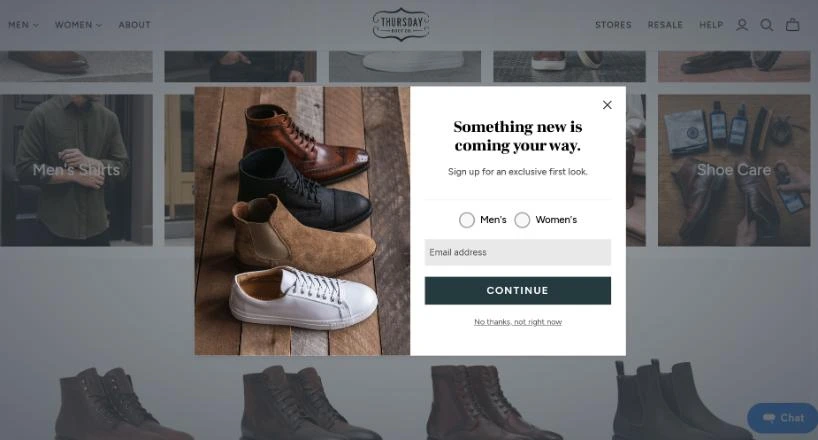
Thursday Boots uses a signup popup that invites visitors to choose between men’s and women’s categories before entering their email. This small step adds relevance without making the popup feel like work.
It stands out because it gathers useful preference data while still keeping the experience clean and minimal. The copy also feels softer and more exclusive than a standard discount popup, which fits the brand well.
This is a smart use of light personalization. Instead of asking visitors to fill out a longer survey, the popup uses one quick choice to improve future targeting. The follow-up messages seem more useful and give the visitor a reason to feel the brand understands what they are looking for.
Example 4: Qure uses urgency and guided choices
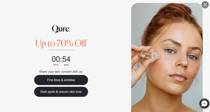
Qure’s popup combines a strong discount with a countdown timer and two clear skin-concern options. Instead of asking visitors to think too hard, it gives them a quick path based on what they care about most.
Their popup feels more tailored. It offers a deal while guiding the visitor to a more relevant next step, which can improve both engagement and lead quality.
This approach works well because it blends urgency with segmentation. The timer adds pressure, while the concern-based buttons add direction. Together, they make the popup feel more interactive and less like a generic attention grab.
Example 5: Caraway pairs an offer with product interest
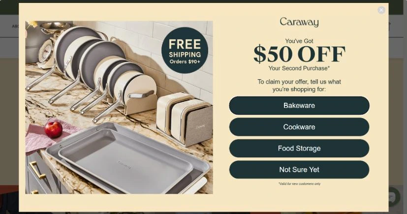
Caraway’s popup offers a discount on the second purchase, then asks visitors what they are shopping for. The popup feels more useful because it starts collecting intent right away.
This is a smart example of a landing page popup doing two jobs at once. It promotes an offer while helping the brand understand which product category matters most to the visitor.
The design, which shows the options are large, easy to scan, and easy to tap, also helps. It reduces hesitation and makes the popup feel more like a guided step than a decision overload.
Example 6: Vegetology uses a seasonal hook to make the offer feel fresh
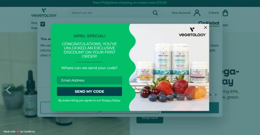
Vegetology’s popup frames the discount as an April special, which gives the message a timely, limited feel. Even if the structure is familiar, that seasonal angle makes the offer feel more current and less like a permanent popup visitors have seen before.
The design also helps. The bright color contrast, product image, and short copy make it easy for visitors to understand what they get and what to do next.
Seasonal framing is a small change, but it can make a common offer feel new again. Instead of presenting another generic first-order discount, it gives the popup a reason to exist right now.
Example 7: Nexus keeps the welcome offer straightforward
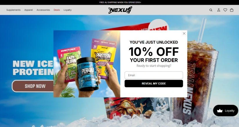
Nexus uses a classic first-order discount popup, but it works because the message is clean, bold, and easy to act on. The visitor instantly sees the reward, the email field, and the button to unlock the code.
This is a good reminder that not every popup needs extra layers. If the design is sharp and the value is obvious, a simple welcome popup can still do its job well. When the offer is good and the action is friction-light, simplicity becomes a strength.
What’s the best timing for popup landing pages?
There’s no single “perfect” timing for popups. The best timing depends on how your visitors behave and how engaged they are. It should appear when interest is forming.
Good timing protects your bounce rate and gives your popup a real chance to convert. And to see what’s working, track metrics like popup conversion rate, landing page conversion rate, bounce rate, form abandonment, and email list growth.
Practical timing framework
Effective popup timing starts with understanding your visitors:
- New visitors: Use scroll-based triggers or short-time delays. These users need breathing room as they are still figuring out who you are and whether you are worth their time. So let them read, scroll, or explore first. If your popup appears after they have truly engaged, it will not feel intrusive—and your conversion rates will improve.
- Returning visitors: Show a popup sooner with a more specific offer. These users are a different story since they already know your brand. Fast triggers can speed up their decision-making, increase your landing page conversion rate, and grow email sign-ups.
- Exit-ready visitors: Use exit-intent popups with a clear “last chance” value proposition. Timing is everything since these users are about to leave. And if your popup appears right as they’re heading out with a strong, relevant offer, it can recover conversions you would have otherwise lost.
Timing also varies by page type. A blog reader may need time before a popup feels helpful. A product shopper who has already viewed multiple items may respond better to a faster offer. A service-page visitor might convert on a click-triggered popup tied to a quote or consultation CTA.
The more intent someone has already shown, the earlier and more specific your popup can be.
Timing mistakes to avoid
Even a great offer can fail if your timing is wrong:
- Too soon: Your visitors have not yet had time to understand your content or value. Interrupt them too early, and your bounce rate goes up while conversions drop. Let them read, scroll, or interact first so your popup does not feel forced.
- Too many fields: Long forms slow visitors down and increase form abandonment, especially when you’re still gaining their trust. Keep it short and focused. Fewer fields make it easier for them to say yes and move forward. On the other hand, asking for too much information could just create friction.
- Irrelevant offer: When your popups don’t align with your page or your visitors’ intent, it breaks the experience. They either ignore or close it immediately. So keep your offers relevant to keep engagement high and support your conversion rate.
- Too often: If someone dismisses it once, they should not see it again immediately. Repetition without added relevance creates fatigue fast. A good rule is to limit how often the same person sees the same popup within a session and then set a cooling-off period after dismissal.
How to create high-converting popup landing pages
High-converting popup pages appear at the right moment and make the next steps obvious.
- Choose one goal: Focus on a single objective such as collecting email, booking a demo, or offering a discount. Your message becomes unclear when your popup presents multiple actions.
- Set the right trigger: Your popups feel helpful when the timing aligns with the behavior. For example, scroll-based and short-time-delayed popups work better for new visitors, and click-triggered popups suit high-intent actions.
- Write clear copy: Your popup should immediately explain your offer, why it matters, and what to do next. Lead with the benefit and keep the message short. Specific CTAs perform better than vague ones because users understand the value before committing.
- Keep the design simple: Use one headline, one primary CTA, and only the fields you truly need. The design should be easy to scan and easy to act on. If you add images, use them to support the offer. If you add segmentation, keep it light. If you add urgency, make sure it feels believable. Every extra element should earn its place.
- QA on mobile: Test your popups on mobile before launch. Text must be readable, buttons must be easy to tap, and the close option must be obvious. They should not block content immediately, especially on smaller screens. Designing for mobile affects performance significantly because mobile visitors have less patience, space, and tolerance for friction.
- Test and improve: Launch with one solid version and test one change at a time. If needed, make adjustments to copy, timing, or layout. Keep what works and continue refining.
If your campaign leads to a dedicated offer page or branded landing page, secure a domain that matches the brand or promotion. We tie this stack together through domain registration, hosting, our Website Builder, and even a Coming Soon page to start building interest before you go live.
Build your popup journeys around this consistent destination.
Best tools to create high-converting popup landing pages
The best popup tools do four things well: no-code building, smart triggers, A/B testing, and clear analytics. These let you launch fast and improve based on real behavior.
Here are some popular tools to explore:
- OptiMonk: Great for e-commerce sites. It offers exit-intent popups, scroll triggers, A/B testing, and dynamic targeting based on cart activity or returning visitors.
- ConvertBox: Known for its simple drag-and-drop interface. It lets you segment traffic, personalize offers based on behavior, and track conversions in real time.
- Unbounce: Best for advanced marketers. While it’s a landing page builder at heart, it includes highly customizable popups, A/B testing, and deep integrations with CRMs and email tools.
- Poptin: A solid option for beginners. It comes with ready-to-use templates, behavior-based triggers, and a visual editor, making it easy to launch without coding.
- Sumo: Lightweight and focused on list-building. It includes basic analytics, email-capture tools, and integration with platforms such as Mailchimp and Shopify.
The right tool also depends on how complex your targeting is, how much testing you want to do, and whether your popup is part of a bigger landing page strategy. A simpler tool may be enough if you are just starting out.
Once visitors convert, you also need an easy way to manage those leads. If you’re building on your own domain, our Customer App—free with every domain purchase—helps you keep contacts and customer activity in one place, without adding another full CRM.
Find the perfect domain
Ready to register a domain name? Check domain availability and get started with Network Solutions today.
Frequently asked questions
Yes, as long as you follow a few guidelines. Google discourages popups that block content right away on mobile. Ensure your popups are easy to dismiss, take up a reasonable amount of screen space, and trigger after a user has engaged with the page.
Absolutely. Advanced popup builders allow for behavioral targeting. You can segment your audience and display tailored messages based on traffic source, returning vs. new visitor status, pages visited, or items in their shopping cart.
Usually, no. A popup should reflect the page it appears on. The closer the message matches the visitor’s intent, the better it tends to perform. A generic popup may still capture leads, but a contextual one usually feels more useful and converts better.
A common best practice is showing a popup only once per browsing session or setting a rule to hide the popup for 14 to 30 days once a user dismisses it.
The most effective method is A/B testing. Create two variations of your popup and split your traffic between them. Monitor the conversion rate and bounce rate within your popup software’s analytics dashboard.
It depends on the type of popup and how conversion is measured. Popupsmart’s 2025 benchmark puts average popup conversion at around 3.49%, while OptiMonk’s benchmark places average popup conversion at 11.09%.
Turn interruptions into actions
Popups get a bad reputation, but the problem is rarely the popup itself.
When used at the right time, with a clear message, purposeful design, and real testing, landing page popups become more than interruptions. They become useful prompts that guide visitors toward the next step with less friction.
You now have the strategy, the examples, and the framework to build landing page popups that support your goals without wrecking the experience. Start with one page, one offer, and one clear action. Then test, refine, and improve from there.
And if you are ready to build the kind of site that makes popup campaigns easier to launch and manage, a strong foundation matters. Our Website Builder can help you create a branded, easy-to-update site that supports your popups, landing pages, and promotions from one place.