

Key takeaways:
- One-page websites are compatible with mobile browsing since scrolling is a familiar action for phone users. Their simple navigation and lack of distracting links provide a smooth user experience on smaller screens.
- A multi-page site is generally better for targeting a variety of keywords and providing in-depth content that helps you rank in search results.
- A one-page site works best for businesses with a focused message, while a multi-page site is better for those who need to scale and offer a lot of information.
Years ago, choosing a format for your website would’ve been easy. Only a few one-page websites existed, as most websites preferred the multi-page design.
As the internet evolved and smartphones became mainstream, single-page websites gained popularity because they were naturally suited for mobile browsing.
The importance of a mobile-first approach is clear when you consider that mobile devices accounted for 52.27% of global website traffic in the first quarter of 2026, according to Statista.
In this article, we’ll explore the differences between one-page and multi-page websites, explaining how each format works and when to use them. We’ll also break down their pros and cons to help you decide which design is right for your business needs.
One-page vs. multi-page website: A quick comparison
A one-page website displays all your content on a single page. Visitors simply scroll from top to bottom instead of moving between separate pages. A multi-page website organizes information across several pages connected by a navigation system. This makes it easier to separate different topics. Both are mobile-friendly when built well, but the better choice depends on your goals. If you have a focused message or offer, a single-page layout may be all you need. But if your business has multiple products, services, or resources, a multi-page website is better equipped to grow with you.
To make the differences easier to see, here’s a quick comparison:
| One-page website | Multi-page website |
|---|---|
| Everything is on one page | Content is organized across several pages |
| Simple navigation with scrolling | Navigation menus help visitors move between pages |
| Best for one product, service, event, or portfolio | Great for businesses with multiple services, products, or e-commerce sites |
| Offers a clean, sleek design with fewer distractions | Keeps large amounts of content well-organized |
| Easier to manage and update | Better for SEO purposes because each page can target a different topic or keyword |
| A good fit for small businesses or campaigns with one clear goal | Well-suited for businesses as the business grows and needs more pages |
What is a one-page website?
A one-page website, also called a single-page website, houses all your essential content on one page. Instead of taking visitors to different pages, the navigation menu jumps to sections on the same page. This simple setup creates a user-friendly browsing experience, especially for visitors who want to find information quickly.
For example, when someone clicks “About” in the navigation menu, the page scrolls directly to the About section instead of loading a new page.
The pros of a one-page website
With everything in one place, a single-page site centers the user’s attention on one topic or idea. This design also offers other advantages to website owners and visitors, such as:
- Simple navigation
- Better mobile experience
- Digestible content
- Quicker boost in page authority
- Low upkeep
- Higher conversion rate
Simple navigation
One-page websites are built for simplicity. Instead of deciding which page to visit next, visitors can continue scrolling until they reach the information they’re looking for.
If they need something specific, they can jump to that section using the navigation menu. Fewer choices create a cleaner browsing experience and keep distractions to a minimum.
Better mobile experience
A one-page layout works well on mobile devices because scrolling is already a familiar way to browse. That’s why one-page websites are easy to navigate on smaller screens.
This type of website can also use lazy loading, which helps pages load quickly by only loading the content currently on the screen. As customers scroll, the rest of the content loads in the background.
This approach helps pages open faster and uses less bandwidth. It can also reduce the strain on devices with limited memory, making browsing smoother.
Note: Multi-page websites can use lazy loading too. But because many visitors only view a single page, the feature often provides greater value on a one-page website.
Digestible content
A one-page website lets you guide visitors through your message in a deliberate order. You decide what they see first, what comes next, and when they’re ready for your call to action.
Instead of leaving users to jump between pages, each section builds on the previous one. This natural progression can improve user engagement because people stay focused on the story you’re telling.
Strong visuals reinforce your message and create a more enjoyable browsing experience.
Quicker boost in page authority
Search engine optimization (SEO) isn’t the biggest strength of a one-page website, but it can still help improve your site’s visibility through link building. While it may not support as many SEO strategies as a multi-page website, it can still appear in search engine results for the right keywords.
Domain Authority (DA) and Page Authority (PA) are ranking scores from Moz that estimate how likely a website is to rank in search engines. The more high-quality websites link to your content, the higher those scores can become.
With a one-page website, every backlink points to the same URL instead of being spread across multiple pages. Over time, this can help build authority for that page.
Because all backlinks point to a single page, any authority gained from those links is concentrated rather than spread across multiple pages. However, Domain Authority and Page Authority are third-party metrics created by Moz and are not direct Google ranking factors.
Low upkeep
One-page websites typically have fewer internal pages to maintain, which can simplify site management. They also remove the need to constantly update pages with fresh content. This makes single-page websites easy to use and manage. Plus, it makes finding and fixing a problem within your site much easier and less costly.
Higher conversion rate
One-page websites can be effective for lead generation when they focus on a single offer, service, or call to action. That’s why they’re a popular choice for landing pages. With fewer distractions, it’s easier to keep users engaged and guide them toward taking action, whether that’s making a purchase, signing up, or contacting your business.
The cons of a one-page website
Single-page sites have several disadvantages. In this section, we’ll focus on the most prominent drawback: SEO limitations. One-page websites can be more challenging to optimize for a wide range of search queries because all content must live on a single URL.
Consider the following cons of using one-page websites:
- You have difficulty targeting multiple keywords
- You can’t go in-depth
- You have limited opportunities to update content
- You only have one URL to work with
You have difficulty targeting multiple keywords
One-page websites usually focus on one topic and one or two main keywords that describe your business. That makes it harder to rank for different keywords people might use when searching for your products or services.
For example, if you’re targeting “New York plumber,” you might miss searches like “boiler repair Manhattan” or “Queens shower installation company.” A multi-page website lets you create content for different services, locations, and topics. That gives you a better chance of reaching a wider audience.
You can’t go in-depth
The ability to go into detail on a particular subject gives you the chance to get links and rank for keywords that boost page authority and visibility. But if you fill a one-page website with too much content, you risk losing a visitor.
You have limited opportunities to update content
Keeping content updated can help maintain relevance, especially for topics that change frequently. However, not every page needs constant updates, and evergreen content can continue performing well when it remains accurate and useful.
A one-page website provides fewer opportunities to create separate content assets, such as blog posts, service pages, or landing pages targeting different topics. The static nature of single-page sites means falling behind larger sites that publish regular blog posts or news articles.
You only have one URL to work with
Multi-page websites have multiple entry points, whereas a one-page website only has one.
While this is good for building up a strong DA and PA, because there is only one primary page, you have fewer opportunities to create dedicated pages that target different keywords, services, locations, or customer needs. This reduces your chances of attracting more audience and generating more leads.
One-page website examples
Single-page websites have one chance to make an impression, so many of them use different design elements to create an engaging experience. Draw inspiration from these excellent examples and templates if you decide to make your own one-page site:
Upstate Laundromat

This laundromat from Greenville, South Carolina, uses color psychology on its single-page website. The top of the page is blue, which is often associated with trust and reliability in marketing.
As you scroll, the color scheme shifts to include the color red, which is commonly used to create a sense of urgency or action.
The combination of these two colors reassures potential customers they’re interacting with a dependable business. This, in turn, entices them to engage with the company’s offerings.
Want to know more about leveraging color psychology for your site? Check out our article on choosing the best color schemes for websites.
Beyond the color choice, the website provides a great user experience with smooth scrolling and easy-to-read fonts.
It also offers a map at the bottom of the page to provide visitors with a clear physical location. These elements come together to create a professional and intuitive site.
Cook Collective
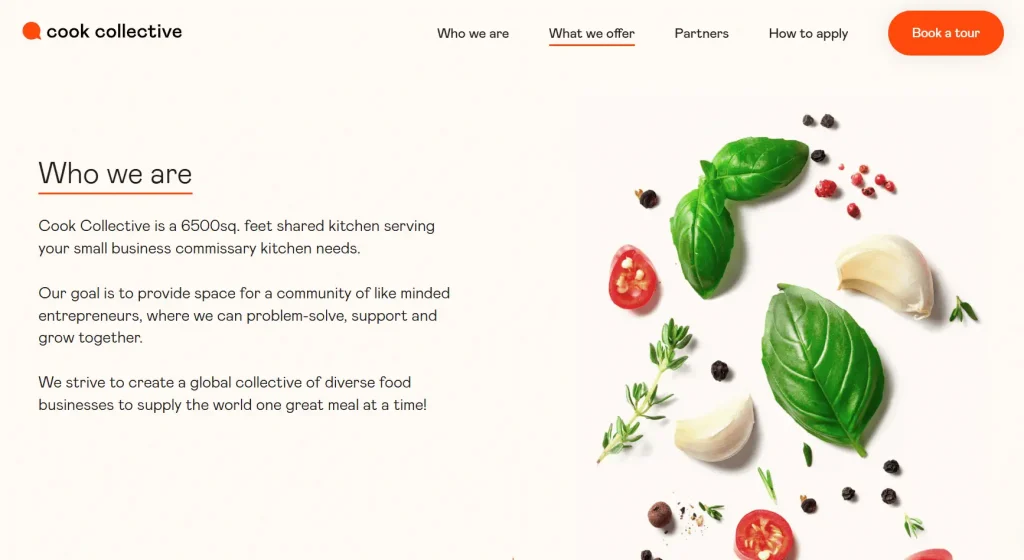
The Cook Collective is a commissary kitchen in Brooklyn, New York that supports small food businesses by renting out professional spaces and equipment. Their website’s design directly reflects this mission.
They use the color orange to create a welcoming and enthusiastic atmosphere. This choice encourages visitors to interact with the site and explore the services offered.
The website also features sharp and vibrant images of food, which perfectly represent the brand’s purpose. These high-quality pictures tell a story about what the company does while communicating a sense of professionalism.
The use of these elements sends a clear message to visitors that they’re engaging with a legitimate and trustworthy business.
Couro Azul
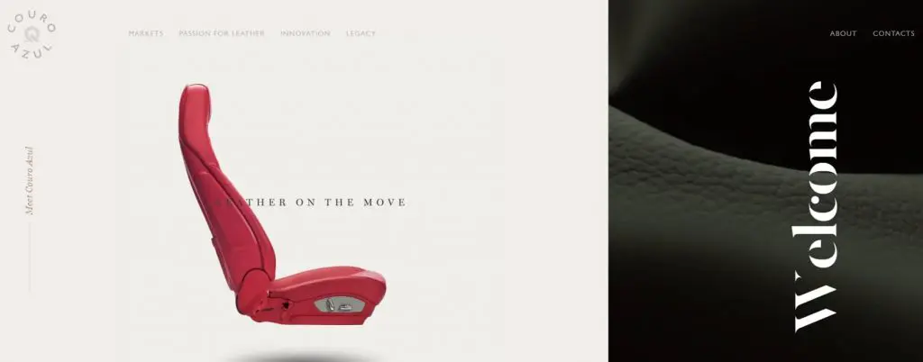
Couro Azul is a leather manufacturer based in Portugal that supplies premium leather to the automotive industry. Its single-page web design reflects the company’s focus on quality through clean layouts, large images, and generous white space.
The website uses short sections and relevant content to guide users through its story without overwhelming them. A simple navigation menu lets users jump to different sections, making the site easy to browse on both desktop and mobile devices.
High-quality photography, subtle animations, and a consistent color palette reinforce the brand’s premium identity while keeping the experience engaging from start to finish.
Boat rental template
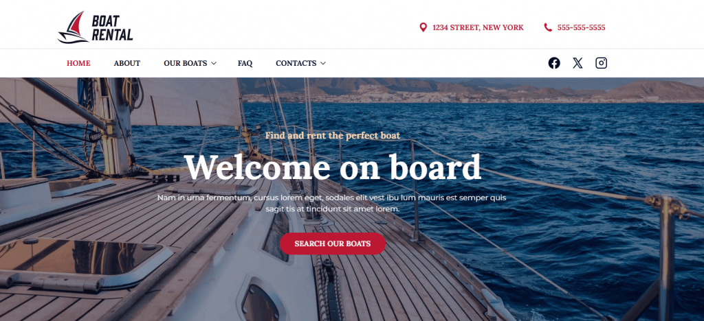
Our boat rental template is a great one-page design example. It uses a full-screen hero image of a sailboat deck in blue waters. The clean design lets the stunning photography do the talking, with white fonts that contrast against the backdrop.
The warm lighting in the hero image creates a calming feeling that makes visitors imagine themselves out in the ocean. Our template is also mostly minimal and uncluttered, which makes the call-to-action (CTA) button that reads “SEARCH OUR BOATS” stand out.
Keeping the design simple with only one primary action eliminates confusion and guides users naturally toward getting the service.
Meanwhile, the color palette of blues and whites reinforces the company’s expertise in the boating industry and builds trust with potential customers.
Bike event page template
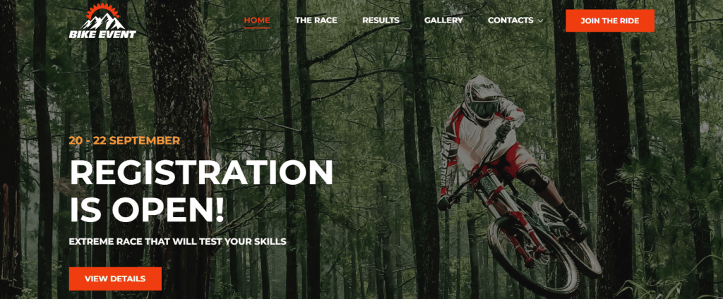
Our bike event website template also makes for a perfect single-page example. It features a hero image of a mountain biker mid-jump through a forest. The design uses a bold, condensed font for “REGISTRATION IS OPEN!” that creates immediate impact.
This template engages visitors by communicating intensity and excitement. The hero image captures exactly what participants want to achieve during the event. Other than that, the headline creates urgency but is phrased in a way that’s not pushy.
We also see the color orange again, which stimulates enthusiasm and energy. This color choice perfectly matches the target audience of this event.
What is a multi-page website?
A multi-page website gives each part of your business its own space. Instead of fitting everything into one page, you can create as many pages as you need for your products, services, company information, blog, and more.
Every page has its own URL and connects through your site’s navigation. Customers can browse the sections that interest them without sorting through unrelated information.
This multi-page website design is ideal for an extensive site with multiple topics, products, or services.
For example, a typical multi-page business website can have:
- A Homepage
- An About page
- A Services or Products page
- A Contact page
- Additional pages, like Blog, FAQ, or Portfolio
You can learn more about other pages to include on your website in this article: What pages should your business website have?
The pros of a multi-page website
Multi-page websites offer specific advantages when you have extensive content or complex business needs. Here are the notable benefits that make multi-page sites the right choice for many businesses:
- Multiple keyword opportunities
- Blogging capabilities
- Content siloing
- Performance measurement
- Traditional navigation
- Scalability
- Greater marketing potential
Multiple keyword opportunities
The biggest drawback of one-page websites is also the biggest benefit of multi-page sites: targeting multiple keywords. With a multi-page site, every page lets you target (and rank for) a new keyword.
Using the New York plumbing business example, your homepage can target the keywords “New York plumber,” while you can use additional pages to target other popular terms, like “licensed plumbers NYC” or “emergency plumber NYC.”
Bookmark our article on finding good keywords for future reference.
Blogging capabilities
While you can start a blog and link to it from a one-page website, a multi-page website lets you publish blog posts directly on your main domain.
This helps bring organic traffic to your website, where visitors can navigate your products, services, and other content. As you publish more pages, each blog post becomes another entry point that can attract potential customers and lead to conversions.
Content siloing
Content siloing is an SEO strategy where you group related content into organized clusters or “silos” around specific topics.
For example, a fitness website can have separate silos for nutrition, workouts, and supplements, with each silo containing multiple related pages that link to each other.
Multi-page websites are perfect for implementing content silos because you can dedicate entire sections of your site to different topic areas. Each silo can have its own landing page with subcategories and supporting pages.
This organized structure can help users and search engines better understand how your content is related.
Performance measurement
With tools like Google Analytics, it’s easy to see how pages on a multi-page website are performing. You’ll see which pages are gaining the most traffic, which content is generating the most clicks, and where visitors are losing interest.
You can then use this data to tweak pages and content to improve their performance. This is a big advantage over one-page sites, where it’s hard to pinpoint which elements or content aren’t working.
Traditional navigation
Long before we used our thumbs to scroll on our phones, we clicked links and menus on our computers. Multi-page websites use the familiar navigation structure people expect, making it easy to browse different sections or use a search bar to find information faster.
Visitors instinctively know that clicking menu items like “About,” “Services,” or “Contact” will take them to the part of your site’s content they’re looking for.
However, it’s important to keep your navigation clean and organized. Too many menu items can overwhelm users and make your site feel cluttered.
The trick is finding the right balance between providing comprehensive navigation options and maintaining a browsing experience that doesn’t confuse or intimidate your audience.
Scalability
Multi-page websites are scalable because they’re built on a structure that can grow organically over time.
When your business expands and you need to add new products, services, or content sections, you can simply create new pages without disrupting your existing site architecture.
This flexibility means your site can evolve as your business needs change without needing a complete redesign.
Greater marketing potential
With multiple pages and blog posts, driving traffic to a multi-page website is much easier.
Through social media posts and advertising on search and social, it’s possible to create content around target keywords. You can target different customer segments to attract visitors to specific pages.
For instance, a pet grooming brand can create targeted campaigns for grooming services on one page and pet care products on another. This allows them to reach different audiences with specific messaging. More content to share equals more attention for your business.
The cons of a multi-page website
The challenges that come with a multi-page website can make a one-page site more suitable for your needs. Here are the main disadvantages to consider:
- It needs constant maintenance
- It can make the mobile experience frustrating
- It creates distractions for users
- It potentially increases your bounce rate
It needs constant maintenance
The larger your website grows, the more demanding and time-consuming it becomes to maintain. Multi-page sites require ongoing attention across multiple areas, including:
- Content updates
- SEO
- Plugin management
- Security monitoring
- Internal link maintenance
- Image optimization
- Individual page performance tracking
Each additional page means more maintenance tasks, which can be intimidating for small businesses with limited technical resources.
It can make the mobile experience frustrating
Multi-level menus and complex page structures can create frustrating mobile experiences, especially if your site isn’t built with a responsive design.
Mobile users expect simplified navigation and fast-loading pages, but multi-page sites often have cluttered menus that are difficult to navigate on small screens.
When choosing a multi-page design, pick a website theme that adjusts to any screen size. It’s also good to choose a website builder that allows you to test a template on different devices to check how it would appear.
Here’s a great resource on how to make a responsive website.
It creates distractions for users
Multi-page websites are built for exploration, and visitors are encouraged to learn more about a business through menu links and CTAs.
This is great for getting people to stay on your website longer. However, it can be counterproductive if your goal is to keep them focused on one topic or guide them to take a certain action.
Traditional navigation means you’ll always be fighting to keep a reader’s attention on one page.
It potentially increases your bounce rate
Bounce rate measures the percentage of visits that were not meaningfully engaged. A visit is considered engaged when a user stays for at least 10 seconds, views multiple pages, or completes an important action. For one-page websites, this isn’t an issue, as there’s only one page to view.
Multi-page websites, on the other hand, can suffer from high bounce rates because of having multiple pages that potentially have various issues, including:
- Slow-loading pages
- Irrelevant content that doesn’t match audience expectations
- Broken links
- Poor user experience design
- Content that doesn’t align with page titles and descriptions
Monitor your website’s bounce rate to find out which areas need your attention.
Multi-page website examples
Multi-page websites have the advantage of dedicating entire pages to specific topics, which allows for more detailed storytelling. These sites often use consistent design elements across pages to maintain cohesion.
Here are some great examples that showcase effective multi-page website design:
Amazon
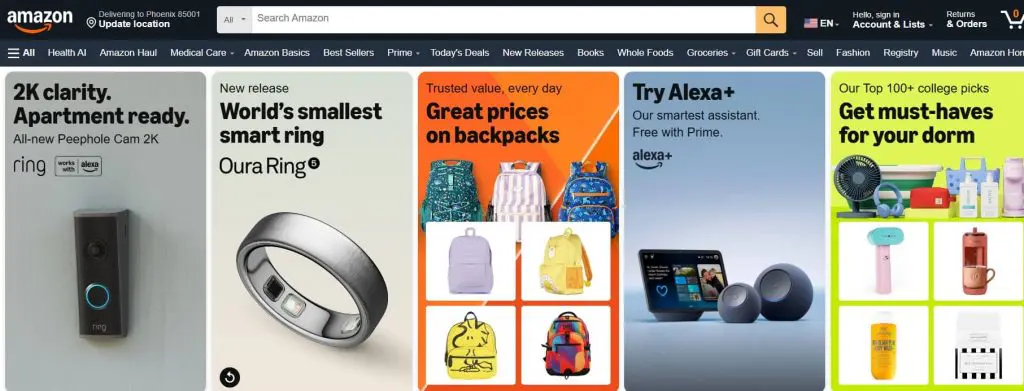
Amazon is an e-commerce platform known for its wide product variety and customer-focused approach. Their multi-page website uses a clean layout with strategic color placement.
Blue is used for the hero banner to indicate reliability, and orange for CTA buttons to create urgency. Their color choice and grid layout for product categories reinforce their reputation as a dependable shopping site.
It’s also good to point out their personalized content sections, like “Trending: Fall Beauty” and “Your Fall routine, upgraded.” This personalization makes the experience more engaging and helps customers discover relevant products faster than competitors.
BBC News
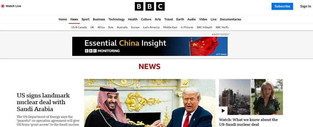
British Broadcasting Corporation (BBC) uses a multi-page layout that prioritizes content hierarchy and readability. The top navigation organizes content into distinct categories to help users find information quickly.
These categories include:
- News
- Sport
- Business
- Innovation
Other than that, the red accent color for “NEWS” emphasizes and aligns with the urgency associated with breaking news. The website also uses high-quality images that support each story, which perfectly reflects a professional and trustworthy news platform.
Apple
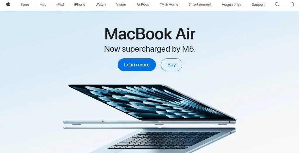
Apple’s multi-page website incorporates their brand’s signature minimalist design. They use a gray background with AirPods across the section, and blue CTA buttons. The hero section also uses playful design, like placing “Buy Mac or iPad for college” in speech bubbles.
The site uses its clean design to eliminate distractions and guide users toward engaging with multiple pages. The consistent use of gray, white, and black communicates Apple’s high-quality brand identity and makes the shopping experience feel effortless.
Disney Plus

Disney Plus designed their multi-page site to showcase offerings effectively. Their hero section displays their subscription options with clear pricing and bundle comparisons.
Their CTA buttons are in bright teal to create a strong contrast against the darker background, which makes them hard to miss.
And as you scroll, you’ll see a carousel of thumbnails that shows all available TV shows and movies categorized by genres. This type of design urges visitors to explore their website and ultimately subscribe to their packages.
Huda Beauty
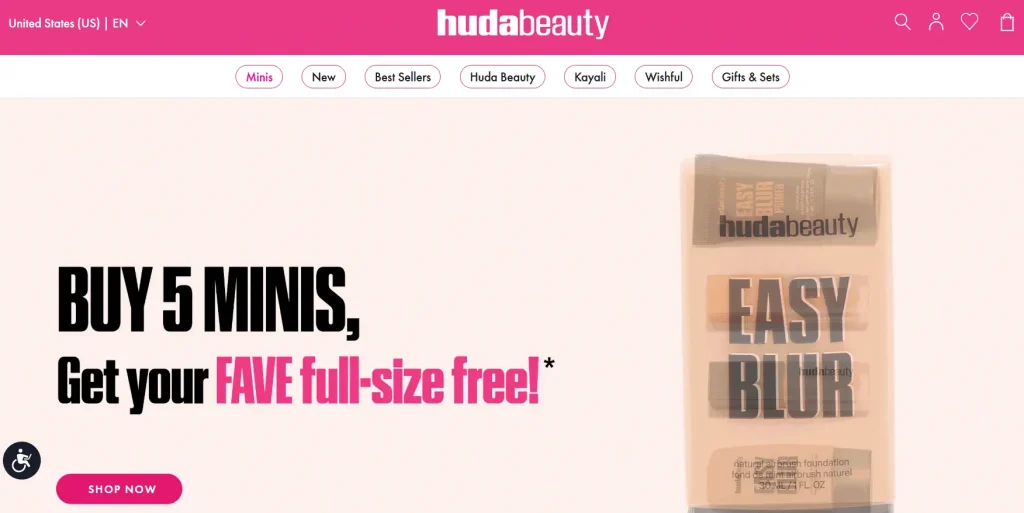
The cosmetics brand Huda Beauty uses a color palette of pinks and whites on their multi-page site. This choice communicates energy and femininity that’s perfectly aligned with their beauty brand.
Their multi-page design shows clear product category navigation with different labels, like:
- Minis
- New
- Best Sellers
- Gifts & Sets
Other than color and navigation, the site attracts visitors through high-quality and beautiful product photography. These approaches provide an excellent user experience that encourages beauty enthusiasts to engage more with their website’s pages.
Factors to consider when choosing between a single-page and a multi-page website
Whether a single-page or a multi-page site is right for you depends on your business and its objectives. That said, consider these two main factors when making your choice:
Your website content
What do you offer, and how familiar are people with it? Can you get your message across concisely, or do readers need to be educated and convinced about what you do?
If you’re a wedding photographer or run a food catering service, for example, people immediately know what you do, and you won’t need multiple pages to explain it.
However, a one-page website is not a good fit if you sell various products or services that need their own descriptions. You’ll end up with a cluttered website if you try to fit all that information onto a single page.
Take a content-led approach. Work out what your customers care about. What do they need to see to make an informed decision about your business?
If you’re struggling to fit everything on one page or you need multiple categories, go with a multi-page site template.
Your marketing strategy
Where does your audience come from? If most of them come from word-of-mouth or social media and you’re not as concerned about search results, a one-page website will provide everything you need.
If you want to gain traffic through SEO and advertising, a multi-page site will make things easier. You’ll have the power of blogging and landing pages to target multiple keywords.
The right website deserves the right builder
Create a one-page or multi-page website with customizable templates, built-in tools, and everything you need to launch online.

Best practices when designing a one-page and a multi-page website
When it comes to designing effective one-page websites, simplicity should be your main theme. Beyond that, keep the following best practices in mind:
- Write a concise but compelling narrative that tells your brand’s story.
- Utilize clear and visually striking sections to guide visitors through the page smoothly.
- Optimize your site for mobile to make sure you provide a seamless user experience across different screen sizes.
- Use prominent CTA buttons to encourage conversions.
- Take advantage of smooth transitions to add depth and engagement.
On the other hand, creating successful multi-page websites requires careful planning and attention to detail. So, remember these:
- Design a clean and intuitive navigation menu to help visitors explore your content effortlessly.
- Maintain consistent branding elements throughout the site.
- Provide high-quality content that answers your target audience’s questions.
- Apply a strong internal linking strategy to enhance navigation and improve SEO.
- Monitor page load speeds and optimize as needed for smooth website performance.
Regardless of your choice, always prioritize user experience and design. Keep the layout clean, use legible fonts, and create visually appealing elements.
Test the website’s functionality on different browsers to verify compatibility. And engage with your audience by adding interactive features or integrating your social media.
Frequently asked questions
A one-page website is a site that presents all of its content on a single page instead of spreading it across multiple, separate pages. This design delivers information in a linear format, with users scrolling down the page to explore different sections.
Choosing a one-page website can provide several benefits, especially for businesses with a focused message. The single-page design is often quicker and more affordable to create and manage than a multi-page site.
The simple layout can also lead to a better user experience, as it removes distractions and guides the visitor toward a specific goal, like making a purchase or filling out a contact form.
Since all the content is in one place, it can also lead to higher page authority, as all links point to a single URL.
One-page websites are great for businesses with one clear message to share. Freelancers, consultants, and artists often use them to create simple online resumes or portfolios.
One-page sites are also effective for promoting a single product, service, or upcoming event, as the design can function like a dedicated landing page.
Choose the website format that takes your business to greater heights
By now, you should have a better idea of whether a one-page or multi-page website is the right fit for your business. If one clear message is all you need, a one-page website may be the better choice. If you want to showcase multiple products, services, or resources, a multi-page website gives you the flexibility to do that.
Once you’ve chosen your website format, it’s time to secure your domain name. Every Network Solutions domain registration includes free apps to help you establish your online presence from day one.
Whether you’re building a one-page website or a larger multi-page site, our Website Builder makes it easy. As Jacqueline Galison, Product Manager, puts it:
“Our Website Builder is feature-rich but easy to use. We support both customers who are looking for a quick and convenient way to get online and customers who are looking to extensively customize a website to represent them or their brand.”
Now all that’s left is to bring your idea online. Network Solutions is built to help you break through.
Find the perfect domain
Ready to register a domain name? Check domain availability and get started with Network Solutions today.