

Key takeaways:
- Website design mistakes can cost you trust, traffic, and potential customers before they take the next step.
- The most common website design mistakes include confusing navigation, slow pages, weak CTAs, poor mobile design, accessibility gaps, and inconsistent branding.
- Knowing how to avoid website design mistakes can make your website easier to use, easier to find, and more effective at turning visitors into customers.
You know that feeling when someone walks into a store, looks around for a few seconds, and walks right back out? That happens on websites, too. Visitors decide almost instantly whether they trust you, understand what you offer, and want to see more. If the experience isn’t smooth, many visitors will leave. That’s the real cost of website design mistakes: missed opportunities to connect with the people you want to reach.
But chances are, you don’t need a brand-new website. Most common website design mistakes come from small details that are easy to miss, like confusing navigation, hard-to-read text, or slow-loading pages. Cleaning them up creates a better user experience and gives potential customers fewer reasons to leave.
In the next few minutes, we’ll walk through the common web design mistakes that trip up small business websites most often. You’ll see why they happen, what they look like, and the simple fixes that make the biggest difference.
10 common website design mistakes and how to avoid them
Many websites lose visitors because of small details that are easy to overlook. Here are 10 common web design mistakes to watch for and the common mistakes you can fix first.
- Confusing navigation and unclear messaging
- Cluttered layouts with too many design elements
- Weak calls to action that don’t guide users
- Poor mobile experience
- Slow loading pages
- Hard-to-read text and poor accessibility
- Inconsistent branding across web pages
- Poor visual hierarchy
- Missing SEO basics on important pages
- Outdated design and missing user feedback
1. Confusing navigation and unclear messaging
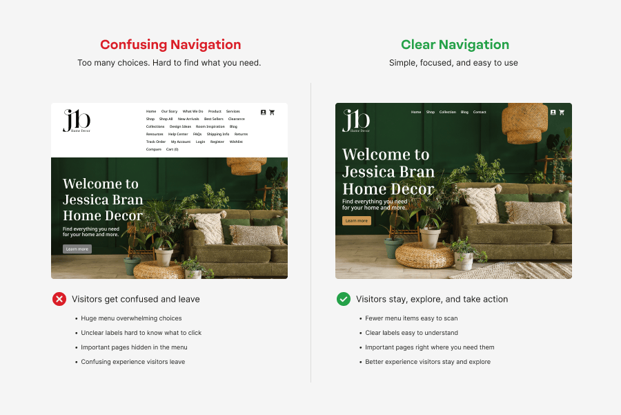
Think about handing someone a map with no labels and telling them to find their way. That’s what a confusing website feels like. It’s one of the common website design mistakes that pushes visitors away before they even get to know you. The moment someone lands on your site, they’re asking three quick questions in their head: What is this place? Am I in the right spot? What do I do now? If your menu is cluttered or your homepage doesn’t answer those questions fast, most people won’t stay long enough to dig for the answers themselves.
Watch for these signs:
- Too many menu items
- Unclear or clever menu labels
- Hard-to-find About page, services, pricing, or contact page
- A homepage that doesn’t clearly explain what your business does.
- No search bar or search function on larger websites.
None of these are huge red flags on their own, but together they can throw off the user journey instead of guiding users where they actually want to go. The fix usually isn’t complicated. Stick to menu labels people would actually use in real life, put your most important pages within easy reach, and build your navigation around how visitors naturally explore rather than how your team organizes things internally.
Every current page should make two things obvious: where the visitor is right now and where they can go next. Nothing about it should leave people wondering or confuse users along the way.
2. Cluttered layouts with too many design elements
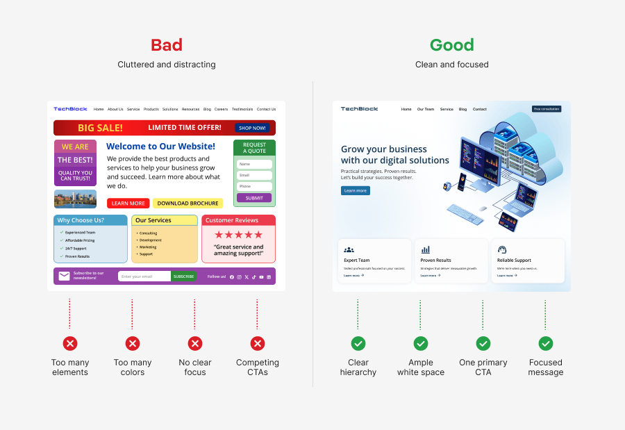
Picture opening a closet where everything got shoved in at once. Shirts, shoes, boxes, all fighting for space until you can’t find anything. That’s what it feels like when a webpage tries to hold too much. It’s another one of those common website design mistakes that catches people off guard. When visitors land on a page packed with design elements, their eyes don’t know where to settle. Instead of helping users take the next step, a cluttered layout scatters their attention and buries the one message you actually wanted them to see.
A few signs your layout might be doing too much:
- Too many images, icons, banners, animations, or colors competing for attention
- Large walls of text that are hard to scan
- Important CTAs buried beneath visual distractions
- Multiple buttons or offers competing on the same page
A cleaner visual design gives visitors room to breathe and focus on what matters. Cut anything that doesn’t serve the page’s purpose, let white space do some of the work, and give your key content space to stand out. Try to build each of your web pages around one main action so people always know what to do next. A simpler layout leads to a better user experience and keeps things from frustrating users who just want a straight answer.
3. Weak calls to action that don’t guide users
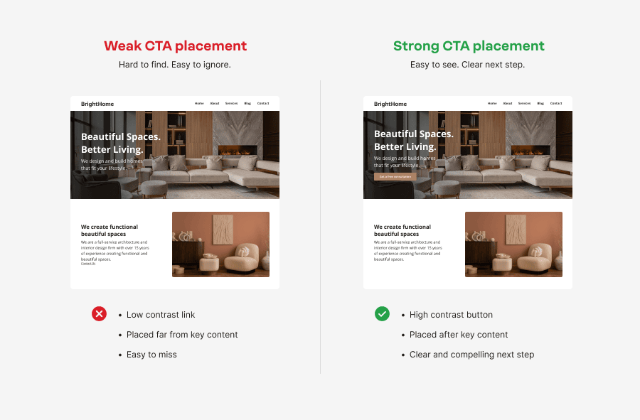
A call to action is your website’s way of pointing and saying “here, go this way.” When it’s weak or vague, visitors are left standing at a fork in the road with no signs. If someone is ready to take action, don’t make them stop and think. A clear CTA keeps the user journey moving and shows them exactly where to go next.
You might notice:
- Generic button text like “Submit” or “Click Here”
- Buttons hidden below the fold or buried in long pages
- CTAs that blend into the rest of the page
- Too many competing CTAs that leave visitors unsure which one to choose
Clear, purposeful buttons do a much better job of guiding users and encouraging potential customers to take that next step. Let visitors know exactly what to expect before they click, place CTAs where people naturally pause to decide, and give buttons enough contrast to stand out at a glance. Finally, test your CTAs on mobile devices and different screen sizes so they’re just as easy to find and tap, no matter what someone’s using to browse.
4. Poor mobile experience
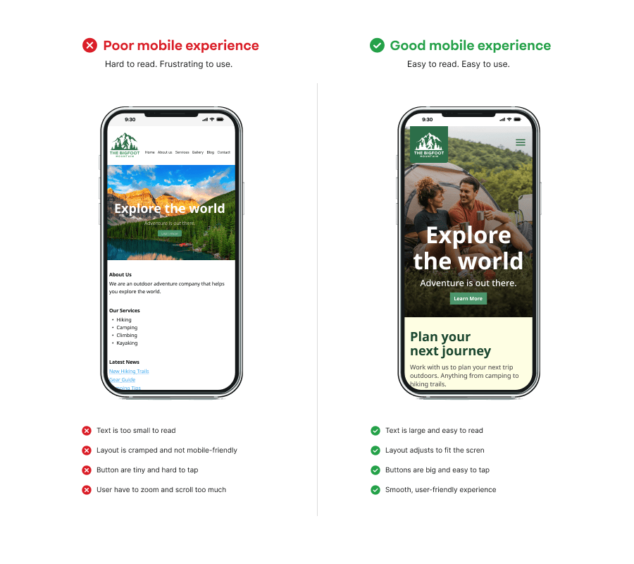
A website can look sharp on a desktop and still fall apart the moment someone opens it on their phone. That gap is one of the most common web design mistakes businesses run into. If people have to pinch, zoom, or hunt around just to read a sentence, most won’t stay on the page for long.
Here are some clues:
- Tiny text that’s hard to read
- Buttons too small or too close together
- Menus that don’t open or work properly
- Images or forms that break on smaller screen sizes
- Horizontal scrolling that makes pages harder to use
A better mobile experience starts with a responsive design that adjusts automatically to different devices. Keep navigation simple, make buttons easy to tap, and check your website on different phones and screen sizes regularly. These small fixes make your website design easier to use and help you steer clear of one of the most common website design mistakes out there.
5. Slow loading pages
No matter how good your content or website design is, people won’t wait around for a page to load. A slow website can make your business look unreliable before anyone even reads the first sentence. It can also frustrate visitors, hurt your user experience, and contribute to lower search engine rankings, since search engines favor faster sites.
A few common reasons pages load slowly:
- Oversized images that take too long to download
- Too many plugins or unnecessary scripts
- Excessive HTTP requests from extra design features
- Heavy videos, animations, or other visual elements
- Poor hosting performance
The good news is that many of these issues are easy to fix. Compress images before uploading, remove plugins and scripts you no longer use, enable browser caching, and choose reliable hosting that can keep up with your website’s needs. It’s also worth checking your page speed regularly so you know when something needs attention.
Give your website a faster foundation
A reliable hosting plan helps your website load faster, stay online, and handle everyday traffic with confidence. Network Solutions hosting gives you the tools to keep your site running smoothly.

6. Hard-to-read text and poor accessibility
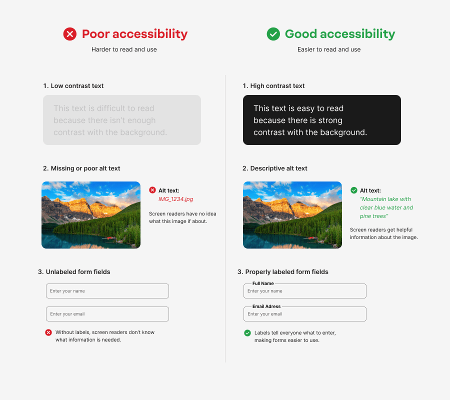
Good web design should be easy for everyone to read and use. If visitors struggle to read your text, navigate your pages, or complete a form, they’re more likely to leave. That’s why accessibility isn’t just for people with disabilities. It creates a better user experience for everyone and helps you avoid one of the most common website design mistakes.
Keep an eye out for:
- Low-contrast text that’s difficult to read.
- Small font sizes or hard-to-read typefaces.
- Text placed over busy images or backgrounds.
- Missing image alt text.
- Unclear buttons or user form labels.
- Headings that are out of order or inconsistent.
Simple improvements can make a real difference. Use readable font sizes, keep color contrast strong (WCAG guidelines recommend a minimum ratio of 4.5:1 for normal body text), write helpful alt text for your images, organize content with proper headings, and label buttons and forms clearly. These changes make your site easier to navigate, help keep design elements from confusing visitors, and create a better experience for potential customers instead of unintentionally alienating users.
7. Inconsistent branding across web pages
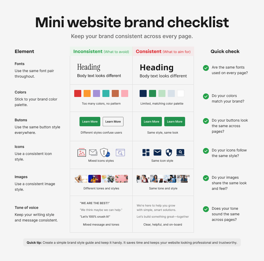
Your brand should look and sound the same no matter which page someone lands on. When inconsistent branding shows up across your web pages, the whole site can feel unfinished, like it was built by three different people who never talked to each other. Even small mismatches can make visitors wonder if they clicked away from your site by accident, and that’s one of those website design mistakes that chips away at trust without anyone quite noticing why.
These are some telltale signs:
- Separate pages using different fonts
- Random colors that don’t match your brand
- Mismatched icons or images
- Inconsistent button styles
- A different tone or writing style across pages
A simple brand style guide can help keep everything lined up. Define your fonts, colors, button styles, image style, and tone of voice, then apply them across every page. Check your key design elements every so often to make sure they still match. Consistent visual design helps visitors recognize your brand at a glance, makes the experience feel smoother, and gives your website a more polished, professional feel overall.
8. Poor visual hierarchy
Ever grabbed a page of notes where every line was underlined, bolded, and highlighted at once? Your eyes don’t know where to land, so they just give up trying. That’s what a page with no visual hierarchy feels like. Most people scan a page before they read it, letting their eyes pick out what matters first. Good hierarchy makes that easy for users. Poor hierarchy makes every heading, button, and image shout at the same volume, so nothing pulls focus. When every design element carries equal weight, visitors can miss the one thing you wanted them to see. It’s one of those web design mistakes that works against your user experience without ever announcing itself.
Some common signs include:
- Headings look the same as body text
- CTAs don’t stand out
- Every section competes for attention
- Important information is buried too far down the page
You don’t have to redesign your whole website to improve it. Use heading sizes consistently, add contrast to highlight key content, place your most valuable information near the top, and make your main CTA easy to spot. A strong visual design naturally leads visitors from one section to the next and helps them know exactly where to look first.
Give your website the refresh it deserves
If your website needs more than a few small fixes, our web design experts can help. We’ll create a professional website that looks great, works smoothly, and supports your business goals.

9. Missing SEO basics on important pages
Good website design and SEO are two sides of the same coin. One makes your site easy to use once someone’s there, the other makes sure they actually show up. You could build the cleanest, most helpful web pages in the world, but if search engines can’t make sense of them, hardly anyone will ever see the work you put in. Skip the basics, and your pages struggle to appear in search engine result pages, which means fewer visitors and lower search engine rankings over time.
Watch out for these common issues:
- Missing or duplicate page titles
- Weak or missing meta descriptions
- Poor heading structure
- Images without alt text
- Important content shown only in images
- URLs that don’t describe the page
You don’t need to make big changes to see better results. Give every page a clear, unique title, use descriptive headings, add alt text to images, and keep important text readable instead of tucking it inside graphics. Run an SEO audit every so often to catch issues early and keep your visibility in search results on track. Clear, well-organized pages make life easier for visitors and search engines alike.
Need a little help finding those issues? Network Solutions SEO Site Analyzer and Website Grader can point out pages that may need a closer look.
10. Outdated design and missing user feedback
Even a well-built website can become outdated over time. Design trends change, technology improves, and so do user expectations. If you never update your site or ask for feedback, small website mistakes can pile up and hurt the user experience.
A few signs it’s time for a refresh:
- Old templates or dated visuals
- Broken layouts, images, or dead links
- Forms that ask for too much or no longer match users’ needs
- Pages with unusually high exit rates, low engagement, or poor conversion performance
- No usability testing or process for collecting feedback
Don’t guess what needs fixing. Review your analytics to spot pages where visitors leave quickly, then ask real users where they get stuck. Run usability testing before major redesigns, and refresh outdated pages on a regular schedule.
That’s also the approach Joe Mueller, Senior Director of Product Management, recommends: “Define your goals, understand the metrics that represent those goals, build a plan to improve those metrics, and stay focused on that plan.”
Frequently asked questions
The most common website design mistakes include confusing navigation, cluttered layouts, weak calls to action, poor mobile design, slow loading pages, accessibility issues, inconsistent branding, poor visual hierarchy, missing SEO basics, and outdated design. Fixing these web design mistakes creates a better experience for your visitors.
To avoid website design mistakes, keep things simple for your visitors. Clear navigation, readable pages, and responsive design go a long way. If you’re launching a new site, check how real people use it and keep improving from there.
Poorly designed websites are hard to navigate, slow to load, difficult to read, or unclear about what users should do next. These problems frustrate users and create a poor user experience.
Many people browse websites on mobile devices, so your site needs to work well on different screen sizes. A mobile-friendly design with readable text, tap-friendly buttons, and simple navigation gives mobile users a better experience and makes it easier for them to stay on your site.
Yes. Design mistakes like slow pages, poor mobile usability, weak page titles, inaccessible content, and confusing site structure make it harder for search engines and people to understand your website. That can make it harder for search engines to understand and surface your content, which may reduce visibility in search results.
Stay in control of your website design
Avoiding website design mistakes doesn’t mean you need to rebuild everything at once. Start with the biggest mistakes first, then tackle the smaller details one step at a time. Small updates can create a better user experience, help you build websites that inspire confidence, and make it easier for potential customers to take the next step.
Pick one page, make one improvement, and build from there. Whether you want to refresh your design, create a stronger brand, or improve your visibility in search, we have the tools to help you, including our Website Builder, Logo Maker, SEO tools, reliable hosting, and Professional Services.